You may believe that colorful, graphical electoral analysis is a relatively recent phenomenon. You know, those cool red and blue maps (and now sometimes green or purple) of each state and country.
But our present day news networks and the internet did not invent this type of infographic map.
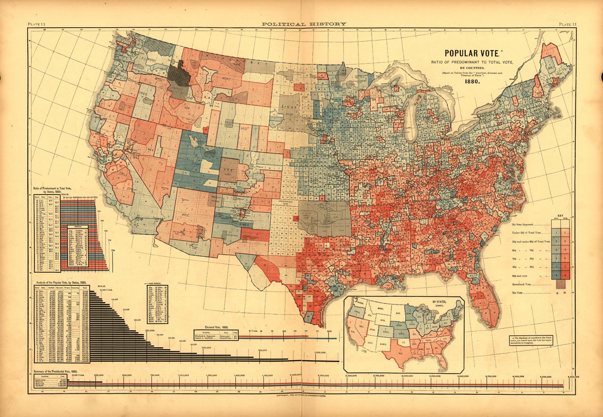
Susan Schulten, chair of the history department at the University of Denver, discovered what may be the earliest example of a US county-level electoral map. Published in 1883 it shows results from the 1880 Presidential election between Republican James Garfield and Democrat Winfield Hancock. Garfield won.
Two notable reversals in the 1880 map versus today’s counterpart: First, Democrats are in red; Republicans in blue. Second, Democrats make up the majority in much of the South and Midwest; Republicans rule in the Northeast. Interestingly, the color scheme switched numerous times over the last hundred years and did not formally become Democrat=Blue, Republican=Red until the 2000 election cycle.
For more fascinating details of our electoral maps, past and present, check out this article by Lazaro Gamio, over at the Washington Post.
Image: Plate 11 from Scribner’s Statistical Atlas of the United States, published in 1883. Courtesy: Library of Congress. Public Domain.
