The United States is often portrayed as the world’s bully and nefarious geo-political schemer — a nation responsible for many of the world’s current political ills. However, it is the French and British who should be called to account for much of the globe’s ongoing turmoil, particularly in the Middle East. After the end of WWI the victors expeditiously carved up the spoils of the vanquished Austro-Hungarian and Ottoman Empires. Much of Eastern Europe and the Middle East was divvied and traded just a kids might swap baseball or football (soccer) cards today. Then President of France Georges Clemenceau and British Prime Minister David Lloyd George famously bartered and gifted — amongst themselves and their friends — entire regions and cities without thought to historical precedence, geographic and ethnic boundaries, or even the basic needs of entire populations. Their decisions were merely lines to be drawn and re-drawn on a map.
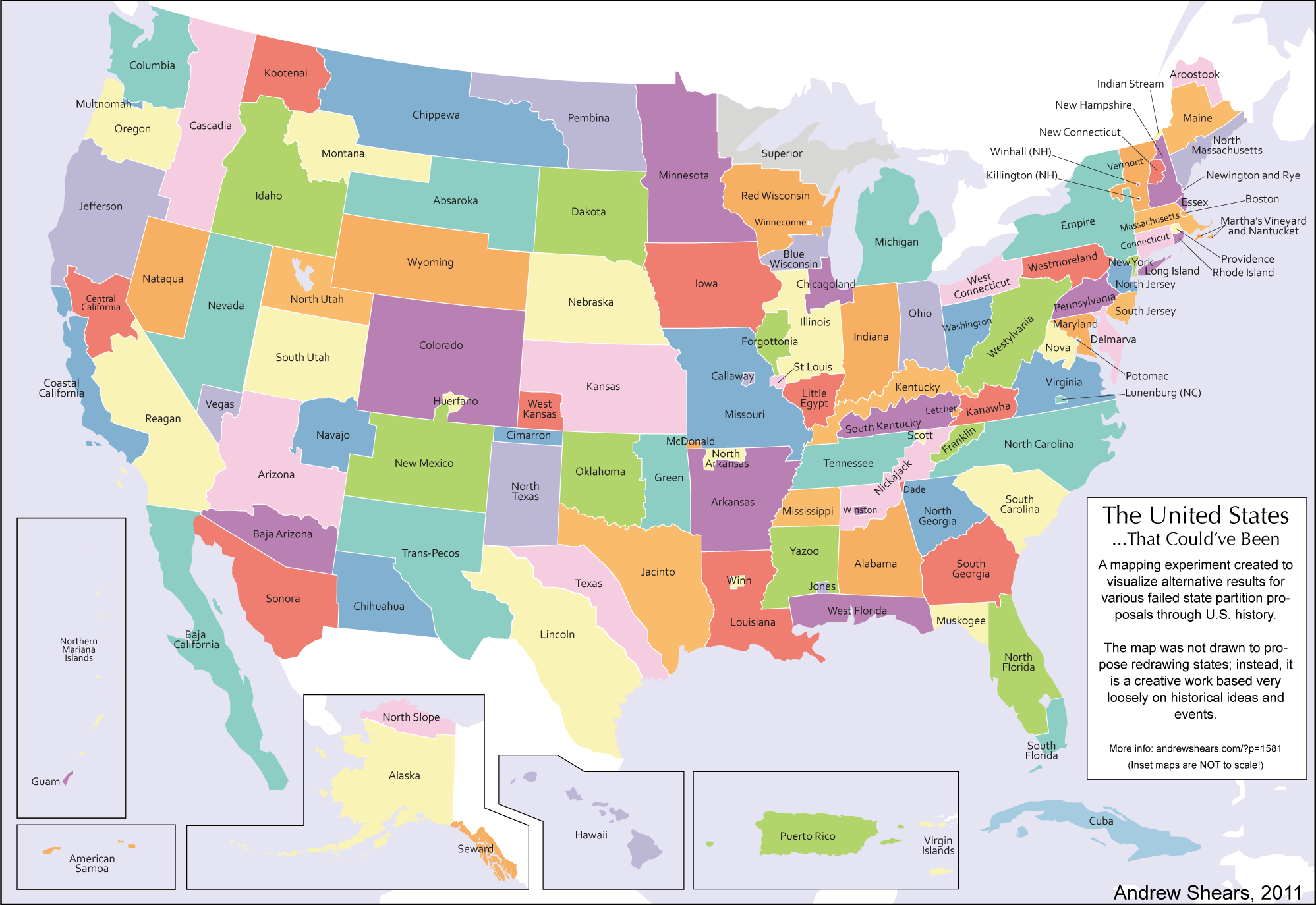
So, it would be a fascinating — though rather naive — exercise to re-draw many of today’s arbitrary and contrived boundaries, and to revert regions to their more appropriate owners. Of course, where and when should this thought experiment begin and end? Pre-roman empire, post-normans, before the Prussians, prior to the Austro-Hungarian Empire, or after the Ottomans, post-Soviets, or after Tito, or way before the Huns, Vandals and the Barbarians and any number of the Germanic tribes?
Nevertheless, essayist Yaroslav Trofimov takes a stab at re-districting to pre-Ottoman boundaries and imagines a world with less bloodshed. A worthy dream.
From WSJ:
Shortly after the end of World War I, the French and British prime ministers took a break from the hard business of redrawing the map of Europe to discuss the easier matter of where frontiers would run in the newly conquered Middle East.
Two years earlier, in 1916, the two allies had agreed on their respective zones of influence in a secret pact—known as the Sykes-Picot agreement—for divvying up the region. But now the Ottoman Empire lay defeated, and the United Kingdom, having done most of the fighting against the Turks, felt that it had earned a juicier reward.
“Tell me what you want,” France’s Georges Clemenceau said to Britain’s David Lloyd George as they strolled in the French embassy in London.
“I want Mosul,” the British prime minister replied.
“You shall have it. Anything else?” Clemenceau asked.
In a few seconds, it was done. The huge Ottoman imperial province of Mosul, home to Sunni Arabs and Kurds and to plentiful oil, ended up as part of the newly created country of Iraq, not the newly created country of Syria.
The Ottomans ran a multilingual, multireligious empire, ruled by a sultan who also bore the title of caliph—commander of all the world’s Muslims. Having joined the losing side in the Great War, however, the Ottomans saw their empire summarily dismantled by European statesmen who knew little about the region’s people, geography and customs.
The resulting Middle Eastern states were often artificial creations, sometimes with implausibly straight lines for borders. They have kept going since then, by and large, remaining within their colonial-era frontiers despite repeated attempts at pan-Arab unification.
The built-in imbalances in some of these newly carved-out states—particularly Syria and Iraq—spawned brutal dictatorships that succeeded for decades in suppressing restive majorities and perpetuating the rule of minority groups.
But now it may all be coming to an end. Syria and Iraq have effectively ceased to function as states. Large parts of both countries lie beyond central government control, and the very meaning of Syrian and Iraqi nationhood has been hollowed out by the dominance of sectarian and ethnic identities.
The rise of Islamic State is the direct result of this meltdown. The Sunni extremist group’s leader, Abu Bakr al-Baghdadi, has proclaimed himself the new caliph and vowed to erase the shame of the “Sykes-Picot conspiracy.” After his men surged from their stronghold in Syria last summer and captured Mosul, now one of Iraq’s largest cities, he promised to destroy the old borders. In that offensive, one of the first actions taken by ISIS (as his group is also known) was to blow up the customs checkpoints between Syria and Iraq.
“What we are witnessing is the demise of the post-Ottoman order, the demise of the legitimate states,” says Francis Ricciardone, a former U.S. ambassador to Turkey and Egypt who is now at the Atlantic Council, a Washington think tank. “ISIS is a piece of that, and it is filling in a vacuum of the collapse of that order.”
In the mayhem now engulfing the Middle East, it is mostly the countries created a century ago by European colonialists that are coming apart. In the region’s more “natural” nations, a much stronger sense of shared history and tradition has, so far, prevented a similar implosion.
“Much of the conflict in the Middle East is the result of insecurity of contrived states,” says Husain Haqqani, an author and a former Pakistani ambassador to the U.S. “Contrived states need state ideologies to make up for lack of history and often flex muscles against their own people or against neighbors to consolidate their identity.”
In Egypt, with its millennial history and strong sense of identity, almost nobody questioned the country’s basic “Egyptian-ness” throughout the upheaval that has followed President Hosni Mubarak’s ouster in a 2011 revolution. As a result, most of Egypt’s institutions have survived the turbulence relatively intact, and violence has stopped well short of outright civil war.
Turkey and Iran—both of them, in bygone eras, the center of vast empires—have also gone largely unscathed in recent years, even though both have large ethnic minorities of their own, including Arabs and Kurds.
The Middle East’s “contrived” countries weren’t necessarily doomed to failure, and some of them—notably Jordan—aren’t collapsing, at least not yet. The world, after all, is full of multiethnic and multiconfessional states that are successful and prosperous, from Switzerland to Singapore to the U.S., which remains a relative newcomer as a nation compared with, say, Iran.
Read the entire article here.
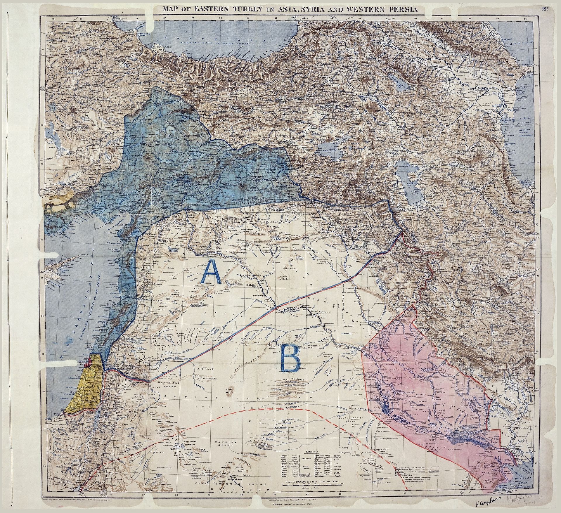
Image: Map of Sykes–Picot Agreement showing Eastern Turkey in Asia, Syria and Western Persia, and areas of control and influence agreed between the British and the French. Royal Geographical Society, 1910-15. Signed by Mark Sykes and François Georges-Picot, 8 May 1916. Courtesy of Wikipedia.


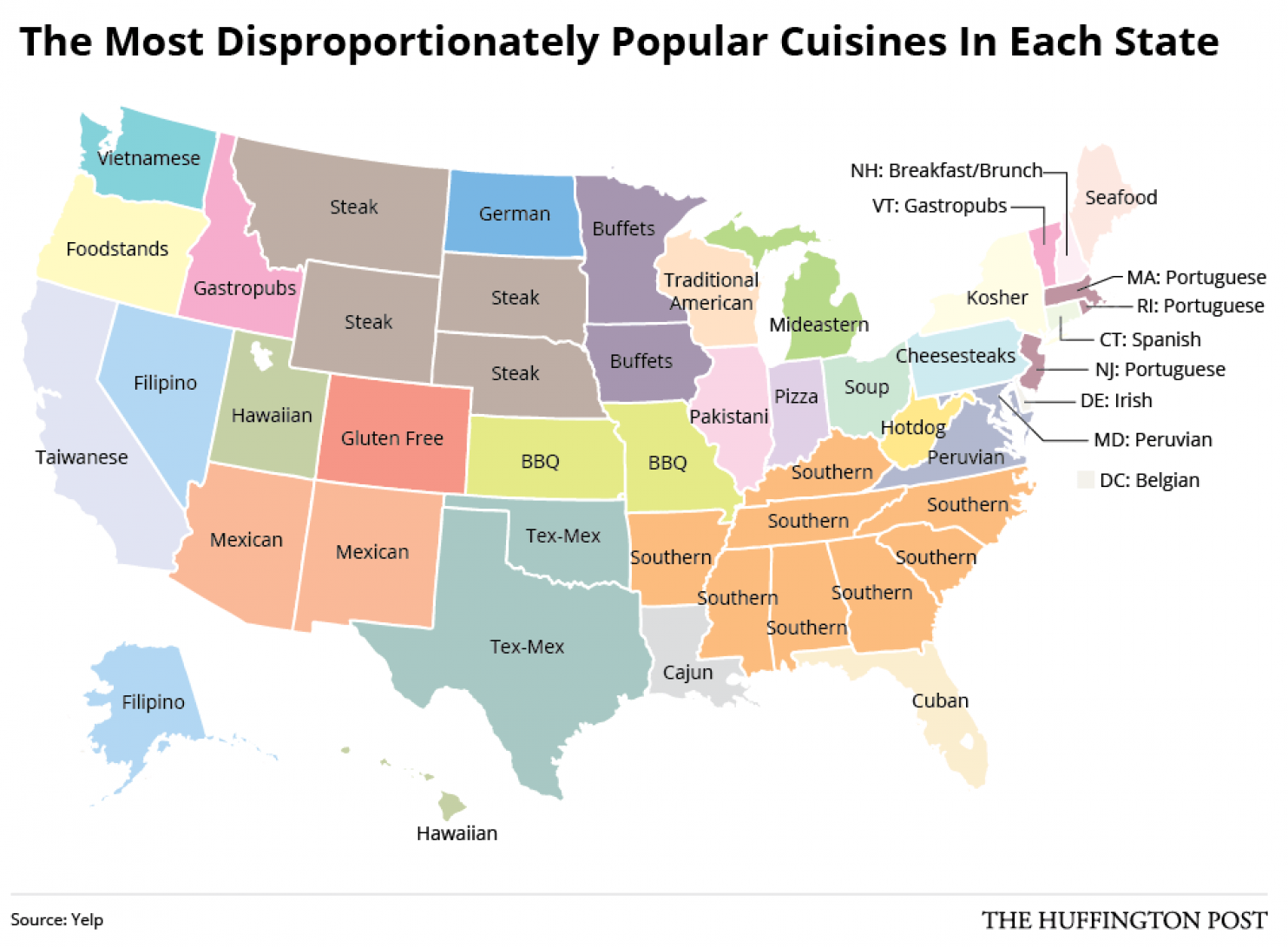
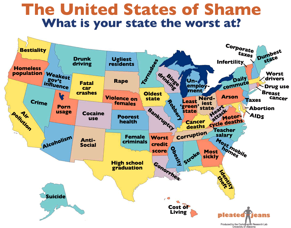
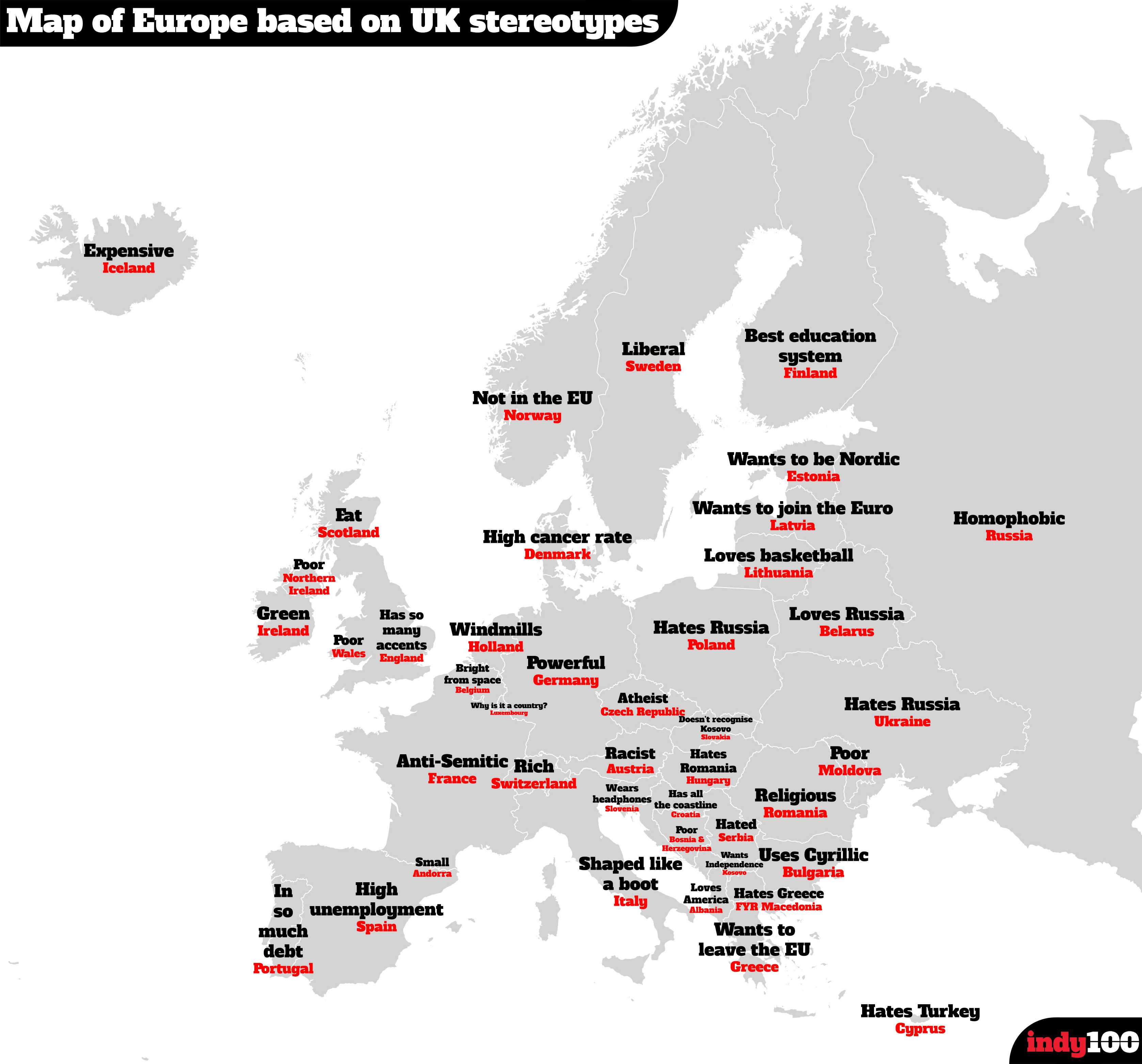 Hot on the heels of the map of US state stereotypes I am delighted to present a second one. This time it’s a
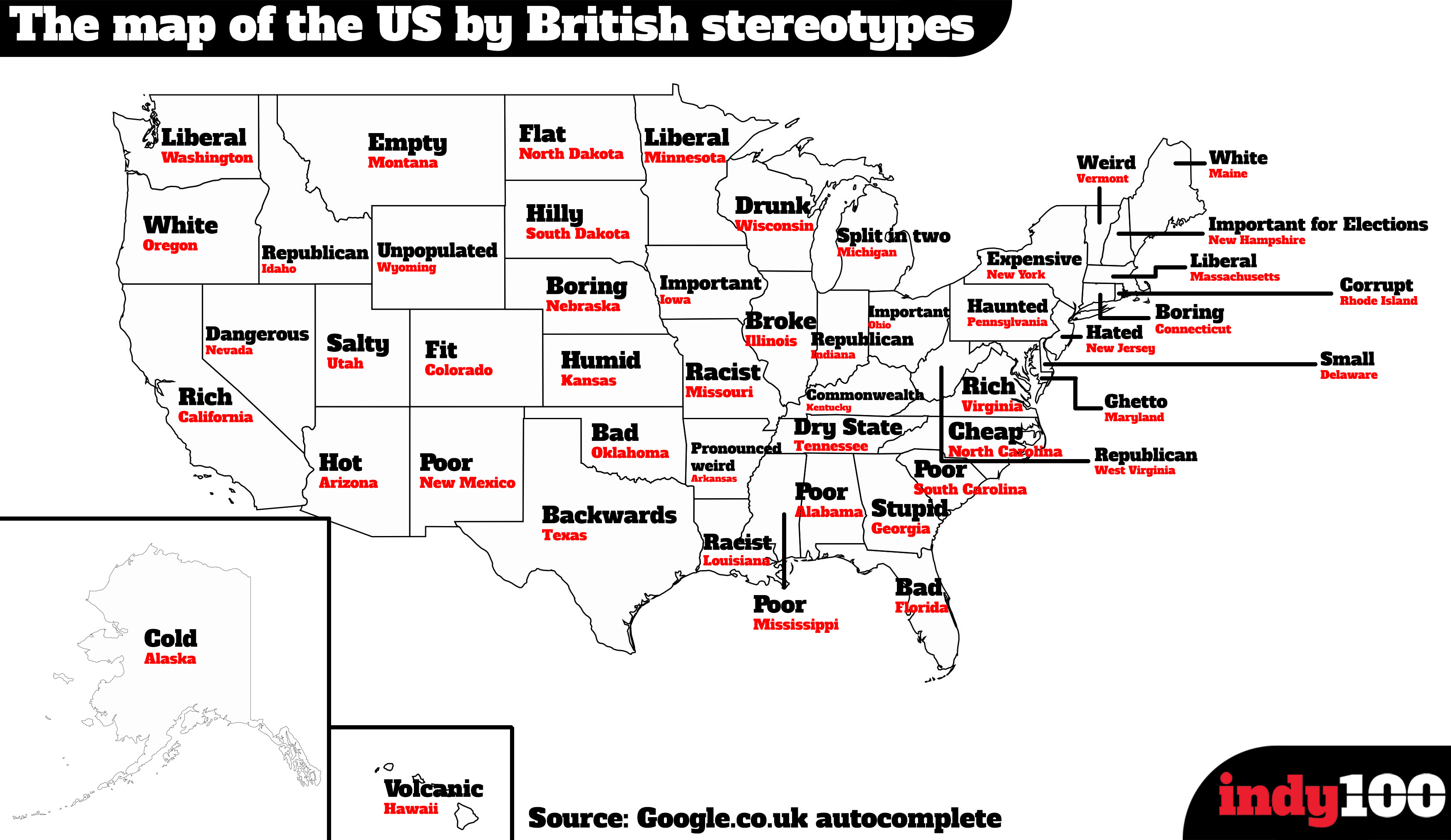
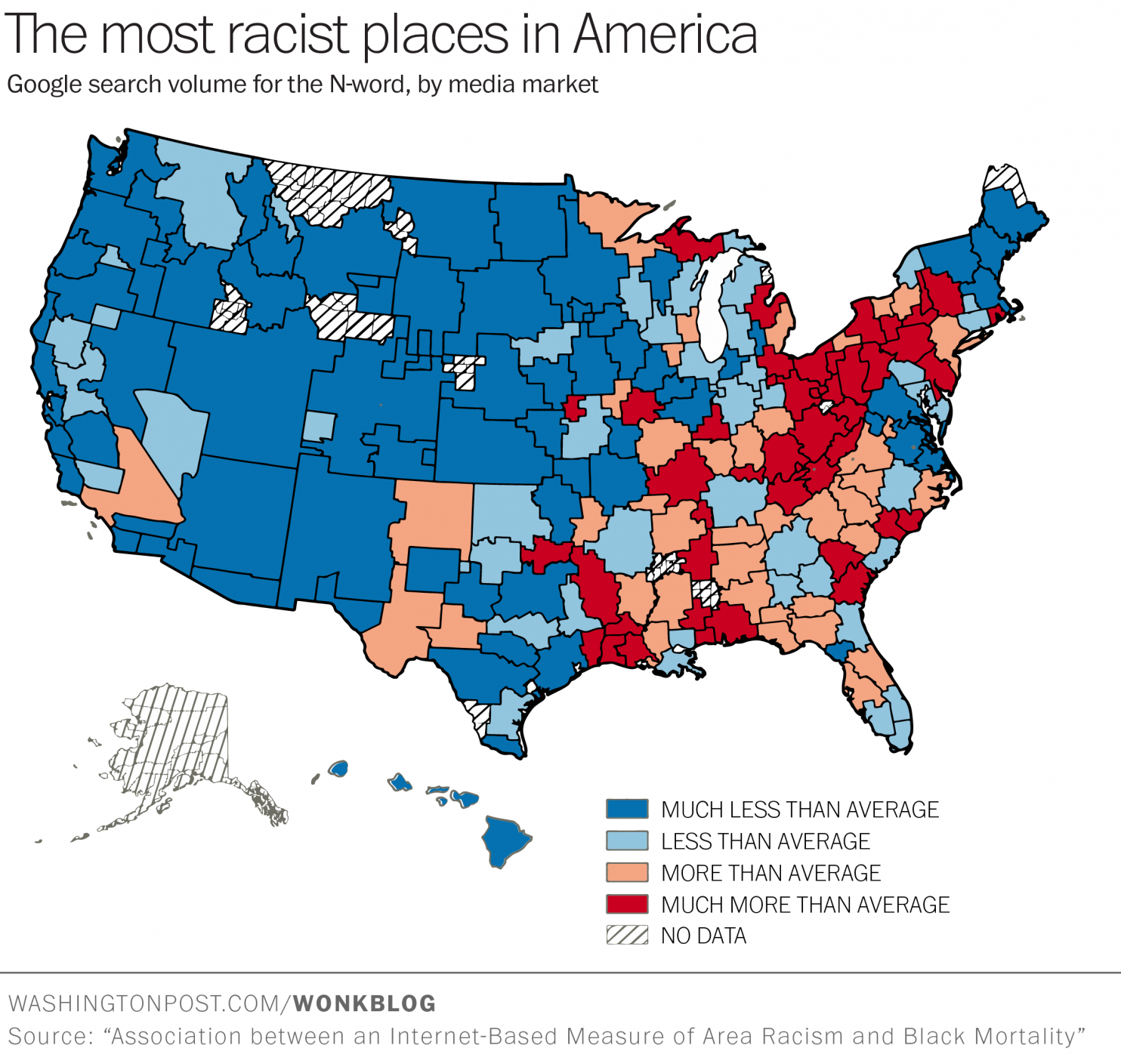
 The inflammatory rhetoric of the US election gives me pause. Pretenders to the nation’s highest office include xenophobes and racists. Yet their words of fear and hate are protected by one of the simplest and most powerful sentences written in to law: