Tag Archives: art criticism

Highbrow or Lowbrow?

Do you prefer the Beatles to Beethoven? Do you prefer Rembrandt over the Sunday comics or the latest Marvel? Do you read Patterson or Proust? Gary Gutting professor of philosophy argues that the distinguishing value of aesthetics must drive us to appreciate fine art over popular work. So, you had better dust off those volumes of Shakespeare.

From the New York Times:

Our democratic society is uneasy with the idea that traditional “high culture” (symphonies, Shakespeare, Picasso) is superior to popular culture (rap music, TV dramas, Norman Rockwell). Our media often make a point of blurring the distinction: newspapers and magazines review rock concerts alongside the Met’s operas and “Batman” sequels next to Chekhov plays. Sophisticated academic critics apply the same methods of analysis and appreciation to Proust and to comic books. And at all levels, claims of objective artistic superiority are likely to be met with smug assertions that all such claims are merely relative to subjective individual preferences.

Our democratic unease is understandable, since the alleged superiority of high culture has often supported the pretensions of an aristocratic class claiming to have privileged access to it. For example, Virginia Woolf’s classic essay — arch, snobbish, and very funny — reserved the appreciation of great art to “highbrows”: those “thoroughbreds of the mind” who combine innate taste with sufficient inherited wealth to sustain a life entirely dedicated to art. Lowbrows were working-class people who had neither the taste nor the time for the artistic life. Woolf claimed to admire lowbrows, who did the work highbrows like herself could not and accepted their cultural inferiority. But she expresses only disdain for a third class — the “middlebrows”— who have earned (probably through trade) enough money to purchase the marks of a high culture that they could never properly appreciate. Middlebrows pursue “no single object, neither art itself nor life itself, but both mixed indistinguishably, and rather nastily, with money, fame, power, or prestige.”

There is, however, no need to tie a defense of high art to Woolf’s “snobocracy.” We can define the high/popular distinction directly in terms of aesthetic quality, without tendentious connections to social status or wealth. Moreover, we can appropriate Woolf’s term “middlebrow,” using it to refer to those, not “to the manner born,” who, admirably, employ the opportunities of a democratic society to reach a level of culture they were not born into.

At this point, however, we can no longer avoid the hovering relativist objection: How do we know that there are any objective criteria that authorize claims that one kind of art is better than another?

Centuries of unresolved philosophical debate show that there is, in fact, little hope of refuting someone who insists on a thoroughly relativist view of art. We should not expect, for example, to provide a definition of beauty (or some other criterion of artistic excellence) that we can use to prove to all doubters that, say, Mozart’s 40th Symphony is objectively superior as art to “I Want to Hold Your Hand.” But in practice there is no need for such a proof, since hardly anyone really holds the relativist view. We may say, “You can’t argue about taste,” but when it comes to art we care about, we almost always do.

For example, fans of popular music may respond to the elitist claims of classical music with a facile relativism. But they abandon this relativism when arguing, say, the comparative merits of the early Beatles and the Rolling Stones. You may, for example, maintain that the Stones were superior to the Beatles (or vice versa) because their music is more complex, less derivative, and has greater emotional range and deeper intellectual content. Here you are putting forward objective standards from which you argue for a band’s superiority. Arguing from such criteria implicitly rejects the view that artistic evaluations are simply matters of personal taste. You are giving reasons for your view that you think others ought to accept.

Further, given the standards fans use to show that their favorites are superior, we can typically show by those same standards that works of high art are overall superior to works of popular art. If the Beatles are better than the Stones in complexity, originality, emotional impact, and intellectual content, then Mozart’s operas are, by those standards, superior to the Beatles’ songs. Similarly, a case for the superiority of one blockbuster movie over another would most likely invoke standards of dramatic power, penetration into character, and quality of dialogue by which almost all blockbuster movies would pale in comparison to Sophocles or Shakespeare.

On reflection, it’s not hard to see why — keeping to the example of music —classical works are in general capable of much higher levels of aesthetic value than popular ones. Compared to a classical composer, someone writing a popular song can utilize only a very small range of musical possibilities: a shorter time span, fewer kinds of instruments, a lower level of virtuosity and a greatly restricted range of compositional techniques. Correspondingly, classical performers are able to supply whatever the composers need for a given piece; popular performers seriously restrict what composers can ask for. Of course, there are sublime works that make minimal performance demands. But constant restriction of resources reduces the opportunities for greater achievement.

Read the entire article here.

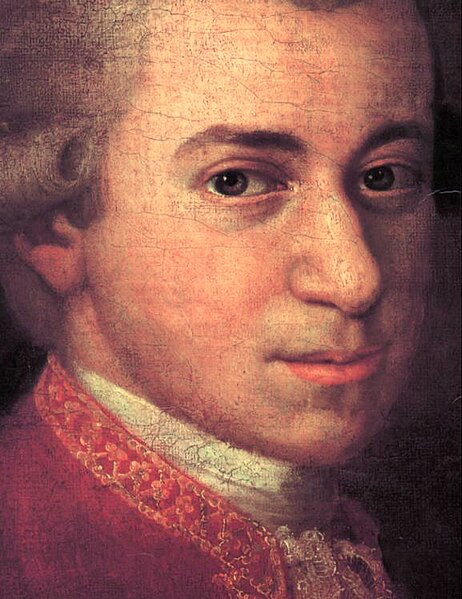
Image: Detail of the face of Wolfgang Amadeus Mozart. Cropped version of the painting where Mozart is seen with Anna Maria (Mozart’s sister) and father, Leopold, on the wall a portrait of his deceased mother, Anna Maria. By Johann Nepomuk della Croce (1736-1819). Courtesy of Wikipedia.

International Art English

Yes, it’s official. There really is a subset of the Queen’s English for the contemporary art scene — dubbed International Art English (IAE). If you’ve visited a gallery over the last couple of decades you may be familiar with this type language on press releases and wall tags. It uses multisyllabic words in breathless, flowery, billowy sentences; high-brow phraseology replete with pretentious insider nods and winks; it’s often enthusiastically festooned with adverbs and esoteric adjectives, in apparently random but clear juxtaposition. So, it’s rather like the preceding sentence. Will IAE become as pervasive as International Sport English – you know, that subset of language increasingly spoken, in the same accent, by international sports celebrities? Time will tell.

[div class=attrib]From the Guardian:[end-div]

The Simon Lee Gallery in Mayfair is currently showing work by the veteran American artist Sherrie Levine. A dozen small pink skulls in glass cases face the door. A dozen small bronze mirrors, blandly framed but precisely arranged, wink from the walls. In the deep, quiet space of the London gallery, shut away from Mayfair’s millionaire traffic jams, all is minimal, tasteful and oddly calming.

Until you read the exhibition hand-out. “The artist brings the viewer face to face with their own preconceived hierarchy of cultural values and assumptions of artistic worth,” it says. “Each mirror imaginatively propels its viewer forward into the seemingly infinite progression of possible reproductions that the artist’s practice engenders, whilst simultaneously pulling them backwards in a quest for the ‘original’ source or referent that underlines Levine’s oeuvre.”

If you’ve been to see contemporary art in the last three decades, you will probably be familiar with the feelings of bafflement, exhaustion or irritation that such gallery prose provokes. You may well have got used to ignoring it. As Polly Staple, art writer and director of the Chisenhale Gallery in London, puts it: “There are so many people who come to our shows who don’t even look at the programme sheet. They don’t want to look at any writing about art.”

With its pompous paradoxes and its plagues of adverbs, its endless sentences and its strained rebellious poses, much of this promotional writing serves mainly, it seems, as ammunition for those who still insist contemporary art is a fraud. Surely no one sensible takes this jargon seriously?

David Levine and Alix Rule do. “Art English is something that everyone in the art world bitches about all the time,” says Levine, a 42-year-old American artist based in New York and Berlin. “But we all use it.” Three years ago, Levine and his friend Rule, a 29-year-old critic and sociology PhD student at Columbia university in New York, decided to try to anatomise it. “We wanted to map it out,” says Levine, “to describe its contours, rather than just complain about it.”

They christened it International Art English, or IAE, and concluded that its purest form was the gallery press release, which – in today’s increasingly globalised, internet-widened art world – has a greater audience than ever. “We spent hours just printing them out and reading them to each other,” says Levine. “We’d find some super-outrageous sentence and crack up about it. Then we’d try to understand the reality conveyed by that sentence.”

Next, they collated thousands of exhibition announcements published since 1999 by e-flux, a powerful New York-based subscriber network for art-world professionals. Then they used some language-analysing software called Sketch Engine, developed by a company in Brighton, to discover what, if anything, lay behind IAE’s great clouds of verbiage.

Their findings were published last year as an essay in the voguish American art journal Triple Canopy; it has since become one of the most widely and excitedly circulated pieces of online cultural criticism. It is easy to see why. Levine and Rule write about IAE in a droll, largely jargon-free style. They call it “a unique language” that has “everything to do with English, but is emphatically not English. [It] is oddly pornographic: we know it when we see it.”

IAE always uses “more rather than fewer words”. Sometimes it uses them with absurd looseness: “Ordinary words take on non-specific alien functions. ‘Reality,’ writes artist Tania Bruguera, ‘functions as my field of action.'” And sometimes it deploys words with faddish precision: “Usage of the word speculative spiked unaccountably in 2009; 2011 saw a sudden rage for rupture; transversal now seems poised to have its best year ever.”

Through Sketch Engine, Rule and Levine found that “the real” – used as a portentous, would-be philosophical abstract noun – occurred “179 times more often” in IAE than in standard English. In fact, in its declarative, multi-clause sentences, and in its odd combination of stiffness and swagger, they argued that IAE “sounds like inexpertly translated French”. This was no coincidence, they claimed, having traced the origins of IAE back to French post-structuralism and the introduction of its slippery ideas and prose style into American art writing via October, the New York critical journal founded in 1976. Since then, IAE had spread across the world so thoroughly that there was even, wrote Rule and Levine, an “IAE of the French press release … written, we can only imagine, by French interns imitating American interns imitating American academics imitating French academics”.

[div class=attrib]Read the entire article following the jump.[end-div]

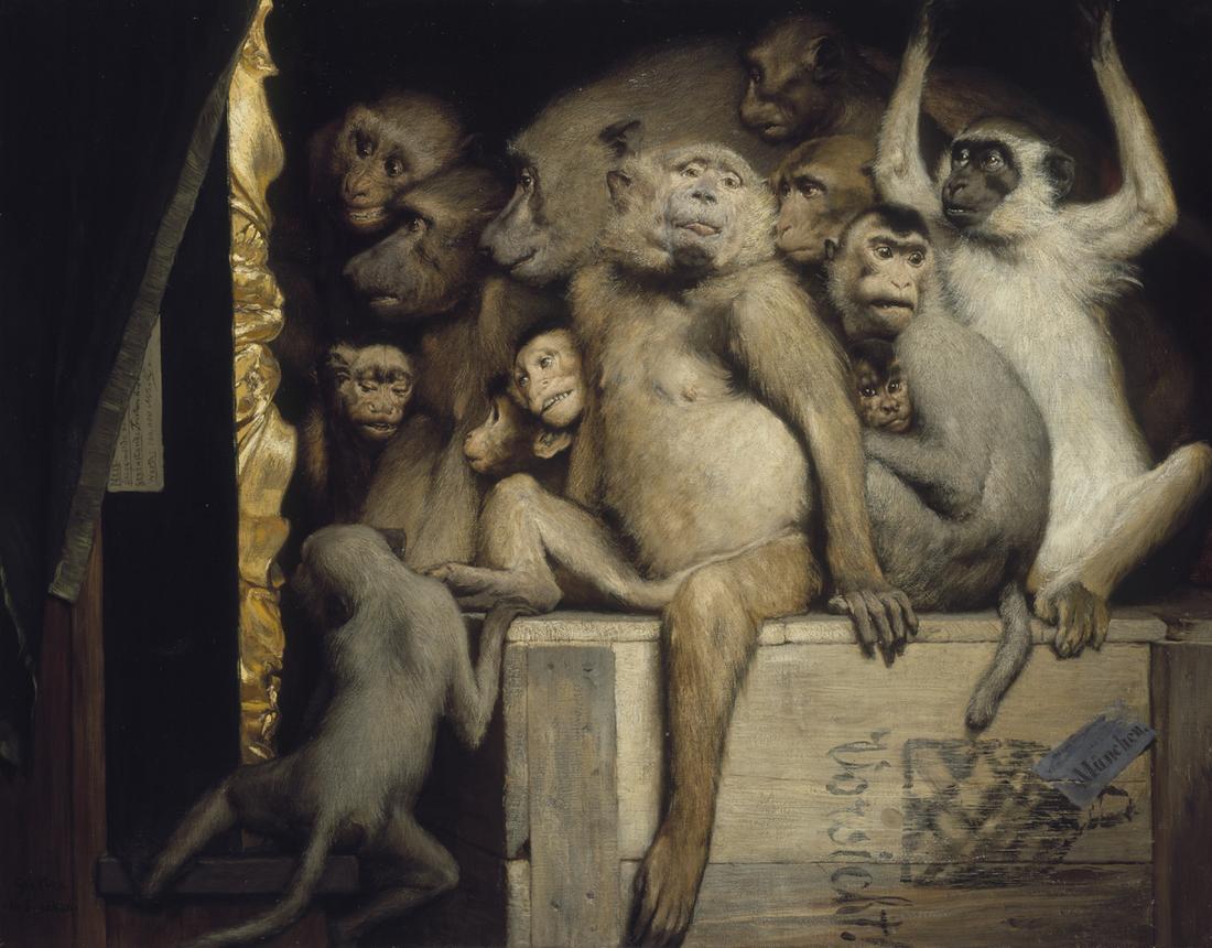
[div class=attrib]Image: Monkeys as Judges of Art, 1889, by Gabriel Cornelius von Max. Courtesy of Wikipedia / Public Domain.[end-div]

Painting the Light: The Life and Death of Thomas Kinkade

You’ve probably seen a Kinkade painting somewhere — think cute cottage, meandering stream, misty clouds, soft focus and warm light.

According to Thomas Kinkade’s company one of his cozy, kitschy paintings (actually a photographic reproduction) could be found in one of every 20 homes in the United States. Kinkade died on April 6, 2012. With his passing, scholars of the art market are now analyzing what he left behind.

[div class=attrib]From the Guardian:[end-div]

In death, the man who at his peak claimed to be the world’s most successful living artist perhaps achieved the sort of art-world excess he craved.

On Tuesday, the coroner’s office in Santa Clara, California, announced that the death of Thomas Kinkade, the Painter of Light™, purveyor of kitsch prints to the masses, was caused by an accidental overdose of alcohol and Valium. For good measure, a legal scrap has emerged between Kinkade’s ex-wife (and trustee of his estate) and his girlfriend.

Who could have imagined that behind so many contented visions of peace, harmony and nauseating goodness lay just another story of deception, disappointment and depravity, fuelled by those ever-ready stooges, Valium and alcohol?

Kinkade was a self-made phenomenon, with his prints (according to his company) hanging in one in 20 American homes. At his height, in 2001, Kinkade generated $130m (£81m) in sales. Kinkade’s twee paintings of cod-traditional cottages, lighthouses, gardens, gazebos and gates sold by the million through a network of Thomas Kinkade galleries, owned by his company, and through a parallel franchise operation. At their peak (between 1995 and 2005) there were 350 Kinkade franchises across the US, with the bulk in his home state of California. You would see them in roadside malls in small towns, twinkly lights adorning the windows, and in bright shopping centres, sandwiched between skatewear outlets and nail bars.

But these weren’t just galleries. They were the Thomas Kinkade experience – minus the alcohol and Valium, of course. Clients would be ushered into a climate-controlled viewing room to maximise the Kinkadeness of the whole place, and their experience. Some galleries offered “master highlighters”, trained by someone not far from the master himself, to add a hand-crafted splash of paint to the desired print and so make a truly unique piece of art, as opposed to the framed photographic print that was the standard fare.

The artistic credo was expressed best in the 2008 movie Thomas Kinkade’s Christmas Cottage. Peter O’Toole, earning a crust playing Kinkade’s artistic mentor, urges the young painter to “Paint the light, Thomas! Paint the light!”.

Kinkade’s art also went beyond galleries through the “Thomas Kinkade lifestyle brand”. This wasn’t just the usual art gallery giftshop schlock: Kinkade sealed a tie-in with La-Z-Boy furniture (home of the big butt recliner) for a Kinkade-inspired range of furniture. But arguably his only great artwork was “The Village, a Thomas Kinkade Community”, unveiled in 2001. A 101-home development in Vallejo, outside San Francisco, operating under the slogan: “Calm, not chaos. Peace, not pressure,” the village offers four house designs, each named after one of Kinkade’s daughters. Plans for further housing developments, alas, fell foul of the housing crisis.

[div class=attrib]Read the entire article after the jump.[end-div]

[div class=attrib]Image courtesy of Google search.[end-div]

Art Criticism at its Best

[div class=attrib]From Jonathan Jones over at the Guardian:[end-div]

Works of art are not objects. They are … Oh lord, what are they? Take, for convenience, a painting. It is a physical object, obviously, in that it consists of a wooden panel or a stretched canvas covered in daubs of colour. Depending on the light you may be more or less aware of cracks, brush marks, different layers of paint. Turn it around and it is even more obviously a physical object. But as such it is not art. Only when it is experienced as art can it be called art, and the intensity and value of that experience varies according to the way it is made and the way it is seen, that is, the receptiveness of the beholder to that particular work of art.

And this is why critics are the only real art writers. We are the only ones who acknowledge, as a basic principle, that art is an unstable category – it lives or dies according to rules that cannot ever be systematised. If you treat art in a pseudo-scientific way, as some kinds of art history do, you miss everything that makes it matter. Only on the hoof can it be caught, or rather followed on its elusive meanderings in and out of meaning, significance, and beauty.

Equally, an uncritical, purely literary approach to art also risks missing the whole point about it. You have to be critical, not just belle-lettriste, to get to the pulse of art. To respond to a work is to compare it with other works, and that comparison only has meaning if you judge their relative merits.

No such judgment is final. No critic is right, necessarily. It’s just that criticism offers a more honest and realistic understanding of the deep strangeness of our encounters with these mysterious human creations called works of art.

That is why the really great art historians were critics, who never fought shy of judgment. Kenneth Clark and EH Gombrich were extremely opinionated about what is and is not good art. Were they right or wrong? That is irrelevant. The response of one passionate and critical writer is worth a hundred, or a thousand, uncritical surveys that, by refusing to come off the fence, never get anywhere near the life of art.

[div class=attrib]Read more of this article here.[end-div]

[div class=attrib]Photograph of John Ruskin, circa 1870. Image courtesy of W. & D. Downey / Wikipedia.[end-div]

Automating the Art Critic

Where evaluating artistic style was once the exclusive domain of seasoned art historians and art critics with many decades of experience, a computer armed with sophisticated image processing software is making a stir in art circles.
Computer scientist, Dr. Lior Shamir of Lawrence Technological University in Michigan authored a recent paper that suggests computers may be just as adept as human art experts at evaluating similarities, and differences, of artistic styles.

Dr. Shamir’s breakthrough was to decompose the task of evaluating a painting into discrete quantifiable components that could be assigned a numeric value and hence available for computation. These components, or descriptors, included surface texture, color intensity and type, distribution of lines and edges, and number and types of shapes used in the painting.

[div class=attrib]From the Economist:[end-div]

Dr Shamir, a computer scientist, presented 57 images by each of nine painters—Salvador Dalí, Giorgio de Chirico, Max Ernst, Vasily Kandinsky, Claude Monet, Jackson Pollock, Pierre-Auguste Renoir, Mark Rothko and Vincent van Gogh—to a computer, to see what it made of them. The computer broke the images into a number of so-called numerical descriptors. These descriptors quantified textures and colours, the statistical distribution of edges across a canvas, the distributions of particular types of shape, the intensity of the colour of individual points on a painting, and also the nature of any fractal-like patterns within it (fractals are features that reproduce similar shapes at different scales; the edges of snowflakes, for example).

All told, the computer identified 4,027 different numerical descriptors. Once their values had been established for each of the 513 artworks that had been fed into it, it was ready to do the analysis.

Dr Shamir’s aim was to look for quantifiable ways of distinguishing between the work of different artists. If such things could be established, it might make the task of deciding who painted what a little easier. Such decisions matter because, even excluding deliberate forgeries, there are many paintings in existence that cannot conclusively be attributed to a master rather than his pupils, or that may be honestly made copies whose provenance is now lost.

[div class=attrib]More from theSource here.[end-div]

[div class=attrib]Persistence of Memory by Salvador Dalí, courtesy of  Salvador Dalí, Gala-Salvador Dalí Foundation/Artists Rights Society.[end-div]

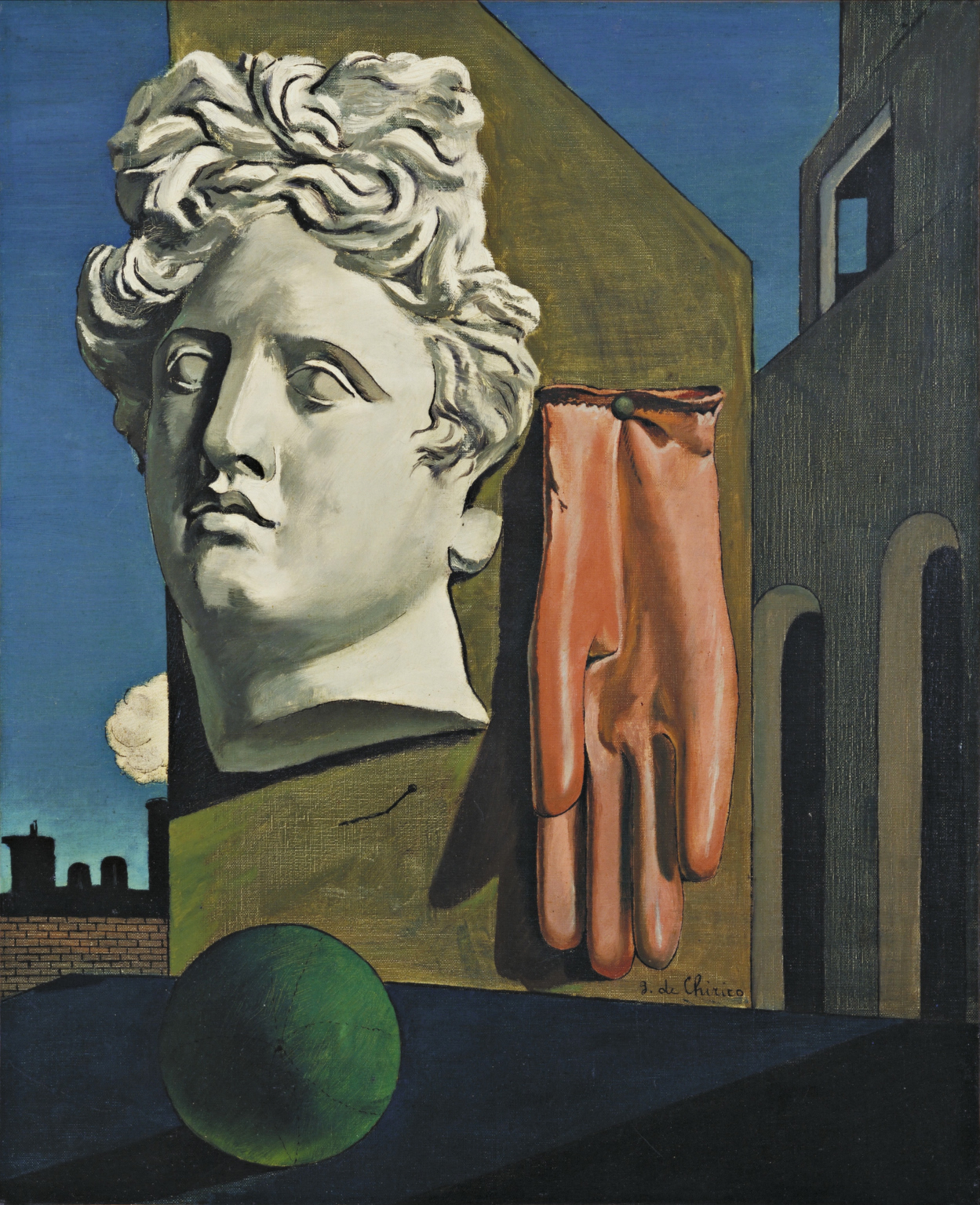
[div class=attrib]Love Song by Giorgio de Chirico, courtesy of Wikipedia / Creative Commons.[end-div]

Art. Does it have to be BOLD to be good?

The lengthy corridors of art history over the last five hundred years are decorated with numerous bold and monumental works. Just to name a handful of memorable favorites you’ll see a pattern emerge: Guernica (Pablo Picasso), The Persistence of Memory (Salvador Dali), The Dance (Henri Matisse), The Garden of Earthly Delights (Heironymous Bosch). Yes, these works are bold. They’re bold in the sense that they represented a fundamental shift from the artistic sensibilities and ideas of their times. These works stirred the salons and caused commotion among the “cognosenti” and the chattering classes. They implored (or decried) the establishment to take notice of new forms, new messages, new perspectives.

And, now here we are in the 21st century, floating in a bottomless bowl of a bold media soup; 24-hour opinion and hyperbole; oversized interactive billboards, explosive 3D movies, voyeuristic reality TV, garish commercials, sexually charged headlines and suggestive mainstream magazines. The provocative images, the loudness, the vividness, the anger – it’s all bold and it’s vying for your increasingly fragmented and desensitized attention. But, this contemporary boldness seems more aligned with surface brightness and bigness than it is with depth of meaning. The boldness of works by earlier artists such as Picasso, Dali, Bosch came from depth of meaning rather than use of neon paints or other bold visual noise.

So, what of contemporary art over the last couple of decades? Well, a pseudo-scientific tour of half-a-dozen art galleries featuring the in-the-moment works of art may well tell you the same story – it’s mostly bold as well. What’s been selling at the top art auction houses? Bold. What’s been making headlines in the art world? Bold.

The trend is and has been set for a while: it has to be brighter, louder, bigger. Indeed, a recent feature article in the New York Times on the 25th Paris Biennale seems to confirm this trend in Western art. (Background: The Biennale is home to around a hundred of the world’s most exclusive art galleries, those that purport to set the art world’s trends, make or break emerging artists and most importantly (for them) set “market” prices.) The article’s author, Souren Melikian, states:

Perception is changing. Interest in subtle nuances is receding as our attention span shortens. Awareness of this trend probably accounts for the recent art trade emphasis on clarity and monumentality and the striking progression of 20th-century modernity.

Well, I certainly take no issue with the observation that “commercial” art has become much more monumental and less subtle, especially over the last 40 years. By it’s very nature for most art to be successful in today’s market overflowing with noise, distraction and mediocrity it must draw someone’s fragmented and limited attention, and sadly, it does this by being bold, bright or big! However, I strongly disagree that “clarity” is a direct result of this new trend in boldness. I could recite a list as long as my arm of paintings and other art works that show remarkable clarity even though they are merely subtle.

Perhaps paradoxically, brokers and buyers of bold seem exclusively to associate boldness with a statement of modernity, compositional complexity, and layered meaning. The galleries at the Biennale seem to be confusing subtlety with dullness, simplicity and shallowness. Yet, the world is full of an equal number of works that exhibit just as much richness, depth and emotion as their bolder counterparts despite their surface subtlety. There is room for reflection and nuanced mood; there is room for complexity and depth in meaning from simple composition; there is room for pastels in this over-saturated, bold neon world.

As Bob Duggan eloquently states, at BigThink:

The meek, such as 2009 Turner Prize winner Richard Wright (reviewed recently by me here) may yet inherit the earth, but only in a characteristically quiet way. Hirst’s jewel-encrusted skulls will always grab headlines, but Wright’s simpler, pensive work can engage hearts and minds in a more fulfilling way. And why is it important that the right thing happens and the Wrights win out over the Hirsts? Because art remains one of the few havens for thought in our noise- and light-polluted world.

So, I’m encouraged to see that I am not yet a lost and lone voice in this noisy wilderness of bold brashness. Oh, and in case you’re wondering what a meaningfully complex yet subtle painting looks like, gaze at Half Light by Dana Blanchard above.