
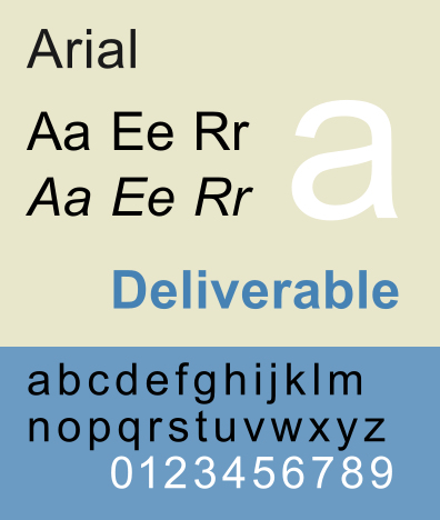
 Not only is the Arial font dreadfully sleep-inducing — most corporate Powerpoint presentations live and breathe Arial — it’s expensive. Print a document suffused with Arial and its variants and it will cost you more in expensive ink. So, jettison Arial for some sleeker typefaces like Century Gothic or Garamond; besides, they’re prettier too!
A fascinating body of research by an 8th-grader (14 years old) from Pittsburgh shows that the U.S. government could save around $400 million per year by moving away from Arial to a thinner, less thirsty typeface. Interestingly enough, researchers have also found that readers tend to retain more from documents set in more esoteric fonts versus simple typefaces such as Arial and Helvetica.
From the Guardian:
In what can only be described as an impressive piece of research, a Pittsburgh schoolboy has calculated that the US state and federal governments could save getting on for $400m (£240m) a year by changing the typeface they use for printed documents.
Shocked by the number of teacher’s handouts he was getting at his new school, 14-year-old Suvir Mirchandani – having established that ink represents up to 60% of the cost of a printed page and is, ounce for ounce, twice as expensive as Chanel No 5 – embarked on a cost-benefit analysis of a range of different typefaces, CNN reports.
He discovered that by switching to Garamond, whose thin, elegant strokes were designed by the 16th-century French publisher in the 16th century by Claude Garamond, his school district could reduce its ink consumption by 24%, saving as much as $21,000 annually. On that basis, he extrapolated, the federal and state governments could economise $370m (£222m) between them.
But should they? For starters, as the government politely pointed out, the real savings these days are in stopping printing altogether. Also, a 2010 study by the University of Wisconsin-Green Bay estimated it could save $10,000 a year by switching from Arial to Century Gothic, which uses 30% less ink – but also found that because the latter is wider, some documents that fitted on a single page in Arial would now run to two, and so use more paper.
Font choice can affect more than just the bottom line. A 2010 Princeton university study found readers consistently retained more information from material displayed in so-called disfluent or ugly fonts (Monotype Corsiva, Haettenschweiler) than in simple, more readable fonts (Helvetica, Arial).
Read the entire article here.
Image: Arial Monotype font example. Courtesy of Wikipedia.

