Tag Archives: income

Beware. Economic Growth May Kill You

There is a long-held belief that economic growth and prosperity makes for a happier, healthier populace. Most economists and social scientists, and indeed lay-people, have subscribed to this idea for many decades.

But, this may be completely wrong.

A handful of contrarian economists began noticing a strange paradox in their research studies from 2000. Evidence suggests that rising incomes and personal well-being are linked in the opposite way. It seems that when the US economy is improving, people suffer more medical problems and die faster.

How could this be? Well, put simply, there are three main factors: increased pollution from increased industrial activity; greater occupational hazards from increased work; and, higher exposure to risky behaviors from greater income.

From the Washington Post:

Yet in recent years, accumulating evidence suggests that rising incomes and personal well-being are linked in the opposite way. It seems that economic growth actually kills people.

Christopher Ruhm, an economics professor at the University of Virginia, was one of the first to notice this paradox. In a 2000 paper, he showed that when the American economy is on an upswing, people suffer more medical problems and die faster; when the economy falters, people tend to live longer.

“It’s very puzzling,” says Adriana Lleras-Muney, an economics professor at the University of California, Los Angeles. “We know that people in rich countries live longer than people in poor countries. There’s a strong relationship between GDP and life expectancy, suggesting that more money is better. And yet, when the economy is doing well, when it’s growing faster than average, we find that more people are dying.”

In other words, there are great benefits to being wealthy. But the process of becoming wealthy — well, that seems to be dangerous.

Lleras-Muney and her colleagues, David Cutler of Harvard and Wei Huang of the National Bureau of Economic Research, believe they can explain why. They have conducted one of the most comprehensive investigations yet of this phenomenon, analyzing over 200 years of data from 32 countries. In a draft of their research, released last week, they lay out something of a grand unified theory of life, death and economic growth.

To start, the economists confirm that when a country’s economic output — its GDP — is higher than expected, mortality rates are also higher than expected.

The data show that when economies are growing particularly fast, emissions and pollution are also on the rise. After controlling for changes in air quality, the economists find that economic growth doesn’t seem to impact death rates as much. “As much as two-thirds of the adverse effect of booms may be the result of increased pollution,” they write.

A booming economy spurs death in other ways too. People start to spend more time at their jobs, exposing them to occupational hazards, as well as the stress of overwork. People drive more, leading to an increase in traffic-related fatalities. People also drink more, causing health problems and accidents. In particular, the economists’ data suggest that alcohol-related mortality is the second-most important explanation, after pollution, for the connection between economic growth and death rates.

This is consistent with other studies finding that people are more likely to die right after they receive their tax rebates. More income makes it easier for people to pay for health care and other basic necessities, but it also makes it easier for people to engage in risky activities and hurt themselves.

Read the entire story here.

Education, Income Inequality and the Great Divide

There’s a commonly held belief that having a greater level of education ensures a higher level of lifetime income. While this is generally true the picture is rather more complex. It’s painfully clear that income inequality is more acute now than it has ever been and the gap between white and black wage earners in the United States is wider than ever. But, perhaps surprisingly, the overall income gap is increasing between well-educated whites and blacks. Why is this the case? A detailed study by the Economic Policy Institute (EPI) reminds us that:

Income growth in recent decades has been limited, more or less, to the highest echelon of earners, a group that is overwhelmingly white. Out of every 1,000 households in the top 1 percent, only two are black, while about 910 are white. And so, as economic forces lifted the incomes of the 1 percent, the blacks on lower rungs of the economic ladder have been largely left behind.

So while black Americans with high school diplomas and college degrees may historically be doing better, the predominantly white top 1 percent continues to pull away.

From Washington Post:

We’ve known for a while that black Americans aren’t making economic progressA recent report from the Economic Policy Institute, a left-leaning think tank, shows that the black-white wage gap is now the widest it has been since 1979. What’s more interesting, though, is how inequality has been increasing, and for whom.

It used to be that low-skilled black workers suffered the greatest disadvantage relative to their white counterparts. But there has been a strange reversal in the past 40 years. EPI finds that the black-white wage gap has become wider — and is widening faster — among those with more education.

This chart illustrates the history of the wage gap among men with less than 10 years of job experience. The early years are the most crucial in a person’s career, and also the most sensitive to fluctuations in the job market.

Read the entire article here.

Scary Chart. Scary Times

Chart-percent-able-to-pay-emergency-expense

A recent report by the US Federal Reserve examines the relative financial health of US households. It makes for very sober reading, highlighting the economic pain suffered by a large swathe of the population.

The report centers around one simple question put to households:

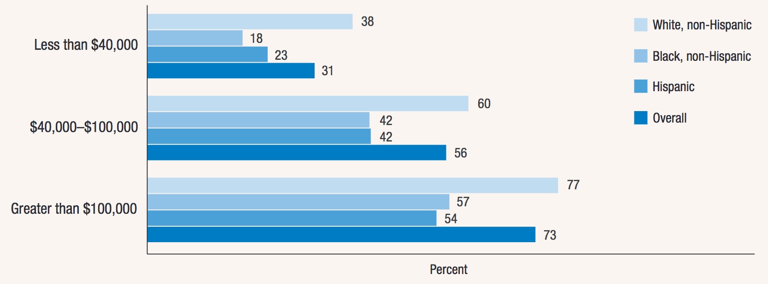
Can you come up with $400 in an emergency (say an unexpected medical bill) and pay for it either in cash or with a credit card whose bill you could pay off within a month?

The answer was jaw-dropping:

For people earning between $40,000 and $100,000 (i.e. not the very poorest), 44 percent said they could not come up with $400 in an emergency.

Even more astonishing, 27 percent of those making more than $100,000 also could not.

The report suggests that this is not poverty. So what on earth is going on?

One thing is clear, and it’s a disturbing message that we keep seeing in many of our neighborhoods and echoed in the media — the great middle-class is declining and income inequality continues to broaden. At the low-end of the economic spectrum, the number of households in or close to poverty is expanding — this, in the richest country in the history of the world. At the high-end, the 1 percent, and especially the richest 0.1 percent, hold an ever greater share of the income and wealth.

Image: Percent of respondents who would completely pay an emergency expense that costs $400 using cash or a credit card
that they pay off at the end of the month (by race/ethnicity and household income). Courtesy: Report on the Economic Well-Being
of U.S. Households in 2014, May 2015. Board of Governors of the Federal Reserve System.

Divergence

chart-income-and-wealth-inequality

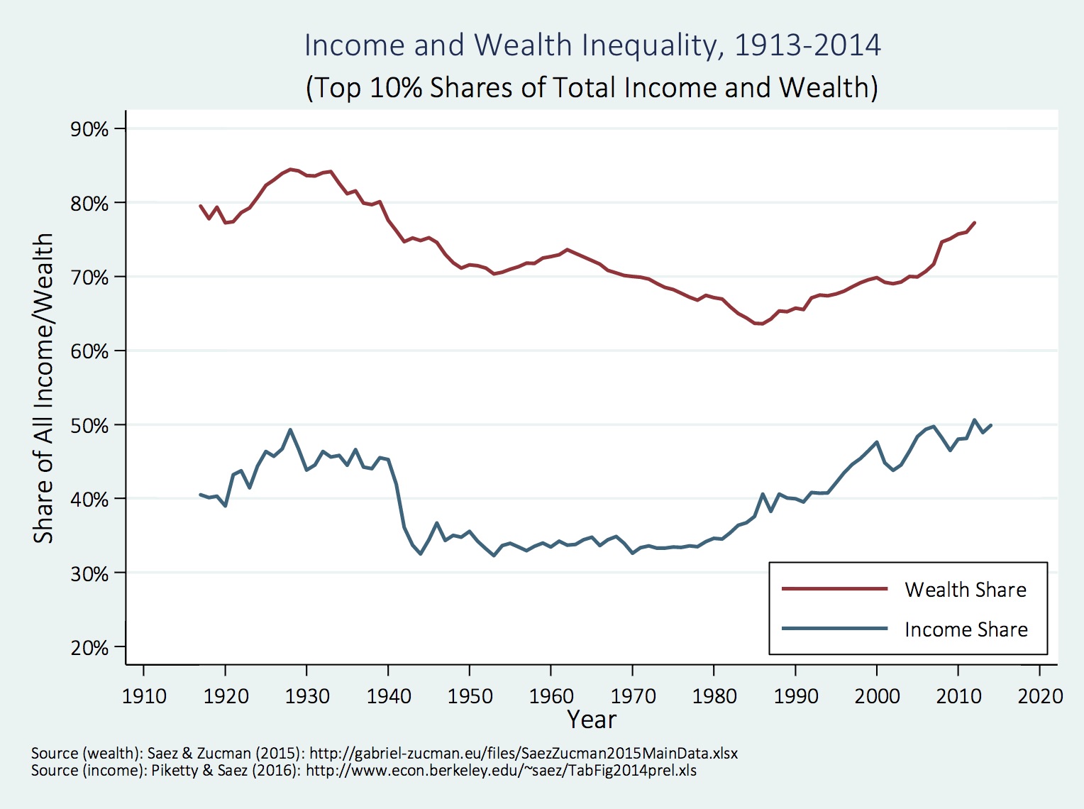
Columnist Thomas B. Edsall over at the NYT offers an incisive article on the diverging fortunes and misfortunes of Americans in the top and bottom fifths of the population as measured by income. We’ve all become accustomed to hearing about the concentration of wealth and power by the 0.1 percent and even the 1 percent. But the separation between the top 10-20 percent and bottom 10-20 percent is no less stark. This separation in income and wealth is now increasingly fracturing the United States along various fault lines: geography, educational attainment, health care access, race and class.

From NYT:

For years now, people have been talking about the insulated world of the top 1 percent of Americans, but the top 20 percent of the income distribution is also steadily separating itself — by geography and by education as well as by income.

This self-segregation of a privileged fifth of the population is changing the American social order and the American political system, creating a self-perpetuating class at the top, which is ever more difficult to break into.

The accompanying chart, taken from “The Continuing Increase in Income Segregation,” a March 2016 paper by Sean F. Reardon, a professor of education at Stanford, and Kendra Bischoff, a professor of sociology at Cornell, demonstrates the accelerating geographic isolation of the well-to-do — the upper middle and upper classes (a pattern of isolation that also applies to the poor, with devastating effect).

In hard numbers, the percentage of families with children living in very affluent neighborhoods more than doubled between 1970 and 2012, from 6.6 percent to 15.7 percent.

At the same time, the percentage of families with children living in traditional middle class neighborhoods with median incomes between 80 and 125 percent of the surrounding metropolitan area fell from 64.7 percent in 1970 to 40.5 percent.

Read the entire article here.

Image: Chart showing income and wealth inequality, 1913?2014, from “The Continuing Increase in Income Segregation”, March 2016. Courtesy: Sean F. Reardon and Kendra Bischoff.


World Happiness Ranking

national-happiness-2015

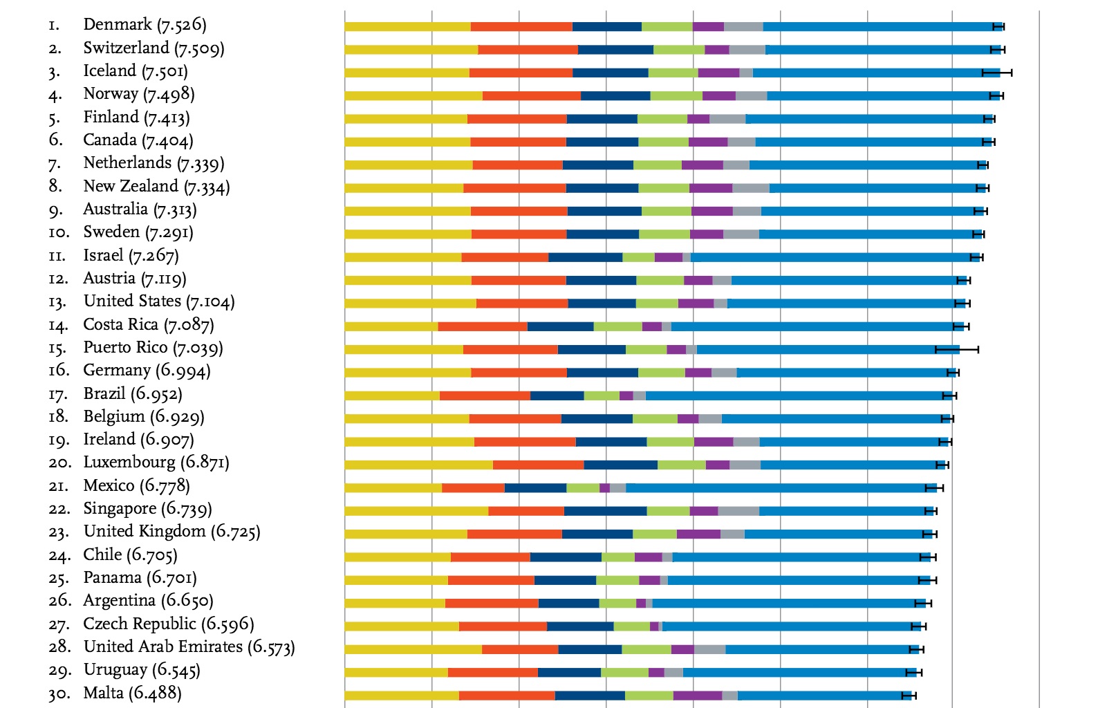
Yet again, nations covering the northern latitudes outrank all others on this year’s global happiness scale. Not surprisingly, Denmark topped the happiness list in 2015, having secured the top spot since 2012, except for 2014 when it was pipped by Switzerland. The top 5 for 2015 are: Denmark, Iceland, Norway, Finland, and Canada.

The report finds that the happiest nations tend to be those with lower income disparity and strong national health and social safety programs. Ironically, richer nations, including the United States, tend to rank lower due to rising inequalities in income, wealth and health.

That said, the United States moved to No. 13, up two places from No. 15 the previous year. This is rather perplexing considering all the anger that we’re hearing about during the relentless 2016 presidential election campaign.

At the bottom of the list of 157 nations is Burundi, recently torn by a violent political upheaval. The bottom five nations for 2015 are: Benin, Afghanistan, Togo, Syria and Burundi; all have recently suffered from war or disease or both.

The happiness score for each nation is based on multiple national surveys covering a number of criteria, which are aggregated into six key measures: GDP per capita, social support; healthy life expectancy; freedom to make life choices; generosity; and perceptions of corruption.

The World Happiness Report was prepared by the Sustainable Development Solutions Network, an international group of social scientists and public health experts under the auspices of the United Nations.

Read more on the report here.

Image: Top 30 nations ranked for happiness, screenshot. Courtesy: World Happiness Report, The Distribution of World Happiness, by John F. Helliwell, Canadian Institute for Advanced Research and Vancouver School of Economics, University of British Columbia; Haifang Huang, Department of Economics, University of Alberta; Shun Wang, KDI School of Public Policy and Management, South Korea.