 [div class=attrib]From Frank Jacobs / BigThink:[end-div]
Are these maps cartograms or mere infographics?
An ‘information graphic’ is defined as any graphic representation of data. It follows from that definition that infographics are less determined by type than by purpose. Which is to represent complex information in a readily graspable graphic format. Those formats are often, but not only: diagrams, flow charts, and maps.
Although one definition of maps – the graphic representation of spatial data – is very similar to that of infographics, the two are easily distinguished by, among other things, the context of the latter, which are usually confined to and embedded in technical and journalistic writing.
Cartograms are a subset of infographics, limited to one type of graphic representation: maps. On these maps, one set of quantitative information (usually surface or distance) is replaced by another (often demographic data or electoral results). The result is an informative distortion of the map (1).
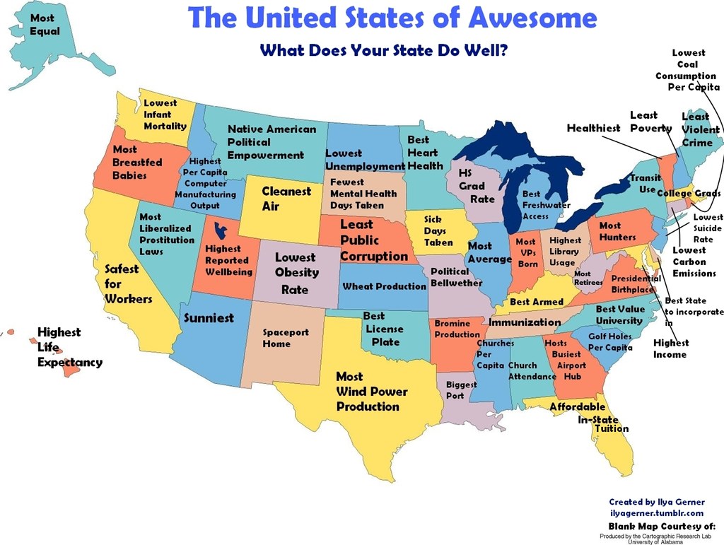
The distortion on these maps is not of the distance-bending or surface-stretching kind. It merely substitutes the names of US states with statistical information relevant to each of them (2). This substitution is non-quantitative, affecting the toponymy rather than the topography of the map. So is this a mere infographic? As the information presented is statistical (each label describes each state as first or last in a Top 50), I’d say this is – if you’ll excuse the pun – a borderline case.
What’s more relevant, from this blog’s perspective, is that it is an atypical, curious and entertaining use of cartography.
The first set of maps labels each and every one of the states as best and worst at something. All of those distinctions, both the favourable and the unfavourable kind, are backed up by some sort of evidence.
The first map, the United States of Awesome, charts fifty things that each state of the Union is best at. Most of those indicators, 12 in all, are related to health and well-being (3). Ten are economic (4), six environmental (5), five educational (6). Three can be classified as ‘moral’, even if these particular distinctions make for strange bedfellows (7).
The best thing that can be said about Missouri and Illinois, apparently, is that they’re extremely average (8). While that may excite few people, it will greatly interest political pollsters and anyone in need of a focus group. Virginia and Indiana are the states with the most birthplaces of presidents and vice-presidents, respectively. South Carolinians prefer to spend their time golfing, Pennsylvanians hunting. Violent crime is lowest in Maine, public corruption in Nebraska. The most bizarre distinctions, finally, are reserved for New Mexico (Spaceport Home), Oklahoma (Best Licence Plate) and Missouri (Bromine Production). If that’s the best thing about those states, what might be the worst?
[div class=attrib]More from theSource here.[end-div]
