
OK, I admit it. Today’s article is not strictly about a map, but I couldn’t resist these fascinating data visualizations. The graphic show some of the patterns and trends that can be derived from the vast mountains of data gathered from Google searches. A group of designers and data scientists from Truth & Beauty teamed up with Google News Labs to produce a portfolio of charts that show food and drink related searches over the last 12 years.
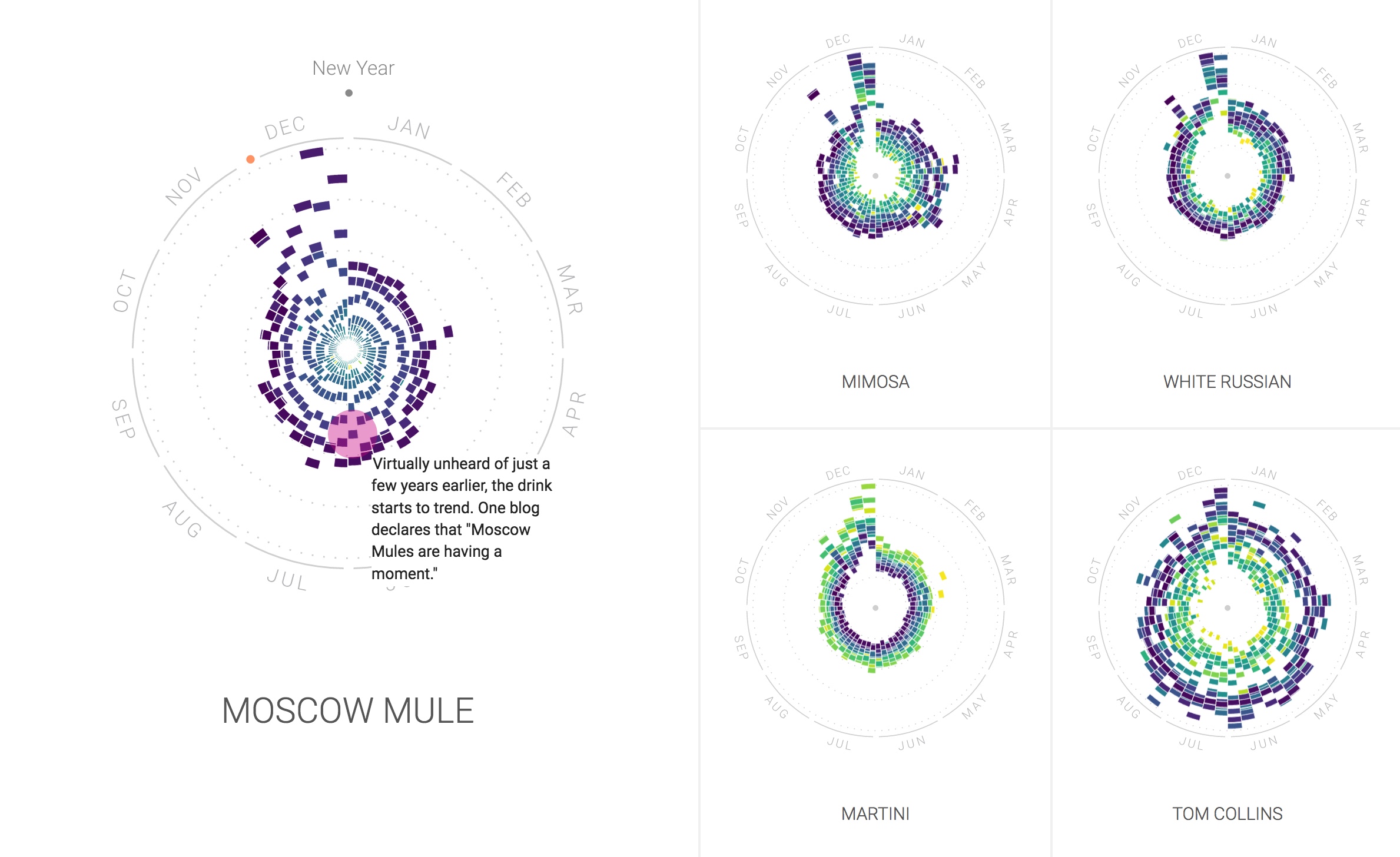
The visual above shows a clear spike in cocktail related searches in December (for entertaining during holiday season). Interestingly Searches for a “Tom Collins” have increased since 2004 whereas those for “Martini” have decreased in number. A more recent phenomenon on the cocktail scene seems to be the “Moscow Mule”.
Since most of the searches emanated in the United States the resulting charts show some fascinating changes in the nation’s collective nutritional mood. While some visualizations confirm the obvious — fruit searches peak when in season; pizza is popular year round — some specific insights are more curious:
- Orange Jell-O [“jelly” for my British readers] is popular for US Thanksgiving.
- Tamale searches peak around Christmas.
- Pumpkin spice latte searches increase in the fall, but searches are peaking earlier each year.
- Superfood searches are up; fat-free searches are down.
- Nacho searches peak around Super Bowl Sunday.
- Cauliflower may be the new Kale.
You can check out much more from this gorgeous data visualization project at The Rhythm of Food.
Image: Screenshot from Rhythm of Food. Courtesy: Rhythm of Food.