Category Archives: Geography

MondayMap: The Feds Own 84.5 Percent of Nevada

map-federal_lands

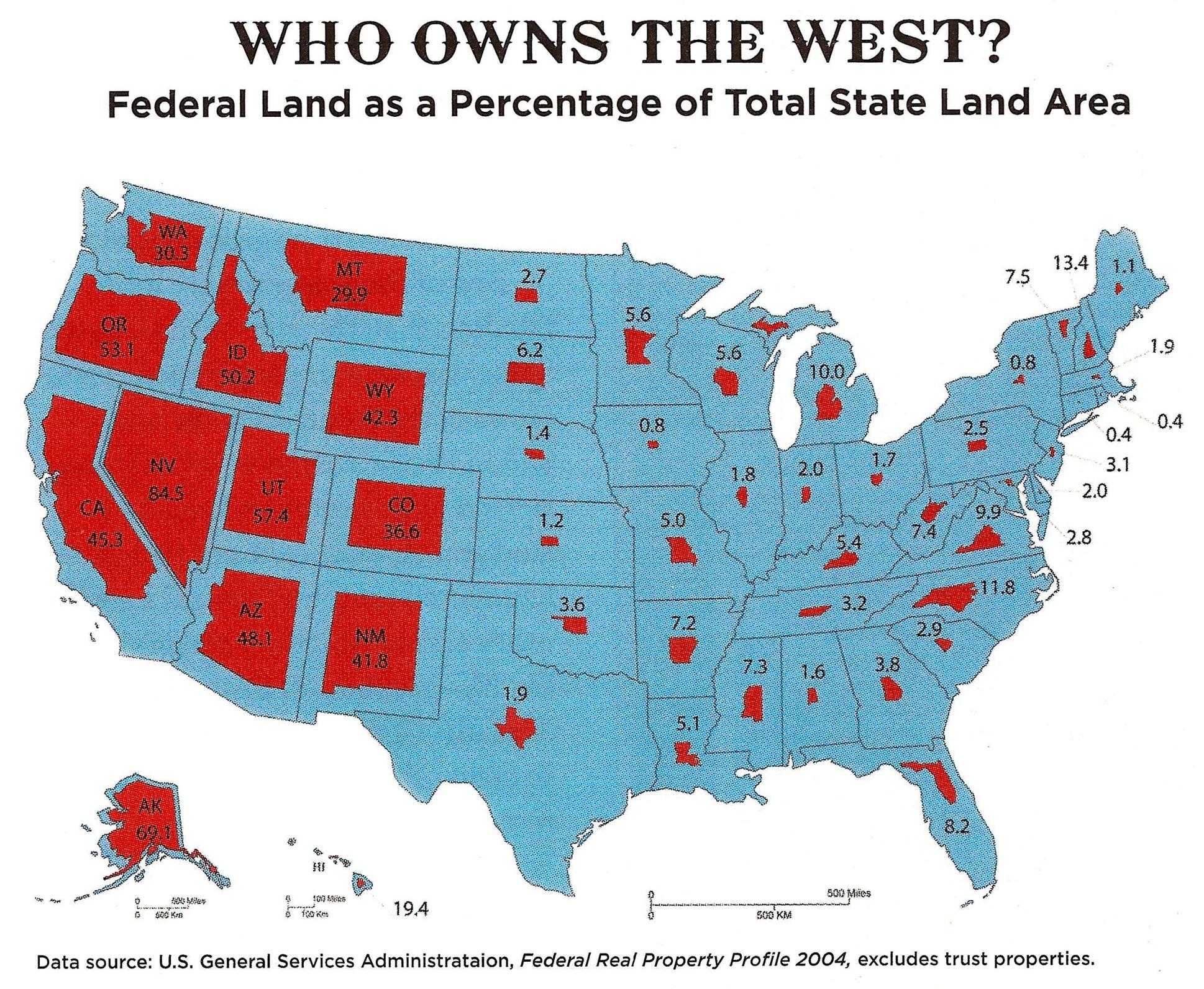
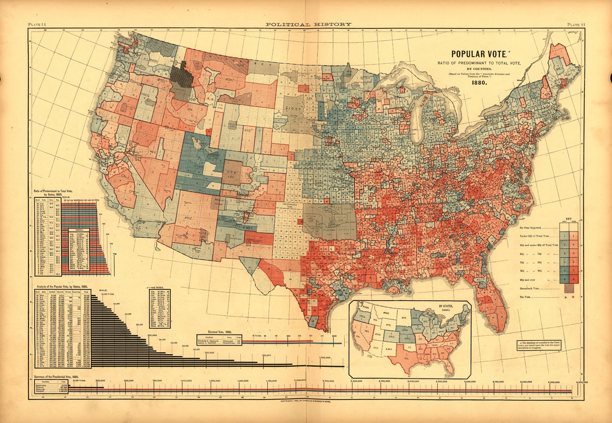
The Unites States government owns almost one-third (28 percent) of the entire nation. Through various agencies that include the United States Forest Service, the National Park Service, the Bureau of Land Management, and the Fish and Wildlife Service, the total owned “by the people, for the people” comes to a staggering 640 million acres of land.

Perhaps not surprisingly, most of the federal owned land lies in the Rocky Mountains and to the West. In fact, the US government owns 47 percent of the land in the western states, versus just 4 percent in states east of the Rockies.

More from Frank Jacobs over at Strange Maps:

The rough beauty of the American West seems as far as you can get from the polished corridors of power in Washington DC. Until you look at the title to the land. The federal government owns large tracts of the western states: from a low of 29.9% in Montana, already more than the national average, up to a whopping 84.5% in Nevada.

What is all that federal land for? And exactly who is in charge? According to the Congressional Research Service [4], a total area of just under 610 million acres – more than twice the size of Namibia – is administered by no more than 4 federal government agencies:

* The United States Forest Service (USFS), which oversees timber harvesting, recreation, wildlife habitat protection and other sustainable uses on a total of 193 million acres – almost the size of Turkey – mainly designated as National Forests.

* The National Park Service (NPS) conserves lands and resources on 80 million acres – a Norway-sized area – in order to preserve them for the public. Any harvesting or resource removal is generally prohibited.

* the Bureau of Land Management (BLM), managing 248 million acres [5] – an area the size of Egypt – has a multiple-use, sustained-yield mandate, supporting energy development, recreation, grazing, conservation, and other uses.

* the Fish and Wildlife Service (FWS) manages 89 million acres – an area slightly bigger than Germany – to conserve and protect animal and plant species.

Check out the entire story here.

Image: Federal Real Property Profile. Courtesy: U.S. General Services Administration /  ‘Can the West Lead Us To A Better Place?‘ an article in Stanford Magazine.

MondayMap: A Global Radio Roadtrip

radio-garden-screenshot1

As a kid my radio allowed me to travel the world. I could use the dial to transport myself over border walls and across oceans to visit new cultures and discover new sounds. I’d always eagerly anticipate the next discovery as I carefully moved the dial around the Short Wave, Long Wave (and later the FM) spectrum, waiting for new music and voices to replace the soothing crackle and hiss of the intervening static.

So, what a revelation it is to stumble across Radio.Garden. It’s a glorious, app that combines the now arcane radio dial with the power of the internet enabling you to journey around the globe on a virtual radio roadtrip.

Trek to Tromsø north of the arctic circle in Norway, then hop over to Omsk in central Russia. Check out the meditative tunes in Kathmandu before heading southwest to Ruwi, Oman on the Persian Gulf. Stopover in Kuching, Malaysia, then visit Nhulunbuy in Australia’s Northern Territory. Take in a mid-Pacific talk radio show in Bairiki, in the Republic of Kiribati, then some salsa inspired tuned in Tacna, Peru, and followed by pounding Brazilian Euro-techno in João Pessoa. Journey to Kinshasa in the DRC for some refreshing African beats, then rest for the day with some lively conversation in the Italian Apennine Mountains in Parma, Italy.

radio-garden-screenshot2

During this wonderful border free journey one thing is becomes crystal clear: we are part of one global community with much in common. History will eventually prove the racists and xenophobes among us wrong.

Images: Screenshots of Radio.Garden. Courtesy of Radio.Garden.

MondayMap: National Superlatives

international-number-ones-2016

OK, I must admit that some maps can be somewhat dubious. Or, is it all maps?

Despite their shaky foundations some maps form the basis for many centuries of human (mis-)understanding, only to be subsequently overturned by a new (and improved) chart. For instance, the geocentric models of our cosmos courtesy of Aristotle and Ptolemy were not replaced for around 1,400 years, until Nicolaus Copernicus proposed a heliocentric view of the solar system.

Thus, keep in mind the latest view of our globe, courtesy of David McCandless. He compiled this esoteric worldview, because every nation is the best at something, from a collection of global data sources.

Looks like the US is “best” at spam (not the luncheon meat). While Russia leads in, of course, dash cams.

Asgardia

asgardia-screenshot

With all this earthbound turmoil around us perhaps it’s time to move elsewhere. Asgardia? Well, almost. You may soon be able to become an Asgardian citizen. First the project leaders must convince the United Nations that a satellite to be launched in 2017 deems legal, sovereign status. One catch, though. You’ll still have to reside on Earth.

From the Guardian:

Proposals for the “first nation state in space” have been unveiled by a team of scientists and legal experts, who say the move will foster peace, open up access to space technologies and offer protection for citizens of planet Earth.

Dubbed “Asgardia” after one of the mythical worlds inhabited by the Norse gods, the team say the “new nation” will eventually become a member of the United Nations, with its own flag and anthem devised by members of the public through a series of competitions.

According to the project website, Asgardia “will offer an independent platform
free from the constraint of a land-based country’s laws. It will become a place it in orbit which is truly ‘no man’s land’”.

Initially, it would seem, this new nation will consist of a single satellite, scheduled to be launched next year, with its citizens residing firmly on terra firma.

Speaking to the Guardian through an interpreter, the project lead Igor Ashurbeyli, said: “Physically the citizens of that nation state will be on Earth; they will be living in different countries on Earth, so they will be a citizen of their own country and at the same time they will be citizens of Asgardia.”

“When the number of those applications goes above 100,000 we can officially apply to the UN for the status of state,” he added.

Read the story here.

Image: Screenshot from Asgardia website.

MondayMap: Red Versus Blue

1883-county-map

You may believe that colorful, graphical electoral analysis is a relatively recent phenomenon. You know, those cool red and blue maps (and now sometimes green or purple) of each state and country.

But our present day news networks and the internet did not invent this type of infographic map.

Susan Schulten, chair of the history department at the University of Denver, discovered what may be the earliest example of a US county-level electoral map. Published in 1883 it shows results from the 1880 Presidential election between Republican James Garfield and Democrat Winfield Hancock. Garfield won.

Two notable reversals in the 1880 map versus today’s counterpart: First, Democrats are in red; Republicans in blue. Second, Democrats make up the majority in much of the South and Midwest; Republicans rule in the Northeast. Interestingly, the color scheme switched numerous times over the last hundred years and did not formally become Democrat=Blue, Republican=Red until the 2000 election cycle.

For more fascinating details of our electoral maps, past and present, check out this article by Lazaro Gamio, over at the Washington Post.

Image: Plate 11 from Scribner’s Statistical Atlas of the United States, published in 1883. Courtesy: Library of Congress. Public Domain.

MondayMap: Yes. A Magnetic, Foldable Dymaxion Map

dymaxion_map_ocean2

fuller_projection

For a map geek [or are we nerds?] like me a foldable Dymaxion map with a 2D and 3D projection is rather cool. Buckminster Fuller and architect, collaborator Shoji Sadao created this peculiar view of our world over 60 years ago, 1954 to be more precise.

A key advantage of this map was that it was held to be the least distorted of all 2D projections of our 3D globe, and it could also be accurate in three dimensions.

For example, Fuller correctly maintained that his projection has less distortion of relative size of areas compared to the common Mercator projection. It also has less distortion of shapes of areas when compared to the Gall–Peters projection.

Now we can enjoy a magnetic globe version of Fuller and Sadao’s creation courtesy of designer Brendan Ravenhill.

From Wired:

Brendan Ravenhill reimagines the Dymaxion Map as a magnetic globe. Like Fuller’s original map, Ravenhill’s globe can exist in two or three dimensions. Laid flat, it’s a series of 20 triangles that show Fuller’s projection as a single landmass. The back of each triangle features a magnet so you can fold the map into an angular globe. “Really it’s a toy, but a toy that has a lot of resonance and importance,” Ravenhill says.

Fuller made his map endlessly reconfigurable. And while Ravenhill’s design nods to that idea with its partitioned triangles, there’s really only one way to put the puzzle together correctly. “You know you’re doing it wrong if there’s a magnet where Antarctica is supposed to be,” he says.

Read the entire article here.

Images: 1) An icosahedral net showing connected oceans surrounding Antarctica; 2) Unfolded Dymaxion map with nearly contiguous land masses. Courtesy: Wikipedia. CC BY 2.5.

MondayMap: European Stereotypes

map-europe-google-stereotype
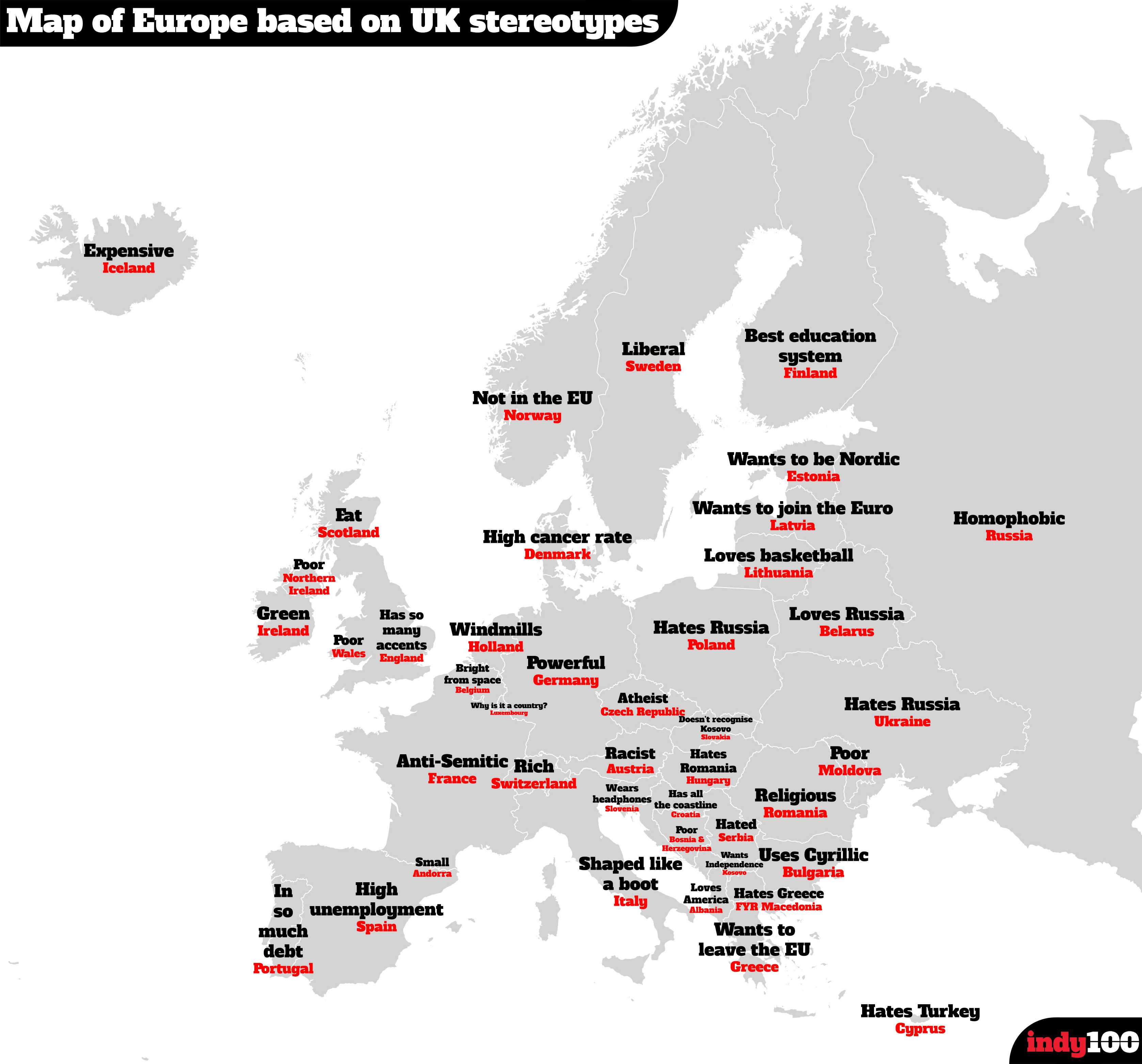
Hot on the heels of the map of US state stereotypes I am delighted to present a second one. This time it’s a map of Google searches in the UK for various nations across Europe. It was compiled by taking the most frequent result from Google’s autocomplete function. For instance, type in, “Why is Italy…”, and Google automatically fills in the most popular result with “Why is Italy shaped like a boot”.

Highlighting just a few: Switzerland is viewed as rich; Austria is racist; Ireland is green.

Map: European nation stereotypes by British Google users. Courtesy: Independent Media.

MondayMap: State Stereotypes

map-uk-google-stereotype

An interesting map courtesy of Google searches in the UK shows some fascinating stereotypes for each of the US fifty states. It was compiled by taking the most frequent result from Google’s autocomplete function. For instance, type in, “Why is Colorado so…”, and Google automatically fills in the most popular result with “Why is Colorado so fit”.

It’s not entirely scientific but interesting nonetheless. Highlighting just a few: Wisconsin is viewed as drunk; Louisiana as racist; Colorado as fit; and, Nevada as dangerous.

Map: US state stereotypes by British Google users. Courtesy: Independent Media.