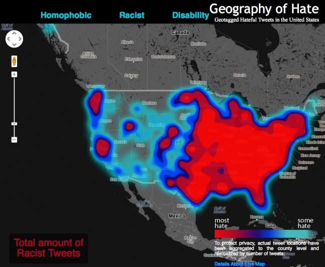
A fascinating map of tweets espousing hatred and racism across the United States. The data analysis and map were developed by researchers at Humboldt State University.
From the Guardian:
[T]he students and professors at Humboldt State University who produced this map read the entirety of the 150,000 geo-coded tweets they analysed.
Using humans rather than machines means that this research was able to avoid the basic pitfall of most semantic analysis where a tweet stating ‘the word homo is unacceptable’ would still be classed as hate speech. The data has also been ‘normalised’, meaning that the scale accounts for the total twitter traffic in each county so that the final result is something that shows the frequency of hateful words on Twitter. The only question that remains is whether the views of US Twitter users can be a reliable indication of the views of US citizens.
See the interactive map and read the entire article here.

