Category Archives: Arts and Letters

Burning Man as Counterculture? Think Again

Fascinating insight into the Burning Man festival courtesy of co-founder, Larry Harvey. It may be more like Wall Street than Haight-Ashbury.

[div class=attrib]From Washington Post:[end-div]

Go to Burning Man, and you’ll find everything from a thunderdome battle between a couple in tiger-striped bodypaint to a man dressed as a gigantic blueberry muffin on wheels. But underneath it all, says the festival’s co-founder, Larry Harvey, is “old-fashioned capitalism.”

There’s not a corporate logo in sight at the countercultural arts festival, and nothing is for sale but ice and coffee. But at its core, Harvey believes that Burning Man hews closely to the true spirit of a free-enterprise democracy: Ingenuity is celebrated, autonomy is affirmed, and self-reliance is expected. “If you’re talking about old-fashioned, Main Street Republicanism, we could be the poster child,” says Harvey, who hastens to add that the festival is non-ideological — and doesn’t anticipate being in GOP campaign ads anytime soon.

For more than two decades, the festival has funded itself entirely through donations and ticket sales — which now go up to $300 a pop — and it’s almost never gone in the red. And on the dry, barren plains of the Nevada desert where Burning Man materializes for a week each summer, you’re judged by what you do — your art, costumes and participation in a community that expects everyone to contribute in some form and frowns upon those who’ve come simply to gawk or mooch off others.

That’s part of the message that Harvey and his colleagues have brought to Washington this week, in his meetings with congressional staffers and the Interior Department to discuss the future of Burning Man. In fact, the festival is already a known quantity on the Hill: Harvey and his colleagues have been coming to Washington for years to explain the festival to policymakers, in least part because Burning Man takes place on public land that’s managed by the Interior Department.

In fact, Burning Man’s current challenge stems come because it’s so immensely popular, growing beyond 50,000 participants since it started some 20 years ago. “We’re no longer so taxed in explaining that it’s not a hippie debauch,” Harvey tells me over sodas in downtown Washington. “The word has leaked out so well that everyone now wants to come.” In fact, the Interior Department’s Bureau of Land Management that oversees the Black Rock Desert recently put the festival on probation for exceeding the land’s permitted crowd limits — a decision that organizers are now appealing.

Harvey now hopes to direct the enormous passion that Burning Man has stoked in its devotees over the years outside of Nevada’s Black Rock Desert, in the U.S. and overseas — the primary focus of this week’s visit to Washington. Last year, Burning Man transitioned from a limited liability corporation into a 501(c)3 nonprofit, which organizers believed was a better way to support their activities — not just for the festival, but for outside projects and collaborations in what festival-goers often refer to as “the default world.”

These days, Harvey — now in his mid-60s, dressed in a gray cowboy hat, silver western shirt, and aviator sunglasses — is just as likely to reference Richard Florida as the beatniks he once met on Haight Street. Most recently, he’s been talking with Tony Hsieh, the CEO of Zappos, who shares his vision of revitalizing Las Vegas, one of the cities hardest hit by the recent housing bust. “Urban renewal? We’re qualified. We’ve built up and torn down cities for 20 years,” says Harvey. “Cities everywhere are calling for artists, and it’s a blank slate there, blocks and blocks. … We want to extend the civil experiment — to see if business and art can coincide and not maim one another.”

Harvey points out that there’s been long-standing ties between Burning Man artists and to some of the private sector’s most successful executives. Its arts foundation, which distributes grants for festival projects, has received backing from everyone from real-estate magnate Christopher Bently to Mark Pincus, head of online gaming giant Zynga, as the Wall Street Journal points out. “There are a fair number of billionaires” who come to the festival every year, says Harvey, adding that some of the art is privately funded as well. In this way, Burning Man is a microcosm of San Francisco itself, stripping the bohemian artists and the Silicon Valley entrepreneurs of their usual tribal markers on the blank slate of the Nevada desert. At Burning Man, “when someone asks, ‘what do you do?’ — they meant, what did you just do” that day, he explains.

It’s one of the many apparent contradictions at the core of the festival: Paired with the philosophy of “radical self-reliance” — one that demands that participants cart out all their own food, water and shelter into a dust-filled desert for a week — is the festival’s communitarian ethos. Burning Man celebrates a gift economy that inspires random acts of generosity, and volunteer “rangers” traverse the festival to aid those in trouble. The climactic burning of the festival’s iconic “man”— along with a wooden temple filled with notes and memorials — is a ritual of togetherness and belonging for many participants. At the same time, one of the festival’s mottos is, ‘You have a right to hurt yourself.’ It’s the opposite of a nanny state,” Harvey says, recounting the time a participant unsuccessfully tried to sue the festival: He had walked out onto the coals after the “man”was set on fire and, predictably, burned himself.

[div class=attrib]Read the entire article after the jump.[end-div]

[div class=attrib]Image courtesy of Jailbreak.[end-div]

I Scream, You Scream, We Should All Scream for The Scream

On May 2, 2012 The Scream sold at auction in New York for just under $120,000,000.

The Scream, actually one of 4 slightly different originals, painted by Edvard Munch, has become as iconic as the Apple or McDonalds corporate logo. And, that sums up the crass, financial madness that continues to envelop the art world, and indeed most of society.

[div class=attrib]More from Jonathan Jones on Art:[end-div]

I used to like The Scream. Its sky of blood and zombie despair seemed to say so much, so honestly. Munch is a poet in colours. His pictures portray moods, most of which are dark. But sometimes on a spring day on the banks of Oslofjord he can muster a bit of uneasy delight in the world. Right now, I would rather look at his painting Ashes, a portrayal of the aftermath of sex in a Norwegian wood, or Girls on a Pier, whose lyrical longing is fraught with loneliness, than at Munch’s most famous epitome of the modern condition.

The modern art market is becoming violent and destructive. It spoils what it sells and leaves nothing but ashes. The greatest works of art are churned through a sausage mill of celebrity and chatter and become, at the end of it all, just a price tag. The Scream has been too famous for too long: too famous for its own good. Its apotheosis by this auction of the only version in private hands turns the introspection of a man in the grip of terrible visions into a number: 120,000,000. Dollars, that is. It is no longer a great painting: it is an event in the madness of our time. As all the world screams at inequality and the tyranny of a finance-led model of capitalism that is failing to provide the general wellbeing that might justify its excesses, the 1% rub salt in the wound by turning profound insights into saleable playthings.

Disgust rises at the thought of that grotesque number, so gross and absurd that it destroys actual value. Art has become the meaningless totem of a world that no longer feels the emotions it was created to express. We can no longer create art like The Scream (the closest we can get is a diamond skull). But we are good at turning the profundities of the past into price tags.

Think about it. Munch’s Scream is an unadulterated vision of modern life as a shudder of despair. Pain vibrates across the entire surface of the painting like a pool of tears rippled by a cry. Munch’s world of poverty and illness, as Sue Prideaux makes clear in her devastating biography, more than justified such a scream. His other paintings, such as The Sick Child and Evening on Karl-Johan reveal his comprehensive unhappiness and alienation that reaches its purest lucidity in The Scream.

[div class=attrib]Read the entire article after the jump.[end-div]

[div class=attrib]Image: One of several versions of the painting “The Scream”. Painted in 1893, Edvard Munch. Courtesy of The National Gallery, Oslo, Norway.[end-div]

Before I Die…

Before I Die” is an interactive, public art project conceived by artist Candy Chang. The first installation was in New Orleans in February 2011, and has since grown to around 30 other cities across the United States, and 7 countries.

The premise is simple: install a blank billboard-sized chalkboard in a publicly accessible space, supply a bucket of chalk, write the prompt “Before I Die…” on the chalkboard, sit back and wait, watch people share their hopes and dreams.

So far the artist and her collaborators have noted over 25,000 responses. Of the responses, 15 percent want to travel to distant lands, 10 percent wish to reconnect with family and 1 percent want to write a book.

[div class=attrib]From the Washington  Post:[end-div]

Before they die, the citizens of Washington, D.C., would like to achieve things both monumental and minuscule. They want to eat delicious food, travel the globe and — naturally — effect political change. They want to see the Earth from the Moon. They want to meet God.

They may have carried these aspirations in their hearts and heads their whole lives, but until a chalkboard sprang up at 14th and Q streets NW, they may have never verbalized them. On the construction barrier enveloping a crumbling old laundromat in the midst of its transformation into an upscale French bistro, the billboard-size chalkboard offers baskets of chalk and a prompt: “Before I die .?.?.”

The project was conceived by artist Candy Chang, a 2011 TED fellow who created the first “Before I Die” public art installation last February in a city that has contemplated its own mortality: New Orleans. On the side of an abandoned building, Chang erected the chalkboard to help residents “remember what is important to them,” she wrote on her Web site. She let the responses — funny, poignant, morbid — roll in. “Before I Die” migrated to other cities, and with the help of other artists who borrowed her template, it has recorded the bucket-list dreams of people in more than 30 locations. The District’s arrived in Logan Circle early Sunday morning.

Chang analyzes the responses on each wall; most involve travel, she says. But in a well-traveled city like Washington, many of the hopes on the board here address politics and power. Before they die, Washingtonians would like to “Liberate Palestine,” “Be a general (Hooah!),” “Be chief of staff,” “See a transgender president,” “[Have] access to reproductive health care without stigma.” Chang also notes that the D.C. wall is more international than others she’s seen, with responses in at least seven languages.

[div class=attrib]Read the entire article after the jump.[end-div]

[div class=attrib]Image: Crystal Hamling, 27, adds her thoughts to the “Before I Die…” art wall at 14th and Q streets NW. She wrote “Make people feel loved.” Courtesy of Katherine Frey / Washington Post.[end-div]

Painting the Light: The Life and Death of Thomas Kinkade

You’ve probably seen a Kinkade painting somewhere — think cute cottage, meandering stream, misty clouds, soft focus and warm light.

According to Thomas Kinkade’s company one of his cozy, kitschy paintings (actually a photographic reproduction) could be found in one of every 20 homes in the United States. Kinkade died on April 6, 2012. With his passing, scholars of the art market are now analyzing what he left behind.

[div class=attrib]From the Guardian:[end-div]

In death, the man who at his peak claimed to be the world’s most successful living artist perhaps achieved the sort of art-world excess he craved.

On Tuesday, the coroner’s office in Santa Clara, California, announced that the death of Thomas Kinkade, the Painter of Light™, purveyor of kitsch prints to the masses, was caused by an accidental overdose of alcohol and Valium. For good measure, a legal scrap has emerged between Kinkade’s ex-wife (and trustee of his estate) and his girlfriend.

Who could have imagined that behind so many contented visions of peace, harmony and nauseating goodness lay just another story of deception, disappointment and depravity, fuelled by those ever-ready stooges, Valium and alcohol?

Kinkade was a self-made phenomenon, with his prints (according to his company) hanging in one in 20 American homes. At his height, in 2001, Kinkade generated $130m (£81m) in sales. Kinkade’s twee paintings of cod-traditional cottages, lighthouses, gardens, gazebos and gates sold by the million through a network of Thomas Kinkade galleries, owned by his company, and through a parallel franchise operation. At their peak (between 1995 and 2005) there were 350 Kinkade franchises across the US, with the bulk in his home state of California. You would see them in roadside malls in small towns, twinkly lights adorning the windows, and in bright shopping centres, sandwiched between skatewear outlets and nail bars.

But these weren’t just galleries. They were the Thomas Kinkade experience – minus the alcohol and Valium, of course. Clients would be ushered into a climate-controlled viewing room to maximise the Kinkadeness of the whole place, and their experience. Some galleries offered “master highlighters”, trained by someone not far from the master himself, to add a hand-crafted splash of paint to the desired print and so make a truly unique piece of art, as opposed to the framed photographic print that was the standard fare.

The artistic credo was expressed best in the 2008 movie Thomas Kinkade’s Christmas Cottage. Peter O’Toole, earning a crust playing Kinkade’s artistic mentor, urges the young painter to “Paint the light, Thomas! Paint the light!”.

Kinkade’s art also went beyond galleries through the “Thomas Kinkade lifestyle brand”. This wasn’t just the usual art gallery giftshop schlock: Kinkade sealed a tie-in with La-Z-Boy furniture (home of the big butt recliner) for a Kinkade-inspired range of furniture. But arguably his only great artwork was “The Village, a Thomas Kinkade Community”, unveiled in 2001. A 101-home development in Vallejo, outside San Francisco, operating under the slogan: “Calm, not chaos. Peace, not pressure,” the village offers four house designs, each named after one of Kinkade’s daughters. Plans for further housing developments, alas, fell foul of the housing crisis.

[div class=attrib]Read the entire article after the jump.[end-div]

[div class=attrib]Image courtesy of Google search.[end-div]

Tilt: The World in Miniature

Tilt-shift photography has been around for quite a while, primarily as a tool in high-end architectural photography. More recently with the advent of more affordable lens attachments for consumer cameras and through software post-processing, including Photoshop and Instagram, tilt-shift is becoming more mainstream.

Tilt-shift is a combination of two movements. Photographers tilt, or rotate, the lens plane relative to the image to control which part of an image retains focus. Then, they shift the perspective to re-position the subject in the image (this usually has the effect of reducing the convergence of parallel lines). When used appropriately, tilt-shift delivers a highly selective focus, and the resulting images give the illusion of a miniaturized landscape.

[div class=attrib]More tilt-shift photographs from the Telegraph after the jump.[end-div]

[div class=attrib]Image: Brighton beach, on the south coast of Sussex, England. Courtesy of the Telegraph.[end-div]

Religious Art: From Faith or For Money?

Over the centuries many notable artists have painted religious scenes initiated or influenced by a very deep religious conviction; some painted to give voice to their own spirituality, others to mirror the faith of their time and community. However, others simply painted for fame or fortune, or both, or to remain in good stead with their wealthy patrons and landlords.

This bring us to another thoughtful article from Jonathan Jones over at the Guardian.

[div class=attrib]From the Guardian:[end-div]

“To paint the things of Christ you must live with Christ,” said the 15th-century artist Fra Angelico. He knew what he was talking about – he was a Dominican monk of such exemplary virtue that in 1982 he was officially beatified by Pope John Paul II. He was also a truly great religious artist whose frescoes at San Marco in Florence have influenced modern artists such as Mark Rothko. But is all holy art that holy?

From the dark ages to the end of the 17th century, the vast majority of artistic commissions in Europe were religious. Around 1700 this somehow stopped, at least when it came to art anyone cares to look at now. The great artists of the 18th century, and since, worked for secular patrons and markets. But in all those centuries when Christianity defined art, its genres, its settings, its content, was every painter and sculptor totally sincerely faithful in every work of art? Or were some of them just doing what they had to do and finding pleasure in the craft?

This question relates to another. What is it like to live in a world where everyone is religious? It is often said it was impossible to even imagine atheism in the middle ages and the Renaissance. This is so different from modern times that people do not even try to imagine it. Modern Christians blithely imagine a connection when actually a universal church meant a mentality so different from modern “faith” that today’s believers are as remote from it as today’s non-believers. Among other things it meant that while some artists “lived with Christ” and made art that searched their souls, others enjoyed the colours, the drama, the rich effects of religious paintings without thinking too deeply about the meaning.

Here are two contrasting examples from the National Gallery. Zurbarán’s painting of St Francis in Meditation (1635-9) is a harrowing and profoundly spiritual work. The face of a kneeling friar is barely glimpsed in a darkness that speaks of inner searching, of the long night of the soul. This is a true Christian masterpiece. But compare it to Carlo Crivelli’s painting The Annunciation (1486) in the same museum. Crivelli’s picture is a feast for the eye. Potted plants, a peacock, elaborately decorated classical buildings – and is that a gherkin just added in at the front of the scene? – add up to a materialistic cornucopia of visual interest. What is the religious function of such detail? Art historians, who sometimes seem to be high on piety, will point to the allegorical meaning of everyday objects in Renaissance art. But that’s all nonsense. I am not saying the allegories do not exist – I am saying they do not matter much to the artist, his original audience or us. In reality, Crivelli is enjoying himself, enjoying the world, and he paints religious scenes because that’s what he got paid to paint.

By smothering the art of the past in a piety that in some cases may be woefully misplaced, its guardians do it a disservice. Is Crivelli a Christian artist? Not in any sense that is meaningful today. He loves the things of this life, not the next.

[div class=attrib]Read the entire article after the jump.[end-div]

[div class=attrib]Annunciation with St Emidius, Crivelli Carlo, 1486. National Gallery, London. Courtesy of Wikipedia / National Gallery.[end-div]

Hitchcock

Alfred Hitchcock was a pioneer of modern cinema. His finely crafted movies introduced audiences to new levels of suspense, sexuality and violence. His work raised cinema to the level of great art.

This summer in London, the British Film Institute (BFI) is celebrating all things Hitchcockian by showing all 58 of his works, including newly restored prints of his early silent films, such as Blackmail.

[div class=attrib]From the Guardian:[end-div]

Alfred Hitchcock is to be celebrated like never before this summer, with a retrospective of all his surviving films and the premieres of his newly restored silent films – including Blackmail, which will be shown outside the British Museum.

The BFI on Tuesday announced details of its biggest ever project: celebrating the genius of a man who, it said, was as important to modern cinema as Picasso to modern art or Le Corbusier to modern architecture. Heather Stewart, the BFI’s creative director, said: “The idea of popular cinema somehow being capable of being great art at the same time as being entertaining is still a problem for some people. Shakespeare is on the national curriculum, Hitchcock is not.”

One of the highlights of the season will be the culmination of a three-year project to fully restore nine of the director’s silent films. It will involve The Pleasure Garden, Hitchcock’s first, being shown at Wilton’s Music Hall; The Ring at Hackney Empire, and Blackmail outside the British Museum, where the film’s climactic chase scene was filmed in 1929, both inside the building and on the roof.

Stewart said the restorations were spectacular and overdue. “We would find it very strange if we could not see Shakespeare’s early plays performed, or read Dickens’s early novels. But we’ve been quite satisfied as a nation that Hitchcock’s early films have not been seen in good quality prints on the big screen, even though – like Shakespearean and Dickensian – Hitchcockian has entered our language.”

The films, with new scores by composers including Nitin Sawhney, Daniel Patrick Cohen and Soweto Kinch, will be shown the London 2012 Festival, the finale of the Cultural Olympiad.

Between August and October the BFI will show all 58 surviving Hitchcock films including his many films made in the UK – The 39 Steps, for example, and The Lady Vanishes – and those from his Hollywood years, from Rebecca in 1940 to Vertigo in 1957, The Birds in 1963 and his penultimate film, Frenzy, in 1972.

[div class=attrib]See more stills here, and read the entire article after the jump.[end-div]

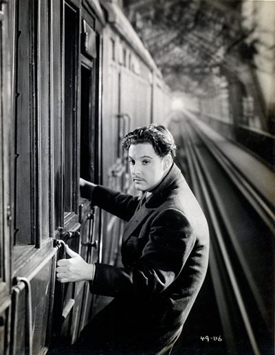
[div class=attrib]Image: Robert Donat in The 39 Steps (1935), often hailed as the best of four film versions of John Buchan’s novel. Courtesy of BFI / Guardian.[end-div]

Arial or Calibri?

Nowadays the choice of a particular font for the written word seems just as important as the word itself. Most organizations, from small businesses to major advertisers, from individual authors to global publishers, debate and analyze the typefaces for their communications to ensure brand integrity and optimum readability. Some even select a particular font to save on printing costs.

The infographic below, courtesy of Mashable, shows some of the key milestones in the development of some of our favorite fonts.

[div class=attrib]See the original, super-sized infographic after the jump.[end-div]

Dissecting Artists

Jonathan Jones dissects artists’ fascination over the ages with anatomy and pickled organs in glass jars.

[div class=attrib]From the Guardian:[end-div]

From Hirst to Da Vinci, a shared obsession with dissection and the human body seems to connect exhibitions opening this spring.

Is it something to do with the Olympics? Athletics is physical, the logic might go, so let’s think about bodies… Anyway, a shared anatomical obsession connects exhibitions that open this week, and later in the spring. Damien Hirst’s debt to anatomy does not need labouring. But just as his specimens are unveiled at Tate Modern, everyone else seems to be opening their own cabinets of curiosities. At London’s Natural History Museum, dissected animals are going on view in an exhibition that brings the morbid spectacle – which in my childhood was simultaneously the horror and fascination of this museum – back into its largely flesh-free modern galleries.

If that were not enough, the Wellcome Collection invites you to take a good look at some brains in jars.

It is no surprise that art and science keep coming together on the anatomist’s table this spring, for anatomy has a venerable and intimate connection with the efforts of artists to depict life and death. In his series of popular prints The Four Stages of Cruelty, William Hogarth sees the public dissection of a murderer by cold-blooded anatomists as the ultimate cruelty. But many artists have been happy to watch or even wield a knife at such events.

In the 16th century, the first published modern study of the human body, by Vesalius, was illustrated by a pupil of Titian. In the 18th century, the British animal artist George Stubbs undertook his own dissections of a horse, and published the results. He is one of the greatest ever portrayers of equine majesty, and his study of the skeleton and muscles of the horse helped him to achieve this.

Clinical knowledge, to help them portray humans and animals correctly, is one reason artists have been drawn to anatomy. Another attraction is more metaphysical: to look inside a human body is to get an eerie sense of who we are, to probe the mystery of being. Rembrandt’s painting The Anatomy Lesson of Dr Nicolaes Tulp is not a scientific study but a poetic reverie on the fragility and wonder of life – glimpsed in a study of death. Does Hirst make it as an artist in this tradition?

[div class=attrib]Read more after the jump.[end-div]

[div class=attrib]Image courtesy of Google search.[end-div]

There’s the Big Bang theory and then there’s The Big Bang Theory

Now in it’s fifth season on U.S. television, The Big Bang Theory has made serious geekiness fun and science cool. In fact, the show is rising in popularity to such an extent that a Google search for “big bang theory” ranks the show first and above all other more learned scientific entires.

Brad Hooker from Symmetry Breaking asks some deep questions of David Saltzberg, science advisor to The Big Bang Theory.

[div class=attrib]From Symmetry Breaking:[end-div]

For those who live, breathe and laugh physics, one show entangles them all: The Big Bang Theory. Now in its fifth season on CBS, the show follows a group of geeks, including a NASA engineer, an astrophysicist and two particle physicists.

Every episode has at least one particle physics joke. On faster-than-light neutrinos: “Is this observation another Swiss export full of more holes than their cheese?” On Saul Perlmutter clutching the Nobel Prize: “What’s the matter, Saul? You afraid somebody’s going to steal it, like you stole Einstein’s cosmological constant?”

To make these jokes timely and accurate, while sprinkling the sets with authentic scientific plots and posters, the show’s writers depend on one physicist, David Saltzberg. Since the first episode, Saltzberg’s dose of realism has made science chic again, and has even been credited with increasing admissions to physics programs. Symmetry writer Brad Hooker asked the LHC physicist, former Tevatron researcher and University of California, Los Angeles professor to explain how he walks the tightrope between science and sitcom.

Brad: How many of your suggestions are put into the show?

David: In general, when they ask for something, they use it. But it’s never anything that’s funny or moves the story along. It’s the part that you don’t need to understand. They explained to me in the beginning that you can watch an I Love Lucy rerun and not understand Spanish, but understand that Ricky Ricardo is angry. That’s all the level of science understanding needed for the show.

B: These references are current. Astrophysicist Saul Perlmutter of Lawrence Berkeley National Laboratory was mentioned on the show just weeks after winning the Nobel Prize for discovering the accelerating expansion of the universe.

D: Right. And you may wonder why they chose Saul Perlmutter, as opposed to the other two winners. It just comes down to that they liked the sound of his name better. Things like that matter. The writers think of the script in terms of music and the rhythm of the lines. I usually give them multiple choices because I don’t know if they want something short or long or something with odd sounds in it. They really think about that kind of thing.

B: Do the writers ever ask you to explain the science and it goes completely over their heads?

D: We respond by email so I don’t really know. But I don’t think it goes over their heads because you can Wikipedia anything.

One thing was a little difficult for me: they asked for a spoof of the Born-Oppenheimer approximation, which is harder than it sounds. But for the most part it’s just a matter of narrowing it down to a few choices. There are so many ways to go through it and I deliberately chose things that are current.

First of all, these guys live in our universe—they’re talking about the things we physicists are talking about. And also, there isn’t a whole lot of science journalism out there. It’s been cut back a lot. In getting the words out there, whether it’s “dark matter” or “topological insulators,” hopefully some fraction of the audience will Google it.

B: Are you working with any other science advisors? I know one character is a neurobiologist.

D: Luckily the actress who portrays her, Mayim Bialik, is also a neuroscientist. She has a PhD in neuroscience from UCLA. So that worked out really well because I don’t know all of physics, let alone all of science. What I’m able to do with the physics is say, “Well, we don’t really talk like that even though it’s technically correct.” And I can’t do that for biology, but she can.

[div class=attrib]Read the entire article after the jump.[end-div]

[div class=attrib]Image courtesy of The Big Bang Theory, Warner Bros.[end-div]

Spectres in the Urban Jungle

Following on from our recent article on contemporary artist Rob Mulholland, whose mirrored sculptures wander in a woodland in Scotland, comes Chinese artist Liu Bolin, with his series of “invisible” self-portraits.

Bolin paints himself into the background, and then disappears. Following many hours of meticulous preparation Bolin merges with his surroundings in a performance that makes U.S. military camouflage systems look almost amateurish.

Liu Bolin’s 4th solo exhibit is currently showing at Eli Klein gallery

Spectres in the Forest

The best art is simple and evocative.

Like eerie imagined alien life forms mirrored sculptures meander through a woodland in Scotland. The life-size camouflaged figures are on display at the David Marshall Lodge near Aberfoyle, Scotland.

Contemporary artist Rob Mulholland designed the series of six mirrored sculptures, named Vestige, which are shaped from silhouettes of people he knows.

In Rob Mulholland’s own words:

The essence of who we are as individuals in relationship to others and our given environment forms a strong aspect of my artistic practise.

In Vestige I wanted to explore this relationship further by creating a group, a community within the protective elements of the woods, reflecting  the past inhabitants of the space.

The six male and female figures not only absorb their environment, they create a notion of non – space, a link with the past that forces us both as individuals and as a society to consider our relationship with our natural environment .

[div class=attrib]See more of Rob Mulholland’s art after the jump.[end-div]

Your Favorite Sitcoms in Italian, Russian or Mandarin

[tube]38iBmsCLwNM[/tube]

Secretly, you may be wishing you had a 12 foot satellite antenna in your backyard to soak up these esoteric, alien signals directly. How about the 1990’s sitcom “The Nanny” dubbed into Italian, or a Russian remake of “Everybody Loves Raymond”, a French “Law and Order”, or our favorite, a British remake of “Jersey Shore” set in Newcastle, named “Gordie Shore”. This would make an interesting anthropological study and partly highlights why other countries may have a certain and dim view of U.S. culture.

The top ten U.S. cultural exports courtesy of FlavorWire after the jump.

Most Expensive Books

OK, it’s World Book Day today, March 1. Regardless whether or not this day was contrived by Hallmark (or more likely, Barnes and Noble or Amazon), it’s fascinating to look at some beautiful record holders.

[div class=attrib]From the Daily Telegraph:[end-div]

To mark World Book Day on March 1, we look at some of the world’s most valuable titles. In a list of the most expensive books sold at auction, The Economist put John James Audubon’s The Birds of America (1827-1838) at number one. It sold for $10.3m in 2010.

[div class=attrib]See the Top 10 most expensive books here.[end-div]

A Hidden World Revealed Through Nine Eyes

Since mid-2007 the restless nine-eyed cameras of Google Street View have been snapping millions, if not billions, of images of the world’s streets.

The mobile cameras with 360 degree views, perched atop Google’s fleet of specially adapted vehicles, have already covered most of North America, Brazil, South Africa, Australia and large swathes of Europe. In roaming many of the world roadways Google’s cameras have also snapped numerous accidental images: people caught unaware, car accidents, odd views into nearby buildings, eerie landscapes.

Regardless of the privacy issues here, the photographs make for some fascinating in-the-moment art. A number of enterprising artists and photographers have included some of these esoteric Google Street View “out-takes” into their work. A selection from Jon Rafman below. See more of his and Google’s work here.


Religion for Atheists and the Agape Restaurant

Alain de Botton is a writer of book-length essays on love, travel, architecture and literature. In his latest book, Religion for Atheists, de Botton argues that while the supernatural claims of all religions are entirely false, religions still have important things to teach the secular world. An excerpt from the book below.
[div class=attrib]From the Wall Street Journal:[end-div]

One of the losses that modern society feels most keenly is the loss of a sense of community. We tend to imagine that there once existed a degree of neighborliness that has been replaced by ruthless anonymity, by the pursuit of contact with one another primarily for individualistic ends: for financial gain, social advancement or romantic love.

In attempting to understand what has eroded our sense of community, historians have assigned an important role to the privatization of religious belief that occurred in Europe and the U.S. in the 19th century. They have suggested that we began to disregard our neighbors at around the same time that we ceased to honor our gods as a community.

This raises two questions: How did religion once enhance the spirit of community? More practically, can secular society ever recover that spirit without returning to the theological principles that were entwined with it? I, for one, believe that it is possible to reclaim our sense of community—and that we can do so, moreover, without having to build upon a religious foundation.

Insofar as modern society ever promises us access to a community, it is one centered on the worship of professional success. We sense that we are brushing up against its gates when the first question we are asked at a party is “What do you do?,” our answer to which will determine whether we are warmly welcomed or conclusively abandoned.

In these competitive, pseudo-communal gatherings, only a few sides of us count as currency with which to buy the goodwill of strangers. What matters above all is what is on our business cards. Those who have opted to spend their lives looking after children, writing poetry or nurturing orchards will be left in no doubt that they have run contrary to the dominant mores of the powerful, who will marginalize them accordingly.

Given this level of discrimination, it is no surprise that many of us choose to throw ourselves with a vengeance into our careers. Focusing on work to the exclusion of almost everything else is a plausible strategy in a world that accepts workplace achievements as the main tokens for securing not just the financial means to survive physically but also the attention that we require to thrive psychologically.

Religions seem to know a great deal about our loneliness. Even if we believe very little of what they tell us about the afterlife or the supernatural origins of their doctrines, we can nevertheless admire their understanding of what separates us from strangers and their attempts to melt away one or two of the prejudices that normally prevent us from building connections with others.

Consider Catholicism, which starts to create a sense of community with a setting. It marks off a piece of the earth, puts walls up around it and declares that within their confines there will reign values utterly unlike the ones that hold sway in the world beyond. A church gives us rare permission to lean over and say hello to a stranger without any danger of being thought predatory or insane.

The composition of the congregation also feels significant. Those in attendance tend not to be uniformly of the same age, race, profession or educational or income level; they are a random sampling of souls united only by their shared commitment to certain values. We are urged to overcome our provincialism and our tendency to be judgmental—and to make a sign of peace to whomever chance has placed on either side of us. The Church asks us to leave behind all references to earthly status. Here no one asks what anyone else “does.” It no longer matters who is the bond dealer and who the cleaner.

The Church does more, however, than merely declare that worldly success doesn’t matter. In a variety of ways, it enables us to imagine that we could be happy without it. Appreciating the reasons why we try to acquire status in the first place, it establishes conditions under which we can willingly surrender our attachment to it.

[div class=attrib]Read the entire article here.[end-div]

[div class=attrib]Image: Alain de Botton. Courtesy of BBC.[end-div]


Pop art + Money = Mind Candy

[div class=attrib]From the Guardian:[end-div]

The first pop artists were serious people. The late Richard Hamilton was being double-edged and sceptical when he called a painting Hommage à Chrysler Corp. Far from emptily celebrating what Andy Warhol called “all the great modern things”, pop art in the 1950s and early 1960s took a quizzical, sideways look at what was still a very new world of consumer goods. Claes Oldenburg made floppy, saggy sculptures of stuff, which rendered the new look worn out. Warhol painted car crashes. These artists saw modern life in the same surreal and eerie way as the science fiction writer JG Ballard does in his stories and novels.

When, then, did pop art become mind candy, bubblegum, an uncritical adoration of bright lights and synthetic colours? Probably when money got involved, and Warhol was shot, never again to be as brave as he was in the 60s, or when Jeff Koons gave Reaganomics its art, or when Damien Hirst made his tenth million. Who knows? The moment when pop art sank from radical criticism to bland adulation is impossible to pinpoint.

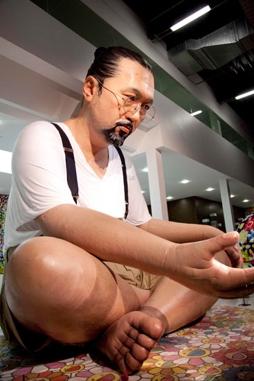
So here we are in Qatar, where today’s pop art guru Takashi Murakami has a new show. We’re not really there, of course, but do we need to be? Murakami is pop for the digital age, a designer of images that make more sense as screensavers than as any kind of high art. In Doha, the artist who celebrated a recent British show with a giveaway cardboard sculpture exhibits a six-metre balloon self-portrait and a 100-metre work inspired by the earthquake in Japan. This follows on from a 2010 exhibition in Versailles, no less. All over the world, in settings old and new, the bright and spectacular art of Murakami is as victorious as Twitter. It is art for computers: all stimuli, no soul.

[div class=attrib]Read the entire article here.[end-div]

[div class=attrib]Image: Takashi Murakami’s six-metre balloon self-portrait, part of the artist’s latest exhibition in Qatar. Courtesy of Chika Okazumi / Guardian.[end-div]

Oil, Art and the 0.0001 Percent

[div class=attrib]From Vanity Fair:[end-div]

The tiny, oil-rich nation of Qatar has purchased a Paul Cézanne painting, The Card Players, for more than $250 million. The deal, in a single stroke, sets the highest price ever paid for a work of art and upends the modern art market.

If the price seems insane, it may well be, since it more than doubles the current auction record for a work of art. And this is no epic van Gogh landscape or Vermeer portrait, but an angular, moody representation of two Aix-en-Provence peasants in a card game. But, for its $250 million, Qatar gets more than a post-Impressionist masterpiece; it wins entry into an exclusive club. There are four other Cézanne Card Players in the series; and they are in the collections of the Metropolitan Museum of Art, the Musée d’Orsay, the Courtauld, and the Barnes Foundation. For a nation in the midst of building a museum empire, it’s instant cred.

Is the painting, created at the cusp of the 20th century, worth it? Well, Cézanne inspired Cubism and presaged abstract art, and Picasso called him “the father of us all.” That said, “$250 million is a fortune,” notes Victor Wiener, the fine-art appraiser called in by Lloyd’s of London when Steve Wynn put his elbow through a Picasso, in 2006. “But you take any art-history course, and a Card Players is likely in it. It’s a major, major image.” For months, he said, “its sale has been rumored. Now, everyone will use this price as a point of departure: it changes the whole art-market structure.”

The Cézanne sale actually took place in 2011, and details of the secret deal are now coming out as a slew of V.I.P. collectors, curators, and dealers head to Qatar for the opening next week of a Takashi Murakami blockbuster that was recently on view in the Palace of Versailles. The nation, located on its own small jetty off the Arabian Peninsula, is a new destination on the art-world grand tour: current exhibitions include an 80-foot-high Richard Serra and a Louise Bourgeois retrospective (her bronze spider is crawling across the Doha Convention Center), and in March it hosts a Global Art Forum that attracts artists, curators, and patrons from museum groups worldwide.

[div class=attrib]Read the entire article here.[end-div]

[div class=attrib]Image: Card Players by Paul Cezanne. Courtesy of Vanity Fair.[end-div]

L’Entente Cordiale: Parenting the French Way

French children, it seems, unlike their cousins in the United States, don’t suffer temper tantrums, sit patiently at meal-times, defer to their parents, eat all their vegetables, respect adults, and are generally happy. Why is this and should American parents ditch the latest pop psychology handbooks for parenting lessons from La Belle France?
[div class=attrib]From the Wall Street Journal:[end-div]

When my daughter was 18 months old, my husband and I decided to take her on a little summer holiday. We picked a coastal town that’s a few hours by train from Paris, where we were living (I’m American, he’s British), and booked a hotel room with a crib. Bean, as we call her, was our only child at this point, so forgive us for thinking: How hard could it be?

We ate breakfast at the hotel, but we had to eat lunch and dinner at the little seafood restaurants around the old port. We quickly discovered that having two restaurant meals a day with a toddler deserved to be its own circle of hell.

Bean would take a brief interest in the food, but within a few minutes she was spilling salt shakers and tearing apart sugar packets. Then she demanded to be sprung from her high chair so she could dash around the restaurant and bolt dangerously toward the docks.

Our strategy was to finish the meal quickly. We ordered while being seated, then begged the server to rush out some bread and bring us our appetizers and main courses at the same time. While my husband took a few bites of fish, I made sure that Bean didn’t get kicked by a waiter or lost at sea. Then we switched. We left enormous, apologetic tips to compensate for the arc of torn napkins and calamari around our table.

After a few more harrowing restaurant visits, I started noticing that the French families around us didn’t look like they were sharing our mealtime agony. Weirdly, they looked like they were on vacation. French toddlers were sitting contentedly in their high chairs, waiting for their food, or eating fish and even vegetables. There was no shrieking or whining. And there was no debris around their tables.

Though by that time I’d lived in France for a few years, I couldn’t explain this. And once I started thinking about French parenting, I realized it wasn’t just mealtime that was different. I suddenly had lots of questions. Why was it, for example, that in the hundreds of hours I’d clocked at French playgrounds, I’d never seen a child (except my own) throw a temper tantrum? Why didn’t my French friends ever need to rush off the phone because their kids were demanding something? Why hadn’t their living rooms been taken over by teepees and toy kitchens, the way ours had?

Soon it became clear to me that quietly and en masse, French parents were achieving outcomes that created a whole different atmosphere for family life. When American families visited our home, the parents usually spent much of the visit refereeing their kids’ spats, helping their toddlers do laps around the kitchen island, or getting down on the floor to build Lego villages. When French friends visited, by contrast, the grownups had coffee and the children played happily by themselves.

By the end of our ruined beach holiday, I decided to figure out what French parents were doing differently. Why didn’t French children throw food? And why weren’t their parents shouting? Could I change my wiring and get the same results with my own offspring?

Driven partly by maternal desperation, I have spent the last several years investigating French parenting. And now, with Bean 6 years old and twins who are 3, I can tell you this: The French aren’t perfect, but they have some parenting secrets that really do work.

I first realized I was on to something when I discovered a 2009 study, led by economists at Princeton, comparing the child-care experiences of similarly situated mothers in Columbus, Ohio, and Rennes, France. The researchers found that American moms considered it more than twice as unpleasant to deal with their kids. In a different study by the same economists, working mothers in Texas said that even housework was more pleasant than child care.

[div class=attrib]Read the entire article here. This is adapted from “Bringing Up Bébé: One American Mother Discovers the Wisdom of French Parenting,” to be published February 7, 2012 by the Penguin Press.[end-div]

[div class=attrib]Image: That’s the way to do it … a young boy at the Côte d’Or restaurant, Saulieu. Courtesy of Owen Franken/Corbis / Guardian [end-div]

The Other Mona Lisa

[div class=attrib]From the Guardian:[end-div]

A contemporaneous copy of the world’s most famous painting has been sensationally discovered by conservators at the Prado in Madrid, allowing us to see the Mona Lisa as she would probably have looked at the time.

In art historical terms, the discovery is nothing short of remarkable. The Prado painting had long been thought to be one of dozens of surviving replicas of Leonardo’s masterpiece, made in the 16th and 17th centuries.

But, the Arts Newspaper reports, recent conservation reveals that the work was in fact painted by a pupil working alongside Leonardo.

The original painting hangs behind glass and with enormous security at the Louvre, a gallery it is unlikely to ever leave. There is also no prospect of it being cleaned in the forseeable future, meaning crowds view a work that, although undeniably beautiful, has several layers of old, cracked varnish.

This newly discovered work – found under black overpaint – allows the viewer to see a much fresher version of the captivating young woman, generally acknowledged to be Lisa Gherardini, the wife of the Florentine cloth merchant Francesco del Giocondo.

The Prado said the restoration had been carried out over the past few months in preparation for an exhibition at the Louvre in March.

[div class=attrib]Read more here.[end-div]

[div class=attrib]Image: Detail of the nearly conserved Leonardo da Vinci pupil’s take of the Mona Lisa. The Prado has yet to finish conservation work on the whole painting. Courtesy of Museo Nacional del Pradio / Guardian.[end-div]

Barcode as Art

The ubiquitous and utilitarian barcode turns 60 years old. Now, it’s upstart and more fashionable sibling, the QR or quick response, code, seems to be stealing the show by finding its way from the product on the grocery store shelf to the world of art and design.

[div class=attrib]From the New York Times:[end-div]

It’s usually cause for celebration when a product turns 60. How could it have survived for so long, unless it is genuinely wanted or needed, or maybe both?

One of the sexagenarians this year, the bar code, has more reasons than most to celebrate. Having been a familiar part of daily life for decades, those black vertical lines have taken on a new role of telling ethically aware consumers whether their prospective purchases are ecologically and socially responsible. Not bad for a 60-year-old.

But a new rival has surfaced. A younger version of the bar code, the QR, or “Quick Response” code, threatens to become as ubiquitous as the original, and is usurping some of its functions. Both symbols are black and white, geometric in style and rectangular in shape, but there the similarities end, because each one has a dramatically different impact on the visual landscape, aesthetically and symbolically.

First, the bar code. The idea of embedding information about a product, including its price, in a visual code that could be decrypted quickly and accurately at supermarket checkouts was hatched in the late 1940s by Bernard Silver and Norman Joseph Woodland, graduate students at the Drexel Institute of Technology in Philadelphia. Their idea was that retailers would benefit from speeding up the checkout process, enabling them to employ fewer staff, and from reducing the expense and inconvenience caused when employees keyed in the wrong prices.

At 8.01 a.m. on June 26, 1974, a packet of Wrigley’s Juicy Fruit chewing gum was sold for 67 cents at a Marsh Supermarket in Troy, Ohio — the first commercial transaction to use a bar code. More than five billion bar-coded products are now scanned at checkouts worldwide every day. Some of those codes will also have been vetted on the cellphones of shoppers who wanted to check the product’s impact on their health and the environment, and the ethical credentials of the manufacturer. They do so by photographing the bar code with their phones and using an application to access information about the product on ethical rating Web sites like GoodGuide.

As for the QR code, it was developed in the mid-1990s by the Japanese carmaker Toyota to track components during the manufacturing process. A mosaic of tiny black squares on a white background, the QR code has greater storage capacity than the original bar code. Soon, Japanese cellphone makers were adding QR readers to camera phones, and people were using them to download text, films and Web links from QR codes on magazines, newspapers, billboards and packaging. The mosaic codes then appeared in other countries and are now common all over the world. Anyone who has downloaded a QR reading application can decrypt them with a camera phone.


[div class=attrib]Read the entire article here.[end-div]

[div class=attrib]Image courtesy of Google search.[end-div]

Shrink-Wrapped Couples

Once in a while a photographer comes along with a simple yet thoroughly new perspective. Japanese artist Photographer Hal fits this description. His images of young Japanese in a variety of contorted and enclosed situations are sometimes funny and disturbing, but certainly different and provocative.
[div class=attrib]From flavorwire:[end-div]

Japanese artist Photographer Hal has stuffed club kids into bathtubs and other cramped spaces in his work before, but this time he’s chosen to shrink-wrap them like living dolls squirming under plastic. With some nude, and some dressed in candy-colored attire, Hal covers his models with a plastic sheeting that he vacuums the air from in order to distort their features and bond them together. It only takes a few seconds for him to snap several images before releasing them, and the results are humorous and somewhat grotesque.

[div class=attrib]See more of Photographer Hal’s work here.[end-div]

How to (Not) Read a Tough Book

Ever picked up a copy of the Illiad or War and Peace or Foucault’s Pendulum or Finnegan’s Wake leafed through the first five pages and given up? Well, you may be in good company. So, here are some useful tips for the readers, and non-readers alike, on how to get through some notable classics that demand our fullest attention and faculties.

[div class=attrib]From the Wall Street Journal:[end-div]

I’m determined to finish “The Iliad” before I start anything else, but I’ve been having trouble picking it up amid all the seasonal distractions and therefore I’m not reading anything at all: It’s blocking other books. Suggestions?

—E.S., New York

When I decided to read “War and Peace” a few years ago, I worried about exactly this problem: a challenging book slowing me down so much that I simply stopped reading anything at all. My solution, which worked, was to assign myself a certain number of pages—in this case, 100—each day, after which I was free to read anything else. One hundred pages a day may seem like a lot, but I had time on my hands, and (of course) “War and Peace” turned out to be anything but laborious. Still, there was a psychological comfort in knowing that if I wasn’t enjoying it, I wasn’t in a reading straitjacket.

With a book like “The Iliad,” which is far more demanding than “War and Peace,” I’d say one or two pages a day would be a perfectly respectable goal. You could see that time as a period of meditation or prayer—an excuse to be alone, quiet and contemplative.

You could also alternate reading “The Iliad” with listening to someone else read it. There’s no rule that says you can’t mix media on a single book, especially when it’s poetry, and the divine Alfred Molina reads Stephen Mitchell’s new translation of Homer’s classic.

Reading a work like “The Iliad” shouldn’t feel like punishment or homework. If it does, then read a sentence a day with the patience of Penelope.

[div class=attrib]Read the entire article here.[end-div]

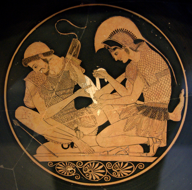
[div class=attrib]Image: Achilles tending Patroclus wounded by an arrow, identified by inscriptions on the upper part of the vase. Tondo of an Attic red-figure kylix, ca. 500 BC. From Vulci. Courtesy of Wikipedia.[end-div]

Ronald Searle

Ronald Searle, your serious wit and your heroic pen will be missed. Searle died on December 30, aged 91.

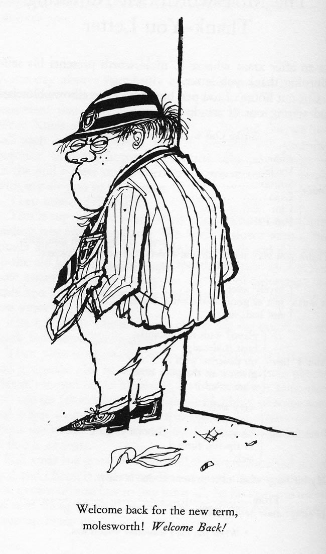
The first “real” book purchased by theDiagonal’s editor with his own money was “How To Be Topp” by Geoffrey Willans and Ronald Searle. The book featured Searle’s unique and unmistakable illustrations of anti-hero Nigel Molesworth, a stoic, shrewd and droll English schoolboy.

Yet while Searle will be best remembered for his drawings of Molesworth and friends at St.Custard’s high school and his invention of St.Trinian’s (school for rowdy schoolgirls), he leaves behind a critical body of work that graphically illustrates his brutal captivity at the hands of the Japanese during the Second World War.

Most of these drawings appear in his 1986 book, Ronald Searle: To the Kwai and Back, War Drawings 1939-1945. In the book, Searle also wrote of his experiences as a prisoner. Many of his original drawings are now in the permanent collection of the Imperial War Museum, London.

[div class=attrib]From the BBC:[end-div]

British cartoonist Ronald Searle, best known for creating the fictional girls’ school St Trinian’s, has died aged 91.

His daughter Kate Searle said in a statement that he “passed away peacefully in his sleep” in a hospital in France.

Searle’s spindly cartoons of the naughty schoolgirls first appeared in 1941, before the idea was adapted for film.

The first movie version, The Belles of St Trinian’s, was released in 1954.

Joyce Grenfell and George Cole starred in the film, along with Alastair Sim, who appeared in drag as headmistress Millicent Fritton.

Searle also provided illustrations the Molesworth series, written by Geoffrey Willans.

The gothic, line-drawn cartoons breathed life into the gruesome pupils of St Custard’s school, in particular the outspoken, but functionally-illiterate Nigel Molesworth “the goriller of 3B”.

Searle’s work regularly appeared in magazines and newspapers, including Punch and The New Yorker.

[div class=attrib]Read more here.[end-div]

[div class=attrib]Image: Welcome back to the new term molesworth! From How to be Topp. Courtesy of Geoffrey Willans and Ronald Searle / Vanguard Press.[end-div]

MondayPoem: The Snow Is Deep on the Ground

We celebrate the arrival of winter to the northern hemisphere with an evocative poem by Kenneth Patchen.

[div class=attrib]From Poetry Foundation:[end-div]

An inspiration for the Beat Generation and a true “people’s poet,” Kenneth Patchen was a prolific writer, visual artist and performer whose exuberant, free-form productions celebrate spontaneity and attack injustices, materialism, and war.

By Kenneth Patchen

– The Snow Is Deep on the Ground

The snow is deep on the ground.
Always the light falls
Softly down on the hair of my belovèd.

This is a good world.
The war has failed.
God shall not forget us.
Who made the snow waits where love is.

Only a few go mad.
The sky moves in its whiteness
Like the withered hand of an old king.
God shall not forget us.
Who made the sky knows of our love.

The snow is beautiful on the ground.
And always the lights of heaven glow
Softly down on the hair of my belovèd.

[div class=attrib]Image: Kenneth Patchen. Courtesy of Wikipedia.[end-div]

Everyone’s an Artist, Designer, Critic. But Curator?

Digital cameras and smartphones have enabled their users to become photographers. Affordable composition and editing tools have made us all designers and editors. Social media have enabled, encouraged and sometimes rewarded us for posting content, reviews and opinions for everything under the sun. So, now we are all critics. So, now are we all curators as well?

[div class=attrib]From dis:[end-div]

As far as word trends go, the word curate still exists in a somewhat rarified air. One can use curate knowingly with tongue in cheek: “Let’s curate our spice rack!” Or, more commonly and less nerdily, in the service of specialized artisanal commerce: “curating food stands” of the Brooklyn Flea swap meet, or a site that lets women curate their own clothing store from featured brands, earning 10% on any sales from their page. Curate used pejoratively indicates The Man- “If The Huffington Post wants to curate Twitter…” [uh, users will be upset]. And then there is that other definition specific to the practice of art curating. In the past ten years, as curate has exploded in popular culture and as a consumer buzz-word, art curators have felt residual effects. Those who value curating as an actual practice are generally loathe to see it harnessed by commercial culture, and conversely, feel sheepish about some deep-set pretensions this move has brought front and center. Simultaneously, curate has become a lightning-rod in the art world, inspiring countless journal articles and colloquia in which academics and professionals discuss issues around curating with a certain amount of anxiety.

Everyone’s a critic but who’s a curator?
In current usage, curating as discipline, which involves assembling and arranging artworks, has been usurped by curating as a nebulous expression of taste, presumed to be inherent rather than learned. This presumption is of course steeped in its own mire of regionalism, class bias and aspirations towards whomever’s privileged lifestyle is currently on-trend or in power. Suffice it to say that taste is problematic. But that curating swung so easily towards taste, indicates that it wasn’t a very hard association to make.

To some extent taste has been wedded to curating since the latter’s inception. A close forebear of the modern curated exhibition was the Renaissance cabinet of curiosities. The practice of selecting finely crafted objects for display first appeared in the 15th century and extended for several centuries after. A gentleman’s cabinet of curiosities showcased treasures bought or collected during travel, and ranged culturally and from collector to collector according to his interests, from mythical?/biblical? relics to artworks to ancient and exotic artifacts. As a practice, this sort of acquisition existed separately from the tradition of patronage of a particular artist. (For a vivid and intricately rendered description of the motivations and mindset of the 18th century collector, which gives way after half the book to a tour-de-force historical novel and then finally, to a political manifesto by a thinly veiled stand-in for the author, see Susan Sontag’s weird and special novel The Volcano Lover.) In Europe and later the United States, these collections of curiosities would give rise to the culture of the museum. In an 1858 New York Times article, the sculptor Bartholomew was described as having held the position of Curator for the Wadsworth Gallery in Hartford, a post he soon abandoned to render marble busts. The Wadsworth, incidentally, was the first public art museum to emerge in the United States, and would anticipate the museum boom of the 20th century.

[div class=attrib]Read the entire article here.[end-div]

[div class=attrib]Image: Dean&Deluca. Courtesy of dis.[end-div]

Woman and Man, and Fish?

A widely held aphorism states that owners often look like their pets, or visa versa. So, might it apply to humans and fish? Well, Ted Sabarese a photographer based in New York provides an answer in a series of fascinating portraits.

[div class=attrib]From Kalliopi Monoyios over at Scientific American:[end-div]

I can’t say for certain whether New York based photographer Ted Sabarese had science or evolution in mind when he conceived of this series. But I’m almost glad he never responded to my follow-up questions about his inspiration behind these. Part of the fun of art is its mirror-like quality: everyone sees something different when faced with it because everyone brings a different set of experiences and expectations to the table. When I look at these I see equal parts “you are what you eat,” “your inner fish,” and “United Colors of Benetton.”

[div class=attrib]Read more of this article here.[end-div]

[div class=attrib]Discover more of Ted Sabarese’s work here.[end-div]