Tag Archives: visualization

MondayMap: Food Rhythms

rhythm-of-food-screenshot

OK, I admit it. Today’s article is not strictly about a map, but I couldn’t resist these fascinating data visualizations. The graphic show some of the patterns and trends that can be derived from the vast mountains of data gathered from Google searches. A group of designers and data scientists from Truth & Beauty teamed up with Google News Labs to produce a portfolio of charts that show food and drink related searches over the last 12 years.

The visual above shows a clear spike in cocktail related searches in December (for entertaining during holiday season). Interestingly Searches for a “Tom Collins” have increased since 2004 whereas those for “Martini” have decreased in number. A more recent phenomenon on the cocktail scene seems to be the “Moscow Mule”.

Since most of the searches emanated in the United States the resulting charts show some fascinating changes in the nation’s collective nutritional mood. While some visualizations confirm the obvious — fruit searches peak when in season; pizza is popular year round — some  specific insights are more curious:

  • Orange Jell-O [“jelly” for my British readers] is popular for US Thanksgiving.
  • Tamale searches peak around Christmas.
  • Pumpkin spice latte searches increase in the fall, but searches are peaking earlier each year.
  • Superfood searches are up; fat-free searches are down.
  • Nacho searches peak around Super Bowl Sunday.
  • Cauliflower may be the new Kale.

You can check out much more from this gorgeous data visualization project at The Rhythm of Food.

Image: Screenshot from Rhythm of Food. Courtesy: Rhythm of Food.

MondayMap: The Architecture of Music

musicmap

A couple of years ago I wrote about Every Noise At Once a visualization, with samples, of (almost) every musical genre. At last count Glenn McDonald’s brainchild had algorithmically-generated and scatter-plotted 1,496 genres.

Now courtesy of Belgian architect Kwinten Crauwels we have the next gorgeous visual iteration of the music universe — Musicmap. It took Crauwels seven years to construct this astounding and comprehensive, interactive map of music genres, sub-genres and their relationships. It traces the genealogy of around 150 years of popular music.

Crauwels color-coded each of the major genres and devised different types of lines to show different relationships across the hundreds of genres and sub-genres. You can fly around the map to follow the links and drill-down to learn more about each musical style.

musicmap2

Now you can visually trace how Garage Rock is related to Detroit’s Motown and Doo Wop, or how present day Industrial Synth evolved from Krautrock of the 1970s.

It’s a visual, and musical, masterpiece. Read more about Musicmap here.

Image: Musicmap screenshots. Courtesy of Kwinten Crauwels, Musicmap.

MondayMap: Beyond the Horizon

Map-beach-view

Andy Woodruff is a cartographer, he makes maps. His most recent construction is a series of whimsical maps that visualize what many off us at least once in our lives may have pondered.

When we are at the beach looking out to sea, casting our eyes to the distant horizon, we often wonder what lies beyond. If you could set off and walk in a straight line from your small plot of sand (or rock) across the vast ocean where would you first make landfall? Andy Woodruff’s “Beyond the Sea” maps answer this question, and the results are surprising.

For instance, if you happen to be looking out from any beach on the US Eastern Seaboard — and your vision could bend and stretch over the horizon — you would see the Southern coastline of Australia. So, drop the boring atlas and Google Maps and go follow some more of Andy Woodruff’s fascinating great circles.

From NPR:

Ever stood on the coastline, gazing out over the horizon, and wondered what’s on the other side? Pondered where you’d end up if you could fly straight ahead until you hit land?

Turns out the answer might be surprising. And even if you pulled out an atlas — or, more realistically, your smartphone — you might have trouble figuring it out. Lines of latitude won’t help, and drawing a path on most maps will lead you astray.

Cartographer Andy Woodruff, who recently embarked on a project called Beyond the Sea to illustrate this puzzle, says there are two simple reasons why it’s harder than it seems to figure out which coast lies directly on the other side of the horizon.

First, coastlines are “wacky,” he writes on his blog. And second, well, the Earth is round.

The crookedness of the world’s coastlines means moving a few miles up or down the coast will leave you facing a different direction (assuming your gaze is straight out, perpendicular to the coast around you).

Read the entire story here.

Map: Beach view of Australia. Courtesy Andy Woodruff.


Mind-Bending Mixed Reality is Coming

Magic-Leap-screenshot

Wired profiles a stealthy startup tech company that garnered lots of insider interest and piles of funding. The company is called Magic Leap. It’s raked in $1.4 billion in venture funds from industry luminaries including Google, Qualcomm, Kleiner Perkins Caufield Byers, Vulcan Capital, and Andreessen Horowitz.

Like several hundred other companies Magic Leap is developing a virtual reality (VR) system. But what sets Magic Leap apart from many of its competitors is its focus on mixed reality (MR). Mixed reality overlays VR onto the real world. This allows synthetic constructions of VR to be superimposed over actual visual surroundings.

VR technologists agree that MR systems are much more difficult to construct than fully immersive VR, but provide much richer and compelling user experiences. Magic Leap calls their technology Cinematic Reality. That’s where the story of Magic Leap begins.

In the company’s own words:

Using our Dynamic Digitized Lightfield Signal™, imagine being able to generate images indistinguishable from real objects and then being able to place those images seamlessly into the real world.

From Wired:

There is something special happening in a generic office park in an uninspiring suburb near Fort Lauderdale, Florida. Inside, amid the low gray cubicles, clustered desks, and empty swivel chairs, an impossible 8-inch robot drone from an alien planet hovers chest-high in front of a row of potted plants. It is steampunk-cute, minutely detailed. I can walk around it and examine it from any angle. I can squat to look at its ornate underside. Bending closer, I bring my face to within inches of it to inspect its tiny pipes and protruding armatures. I can see polishing swirls where the metallic surface was “milled.” When I raise a hand, it approaches and extends a glowing appendage to touch my fingertip. I reach out and move it around. I step back across the room to view it from afar. All the while it hums and slowly rotates above a desk. It looks as real as the lamps and computer monitors around it. It’s not. I’m seeing all this through a synthetic-reality headset. Intellectually, I know this drone is an elaborate simulation, but as far as my eyes are concerned it’s really there, in that ordinary office. It is a virtual object, but there is no evidence of pixels or digital artifacts in its three-dimensional fullness.

If I reposition my head just so, I can get the virtual drone to line up in front of a bright office lamp and perceive that it is faintly transparent, but that hint does not impede the strong sense of it being present. This, of course, is one of the great promises of artificial reality—either you get teleported to magical places or magical things get teleported to you. And in this prototype headset, created by the much speculated about, ultrasecretive company called Magic Leap, this alien drone certainly does seem to be transported to this office in Florida—and its reality is stronger than I thought possible.

Read the entire story here.

Image: Magic Leap MR screenshot. The hands live in the real world, the miniature elephant lives in a digitized VR world.


Business Decison-Making Welcomes Science

data-visualization-ayasdi

It is likely that business will never eliminate gut instinct from the decision-making process. However, as data, now big data, increasingly pervades every crevice of every organization, the use of data-driven decisions will become the norm. As this happens, more and more businesses find themselves employing data scientists to help filter, categorize, mine and analyze these mountains of data in meaningful ways.

The caveat, of course, is that data, big data and an even bigger reliance on that data requires subject matter expertise and analysts with critical thinking skills and sound judgement — data cannot be used blindly.

From Technology review:

Throughout history, innovations in instrumentation—the microscope, the telescope, and the cyclotron—have repeatedly revolutionized science by improving scientists’ ability to measure the natural world. Now, with human behavior increasingly reliant on digital platforms like the Web and mobile apps, technology is effectively “instrumenting” the social world as well. The resulting deluge of data has revolutionary implications not only for social science but also for business decision making.

As enthusiasm for “big data” grows, skeptics warn that overreliance on data has pitfalls. Data may be biased and is almost always incomplete. It can lead decision makers to ignore information that is harder to obtain, or make them feel more certain than they should. The risk is that in managing what we have measured, we miss what really matters—as Vietnam-era Secretary of Defense Robert McNamara did in relying too much on his infamous body count, and as bankers did prior to the 2007–2009 financial crisis in relying too much on flawed quantitative models.

The skeptics are right that uncritical reliance on data alone can be problematic. But so is overreliance on intuition or ideology. For every Robert McNamara, there is a Ron Johnson, the CEO whose disastrous tenure as the head of JC Penney was characterized by his dismissing data and evidence in favor of instincts. For every flawed statistical model, there is a flawed ideology whose inflexibility leads to disastrous results.

So if data is unreliable and so is intuition, what is a responsible decision maker supposed to do? While there is no correct answer to this question—the world is too complicated for any one recipe to apply—I believe that leaders across a wide range of contexts could benefit from a scientific mind-set toward decision making.

A scientific mind-set takes as its inspiration the scientific method, which at its core is a recipe for learning about the world in a systematic, replicable way: start with some general question based on your experience; form a hypothesis that would resolve the puzzle and that also generates a testable prediction; gather data to test your prediction; and finally, evaluate your hypothesis relative to competing hypotheses.

The scientific method is largely responsible for the astonishing increase in our understanding of the natural world over the past few centuries. Yet it has been slow to enter the worlds of politics, business, policy, and marketing, where our prodigious intuition for human behavior can always generate explanations for why people do what they do or how to make them do something different. Because these explanations are so plausible, our natural tendency is to want to act on them without further ado. But if we have learned one thing from science, it is that the most plausible explanation is not necessarily correct. Adopting a scientific approach to decision making requires us to test our hypotheses with data.

While data is essential for scientific decision making, theory, intuition, and imagination remain important as well—to generate hypotheses in the first place, to devise creative tests of the hypotheses that we have, and to interpret the data that we collect. Data and theory, in other words, are the yin and yang of the scientific method—theory frames the right questions, while data answers the questions that have been asked. Emphasizing either at the expense of the other can lead to serious mistakes.

Also important is experimentation, which doesn’t mean “trying new things” or “being creative” but quite specifically the use of controlled experiments to tease out causal effects. In business, most of what we observe is correlation—we do X and Y happens—but often what we want to know is whether or not X caused Y. How many additional units of your new product did your advertising campaign cause consumers to buy? Will expanded health insurance coverage cause medical costs to increase or decline? Simply observing the outcome of a particular choice does not answer causal questions like these: we need to observe the difference between choices.

Replicating the conditions of a controlled experiment is often difficult or impossible in business or policy settings, but increasingly it is being done in “field experiments,” where treatments are randomly assigned to different individuals or communities. For example, MIT’s Poverty Action Lab has conducted over 400 field experiments to better understand aid delivery, while economists have used such experiments to measure the impact of online advertising.

Although field experiments are not an invention of the Internet era—randomized trials have been the gold standard of medical research for decades—digital technology has made them far easier to implement. Thus, as companies like Facebook, Google, Microsoft, and Amazon increasingly reap performance benefits from data science and experimentation, scientific decision making will become more pervasive.

Nevertheless, there are limits to how scientific decision makers can be. Unlike scientists, who have the luxury of withholding judgment until sufficient evidence has accumulated, policy makers or business leaders generally have to act in a state of partial ignorance. Strategic calls have to be made, policies implemented, reward or blame assigned. No matter how rigorously one tries to base one’s decisions on evidence, some guesswork will be required.

Exacerbating this problem is that many of the most consequential decisions offer only one opportunity to succeed. One cannot go to war with half of Iraq and not the other just to see which policy works out better. Likewise, one cannot reorganize the company in several different ways and then choose the best. The result is that we may never know which good plans failed and which bad plans worked.

Read the entire article here.

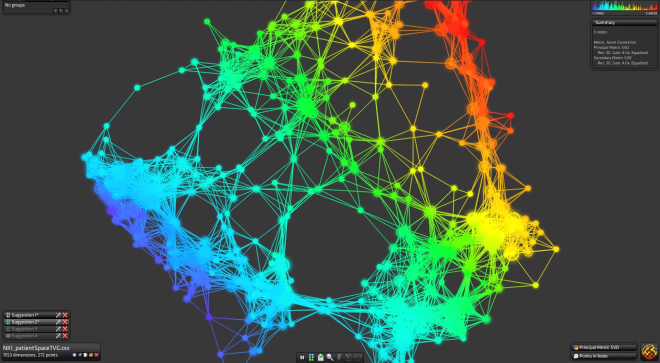
Image: Screenshot of Iris, Ayasdi’s data-visualization tool. Courtesy of Ayasdi / Wired.