Category Archives: Art

International Art English

Yes, it’s official. There really is a subset of the Queen’s English for the contemporary art scene — dubbed International Art English (IAE). If you’ve visited a gallery over the last couple of decades you may be familiar with this type language on press releases and wall tags. It uses multisyllabic words in breathless, flowery, billowy sentences; high-brow phraseology replete with pretentious insider nods and winks; it’s often enthusiastically festooned with adverbs and esoteric adjectives, in apparently random but clear juxtaposition. So, it’s rather like the preceding sentence. Will IAE become as pervasive as International Sport English – you know, that subset of language increasingly spoken, in the same accent, by international sports celebrities? Time will tell.

[div class=attrib]From the Guardian:[end-div]

The Simon Lee Gallery in Mayfair is currently showing work by the veteran American artist Sherrie Levine. A dozen small pink skulls in glass cases face the door. A dozen small bronze mirrors, blandly framed but precisely arranged, wink from the walls. In the deep, quiet space of the London gallery, shut away from Mayfair’s millionaire traffic jams, all is minimal, tasteful and oddly calming.

Until you read the exhibition hand-out. “The artist brings the viewer face to face with their own preconceived hierarchy of cultural values and assumptions of artistic worth,” it says. “Each mirror imaginatively propels its viewer forward into the seemingly infinite progression of possible reproductions that the artist’s practice engenders, whilst simultaneously pulling them backwards in a quest for the ‘original’ source or referent that underlines Levine’s oeuvre.”

If you’ve been to see contemporary art in the last three decades, you will probably be familiar with the feelings of bafflement, exhaustion or irritation that such gallery prose provokes. You may well have got used to ignoring it. As Polly Staple, art writer and director of the Chisenhale Gallery in London, puts it: “There are so many people who come to our shows who don’t even look at the programme sheet. They don’t want to look at any writing about art.”

With its pompous paradoxes and its plagues of adverbs, its endless sentences and its strained rebellious poses, much of this promotional writing serves mainly, it seems, as ammunition for those who still insist contemporary art is a fraud. Surely no one sensible takes this jargon seriously?

David Levine and Alix Rule do. “Art English is something that everyone in the art world bitches about all the time,” says Levine, a 42-year-old American artist based in New York and Berlin. “But we all use it.” Three years ago, Levine and his friend Rule, a 29-year-old critic and sociology PhD student at Columbia university in New York, decided to try to anatomise it. “We wanted to map it out,” says Levine, “to describe its contours, rather than just complain about it.”

They christened it International Art English, or IAE, and concluded that its purest form was the gallery press release, which – in today’s increasingly globalised, internet-widened art world – has a greater audience than ever. “We spent hours just printing them out and reading them to each other,” says Levine. “We’d find some super-outrageous sentence and crack up about it. Then we’d try to understand the reality conveyed by that sentence.”

Next, they collated thousands of exhibition announcements published since 1999 by e-flux, a powerful New York-based subscriber network for art-world professionals. Then they used some language-analysing software called Sketch Engine, developed by a company in Brighton, to discover what, if anything, lay behind IAE’s great clouds of verbiage.

Their findings were published last year as an essay in the voguish American art journal Triple Canopy; it has since become one of the most widely and excitedly circulated pieces of online cultural criticism. It is easy to see why. Levine and Rule write about IAE in a droll, largely jargon-free style. They call it “a unique language” that has “everything to do with English, but is emphatically not English. [It] is oddly pornographic: we know it when we see it.”

IAE always uses “more rather than fewer words”. Sometimes it uses them with absurd looseness: “Ordinary words take on non-specific alien functions. ‘Reality,’ writes artist Tania Bruguera, ‘functions as my field of action.'” And sometimes it deploys words with faddish precision: “Usage of the word speculative spiked unaccountably in 2009; 2011 saw a sudden rage for rupture; transversal now seems poised to have its best year ever.”

Through Sketch Engine, Rule and Levine found that “the real” – used as a portentous, would-be philosophical abstract noun – occurred “179 times more often” in IAE than in standard English. In fact, in its declarative, multi-clause sentences, and in its odd combination of stiffness and swagger, they argued that IAE “sounds like inexpertly translated French”. This was no coincidence, they claimed, having traced the origins of IAE back to French post-structuralism and the introduction of its slippery ideas and prose style into American art writing via October, the New York critical journal founded in 1976. Since then, IAE had spread across the world so thoroughly that there was even, wrote Rule and Levine, an “IAE of the French press release … written, we can only imagine, by French interns imitating American interns imitating American academics imitating French academics”.

[div class=attrib]Read the entire article following the jump.[end-div]

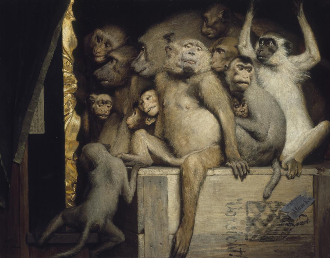
[div class=attrib]Image: Monkeys as Judges of Art, 1889, by Gabriel Cornelius von Max. Courtesy of Wikipedia / Public Domain.[end-div]

Lego Expressionism: But is it Art?

Lego as we know it — think brightly colored, interlinking, metamorphic bricks – has been around for over 60 years. Even in this high-tech, electronic age it is still likely that most kids around the world have made a little house or a robot with Lego bricks. It satisfies our need to create and to build (and of course, to destroy). But is it art? Jonathan Jones has some ideas.

[div class=attrib]From the Guardian:[end-div]

Lego is the clay of the modern world, the stuff of creativity. You can shape it, unshape it, make worlds and smash them up to be replaced by new ideas. It’s a perpetual-motion machine of kids’ imaginations.

Today’s Lego is very different from the Lego I played with when I was eight. For adults like me who grew up with simple Lego bricks and no instructions, just a free-for-all, the kits that now dazzle in their bright impressive boxes take some adjusting to. A puritan might well be troubled that this year’s new Christmas Lego recreates the film The Hobbit in yet another addition to a popular culture repertoire that includes Marvel Superheroes Lego and the ever-popular Star Wars range.

The Danish toymaker is ruthless in its pursuit of mass entertainment. Harry Potter Lego was a major product – until the film series finished. This summer, it suddenly vanished from shops. I had to go to the Harry Potter Studios to get a Knight Bus.

Cool bus, though. Purple Lego! And it fits together in such a way that, when dropped or otherwise subjected to the rigours of play, the three floors of the bus neatly separate and can easily be reconnected. It is a kit, a toy, and a stimulus to story-telling.

Do not doubt the creative value of modern Lego. Making these kits isn’t a fetishistic, sterile enterprise – children don’t think like that. Rather, the ambition of the kits inspires children to aim high with their own crazy designs – the scenarios Lego provides stimulate inventive play. Children can tell stories with Lego, invest the fantastic mini-figures with names and characters, and build what they like after the models disintegrate. Above all, there is something innately humorous about Lego.

But is it art? It definitely teaches something about art. Like a three-dimensional sketchpad, Lego allows you to doodle in bright colours. It is “virtual”, but real and solid. It has practical limits and potentials that have to be respected, while teaching that anyone can create anything. You can be a representational Lego artist, meticulously following instructions and making accurate models, or an abstract one. It really is liberating stuff: shapeshifting, metamorphic. And now I am off to play with it.

[div class=attrib]Read the entire article following the jump.[end-div]

[div class=attrib]Image courtesy of Nathan Sawaya, the Lego brick artist.[end-div]

Art Basel: Cheese Expo, Pool Party or Art Show?

Simon Coonan over a Slate posits a simple question:

“How did the art world become such a vapid hell-hole of investment-crazed pretentiousness?”

In his scathing attack on the contemporary art scene replete with Twitter feeds, pool parties, and gallery-curated designer cheese, Coonan quite rightly asks why window dressing and marketing have replaced artistry and craftsmanship. And, more importantly, has big money replaced great, new art?

As an example, the biggest news from Art Basel, the biggest art show in the United States, is not art at all. Celebrity contemporary artist Jeff Koons’ has defected to a rival gallery from his previous home with Larry Gagosian. Gagosian to the art cognoscenti is the “world’s most powerful art dealer”.

[div class=attrib]From Slate:[end-div]

Freud said the goals of the artist are fame, money, and beautiful lovers. Based on my artist acquaintances, I would say this holds true today. What have changed, however, are the goals of the art itself. Do any exist?

How did the art world become such a vapid hell-hole of investment-crazed pretentiousness? How did it become, as Camille Paglia has recently described it, a place where “too many artists have lost touch with the general audience and have retreated to an airless echo chamber”? (More from her in a moment.)

There are sundry problems bedeviling the contemporary art scene. Here are eight that spring readily to mind:

1. Art Basel Miami.

It’s baaa-ack, and I, for one, will not be attending. The overblown art fair in Miami—an offshoot of the original, held in Basel, Switzerland—has become a promo-party cheese-fest. All that craven socializing and trendy posing epitomize the worst aspects of today’s scene, provoking in me a strong desire to start a Thomas Kinkade collection. Whenever some hapless individual innocently asks me if I will be attending Art Basel—even though the shenanigans don’t start for another two weeks, I am already getting e-vites for pre-Basel parties—I invariably respond in Tourette’s mode:

“No. In fact, I would rather jump in a river of boiling snot, which is ironic since that could very well be the title of a faux-conceptual installation one might expect to see at Art Basel. Have you seen Svetlana’s new piece? It’s a river of boiling snot. No, I’m not kidding. And, guess what, Charles Saatchi wants to buy it and is duking it out with some Russian One Percent-er.”

2. Blood, poo, sacrilege, and porn.

Old-school ’70s punk shock tactics are so widespread in today’s art world that they have lost any resonance. As a result, twee paintings like Gainsborough’s Blue Boy and Constable’s Hay Wain now appear mesmerizing, mysterious, and wildly transgressive. And, as Camille Paglia brilliantly argues in her must-read new book, Glittering Images, this torrent of penises, elephant dung, and smut has not served the broader interests of art. By providing fuel for the Rush Limbaugh-ish prejudice that the art world is full of people who are shoving yams up their bums and doing horrid things to the Virgin Mary, art has, quoting Camille again, “allowed itself to be defined in the public eye as an arrogant, insular fraternity with frivolous tastes and debased standards.” As a result, the funding of school and civic arts programs has screeched to a halt and “American schoolchildren are paying the price for the art world’s delusional sense of entitlement.” Thanks a bunch, Karen Finley, Chris Ofili, Andres Serrano, Damien Hirst, and the rest of you naughty pranksters!

Any taxpayers not yet fully aware of the level of frivolity and debasement to which art has plummeted need look no further than the Museum of Modern Art, which recently hosted a jumbo garage-sale-cum-performance piece created by one Martha Rosler titled “Meta-Monumental Garage Sale.” Maybe this has some reverse-chic novelty for chi-chi arty insiders, but for the rest of us out here in the real world, a garage sale is just a garage sale.

8. Cool is corrosive.

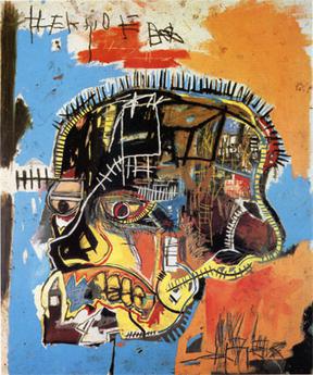
The dorky uncool ’80s was a great time for art. The Harings, Cutrones, Scharfs, and Basquiats—life-enhancing, graffiti-inspired painters—communicated a simple, relevant, populist message of hope and flava during the darkest years of the AIDS crisis. Then, in the early ‘90s, grunge arrived, and displaced the unpretentious communicative culture of the ‘80s with the dour obscurantism of COOL. Simple fun and emotional sincerity were now seen as embarrassing and deeply uncool. Enter artists like Rachel barrel-of-laughs Whiteread, who makes casts of the insides of cardboard boxes. (Nice work if you can get it!)

A couple of decades on, art has become completely pickled in the vinegar of COOL, and that is why it is so irrelevant to the general population.

[div class=attrib]Read the entire article following the jump.[end-div]

[div class=attrib]Image: Untitled acrylic and mixed media on canvas by Jean-Michel Basquiat, 1984. Courtesy of Wikipedia.[end-div]

UX and the Untergunther: Underground (Literally) Art

Many cities around the globe are home to underground art movements — those whose participants eschew the strictures of modern day gallery wine and cheese, curated exhibits, and formal public art shows. Paris has gone a step further — though deeper, would be more correct — in providing a subterranean home for some truly underground art and the groups of dedicated, clandestine artists, hackers and art restorers.

Wired spent some quality time with a leading group of Parisian underground artists, known as UX, for Underground eXperiment. Follow Wired’s fascinating and lengthy article here.

[div class=attrib]From the BBC:[end-div]

The obsessively secretive members of an underground art collective have spent the last 30 years surreptitiously staging events in tunnels beneath Paris. They say they never ask permission – and never ask for subsidies.

We’re standing nervously on the pavement, trying not to feel self-conscious as we furtively scrutinise each passer-by.

After weeks of negotiation, we have a meeting with someone who says he is a member of the highly secretive French artists’ collective – UX, as they are known for short – outside a town hall in the south of Paris. It is late on a Sunday night but the street is still quite busy.

Finally I notice a young man dressed entirely in black apart from a red beret and a small rucksack on his back. He hovers for a moment and then motions us to follow him. Our destination is the catacombs, the tunnels that run beneath the pavements of Paris.

A few minutes later Tristan (not his real name) and two companions are pulling the heavy steel cover off a manhole. “Quick, quick,” he says, “before the police come.”

I stare down a seemingly endless black hole before stepping gingerly on to a rusty ladder and start to clamber down.

There are several more ladders after that before we finally reach the bottom. To my great relief, there are no rats – we go deeper than the rats ever do – but it is pitch black and very wet.

The water is ankle deep and my shoes are soaked through. “It’s fine, if you’re properly dressed,” laughs Tristan as he splashes ahead in his rubber boots.

Using the flashlight on my phone, we do our best to follow him. Along the way I notice some colourful graffiti and a painting of an evil looking cat.

After a few minutes, we reach a dry, open space with intricate carvings on the wall and it is here that we finally sit down to interrogate our mysterious companions.

Tristan explains that he gets a kick out of getting to places, which are normally off-limits. He is a “cataphile” – somebody who loves to roam the catacombs of Paris.

UX are not the only people who go underground. There is a rap song about cataphiles, people who would rather don the rubber boots of a sewer worker (egoutier) than go clubbing in a normal night spot.

There have been a number of raves underground – some chambers are said to be big enough to hold 1,000 people.

The galleries are turned into makeshift night clubs, with a bar, lighting effects, and DJ turntables, using electricity diverted from the Parisian metro.

He also climbs on the roofs of churches. “You get a great view of the city, especially at night and it’s a cool place for a picnic,” he says.

Tristan who is originally from Lyon says his group is called the Lyonnaise des Os – a reference to the piles of bones (“os” is French for “bone”) in the catacombs – but also a pun on France’s famous water company, Lyonnaise des Eaux. He and his group spend their time exploring the tunnels, and carving sculptures.

The UX are a loose collective of people from a variety of backgrounds. Not just artists but also engineers, civil servants, lawyers and even a state prosecutor. They divide into different groups depending on their interests.

The Untergunther specialise in clandestine acts of restoration of parts of France’s heritage which they believe the state has neglected. There is also an all-women group, nicknamed The Mouse House, who are experts at infiltration.

Another group, called La Mexicaine de Perforation, or The Mexican Consolidated Drilling Authority, stages arts events like film festivals underground. They once created an entire cinema under the Palais de Chaillot, by the Trocadero, with seats cut out of the rock.

[div class=attrib]Read the entire article following the jump.[end-div]

[div class=attrib]Image: Hacker-artists below Paris. Courtesy of Wired / UX.[end-div]

Black and White or Color

Please forget Instagram, Photoshop filters, redeye elimination, automatic camera shake reduction systems and high dynamic range apps. If you’re a true photographer or simply a lover of great photography the choice is much simpler: black and white or color.
A new photography exhibit in London pits these contrasting media alongside each other for you to decide. The great Henri Cartier-Bresson would have you believe that black and white images live in a class of their own, far and above the lowly form of color snaps. He was vociferous in his opinion — that for technical and aeasthetic reasons only black and white photography could be considered art.

So, curators of the exhibition — Cartier-Bresson: A Question of Colour, have juxtaposed 10 of Cartier-Bressons prints alongside the colorful works of 15 international contemporary photographers. The results show that “the decisive moment”, so integral to Cartier-Bresson’s memorable black and white images, can be adapted to great, if not equal effect, in color.

The exhibit can be seen at Somerset House, London and runs from 8 November 2012 to 27 January 2013.

[div class=attrib]From Somerset House:[end-div]

Positive View Foundation announces its inaugural exhibition Cartier-Bresson: A Question of Colour, to be held at Somerset House, 8 November 2012 – 27 January 2013. Curated by William A. Ewing, the exhibition will feature 10 Henri Cartier-Bresson photographs never before exhibited in the UK alongside over 75 works by 15 international contemporary photographers, including: Karl Baden (US), Carolyn Drake (US), Melanie Einzig (US), Andy Freeberg (US), Harry Gruyaert (Belgium), Ernst Haas (Austrian), Fred Herzog (Canadian), Saul Leiter (US), Helen Levitt (US), Jeff Mermelstein (US), Joel Meyerowitz (US), Trent Parke (Australian), Boris Savelev (Ukranian), Robert Walker (Canadian), and Alex Webb (US).

The extensive showcase will illustrate how photographers working in Europe and North America adopted and adapted the master’s ethos famously known as  ‘the decisive moment’ to their work in colour. Though they often departed from the concept in significant ways, something of that challenge remained: how to seize something that happens and capture it in the very moment that it takes place.

It is well-known that Cartier-Bresson was disparaging towards colour photography, which in the 1950s was in its early years of development, and his reasoning was based both on the technical and aesthetic limitations of the medium at the time.

Curator William E. Ewing has conceived the exhibition in terms of, as he puts it, ‘challenge and response’. “This exhibition will show how Henri Cartier-Bresson, in spite of his skeptical attitude regarding the artistic value of colour photography, nevertheless exerted a powerful influence over photographers who took up the new medium and who were determined to put a personal stamp on it. In effect, his criticisms of colour spurred on a new generation, determined to overcome the obstacles and prove him wrong. A Question of Colour simultaneously pays homage to a master who felt that black and white photography was the ideal medium, and could not be bettered, and to a group of photographers of the 20th and 21st centuries who chose the path of colour and made, and continue to make, great strides.”

Cartier-Bresson: A Question of Colour will feature a selection of photographers whose commitment to expression in colour was – or is – wholehearted and highly sophisticated, and which measured up to Cartier-Bresson’s essential requirement that content and form were in perfect balance. Some of these artists were Cartier-Bresson’s contemporaries, like Helen Levitt, or even, as with Ernst Haas, his friends; others, such as Fred Herzog in Vancouver, knew the artist’s seminal work across vast distances; others were junior colleagues, such as Harry Gruyaert, who found himself debating colour ferociously with the master; and others still, like Andy Freeberg or Carolyn Drake, never knew the man first-hand, but were deeply influenced by his example.

[div class=attrib]Find out more about the exhibit here.[end-div]

[div class=attrib]Image Henri Cartier-Bresson. Courtesy of Wikipedia.[end-div]

Scientifiction

Science fiction stories and illustrations from our past provide a wonderful opportunity for us to test the predictive and prescient capabilities of their creators. Some like Arthur C. Clarke, we are often reminded, foresaw the communications satellite and the space elevator. Others, such as science fiction great, Isaac Asimov, fared less well in predicting future technology; while he is considered to have coined the term “robotics”, he famously predicted future computers and robots as using punched cards.

Illustrations of our future from the past are even more fascinating. One of the leading proponents of the science fiction illustration genre, or scientifiction, as it was titled in the mid-1920s, was Frank R. Paul. Paul illustrated many of the now classic U.S. pulp science fiction magazines beginning in the 1920s with vivid visuals of aliens, spaceships, destroyed worlds and bizarre technologies. Though, one of his less apocalyptic, but perhaps prescient, works showed a web-footed alien smoking a cigarette through a lengthy proboscis.

Of Frank R. Paul, Ray Bradbury is quoted as saying, “Paul’s fantastic covers for Amazing Stories changed my life forever.”

See more of Paul’s classic illustrations after the jump.

[div class=attrib]Image courtesy of 50Watts / Frank R. Paul.[end-div]

Art That Makes You Scratch Your Head

Some works of art are visceral or grotesque, others evoke soaring and enlightening emotions. Some art just makes you think deeply about a specific event or about fundamental philosophical questions. Then, every once in a while, along comes a work that requires serious head-scratching.

[div class=attrib]From NPR:[end-div]

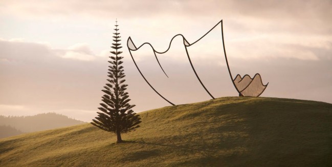
You are standing in a park in New Zealand. You look up at the top of a hill, and there, balanced on the ground, looking like it might catch a breeze and blow away, is a gigantic, rumpled piece of paper.

Except … one side of it, the underside, is … not there. You can see the sky, clouds, birds where there should be paper, so what is this?

As you approach, you realize it is made of metal. It’s a sculpture, made of welded and painted steel that looks like a two dimensional cartoon drawing of a three dimensional piece of paper … that is three dimensional if you get close, but looks two dimensional if you stay at the bottom of the hill…

[div class=attrib]Read the entire article and catch more images after the jump, and see more of Neil Dawson’s work here.[end-div]

[div class=attrib]Image: Horizons at Gibbs Farm by sculptor Neil Dawson, private art park, New Zealand. Courtesy of NPR / Gibbs Farm / Neil Dawson.[end-div]

London’s Telephone Box

London’s bright red telephone boxes (booths for our readers in the United States) are as iconic and recognizable as the Queen or Big Ben looming over the Houses of Parliament. Once as ubiquitous as the distinctive London Bobby’s (police officer) helmet, many of these red iron chambers have now been replaced by mobile phones. As a result BT has taken to auctioning some of its telephone boxes for a very good cause — ChildLine’s 25th anniversary. Though not before each is painted or re-imagined by an artist or designer. Check out our five favorites below, and see all of BT’s colorful “Artboxes”, here.

Accessorize

Proud of their London heritage, the ArtBox sports Accessorize’s trademark Union Jack design – customized and embellished in true Accessorize fashion.


Big Ben BT ArtBox

When Mandii first came to London from New Zealand, one of the first sights she wanted to see was Big Ben.


Peekaboo

Take a look and see what you find.

Evoking memories of the childhood game, hide and seek ‘Peekaboo’ invites you to consider issues of loneliness and neglect, and the role of the ‘finder’, which can be attributed to ChildLine.


Slip

A phonebox troubled by a landslide. Just incredible.


Londontotem

Loving the block colours and character designs. Their jolly spirit is infection, I mean, just look at their faces! The PhoneBox is like a mini street ornament in London isn’t it? A proper little totem pole in its own right!


[div class=attrib]Read more about BT’s Artbox project after the jump.[end-div]

[div class=attrib]Images courtesy of BT.[end-div]

Yayoi Kusama: Connecting All the Dots


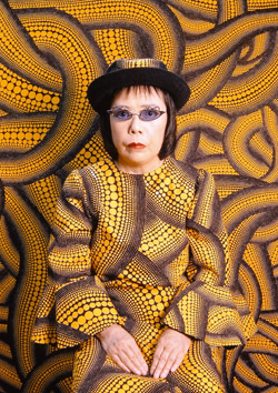
Yayoi Kusama, c1939                                                           Yayoi Kusama, 2000

The art establishment has Yayoi Kusama in its sights, again. Over the last 60 years Kusama has created and evolved a style that is all her own, best seen rather than discussed.

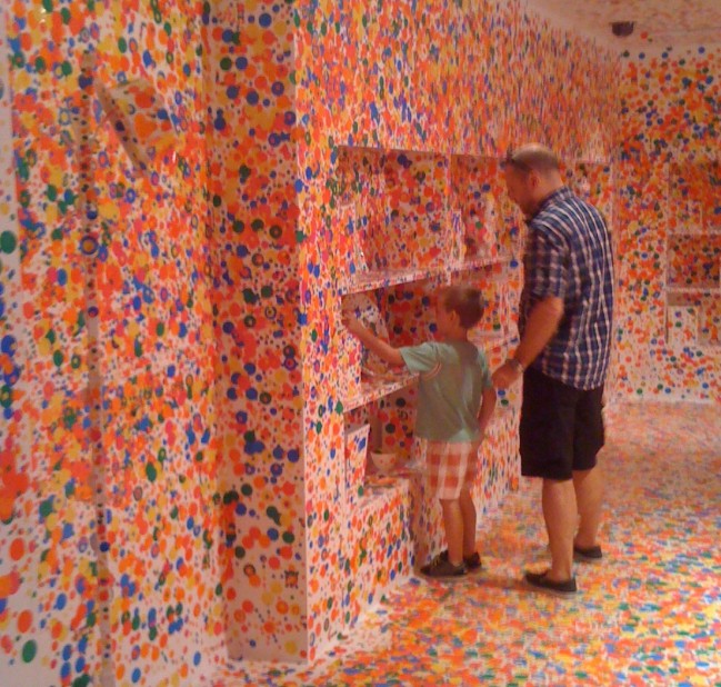
A recent exhibit of Kusama’s work in Brisbane featured “The obliteration room”. This wonderful, interactive exhibit was commissioned specifically for kids aged 1-101 years. The exhibit features a whitewashed room with simple furniture, fixtures and objects all in white. The interactive — and fun — part features sheets of bright and colorful sticky dots given to each visitor. Armed with these dots visitors are encouraged to place them anywhere and everywhere. Results below (including a few, select dots courtesy of theDiagonal’s editor).

For an interesting timeline of her work, courtesy of the Queensland Art Gallery in Brisbane, Australia follow this jump.

[div class=attrib]From the Telegraph:[end-div]

There are spots before my eyes. I am at the National Museum of Art in Osaka, Japan, where crowds are flocking to a big exhibition of Yayoi Kusama’s work. Dots are a recurring theme in her art, a visual representation of the hallucinations and anxiety attacks she has suffered from since childhood, so the show is dominated by giant red polka-dotted spheres, and a disorienting room in which huge white fibreglass tulips are covered in red dots – as are the white walls, ceiling and floor.

There’s one of her unsettling infinity mirror rooms, illuminated by seemingly endless floating dots of light, and a giant pumpkin crawling with a distinctive pattern of dots she calls Nerves. But unlike her retrospective at Tate Modern in London, which ran from February to June this year, the emphasis here is on her recent paintings: one long gallery is filled with monochrome works, another with paintings so bright they hurt the eyes. The same primitive, repetitive motifs occur in all of them: dots, eyes, faces, zigzag patterns, amoebic blobs and snakelike forms bristling with cilia.

The sheer number is overwhelming, dizzying. When she was based in New York, her phallus sculptures and naked hippie ‘happenings’ were seen as scandalous and shameful by many in her home country, but the scale of this show is an indication of her standing in Japan, where she is fast becoming a national treasure.

The next day, I am invited to Kusama’s studio in a backstreet of the Shinjuku area of Tokyo, a short walk away from her private room in Siewa Hospital, a psychiatric unit where she has been a voluntary in-patient since 1977 and which she rarely leaves, except to work. Her studio is a cramped concrete and glass building, with cardboard boxes of supplies stacked up to the ceiling, the walls covered in racks of finished paintings, works in progress and blank canvases, a grey paint-spattered industrial carpet and a scruffy old office chair at the table where Kusama works under a glaring neon strip light.

She usually paints in comfortable pyjamas, one of her assistants tells me, her grey hair pulled up into a bun, but today she is upstairs having her hair and make-up done, ready to greet her guests.

When she finally comes down in the lift, a frail but colourful 83-year-old resplendent in a red wig and polka-dot ensemble, pushed in a polka-dotted wheelchair, she asks an assistant to show us some press cuttings of the Tate show, especially one from a paper from Matsumoto City, where she grew up. There’s something touching about this need to prove herself, but it’s also confusing – akin to J K Rowling showing off a review in The Gloucestershire Echo to verify that she is a published author.

Talking to Kusama can be a surreal experience. She is easily distracted, and although she lived in America for 20 years, she now speaks no English. She is surrounded by a team of assistants who translate for her, addressing her with respect as ‘sensei’ (‘master’ or ‘teacher’), and with whom she often seems to have long discussions before answering even the blandest questions. It’s hard to know what is being lost in translation, and what is down to the vagaries of age and health. But occasionally a question will engage her, and you’ll get a brief but fierce flash of the intelligence and focus she has so clearly poured into her work over the years.

[div class=attrib]Read the entire article after the jump.[end-div]

[div class=attrib]Images: Yayoi Kusama, 1939 / Image courtesy: Ota Fine Arts, Tokyo / © Yayoi Kusama, Yayoi Kusama Studio Inc; Kusama, 2000 / Image courtesy: Ota Fine Arts, Tokyo / © Yayoi Kusama, Yayoi Kusama Studio Inc; theDiagonal / Queensland Art Gallery.[end-div]

Famous Artworks Inspired by Other Famous Works

The Garden of Earthly Delights. Hieronymous Bosch.

The Tilled Field. Joan Miró.

[div class=attrib]From Flavorwire:[end-div]

We tend to think of appropriation as a postmodern thing, with artists in all media drawing on, referring to, and mashing up the most influential works of the past. But we forget that this has been happening for centuries — millennia, actually — as Renaissance painters paid tribute to Greek art, ideas circulated within the 19th-century French art scene, and Dada hijacked the course of art history, mocking and inverting everything that came before it. After the jump, we round up some of the best, most famous, and all-around strangest artworks inspired by other artworks. Some are homages, some are parodies, some are responses, and a few seem to function as all three.

Joan Miró’s The Tilled Field, inspired by Hieronymous Bosch’s The Garden of Earthly Delights

The resemblance between Joan Miró’s Surrealist painting and Bosch’s Early Netherlander triptych may not be as clear as the parallels between some of the other works on this list, but when you know what to look for, the resemblance is certainly there. Besides the colors, which do echo The Garden of Earthly Delights, Miró placed in his painting many objects that appear in Bosch’s — crudely sexualized figures, disembodied ears, flocks of birds. Although the styles are different, both have the same busy, chaotic energy.

[div class=attrib]More from this top 10 list after the jump.[end-div]

First Artists: Neanderthals or Homo Sapiens?

The recent finding in a Spanish cave of a painted “red dot” dating from around 40,800 years ago suggests that our Neanderthal cousins may have beaten our species to claim the prize of “first artist”. Yet, evidence remains scant, and even if this were proven to be the case, we Homo sapiens can certainly lay claim to taking it beyond a “red dot” and making art our very own (and much else too.)
[div class=attrib]From the Guardian:[end-div]
Why do Neanderthals so fascinate Homo sapiens? And why are we so keen to exaggerate their virtues?

It is political correctness gone prehistoric. At every opportunity, people rush to attribute “human” virtues to this extinct human-like species. The latest generosity is to credit them with the first true art.

A recent redating of cave art in Spain has revealed the oldest paintings in Europe. A red dot in the cave El Castillo has now been dated at 40,800 years ago – considerably older than the cave art of Chauvet in France and contemporary with the arrival of the very first “modern humans”, Homo sapiens, in Europe.

This raises two possibilities, point out the researchers. Either the new humans from Africa started painting in caves the moment they entered Europe, or painting was already being done by the Neanderthals who were at that moment the most numerous relatives of modern humans on the European continent. One expert confesses to a “hunch” – which he acknowledges cannot be proven as things stand – that Neanderthals were painters.

That hunch goes against the weight of the existing evidence. Of course that hasn’t stopped it dominating all reports of the story: as far as media impressions go, the Neanderthals were now officially the first artists. Yet nothing of the sort has been proven, and plenty of evidence suggests that the traditional view is still far more likely.

In this view, the precocious development of art in ice age Europe marks out the first appearance of modern human consciousness, the intellectual birth of our species, the hand of Homo sapiens making its mark.

One crucial piece of evidence of where art came from is a piece of red ochre, engraved with abstract lines, that was discovered a decade ago in Blombos cave in South Africa. It is at least 70,000 years old and the oldest unmistakable artwork ever found. It is also a tool to make more art: ochre was great for making red marks on stone. It comes from Africa, where modern humans evolved, and reveals that when Homo sapiens made the move into Europe, our species could already draw on a long legacy of drawing and engraving. In fact, the latest finds at Blombos include a complete painting kit.

In other words, what is so surprising about the idea that Homo sapiens started to apply these skills immediately on discovering the caves of ice age Europe? It has to be more likely, on the face of it, than assuming these early Spanish images are by Neanderthals in the absence of any other solid evidence of paintings by them.

For, moving forward a few thousand years, the paintings of Chauvet and other French caves are certainly by us, Homo sapiens. And they remind us why this first art is so exciting and important: modern humans did not just do dots and handprints but magnificent, realistic portraits of animals. Their art is so superb in quality that it proves the existence of a higher mind, the capacity to create civilisation.

Is it possible that Neanderthals also used pigment to colour walls and also had the mental capacity to invent art? Of course it is, but the evidence at the moment still massively suggests art is a uniquely human achievement, unique, that is, to us – and fundamental to who we are.

[div class=attrib]Read the entire article after the jump.[end-div]

[div class=attrib]Image: A hand stencil in El Castillo cave, Spain, has been dated to earlier than 37,300 years ago and a red dot to earlier than 40,600 years ago, making them the oldest cave paintings in Europe. Courtesy of New Scientist / Pedro Saura.[end-div]

Burning Man as Counterculture? Think Again

Fascinating insight into the Burning Man festival courtesy of co-founder, Larry Harvey. It may be more like Wall Street than Haight-Ashbury.

[div class=attrib]From Washington Post:[end-div]

Go to Burning Man, and you’ll find everything from a thunderdome battle between a couple in tiger-striped bodypaint to a man dressed as a gigantic blueberry muffin on wheels. But underneath it all, says the festival’s co-founder, Larry Harvey, is “old-fashioned capitalism.”

There’s not a corporate logo in sight at the countercultural arts festival, and nothing is for sale but ice and coffee. But at its core, Harvey believes that Burning Man hews closely to the true spirit of a free-enterprise democracy: Ingenuity is celebrated, autonomy is affirmed, and self-reliance is expected. “If you’re talking about old-fashioned, Main Street Republicanism, we could be the poster child,” says Harvey, who hastens to add that the festival is non-ideological — and doesn’t anticipate being in GOP campaign ads anytime soon.

For more than two decades, the festival has funded itself entirely through donations and ticket sales — which now go up to $300 a pop — and it’s almost never gone in the red. And on the dry, barren plains of the Nevada desert where Burning Man materializes for a week each summer, you’re judged by what you do — your art, costumes and participation in a community that expects everyone to contribute in some form and frowns upon those who’ve come simply to gawk or mooch off others.

That’s part of the message that Harvey and his colleagues have brought to Washington this week, in his meetings with congressional staffers and the Interior Department to discuss the future of Burning Man. In fact, the festival is already a known quantity on the Hill: Harvey and his colleagues have been coming to Washington for years to explain the festival to policymakers, in least part because Burning Man takes place on public land that’s managed by the Interior Department.

In fact, Burning Man’s current challenge stems come because it’s so immensely popular, growing beyond 50,000 participants since it started some 20 years ago. “We’re no longer so taxed in explaining that it’s not a hippie debauch,” Harvey tells me over sodas in downtown Washington. “The word has leaked out so well that everyone now wants to come.” In fact, the Interior Department’s Bureau of Land Management that oversees the Black Rock Desert recently put the festival on probation for exceeding the land’s permitted crowd limits — a decision that organizers are now appealing.

Harvey now hopes to direct the enormous passion that Burning Man has stoked in its devotees over the years outside of Nevada’s Black Rock Desert, in the U.S. and overseas — the primary focus of this week’s visit to Washington. Last year, Burning Man transitioned from a limited liability corporation into a 501(c)3 nonprofit, which organizers believed was a better way to support their activities — not just for the festival, but for outside projects and collaborations in what festival-goers often refer to as “the default world.”

These days, Harvey — now in his mid-60s, dressed in a gray cowboy hat, silver western shirt, and aviator sunglasses — is just as likely to reference Richard Florida as the beatniks he once met on Haight Street. Most recently, he’s been talking with Tony Hsieh, the CEO of Zappos, who shares his vision of revitalizing Las Vegas, one of the cities hardest hit by the recent housing bust. “Urban renewal? We’re qualified. We’ve built up and torn down cities for 20 years,” says Harvey. “Cities everywhere are calling for artists, and it’s a blank slate there, blocks and blocks. … We want to extend the civil experiment — to see if business and art can coincide and not maim one another.”

Harvey points out that there’s been long-standing ties between Burning Man artists and to some of the private sector’s most successful executives. Its arts foundation, which distributes grants for festival projects, has received backing from everyone from real-estate magnate Christopher Bently to Mark Pincus, head of online gaming giant Zynga, as the Wall Street Journal points out. “There are a fair number of billionaires” who come to the festival every year, says Harvey, adding that some of the art is privately funded as well. In this way, Burning Man is a microcosm of San Francisco itself, stripping the bohemian artists and the Silicon Valley entrepreneurs of their usual tribal markers on the blank slate of the Nevada desert. At Burning Man, “when someone asks, ‘what do you do?’ — they meant, what did you just do” that day, he explains.

It’s one of the many apparent contradictions at the core of the festival: Paired with the philosophy of “radical self-reliance” — one that demands that participants cart out all their own food, water and shelter into a dust-filled desert for a week — is the festival’s communitarian ethos. Burning Man celebrates a gift economy that inspires random acts of generosity, and volunteer “rangers” traverse the festival to aid those in trouble. The climactic burning of the festival’s iconic “man”— along with a wooden temple filled with notes and memorials — is a ritual of togetherness and belonging for many participants. At the same time, one of the festival’s mottos is, ‘You have a right to hurt yourself.’ It’s the opposite of a nanny state,” Harvey says, recounting the time a participant unsuccessfully tried to sue the festival: He had walked out onto the coals after the “man”was set on fire and, predictably, burned himself.

[div class=attrib]Read the entire article after the jump.[end-div]

[div class=attrib]Image courtesy of Jailbreak.[end-div]

I Scream, You Scream, We Should All Scream for The Scream

On May 2, 2012 The Scream sold at auction in New York for just under $120,000,000.

The Scream, actually one of 4 slightly different originals, painted by Edvard Munch, has become as iconic as the Apple or McDonalds corporate logo. And, that sums up the crass, financial madness that continues to envelop the art world, and indeed most of society.

[div class=attrib]More from Jonathan Jones on Art:[end-div]

I used to like The Scream. Its sky of blood and zombie despair seemed to say so much, so honestly. Munch is a poet in colours. His pictures portray moods, most of which are dark. But sometimes on a spring day on the banks of Oslofjord he can muster a bit of uneasy delight in the world. Right now, I would rather look at his painting Ashes, a portrayal of the aftermath of sex in a Norwegian wood, or Girls on a Pier, whose lyrical longing is fraught with loneliness, than at Munch’s most famous epitome of the modern condition.

The modern art market is becoming violent and destructive. It spoils what it sells and leaves nothing but ashes. The greatest works of art are churned through a sausage mill of celebrity and chatter and become, at the end of it all, just a price tag. The Scream has been too famous for too long: too famous for its own good. Its apotheosis by this auction of the only version in private hands turns the introspection of a man in the grip of terrible visions into a number: 120,000,000. Dollars, that is. It is no longer a great painting: it is an event in the madness of our time. As all the world screams at inequality and the tyranny of a finance-led model of capitalism that is failing to provide the general wellbeing that might justify its excesses, the 1% rub salt in the wound by turning profound insights into saleable playthings.

Disgust rises at the thought of that grotesque number, so gross and absurd that it destroys actual value. Art has become the meaningless totem of a world that no longer feels the emotions it was created to express. We can no longer create art like The Scream (the closest we can get is a diamond skull). But we are good at turning the profundities of the past into price tags.

Think about it. Munch’s Scream is an unadulterated vision of modern life as a shudder of despair. Pain vibrates across the entire surface of the painting like a pool of tears rippled by a cry. Munch’s world of poverty and illness, as Sue Prideaux makes clear in her devastating biography, more than justified such a scream. His other paintings, such as The Sick Child and Evening on Karl-Johan reveal his comprehensive unhappiness and alienation that reaches its purest lucidity in The Scream.

[div class=attrib]Read the entire article after the jump.[end-div]

[div class=attrib]Image: One of several versions of the painting “The Scream”. Painted in 1893, Edvard Munch. Courtesy of The National Gallery, Oslo, Norway.[end-div]

Before I Die…

Before I Die” is an interactive, public art project conceived by artist Candy Chang. The first installation was in New Orleans in February 2011, and has since grown to around 30 other cities across the United States, and 7 countries.

The premise is simple: install a blank billboard-sized chalkboard in a publicly accessible space, supply a bucket of chalk, write the prompt “Before I Die…” on the chalkboard, sit back and wait, watch people share their hopes and dreams.

So far the artist and her collaborators have noted over 25,000 responses. Of the responses, 15 percent want to travel to distant lands, 10 percent wish to reconnect with family and 1 percent want to write a book.

[div class=attrib]From the Washington  Post:[end-div]

Before they die, the citizens of Washington, D.C., would like to achieve things both monumental and minuscule. They want to eat delicious food, travel the globe and — naturally — effect political change. They want to see the Earth from the Moon. They want to meet God.

They may have carried these aspirations in their hearts and heads their whole lives, but until a chalkboard sprang up at 14th and Q streets NW, they may have never verbalized them. On the construction barrier enveloping a crumbling old laundromat in the midst of its transformation into an upscale French bistro, the billboard-size chalkboard offers baskets of chalk and a prompt: “Before I die .?.?.”

The project was conceived by artist Candy Chang, a 2011 TED fellow who created the first “Before I Die” public art installation last February in a city that has contemplated its own mortality: New Orleans. On the side of an abandoned building, Chang erected the chalkboard to help residents “remember what is important to them,” she wrote on her Web site. She let the responses — funny, poignant, morbid — roll in. “Before I Die” migrated to other cities, and with the help of other artists who borrowed her template, it has recorded the bucket-list dreams of people in more than 30 locations. The District’s arrived in Logan Circle early Sunday morning.

Chang analyzes the responses on each wall; most involve travel, she says. But in a well-traveled city like Washington, many of the hopes on the board here address politics and power. Before they die, Washingtonians would like to “Liberate Palestine,” “Be a general (Hooah!),” “Be chief of staff,” “See a transgender president,” “[Have] access to reproductive health care without stigma.” Chang also notes that the D.C. wall is more international than others she’s seen, with responses in at least seven languages.

[div class=attrib]Read the entire article after the jump.[end-div]

[div class=attrib]Image: Crystal Hamling, 27, adds her thoughts to the “Before I Die…” art wall at 14th and Q streets NW. She wrote “Make people feel loved.” Courtesy of Katherine Frey / Washington Post.[end-div]

Painting the Light: The Life and Death of Thomas Kinkade

You’ve probably seen a Kinkade painting somewhere — think cute cottage, meandering stream, misty clouds, soft focus and warm light.

According to Thomas Kinkade’s company one of his cozy, kitschy paintings (actually a photographic reproduction) could be found in one of every 20 homes in the United States. Kinkade died on April 6, 2012. With his passing, scholars of the art market are now analyzing what he left behind.

[div class=attrib]From the Guardian:[end-div]
In death, the man who at his peak claimed to be the world’s most successful living artist perhaps achieved the sort of art-world excess he craved.

On Tuesday, the coroner’s office in Santa Clara, California, announced that the death of Thomas Kinkade, the Painter of Light™, purveyor of kitsch prints to the masses, was caused by an accidental overdose of alcohol and Valium. For good measure, a legal scrap has emerged between Kinkade’s ex-wife (and trustee of his estate) and his girlfriend.

Who could have imagined that behind so many contented visions of peace, harmony and nauseating goodness lay just another story of deception, disappointment and depravity, fuelled by those ever-ready stooges, Valium and alcohol?

Kinkade was a self-made phenomenon, with his prints (according to his company) hanging in one in 20 American homes. At his height, in 2001, Kinkade generated $130m (£81m) in sales. Kinkade’s twee paintings of cod-traditional cottages, lighthouses, gardens, gazebos and gates sold by the million through a network of Thomas Kinkade galleries, owned by his company, and through a parallel franchise operation. At their peak (between 1995 and 2005) there were 350 Kinkade franchises across the US, with the bulk in his home state of California. You would see them in roadside malls in small towns, twinkly lights adorning the windows, and in bright shopping centres, sandwiched between skatewear outlets and nail bars.

But these weren’t just galleries. They were the Thomas Kinkade experience – minus the alcohol and Valium, of course. Clients would be ushered into a climate-controlled viewing room to maximise the Kinkadeness of the whole place, and their experience. Some galleries offered “master highlighters”, trained by someone not far from the master himself, to add a hand-crafted splash of paint to the desired print and so make a truly unique piece of art, as opposed to the framed photographic print that was the standard fare.

The artistic credo was expressed best in the 2008 movie Thomas Kinkade’s Christmas Cottage. Peter O’Toole, earning a crust playing Kinkade’s artistic mentor, urges the young painter to “Paint the light, Thomas! Paint the light!”.

Kinkade’s art also went beyond galleries through the “Thomas Kinkade lifestyle brand”. This wasn’t just the usual art gallery giftshop schlock: Kinkade sealed a tie-in with La-Z-Boy furniture (home of the big butt recliner) for a Kinkade-inspired range of furniture. But arguably his only great artwork was “The Village, a Thomas Kinkade Community”, unveiled in 2001. A 101-home development in Vallejo, outside San Francisco, operating under the slogan: “Calm, not chaos. Peace, not pressure,” the village offers four house designs, each named after one of Kinkade’s daughters. Plans for further housing developments, alas, fell foul of the housing crisis.

[div class=attrib]Read the entire article after the jump.[end-div]

[div class=attrib]Image courtesy of Google search.[end-div]

Religious Art: From Faith or For Money?

Over the centuries many notable artists have painted religious scenes initiated or influenced by a very deep religious conviction; some painted to give voice to their own spirituality, others to mirror the faith of their time and community. However, others simply painted for fame or fortune, or both, or to remain in good stead with their wealthy patrons and landlords.

This bring us to another thoughtful article from Jonathan Jones over at the Guardian.

[div class=attrib]From the Guardian:[end-div]
“To paint the things of Christ you must live with Christ,” said the 15th-century artist Fra Angelico. He knew what he was talking about – he was a Dominican monk of such exemplary virtue that in 1982 he was officially beatified by Pope John Paul II. He was also a truly great religious artist whose frescoes at San Marco in Florence have influenced modern artists such as Mark Rothko. But is all holy art that holy?

From the dark ages to the end of the 17th century, the vast majority of artistic commissions in Europe were religious. Around 1700 this somehow stopped, at least when it came to art anyone cares to look at now. The great artists of the 18th century, and since, worked for secular patrons and markets. But in all those centuries when Christianity defined art, its genres, its settings, its content, was every painter and sculptor totally sincerely faithful in every work of art? Or were some of them just doing what they had to do and finding pleasure in the craft?

This question relates to another. What is it like to live in a world where everyone is religious? It is often said it was impossible to even imagine atheism in the middle ages and the Renaissance. This is so different from modern times that people do not even try to imagine it. Modern Christians blithely imagine a connection when actually a universal church meant a mentality so different from modern “faith” that today’s believers are as remote from it as today’s non-believers. Among other things it meant that while some artists “lived with Christ” and made art that searched their souls, others enjoyed the colours, the drama, the rich effects of religious paintings without thinking too deeply about the meaning.

Here are two contrasting examples from the National Gallery. Zurbarán’s painting of St Francis in Meditation (1635-9) is a harrowing and profoundly spiritual work. The face of a kneeling friar is barely glimpsed in a darkness that speaks of inner searching, of the long night of the soul. This is a true Christian masterpiece. But compare it to Carlo Crivelli’s painting The Annunciation (1486) in the same museum. Crivelli’s picture is a feast for the eye. Potted plants, a peacock, elaborately decorated classical buildings – and is that a gherkin just added in at the front of the scene? – add up to a materialistic cornucopia of visual interest. What is the religious function of such detail? Art historians, who sometimes seem to be high on piety, will point to the allegorical meaning of everyday objects in Renaissance art. But that’s all nonsense. I am not saying the allegories do not exist – I am saying they do not matter much to the artist, his original audience or us. In reality, Crivelli is enjoying himself, enjoying the world, and he paints religious scenes because that’s what he got paid to paint.

By smothering the art of the past in a piety that in some cases may be woefully misplaced, its guardians do it a disservice. Is Crivelli a Christian artist? Not in any sense that is meaningful today. He loves the things of this life, not the next.

[div class=attrib]Read the entire article after the jump.[end-div]

[div class=attrib]Annunciation with St Emidius, Crivelli Carlo, 1486. National Gallery, London. Courtesy of Wikipedia / National Gallery.[end-div]

Dissecting Artists

Jonathan Jones dissects artists’ fascination over the ages with anatomy and pickled organs in glass jars.

[div class=attrib]From the Guardian:[end-div]

From Hirst to Da Vinci, a shared obsession with dissection and the human body seems to connect exhibitions opening this spring.

Is it something to do with the Olympics? Athletics is physical, the logic might go, so let’s think about bodies… Anyway, a shared anatomical obsession connects exhibitions that open this week, and later in the spring. Damien Hirst’s debt to anatomy does not need labouring. But just as his specimens are unveiled at Tate Modern, everyone else seems to be opening their own cabinets of curiosities. At London’s Natural History Museum, dissected animals are going on view in an exhibition that brings the morbid spectacle – which in my childhood was simultaneously the horror and fascination of this museum – back into its largely flesh-free modern galleries.

If that were not enough, the Wellcome Collection invites you to take a good look at some brains in jars.

It is no surprise that art and science keep coming together on the anatomist’s table this spring, for anatomy has a venerable and intimate connection with the efforts of artists to depict life and death. In his series of popular prints The Four Stages of Cruelty, William Hogarth sees the public dissection of a murderer by cold-blooded anatomists as the ultimate cruelty. But many artists have been happy to watch or even wield a knife at such events.

In the 16th century, the first published modern study of the human body, by Vesalius, was illustrated by a pupil of Titian. In the 18th century, the British animal artist George Stubbs undertook his own dissections of a horse, and published the results. He is one of the greatest ever portrayers of equine majesty, and his study of the skeleton and muscles of the horse helped him to achieve this.

Clinical knowledge, to help them portray humans and animals correctly, is one reason artists have been drawn to anatomy. Another attraction is more metaphysical: to look inside a human body is to get an eerie sense of who we are, to probe the mystery of being. Rembrandt’s painting The Anatomy Lesson of Dr Nicolaes Tulp is not a scientific study but a poetic reverie on the fragility and wonder of life – glimpsed in a study of death. Does Hirst make it as an artist in this tradition?

[div class=attrib]Read more after the jump.[end-div]

[div class=attrib]Image courtesy of Google search.[end-div]

Spectres in the Urban Jungle

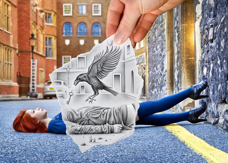
Following on from our recent article on contemporary artist Rob Mulholland, whose mirrored sculptures wander in a woodland in Scotland, comes Chinese artist Liu Bolin, with his series of “invisible” self-portraits.

Bolin paints himself into the background, and then disappears. Following many hours of meticulous preparation Bolin merges with his surroundings in a performance that makes U.S. military camouflage systems look almost amateurish.

Liu Bolin’s 4th solo exhibit is currently showing at Eli Klein gallery

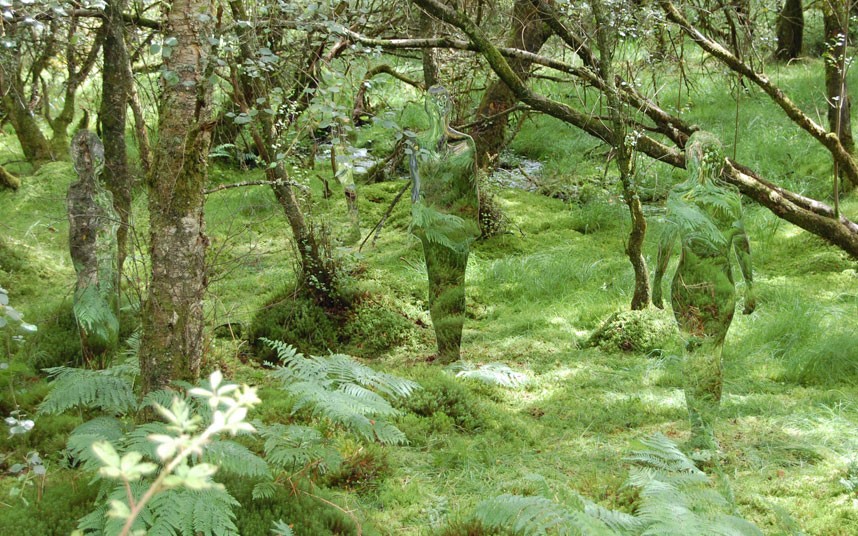
Spectres in the Forest

The best art is simple and evocative.

Like eerie imagined alien life forms mirrored sculptures meander through a woodland in Scotland. The life-size camouflaged figures are on display at the David Marshall Lodge near Aberfoyle, Scotland.

Contemporary artist Rob Mulholland designed the series of six mirrored sculptures, named Vestige, which are shaped from silhouettes of people he knows.

In Rob Mulholland’s own words:

The essence of who we are as individuals in relationship to others and our given environment forms a strong aspect of my artistic practise.

In Vestige I wanted to explore this relationship further by creating a group, a community within the protective elements of the woods, reflecting  the past inhabitants of the space.

The six male and female figures not only absorb their environment, they create a notion of non – space, a link with the past that forces us both as individuals and as a society to consider our relationship with our natural environment .

[div class=attrib]See more of Rob Mulholland’s art after the jump.[end-div]

A Hidden World Revealed Through Nine Eyes

Since mid-2007 the restless nine-eyed cameras of Google Street View have been snapping millions, if not billions, of images of the world’s streets.

The mobile cameras with 360 degree views, perched atop Google’s fleet of specially adapted vehicles, have already covered most of North America, Brazil, South Africa, Australia and large swathes of Europe. In roaming many of the world roadways Google’s cameras have also snapped numerous accidental images: people caught unaware, car accidents, odd views into nearby buildings, eerie landscapes.

Regardless of the privacy issues here, the photographs make for some fascinating in-the-moment art. A number of enterprising artists and photographers have included some of these esoteric Google Street View “out-takes” into their work. A selection from Jon Rafman below. See more of his and Google’s work here.


Pop art + Money = Mind Candy

[div class=attrib]From the Guardian:[end-div]

The first pop artists were serious people. The late Richard Hamilton was being double-edged and sceptical when he called a painting Hommage à Chrysler Corp. Far from emptily celebrating what Andy Warhol called “all the great modern things”, pop art in the 1950s and early 1960s took a quizzical, sideways look at what was still a very new world of consumer goods. Claes Oldenburg made floppy, saggy sculptures of stuff, which rendered the new look worn out. Warhol painted car crashes. These artists saw modern life in the same surreal and eerie way as the science fiction writer JG Ballard does in his stories and novels.

When, then, did pop art become mind candy, bubblegum, an uncritical adoration of bright lights and synthetic colours? Probably when money got involved, and Warhol was shot, never again to be as brave as he was in the 60s, or when Jeff Koons gave Reaganomics its art, or when Damien Hirst made his tenth million. Who knows? The moment when pop art sank from radical criticism to bland adulation is impossible to pinpoint.

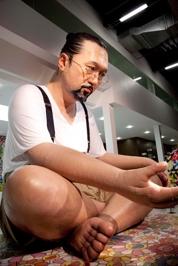
So here we are in Qatar, where today’s pop art guru Takashi Murakami has a new show. We’re not really there, of course, but do we need to be? Murakami is pop for the digital age, a designer of images that make more sense as screensavers than as any kind of high art. In Doha, the artist who celebrated a recent British show with a giveaway cardboard sculpture exhibits a six-metre balloon self-portrait and a 100-metre work inspired by the earthquake in Japan. This follows on from a 2010 exhibition in Versailles, no less. All over the world, in settings old and new, the bright and spectacular art of Murakami is as victorious as Twitter. It is art for computers: all stimuli, no soul.

[div class=attrib]Read the entire article here.[end-div]

[div class=attrib]Image: Takashi Murakami’s six-metre balloon self-portrait, part of the artist’s latest exhibition in Qatar. Courtesy of Chika Okazumi / Guardian.[end-div]

Oil, Art and the 0.0001 Percent

[div class=attrib]From Vanity Fair:[end-div]

The tiny, oil-rich nation of Qatar has purchased a Paul Cézanne painting, The Card Players, for more than $250 million. The deal, in a single stroke, sets the highest price ever paid for a work of art and upends the modern art market.

If the price seems insane, it may well be, since it more than doubles the current auction record for a work of art. And this is no epic van Gogh landscape or Vermeer portrait, but an angular, moody representation of two Aix-en-Provence peasants in a card game. But, for its $250 million, Qatar gets more than a post-Impressionist masterpiece; it wins entry into an exclusive club. There are four other Cézanne Card Players in the series; and they are in the collections of the Metropolitan Museum of Art, the Musée d’Orsay, the Courtauld, and the Barnes Foundation. For a nation in the midst of building a museum empire, it’s instant cred.

Is the painting, created at the cusp of the 20th century, worth it? Well, Cézanne inspired Cubism and presaged abstract art, and Picasso called him “the father of us all.” That said, “$250 million is a fortune,” notes Victor Wiener, the fine-art appraiser called in by Lloyd’s of London when Steve Wynn put his elbow through a Picasso, in 2006. “But you take any art-history course, and a Card Players is likely in it. It’s a major, major image.” For months, he said, “its sale has been rumored. Now, everyone will use this price as a point of departure: it changes the whole art-market structure.”

The Cézanne sale actually took place in 2011, and details of the secret deal are now coming out as a slew of V.I.P. collectors, curators, and dealers head to Qatar for the opening next week of a Takashi Murakami blockbuster that was recently on view in the Palace of Versailles. The nation, located on its own small jetty off the Arabian Peninsula, is a new destination on the art-world grand tour: current exhibitions include an 80-foot-high Richard Serra and a Louise Bourgeois retrospective (her bronze spider is crawling across the Doha Convention Center), and in March it hosts a Global Art Forum that attracts artists, curators, and patrons from museum groups worldwide.

[div class=attrib]Read the entire article here.[end-div]

[div class=attrib]Image: Card Players by Paul Cezanne. Courtesy of Vanity Fair.[end-div]

The Other Mona Lisa

[div class=attrib]From the Guardian:[end-div]

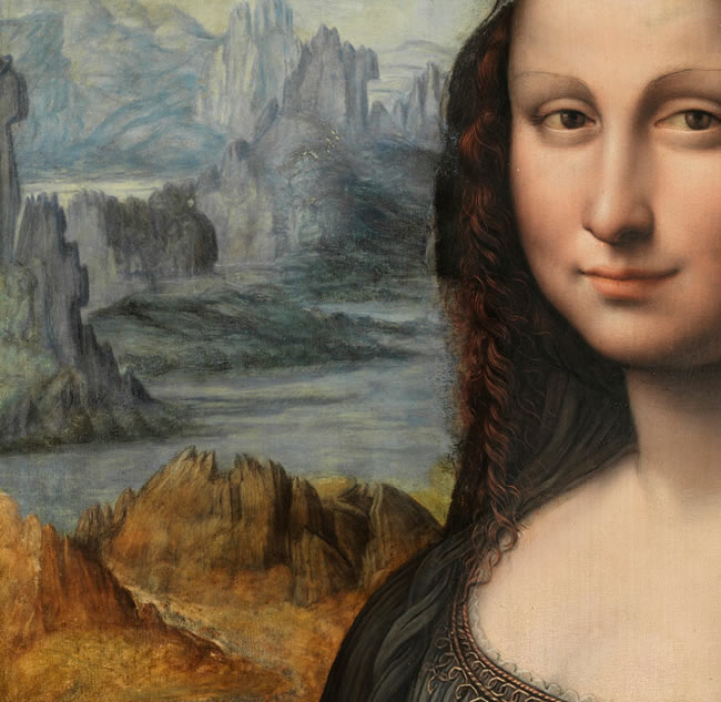
A contemporaneous copy of the world’s most famous painting has been sensationally discovered by conservators at the Prado in Madrid, allowing us to see the Mona Lisa as she would probably have looked at the time.

In art historical terms, the discovery is nothing short of remarkable. The Prado painting had long been thought to be one of dozens of surviving replicas of Leonardo’s masterpiece, made in the 16th and 17th centuries.

But, the Arts Newspaper reports, recent conservation reveals that the work was in fact painted by a pupil working alongside Leonardo.

The original painting hangs behind glass and with enormous security at the Louvre, a gallery it is unlikely to ever leave. There is also no prospect of it being cleaned in the forseeable future, meaning crowds view a work that, although undeniably beautiful, has several layers of old, cracked varnish.

This newly discovered work – found under black overpaint – allows the viewer to see a much fresher version of the captivating young woman, generally acknowledged to be Lisa Gherardini, the wife of the Florentine cloth merchant Francesco del Giocondo.

The Prado said the restoration had been carried out over the past few months in preparation for an exhibition at the Louvre in March.

[div class=attrib]Read more here.[end-div]

[div class=attrib]Image: Detail of the nearly conserved Leonardo da Vinci pupil’s take of the Mona Lisa. The Prado has yet to finish conservation work on the whole painting. Courtesy of Museo Nacional del Pradio / Guardian.[end-div]

Barcode as Art

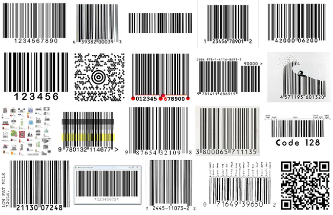
The ubiquitous and utilitarian barcode turns 60 years old. Now, it’s upstart and more fashionable sibling, the QR or quick response, code, seems to be stealing the show by finding its way from the product on the grocery store shelf to the world of art and design.

[div class=attrib]From the New York Times:[end-div]

It’s usually cause for celebration when a product turns 60. How could it have survived for so long, unless it is genuinely wanted or needed, or maybe both?

One of the sexagenarians this year, the bar code, has more reasons than most to celebrate. Having been a familiar part of daily life for decades, those black vertical lines have taken on a new role of telling ethically aware consumers whether their prospective purchases are ecologically and socially responsible. Not bad for a 60-year-old.

But a new rival has surfaced. A younger version of the bar code, the QR, or “Quick Response” code, threatens to become as ubiquitous as the original, and is usurping some of its functions. Both symbols are black and white, geometric in style and rectangular in shape, but there the similarities end, because each one has a dramatically different impact on the visual landscape, aesthetically and symbolically.

First, the bar code. The idea of embedding information about a product, including its price, in a visual code that could be decrypted quickly and accurately at supermarket checkouts was hatched in the late 1940s by Bernard Silver and Norman Joseph Woodland, graduate students at the Drexel Institute of Technology in Philadelphia. Their idea was that retailers would benefit from speeding up the checkout process, enabling them to employ fewer staff, and from reducing the expense and inconvenience caused when employees keyed in the wrong prices.

At 8.01 a.m. on June 26, 1974, a packet of Wrigley’s Juicy Fruit chewing gum was sold for 67 cents at a Marsh Supermarket in Troy, Ohio — the first commercial transaction to use a bar code. More than five billion bar-coded products are now scanned at checkouts worldwide every day. Some of those codes will also have been vetted on the cellphones of shoppers who wanted to check the product’s impact on their health and the environment, and the ethical credentials of the manufacturer. They do so by photographing the bar code with their phones and using an application to access information about the product on ethical rating Web sites like GoodGuide.

As for the QR code, it was developed in the mid-1990s by the Japanese carmaker Toyota to track components during the manufacturing process. A mosaic of tiny black squares on a white background, the QR code has greater storage capacity than the original bar code. Soon, Japanese cellphone makers were adding QR readers to camera phones, and people were using them to download text, films and Web links from QR codes on magazines, newspapers, billboards and packaging. The mosaic codes then appeared in other countries and are now common all over the world. Anyone who has downloaded a QR reading application can decrypt them with a camera phone.


[div class=attrib]Read the entire article here.[end-div]

[div class=attrib]Image courtesy of Google search.[end-div]

Shrink-Wrapped Couples

Once in a while a photographer comes along with a simple yet thoroughly new perspective. Japanese artist Photographer Hal fits this description. His images of young Japanese in a variety of contorted and enclosed situations are sometimes funny and disturbing, but certainly different and provocative.

[div class=attrib]From flavorwire:[end-div]

Japanese artist Photographer Hal has stuffed club kids into bathtubs and other cramped spaces in his work before, but this time he’s chosen to shrink-wrap them like living dolls squirming under plastic. With some nude, and some dressed in candy-colored attire, Hal covers his models with a plastic sheeting that he vacuums the air from in order to distort their features and bond them together. It only takes a few seconds for him to snap several images before releasing them, and the results are humorous and somewhat grotesque.

[div class=attrib]See more of Photographer Hal’s work here.[end-div]

Everyone’s an Artist, Designer, Critic. But Curator?

Digital cameras and smartphones have enabled their users to become photographers. Affordable composition and editing tools have made us all designers and editors. Social media have enabled, encouraged and sometimes rewarded us for posting content, reviews and opinions for everything under the sun. So, now we are all critics. So, now are we all curators as well?

[div class=attrib]From dis:[end-div]

As far as word trends go, the word curate still exists in a somewhat rarified air. One can use curate knowingly with tongue in cheek: “Let’s curate our spice rack!” Or, more commonly and less nerdily, in the service of specialized artisanal commerce: “curating food stands” of the Brooklyn Flea swap meet, or a site that lets women curate their own clothing store from featured brands, earning 10% on any sales from their page. Curate used pejoratively indicates The Man- “If The Huffington Post wants to curate Twitter…” [uh, users will be upset]. And then there is that other definition specific to the practice of art curating. In the past ten years, as curate has exploded in popular culture and as a consumer buzz-word, art curators have felt residual effects. Those who value curating as an actual practice are generally loathe to see it harnessed by commercial culture, and conversely, feel sheepish about some deep-set pretensions this move has brought front and center. Simultaneously, curate has become a lightning-rod in the art world, inspiring countless journal articles and colloquia in which academics and professionals discuss issues around curating with a certain amount of anxiety.

Everyone’s a critic but who’s a curator?
In current usage, curating as discipline, which involves assembling and arranging artworks, has been usurped by curating as a nebulous expression of taste, presumed to be inherent rather than learned. This presumption is of course steeped in its own mire of regionalism, class bias and aspirations towards whomever’s privileged lifestyle is currently on-trend or in power. Suffice it to say that taste is problematic. But that curating swung so easily towards taste, indicates that it wasn’t a very hard association to make.

To some extent taste has been wedded to curating since the latter’s inception. A close forebear of the modern curated exhibition was the Renaissance cabinet of curiosities. The practice of selecting finely crafted objects for display first appeared in the 15th century and extended for several centuries after. A gentleman’s cabinet of curiosities showcased treasures bought or collected during travel, and ranged culturally and from collector to collector according to his interests, from mythical?/biblical? relics to artworks to ancient and exotic artifacts. As a practice, this sort of acquisition existed separately from the tradition of patronage of a particular artist. (For a vivid and intricately rendered description of the motivations and mindset of the 18th century collector, which gives way after half the book to a tour-de-force historical novel and then finally, to a political manifesto by a thinly veiled stand-in for the author, see Susan Sontag’s weird and special novel The Volcano Lover.) In Europe and later the United States, these collections of curiosities would give rise to the culture of the museum. In an 1858 New York Times article, the sculptor Bartholomew was described as having held the position of Curator for the Wadsworth Gallery in Hartford, a post he soon abandoned to render marble busts. The Wadsworth, incidentally, was the first public art museum to emerge in the United States, and would anticipate the museum boom of the 20th century.

[div class=attrib]Read the entire article here.[end-div]

[div class=attrib]Image: Dean&Deluca. Courtesy of dis.[end-div]

Woman and Man, and Fish?

A widely held aphorism states that owners often look like their pets, or visa versa. So, might it apply to humans and fish? Well, Ted Sabarese a photographer based in New York provides an answer in a series of fascinating portraits.

[div class=attrib]From Kalliopi Monoyios over at Scientific American:[end-div]

I can’t say for certain whether New York based photographer Ted Sabarese had science or evolution in mind when he conceived of this series. But I’m almost glad he never responded to my follow-up questions about his inspiration behind these. Part of the fun of art is its mirror-like quality: everyone sees something different when faced with it because everyone brings a different set of experiences and expectations to the table. When I look at these I see equal parts “you are what you eat,” “your inner fish,” and “United Colors of Benetton.”

[div class=attrib]Read more of this article here.[end-div]

[div class=attrib]Discover more of Ted Sabarese’s work here.[end-div]