Tag Archives: beauty

UnDesign

The future of good design may actually lie in intentionally doing the wrong thing. While we are drawn to the beauty of symmetry — in faces, in objects — we are also drawn by the promise of imperfection.

From Wired:

In the late 1870s, Edgar Degas began work on what would become one of his most radical paintings, Jockeys Before the Race. Degas had been schooled in techniques of the neoclassicist and romanticist masters but had begun exploring subject matter beyond the portraits and historical events that were traditionally considered suitable for fine art, training his eye on café culture, common laborers, and—most famously—ballet dancers. But with Jockeys, Degas pushed past mild provocation. He broke some of the most established formulas of composition. The painting is technically exquisite, the horses vividly sculpted with confident brushstrokes, their musculature perfectly rendered. But while composing this beautifully balanced, impressionistically rendered image, Degas added a crucial, jarring element: a pole running vertically—and asymmetrically—in the immediate foreground, right through the head of one of the horses.

Degas wasn’t just “thinking outside of the box,” as the innovation cliché would have it. He wasn’t trying to overturn convention to find a more perfect solution. He was purposely creating something that wasn’t pleasing, intentionally doing the wrong thing. Naturally viewers were horrified. Jockeys was lampooned in the magazine Punch, derided as a “mistaken impression.” But over time, Degas’ transgression provided inspiration for other artists eager to find new ways to inject vitality and dramatic tension into work mired in convention. You can see its influence across art history, from Frederic Remington’s flouting of traditional compositional technique to the crackling photojournalism of Henri Cartier-Bresson.

Degas was engaged in a strategy that has shown up periodically for centuries across every artistic and creative field. Think of it as one step in a cycle: In the early stages, practitioners dedicate themselves to inventing and improving the rules—how to craft the most pleasing chord progression, the perfectly proportioned building, the most precisely rendered amalgamation of rhyme and meter. Over time, those rules become laws, and artists and designers dedicate themselves to excelling within these agreed-upon parameters, creating work of unparalleled refinement and sophistication—the Pantheon, the Sistine Chapel, the Goldberg Variations. But once a certain maturity has been reached, someone comes along who decides to take a different route. Instead of trying to create an ever more polished and perfect artifact, this rebel actively seeks out imperfection—sticking a pole in the middle of his painting, intentionally adding grungy feedback to a guitar solo, deliberately photographing unpleasant subjects. Eventually some of these creative breakthroughs end up becoming the foundation of a new set of aesthetic rules, and the cycle begins again.

DEGAS WASN’T JUST THINKING OUTSIDE THE BOX. HE WAS PURPOSELY CREATING SOMETHING THAT WASN’T PLEASING.

For the past 30 years, the field of technology design has been working its way through the first two stages of this cycle, an industry-wide march toward more seamless experiences, more delightful products, more leverage over the world around us. Look at our computers: beige and boxy desktop machines gave way to bright and colorful iMacs, which gave way to sleek and sexy laptops, which gave way to addictively touchable smartphones. It’s hard not to look back at this timeline and see it as a great story of human progress, a joint effort to experiment and learn and figure out the path toward a more refined and universally pleasing design.

All of this has resulted in a world where beautifully constructed tech is more powerful and more accessible than ever before. It is also more consistent. That’s why all smartphones now look basically the same—gleaming black glass with handsomely cambered edges. Google, Apple, and Microsoft all use clean, sans-serif typefaces in their respective software. After years of experimentation, we have figured out what people like and settled on some rules.

But there’s a downside to all this consensus—it can get boring. From smartphones to operating systems to web page design, it can start to feel like the truly transformational moments have come and gone, replaced by incremental updates that make our devices and interactions faster and better.

This brings us to an important and exciting moment in the design of our technologies. We have figured out the rules of creating sleek sophistication. We know, more or less, how to get it right. Now, we need a shift in perspective that allows us to move forward. We need a pole right through a horse’s head. We need to enter the third stage of this cycle. It’s time to stop figuring out how to do things the right way, and start getting it wrong.

In late 2006, when I was creative director here at WIRED, I was working on the design of a cover featuring John Hodgman. We were far along in the process—Hodgman was styled and photographed, the cover lines written, our fonts selected, the layout firmed up. I had been aiming for a timeless design with a handsome monochromatic color palette, a cover that evoked a 1960s jet-set vibe. When I presented my finished design, WIRED’s editor at the time, Chris Anderson, complained that the cover was too drab. He uttered the prescriptive phrase all graphic designers hate hearing: “Can’t you just add more colors?”

I demurred. I felt the cover was absolutely perfect. But Chris did not, and so, in a spasm of designerly “fuck you,” I drew a small rectangle into my design, a little stripe coming off from the left side of the page, rudely breaking my pristine geometries. As if that weren’t enough, I filled it with the ugliest hue I could find: neon orange— Pantone 811, to be precise. My perfect cover was now ruined!

By the time I came to my senses a couple of weeks later, it was too late. The cover had already been sent to the printer. My anger morphed into regret. To the untrained eye, that little box might not seem so offensive, but I felt that I had betrayed one of the most crucial lessons I learned in design school—that every graphic element should serve a recognizable function. This stray dash of color was careless at best, a postmodernist deviation with no real purpose or value. It confused my colleagues and detracted from the cover’s clarity, unnecessarily making the reader more conscious of the design.

But you know what? I actually came to like that crass little neon orange bar. I ended up including a version of it on the next month’s cover, and again the month after that. It added something, even though I couldn’t explain what it was. I began referring to this idea—intentionally making “bad” design choices—as Wrong Theory, and I started applying it in little ways to all of WIRED’s pages. Pictures that were supposed to run large, I made small. Where type was supposed to run around graphics, I overlapped the two. Headlines are supposed to come at the beginning of stories? I put them at the end. I would even force our designers to ruin each other’s “perfect” layouts.

At the time, this represented a major creative breakthrough for me—the idea that intentional wrongness could yield strangely pleasing results. Of course I was familiar with the idea of rule-breaking innovation—that each generation reacts against the one that came before it, starting revolutions, turning its back on tired conventions. But this was different. I wasn’t just throwing out the rulebook and starting from scratch. I was following the rules, then selectively breaking one or two for maximum impact.

Read the entire article here.

Beauty Of and In Numbers

golden-ratio

Mathematics seems to explain and underlie much of our modern world: manufacturing, exploration, transportation, logistics, healthcare, technology — all depend on numbers in one form or another. So it should come as no surprise that there are mathematical formulae that describe our notions of beauty. This would seem to be counter-intuitive since beauty is a very subjective experience for all of us — one person’s colorful, blotted mess is another’s Jackson Pollock masterpiece. Yet, mathematicians have known for some time that there is a certain composition of sizes that are more frequently characterized as beautiful than others. Known as the golden ratio, architects, designers and artists have long exploited this mathematical formula to render their works more appealing.

From Wired:

Mathematical concepts can be difficult to grasp, but given the right context they can help explain some of the world’s biggest mysteries. For instance, what is it about a sunflower that makes it so pleasing to look at? Or why do I find the cereal box-shaped United Nations building in New York City to be so captivating?

Beauty may very well be subjective, but there’s thought to be mathematical reasoning behind why we’re attracted to certain shapes and objects. Called the golden ratio, this theory states there’s a recurring proportion of arrangement that lends certain things their beauty. Represented as an equation: a/b = (a+b)/a, the golden ratio is all around us—conical sea shells, human faces, flower petals, buildings—we just don’t always know we’re looking at it. In Golden Meaning, a new book from London publisher GraphicDesign&, 55 designers aim to demystify the golden ratio using clever illustrations and smart graphic design.

GraphicDesign& founders Lucienne Roberts and Rebecca Wright partnered up with math evangelist Alex Bellos to develop the book, with the main goal of making math accessible through design. “We want this to be a useful tool to demonstrate something that often makes people anxious,” explains Roberts. “We hope it’s as interesting to people who are interested in math as it is to the people who are interested in the visual.”

Each designer came at the problem from a different angle, but in order to appreciate the cleverness found in the book, it’s important to have a little background on the golden mean. Bellos uses this line to illustrate the concept at its most basic.

n Golden Meaning he writes: “The line is separated into two sections in such a way that the ratio of the whole line to the larger section is equal to the ratio of the larger section to the smaller section.” This ratio ends up being 1.618.

Salvador Dali and Le Corbusier have used the golden mean as a guiding principle in their work, the Taj Mahal was designed with it in mind, and it’s thought that many of the faces of attractive people follow these proportions. The golden ratio then is essentially a formula for beauty.

With this in mind, Robert and Wright gave designers a simple brief: To explore, explain and communicate the golden ratio however they see fit. There’s a recipe for golden bars that requires bakers to parcel out ingredients based the ratio instead of exact measurements, an illustration that shows a bottle of wine being poured into glasses using the ratio. The book itself is actually a golden rectangle. “You get it much more than looking at an equation,” says Roberts.

A particular favorite shows two side-by-side images of British designer Oli Kellett. On the left is his normal face, on the right is the same face after he rearranged his features in accordance to the golden ratio. So is he really more beautiful after his mathematical surgery? “We liked him as he is,” says Roberts. “In a way it disproves the theory.”

Read the entire article here.

Image: Several examples of the golden ratio at work, from the book Golden Meaning by GraphicDesign&. Courtesy of GraphicDesign&.

If You Can Only Visit One Place…

scotland-2014

Travel editors at the New York Times have compiled their annual globe-spanning list of places to visit. As eclectic as ever, the list includes the hinderlands of Iceland, a cultural tour of Indianapolis, unspoilt (at the moment) beaches of Uruguay, a trip down the Mekong river, and a pub crawl across the hills and dales of Yorkshire. All fascinating. Our favorites are Aspen during the off-season, a resurgent Athens, the highlands of Scotland and the beautiful Seychelle Islands.

Read the entire article and see all the glorious images here.

Image: Hikers pause in the Loch Lomond area. Courtesy of Paul Tomkins/Scottish Viewpoint, New York Times.

Mind the Gap

The gap in question is not the infamous gap between subway platform and train, but the so-called “thigh gap”. Courtesy of the twittersphere, internet trolls and the substance-lacking 24hr news media, the thigh gap has now become the hot topic du jour.

One wonders when the conversation will move to a more significant gap — the void between the ears of a significant number of image-obsessed humans.

From the Guardian:

She may have modelled for Ralph Lauren and appeared on the cover of Vogue Italia, but when a photo of Robyn Lawley wearing a corset appeared on Facebook the responses were far from complimentary. “Pig”, “hefty” and “too fat” were some of the ways in which commenters described the 24-year-old. Her crime? Her thighs were touching. Lawley had failed to achieve a “thigh gap”.

The model, who has her own swimwear line and has won numerous awards for her work, responded vehemently below the line: “You sit behind a computer screen objectifying my body, judging it and insulting it, without even knowing it.”

She also went on to pen a thoughtful rallying cry for the Daily Beast last week against those who attacked her, saying their words were “just another tool of manipulation that other people are trying to use to keep me from loving my body”.

The response to her article was electric and Lawley was invited to speak about thigh-gap prejudice on America’s NBC Today. In a careful and downbeat tone, she explained: “It’s basically when your upper middle thighs do not touch when you’re standing with your legs together.”

The Urban Dictionary website describes it in no uncertain terms as “the gap between a woman’s thighs directly below the vagina, often diamond shaped when the thighs are together.”

The thigh gap is not a new concept to Lawley, who at 6ft 2in and 12 stone is classified as a “plus-size” model, and who remembers learning about it aged 12. But the growth of Instagram and other social media has allowed the concept of a thigh gap to enter the public consciousness and become an alarming, and exasperating, new trend among girls and women.

A typical example is a Twitter account devoted solely to Cara Delevingne’s thigh gap, which the model initially described as “pretty funny” but also “quite crazy”.

Selfies commonly show one part of a person’s anatomy, a way of compartmentalising body sections to show them in the best light, and the thigh gap is particularly popular. What was once a standard barometer of thinness among models is now apparently sought after by a wider public.

The thigh gap has its own hashtag on Twitter, under which users post pictures of non-touching thighs for inspiration, and numerous dedicated blogs. The images posted mirror the ubiquitous images of young, slim models and pop stars in shorts, often at festivals such as Glastonbury or Coachella, that have flooded the mainstream media in recent years, bringing with them the idea that skinniness, glamour and fun are intertwined.

There is even a “how to” page on the internet, although worshippers of thin may be disappointed to find that the first step is to “understand that a thigh gap is not physically possible for most people”.

Naomi Shimada began modelling at 13, but had to quit the industry when her weight changed. “I was what they call a straight-size model – a size 6 – when I started, which is normal for a very young girl.

“But as I got older my body didn’t stay like that, because, guess what, that doesn’t happen to people! So I took a break and went back in as a size 14 and now work as a plus-size model.”

Shimada is unequivocal about where the obsession with the thigh gap comes from. “It’s not a new trend: it’s been around for years. It comes partly from a fashion industry that won’t acknowledge that there are different ways a woman should look, and it comes from the pro-anorexic community. It’s a path to an eating disorder.”

Caryn Franklin, the former Clothes Show presenter who co-founded the diversity campaign All Walks Beyond the Catwalk, is quite appalled. “We now have a culture that convinces women to see themselves as an exterior only, and evaluating and measuring the component parts of their bodies is one of the symptoms.

“Young women do not have enough female role models showing them action or intellect. In their place are scantily clad celebrities. Sadly, young women are wrongly looking to fashion for some kind of guidance on what it is to be female.”

Franklin, who was fashion editor of style magazine i-D in the 1980s, says it hasn’t always been this way: “I had spent my teen years listening to Germaine Greer and Susie Orbach talking about female intellect.

“When I came out of college I knew I had a contribution to make that wasn’t based on my appearance. I then landed in a fashion culture that was busy celebrating diversity. There was no media saying ‘get the look’ and pointing to celebrities as style leaders because there wasn’t a homogenised fashion look, and there weren’t digital platforms that meant that I was exposed to more images of unachievable beauty.”

Asked whether the fixation on skinny thighs is a way of forcing women’s bodies to look pre-pubescent, Franklin says: “This culture has encouraged women to infantilise themselves. When you are so fixated on approval for what you look like, you are a little girl: you haven’t grown up.”

For many, the emergence of the thigh gap trend is baffling.

“About four hours ago, as far as I was concerned a ‘thigh gap’ was something anyone could have if they stood up and placed their feet wider than hip distance apart,” wrote Vice journalist Bertie Brandes when she discovered the phenomenon.

“A thigh gap is actually the hollow cavity which appears between the tops of your legs when you stand with your feet together. It also means that your body is underweight.”

Other bloggers have responded with a sense of the absurd; feminist blog Smells Like Girl Riot recently posted a diagram of a skeleton to show why the ischium and the pubis cannot be altered through diet alone.

Shimada, now 26, is about to launch her own fanzine, A-Genda, which aims to use a diverse range of models to show young women “something healthy to aspire to”.

“When I was a really young model there were girls who used to talk about the pencil test, which is when you measure the depth of your waist against the length of a pencil, and back dimples, when the lack of fat would create concave areas of skin,” she says. “But I don’t even think this kind of thing is limited to the fashion industry any more. It’s all a big mess. But we all have to play a role in making it better.”

Franklin also wonders: “When did everyone become so narcissistic? What happened to intellect? My sense of myself was not informed by a very shallow patriarchal media that prioritised the objectification of women – it was informed by feminism.”

Lawley signed off her call to arms with a similar acknowledgement of the potential power of women’s bodies.

“I’ve been trying to do just the opposite: I want my thighs to be bigger and stronger. I want to run faster and swim longer. I suppose we all just want different things, but women have enough pressure as it is without the added burden of achieving a ‘thigh gap’.

“The last thing I would want for my future daughter would be to starve herself because she thought a ‘thigh gap’ was necessary to be deemed attractive.”

Read the entire article here.

Image: Model Robyn Lawley. Courtesy of Jon Gorrigan / Observer.

Our Beautiful Galaxy

We should post stunning images of the night sky like these more often. For most of us, unfortunately, light pollution from our surroundings hides beautiful vistas like these from the naked eye.

Image: Receiving the Galatic Beam. The Milky Way appears to line up with the giant 64-m dish of the radio telescope at Parkes Observatory in Australia. As can be seen from the artificial lights around the telescope, light pollution is not a problem for radio astronomers. Radio and microwave interference is a big issue however, as it masks the faint natural emissions from distant objects in space. For this reason many radio observatories ban mobile phone use on their premises. Courtesy: Wayne England / The Royal Observatory Greenwich / Telegraph.

Places to Visit Before World’s End

In case you missed all the apocalyptic hoopla, the world is supposed to end today. Now, if you’re reading this, you obviously still have a little time, since the Mayans apparently did not specify a precise time for prophesied end. So, we highly recommend that you visit one or more of these beautiful places, immediately. Of course, if we’re all still here tomorrow, you will have some extra time to take in these breathtaking sights before the next planned doomsday.

[div class=attrib]Check out the top 100 places according to the Telegraph after the jump.[end-div]

[div class=attrib]Image: Lapland for the northern lights. Courtesy of ALAMY / Telegraph.[end-div]

The Beauty of Ugliness

The endless pursuit of beauty in human affairs probably pre-dates our historical record. We certainly know that ancient Egyptians used cosmetics believing them to offer magical and religious powers, in addition to aesthetic value.

Yet paradoxically beauty it is rather subjective and often fleeting. The French singer, songwriter, composer and bon viveur once said that, “ugliness is superior to beauty because it lasts longer”. Author Stephen Bayley argues in his new book “Ugly: The Aesthetics of Everything”, that beauty is downright boring.

[div class=attrib]From the Telegraph:[end-div]

Beauty is boring. And the evidence is piling up. An article in the journal Psychological Science now confirms what partygoers have known forever: that beauty and charm are no more directly linked than a high IQ and a talent for whistling.

A group of scientists set out to discover whether physically attractive people also have appealing character traits and values, and found, according to Lihi Segal-Caspi, who carried out part of the research, that “beautiful people tend to focus more on conformity and self-promotion than independence and tolerance”.

Certainly, while a room full of beautiful people might be impressively stiff with the whiff of Chanel No 5, the intellectual atmosphere will be carrying a very low charge. If positive at all.

The grizzled and gargoyle-like Parisian chanteur, and legendary lover, Serge Gainsbourg always used to pick up the ugliest girls at parties. This was not simply because predatory male folklore insists that ill-favoured women will be more “grateful”, but because Gainsbourg, a stylish contrarian, knew that the conversation would be better, the uglier the girl.

Beauty is a conformist conspiracy. And the conspirators include the fashion, cosmetics and movie businesses: a terrible Greek chorus of brainless idolatry towards abstract form. The conspirators insist that women – and, nowadays, men, too – should be un-creased, smooth, fat-free, tanned and, with the exception of the skull, hairless. Flawlessly dull. Even Hollywood once acknowledged the weakness of this proposition: Marilyn Monroe was made more attractive still by the addition of a “beauty spot”, a blemish turned into an asset.

The red carpet version of beauty is a feeble, temporary construction. Bodies corrode and erode, sag and bulge, just as cars rust and buildings develop a fine patina over time. This is not to be feared, rather to be understood and enjoyed. Anyone wishing to arrest these processes with the aid of surgery, aerosols, paint, glue, drugs, tape and Lycra must be both very stupid and very vain. Hence the problems encountered in conversation with beautiful people: stupidity and vanity rarely contribute much to wit and creativity.

Fine features may be all very well, but the great tragedy of beauty is that it is so ephemeral. Albert Camus said it “drives us to despair, offering for a minute the glimpse of an eternity that we should like to stretch out over the whole of time”. And Gainsbourg agreed when he said: “Ugliness is superior to beauty because it lasts longer.” A hegemony of beautiful perfection would be intolerable: we need a good measure of ugliness to keep our senses keen. If everything were beautiful, nothing would be.

And yet, despite the evidence against, there has been a conviction that beauty and goodness are somehow inextricably and permanently linked. Political propaganda exploited our primitive fear of ugliness, so we had Second World War American posters of Japanese looking like vampire bats. The Greeks believed that beauty had a moral character: beautiful people – discus-throwers and so on – were necessarily good people. Darwin explained our need for “beauty” in saying that breeding attractive children is a survival characteristic: I may feel the need to fuse my premium genetic material with yours, so that humanity continues in the same fine style.

This became a lazy consensus, described as the “beauty premium” by US economists Markus M Mobius and Tanya S Rosenblat. The “beauty premium” insists that as attractive children grow into attractive adults, they may find it easier to develop agreeable interpersonal communications skills because their audience reacts more favourably to them. In this beauty-related employment theory, short people are less likely to get a good job. As Randy Newman sang: “Short people got no reason to live.” So Darwin’s argument that evolutionary forces favour a certain physical type may be proven in the job market as well as the wider world.

But as soon as you try to grasp the concept of beauty, it disappears.

[div class=attrib]Read the entire article following the jump.[end-div]

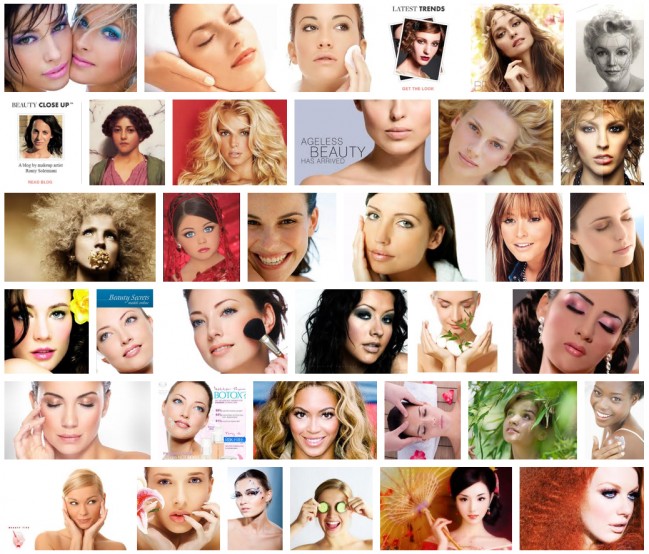
[div class=attrib]Image courtesy of Google search.[end-div]

A Most Beautiful Equation

Many mathematicians and those not mathematically oriented would consider Albert Einstein’s equation stating energy=mass equivalence to be singularly simple and beautiful. Indeed, e=mc2 is perhaps one of the few equations to have entered the general public consciousness. However, there are a number of other less well known mathematical constructs that convey this level of significance and fundamental beauty as well. Wired lists several to consider.
[div class=attrib]From Wired:[end-div]

Even for those of us who finished high school algebra on a wing and a prayer, there’s something compelling about equations. The world’s complexities and uncertainties are distilled and set in orderly figures, with a handful of characters sufficing to capture the universe itself.

For your enjoyment, the Wired Science team has gathered nine of our favorite equations. Some represent the universe; others, the nature of life. One represents the limit of equations.

We do advise, however, against getting any of these equations tattooed on your body, much less branded. An equation t-shirt would do just fine.

The Beautiful Equation: Euler’s Identity

ei? + 1 = 0

Also called Euler’s relation, or the Euler equation of complex analysis, this bit of mathematics enjoys accolades across geeky disciplines.

Swiss mathematician Leonhard Euler first wrote the equality, which links together geometry, algebra, and five of the most essential symbols in math — 0, 1, i, pi and e — that are essential tools in scientific work.

Theoretical physicist Richard Feynman was a huge fan and called it a “jewel” and a “remarkable” formula. Fans today refer to it as “the most beautiful equation.”

[div class=attrib]Read more here.[end-div]

[div class=attrib]Image: Euler’s Relation. Courtesy of Wired.[end-div]

Can Anyone Say “Neuroaesthetics”

As in all other branches of science, there seem to be fascinating new theories, research and discoveries in neuroscience on a daily, if not hourly, basis. With this in mind, brain and cognitive researchers have recently turned their attentions to the science of art, or more specifically to addressing the question “how does the human brain appreciate art?” Yes, welcome to the world of “neuroaesthetics”.

[div class=attrib]From Scientific American:[end-div]

The notion of “the aesthetic” is a concept from the philosophy of art of the 18th century according to which the perception of beauty occurs by means of a special process distinct from the appraisal of ordinary objects. Hence, our appreciation of a sublime painting is presumed to be cognitively distinct from our appreciation of, say, an apple. The field of “neuroaesthetics” has adopted this distinction between art and non-art objects by seeking to identify brain areas that specifically mediate the aesthetic appreciation of artworks.

However, studies from neuroscience and evolutionary biology challenge this separation of art from non-art. Human neuroimaging studies have convincingly shown that the brain areas involved in aesthetic responses to artworks overlap with those that mediate the appraisal of objects of evolutionary importance, such as the desirability of foods or the attractiveness of potential mates. Hence, it is unlikely that there are brain systems specific to the appreciation of artworks; instead there are general aesthetic systems that determine how appealing an object is, be that a piece of cake or a piece of music.

We set out to understand which parts of the brain are involved in aesthetic appraisal. We gathered 93 neuroimaging studies of vision, hearing, taste and smell, and used statistical analyses to determine which brain areas were most consistently activated across these 93 studies. We focused on studies of positive aesthetic responses, and left out the sense of touch, because there were not enough studies to arrive at reliable conclusions.

The results showed that the most important part of the brain for aesthetic appraisal was the anterior insula, a part of the brain that sits within one of the deep folds of the cerebral cortex. This was a surprise. The anterior insula is typically associated with emotions of negative quality, such as disgust and pain, making it an unusual candidate for being the brain’s “aesthetic center.” Why would a part of the brain known to be important for the processing of pain and disgust turn out to the most important area for the appreciation of art?

[div class=attrib]Read entire article here.[end-div]

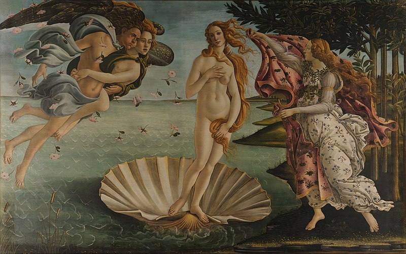
[div class=attrib]Image: The Birth of Venus by Sandro Botticelli. Courtesy of Wikipedia.[end-div]

The Culture of Vanity

Alexander Edmonds has a thoroughly engrossing piece on the pursuit of “beauty” and the culture of vanity as commodity. And the role of plastic surgeon as both enabler and arbiter comes under a very necessary microscope.

[div class=attrib]Alexander Edmonds for the New York Times:[end-div]

While living in Rio de Janeiro in 1999, I saw something that caught my attention: a television broadcast of a Carnival parade that paid homage to a plastic surgeon, Dr. Ivo Pitanguy. The doctor led the procession surrounded by samba dancers in feathers and bikinis.  Over a thundering drum section and anarchic screech of a cuica, the singer praised Pitanguy for “awakening the self-esteem in each ego” with a “scalpel guided by heaven.”

It was the height of Rio’s sticky summer and the city had almost slowed to a standstill, as had progress on my anthropology doctorate research on Afro-Brazilian syncretism. After seeing the parade, I began to notice that Rio’s plastic surgery clinics were almost as numerous as beauty parlors (and there are a lot of those).  Newsstands sold magazines with titles like Plástica & Beauty, next to Marie Claire.  I assumed that the popularity of cosmetic surgery in a developing nation was one more example of Brazil’s gaping inequalities.  But Pitanguy had long maintained that plastic surgery was not only for the rich: “The poor have the right to be beautiful, too,” he has said.

The beauty of the human body has raised distinct ethical issues for different epochs.  The literary scholar Elaine Scarry pointed out that in the classical world a glimpse of a beautiful person could imperil an observer. In his “Phaedrus” Plato describes a man who after beholding a beautiful youth begins to spin, shudder, shiver and sweat.   With the rise of mass consumption, ethical discussions have focused on images of female beauty.  Beauty ideals are blamed for eating disorders and body alienation.  But Pitanguy’s remark raises yet another issue: Is beauty a right, which, like education or health care, should be realized with the help of public institutions and expertise?

The question might seem absurd.  Pitanguy’s talk of rights echoes the slogans of make-up marketing (L’Oreal’s “Because you’re worth it.”). Yet his vision of plastic surgery reflects a clinical reality that he helped create.  For years he has performed charity surgeries for the poor. More radically, some of his students offer free cosmetic operations in the nation’s public health system.

[div class=attrib]More from theSource here.[end-div]

How Beauty? Why Beauty?

A recent study by Tomohiro Ishizu and Semir Zeki from University College London places the seat of our sense of beauty in the medial orbitofrontal cortex (mOFC). Not very romantic of course, but thoroughly reasonable that this compound emotion would be found in an area of the brain linked with reward and pleasure.

[div class=attrib]The results are described over at Not Exactly Rocket Science / Discover:[end-div]

Tomohiro Ishizu and Semir Zeki from University College London watched the brains of 21 volunteers as they looked at 30 paintings and listened to 30 musical excerpts. All the while, they were lying inside an fMRI scanner, a machine that measures blood flow to different parts of the brain and shows which are most active. The recruits rated each piece as “beautiful”, “indifferent” or “ugly”.

The scans showed that one part of their brains lit up more strongly when they experienced beautiful images or music than when they experienced ugly or indifferent ones – the medial orbitofrontal cortex or mOFC.

Several studies have linked the mOFC to beauty, but this is a sizeable part of the brain with many roles. It’s also involved in our emotions, our feelings of reward and pleasure, and our ability to make decisions. Nonetheless, Ishizu and Zeki found that one specific area, which they call “field A1” consistently lit up when people experienced beauty.

The images and music were accompanied by changes in other parts of the brain as well, but only the mOFC reacted to beauty in both forms. And the more beautiful the volunteers found their experiences, the more active their mOFCs were. That is not to say that the buzz of neurons in this area produces feelings of beauty; merely that the two go hand-in-hand.

Clearly, this is a great start, and as brain scientists get their hands on ever improving fMRI technology and other brain science tools our understanding will only get sharper. However, what still remains very much a puzzle is “why does our sense of beauty exist”?

The researchers go on to explain their results, albeit tentatively:

Our proposal shifts the definition of beauty very much in favour of the perceiving subject and away from the characteristics of the apprehended object. Our definition… is also indifferent to what is art and what is not art. Almost anything can be considered to be art, but only creations whose experience has, as a correlate, activity in mOFC would fall into the classification of beautiful art… A painting by Francis Bacon may be executed in a painterly style and have great artistic merit but may not qualify as beautiful to a subject, because the experience of viewing it does not correlate with activity in his or her mOFC.

In proposing this the researchers certainly seem to have hit on the underlying “how” of beauty, and it’s reliably consistent, though the sample was not large enough to warrant statistical significance. However, the researchers conclude that “A beautiful thing is met with the same neural changes in the brain of a wealthy cultured connoisseur as in the brain of a poor, uneducated novice, as long as both of them find it beautiful.”

But what of the “why” of beauty. Why is the perception of beauty socially and cognitively important and why did it evolve? After all, as Jonah Lehrer over at Wired questions:

But why does beauty exist? What’s the point of marveling at a Rembrandt self portrait or a Bach fugue? To paraphrase Auden, beauty makes nothing happen. Unlike our more primal indulgences, the pleasure of perceiving beauty doesn’t ensure that we consume calories or procreate. Rather, the only thing beauty guarantees is that we’ll stare for too long at some lovely looking thing. Museums are not exactly adaptive.

The answer to this question has stumped the research community for quite some time, and will undoubtedly continue to do so for some time to come. Several recent cognitive research studies hint at possible answers related to reinforcement for curious and inquisitive behavior, reward for and feedback from anticipation responses, and pattern seeking behavior.

[div class=attrib]More from Jonah Lehrer for Wired:[end-div]

What I like about this speculation is that it begins to explain why the feeling of beauty is useful. The aesthetic emotion might have begun as a cognitive signal telling us to keep on looking, because there is a pattern here that we can figure out it. In other words, it’s a sort of a metacognitive hunch, a response to complexity that isn’t incomprehensible. Although we can’t quite decipher this sensation – and it doesn’t matter if the sensation is a painting or a symphony – the beauty keeps us from looking away, tickling those dopaminergic neurons and dorsal hairs. Like curiosity, beauty is a motivational force, an emotional reaction not to the perfect or the complete, but to the imperfect and incomplete. We know just enough to know that we want to know more; there is something here, we just don’t what. That’s why we call it beautiful.

[div class=attrib]More from theSource here.[end-div]

[div class=attrib]Claude Monet, Water-Lily Pond and Weeping Willow. Image courtesy of Wikipedia / Creative Commons.[end-div]

[div class=attrib]First page of the manuscript of Bach’s lute suite in G Minor. Image courtesy of Wikipedia / Creative Commons.[end-div]