
Mathematics seems to explain and underlie much of our modern world: manufacturing, exploration, transportation, logistics, healthcare, technology — all depend on numbers in one form or another. So it should come as no surprise that there are mathematical formulae that describe our notions of beauty. This would seem to be counter-intuitive since beauty is a very subjective experience for all of us — one person’s colorful, blotted mess is another’s Jackson Pollock masterpiece. Yet, mathematicians have known for some time that there is a certain composition of sizes that are more frequently characterized as beautiful than others. Known as the golden ratio, architects, designers and artists have long exploited this mathematical formula to render their works more appealing.
From Wired:
Mathematical concepts can be difficult to grasp, but given the right context they can help explain some of the world’s biggest mysteries. For instance, what is it about a sunflower that makes it so pleasing to look at? Or why do I find the cereal box-shaped United Nations building in New York City to be so captivating?
Beauty may very well be subjective, but there’s thought to be mathematical reasoning behind why we’re attracted to certain shapes and objects. Called the golden ratio, this theory states there’s a recurring proportion of arrangement that lends certain things their beauty. Represented as an equation: a/b = (a+b)/a, the golden ratio is all around us—conical sea shells, human faces, flower petals, buildings—we just don’t always know we’re looking at it. In Golden Meaning, a new book from London publisher GraphicDesign&, 55 designers aim to demystify the golden ratio using clever illustrations and smart graphic design.
GraphicDesign& founders Lucienne Roberts and Rebecca Wright partnered up with math evangelist Alex Bellos to develop the book, with the main goal of making math accessible through design. “We want this to be a useful tool to demonstrate something that often makes people anxious,” explains Roberts. “We hope it’s as interesting to people who are interested in math as it is to the people who are interested in the visual.”
Each designer came at the problem from a different angle, but in order to appreciate the cleverness found in the book, it’s important to have a little background on the golden mean. Bellos uses this line to illustrate the concept at its most basic.
n Golden Meaning he writes: “The line is separated into two sections in such a way that the ratio of the whole line to the larger section is equal to the ratio of the larger section to the smaller section.” This ratio ends up being 1.618.
Salvador Dali and Le Corbusier have used the golden mean as a guiding principle in their work, the Taj Mahal was designed with it in mind, and it’s thought that many of the faces of attractive people follow these proportions. The golden ratio then is essentially a formula for beauty.
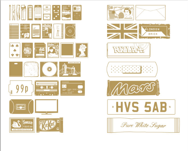
With this in mind, Robert and Wright gave designers a simple brief: To explore, explain and communicate the golden ratio however they see fit. There’s a recipe for golden bars that requires bakers to parcel out ingredients based the ratio instead of exact measurements, an illustration that shows a bottle of wine being poured into glasses using the ratio. The book itself is actually a golden rectangle. “You get it much more than looking at an equation,” says Roberts.
A particular favorite shows two side-by-side images of British designer Oli Kellett. On the left is his normal face, on the right is the same face after he rearranged his features in accordance to the golden ratio. So is he really more beautiful after his mathematical surgery? “We liked him as he is,” says Roberts. “In a way it disproves the theory.”
Read the entire article here.
Image: Several examples of the golden ratio at work, from the book Golden Meaning by GraphicDesign&. Courtesy of GraphicDesign&.
 Only yesterday we