Tag Archives: design

MondayMap: Yes. A Magnetic, Foldable Dymaxion Map

dymaxion_map_ocean2

fuller_projection

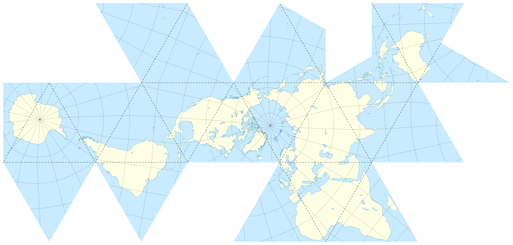
For a map geek [or are we nerds?] like me a foldable Dymaxion map with a 2D and 3D projection is rather cool. Buckminster Fuller and architect, collaborator Shoji Sadao created this peculiar view of our world over 60 years ago, 1954 to be more precise.

A key advantage of this map was that it was held to be the least distorted of all 2D projections of our 3D globe, and it could also be accurate in three dimensions.

For example, Fuller correctly maintained that his projection has less distortion of relative size of areas compared to the common Mercator projection. It also has less distortion of shapes of areas when compared to the Gall–Peters projection.

Now we can enjoy a magnetic globe version of Fuller and Sadao’s creation courtesy of designer Brendan Ravenhill.

From Wired:

Brendan Ravenhill reimagines the Dymaxion Map as a magnetic globe. Like Fuller’s original map, Ravenhill’s globe can exist in two or three dimensions. Laid flat, it’s a series of 20 triangles that show Fuller’s projection as a single landmass. The back of each triangle features a magnet so you can fold the map into an angular globe. “Really it’s a toy, but a toy that has a lot of resonance and importance,” Ravenhill says.

Fuller made his map endlessly reconfigurable. And while Ravenhill’s design nods to that idea with its partitioned triangles, there’s really only one way to put the puzzle together correctly. “You know you’re doing it wrong if there’s a magnet where Antarctica is supposed to be,” he says.

Read the entire article here.

Images: 1) An icosahedral net showing connected oceans surrounding Antarctica; 2) Unfolded Dymaxion map with nearly contiguous land masses. Courtesy: Wikipedia. CC BY 2.5.

Another London Bridge

nep-bridge-008

I don’t live in London. But having been born and raised there I still have a particular affinity for this great city. So, when the London Borough of Wandsworth recently published submissions for a new bridge of the River Thames I had to survey the designs. Over 70 teams submitted ideas since the process was opened to competition in December 2014.  The bridge will eventually span the river between Nine Elms and Pimlico.

Please check out the official designs here. Some are quite extraordinary.

Image: Scheme 008. Courtesy of Nine Elms to Pimlico (NEP) Bridge Competition, London Borough of Wandsworth.


UnDesign

The future of good design may actually lie in intentionally doing the wrong thing. While we are drawn to the beauty of symmetry — in faces, in objects — we are also drawn by the promise of imperfection.

From Wired:

In the late 1870s, Edgar Degas began work on what would become one of his most radical paintings, Jockeys Before the Race. Degas had been schooled in techniques of the neoclassicist and romanticist masters but had begun exploring subject matter beyond the portraits and historical events that were traditionally considered suitable for fine art, training his eye on café culture, common laborers, and—most famously—ballet dancers. But with Jockeys, Degas pushed past mild provocation. He broke some of the most established formulas of composition. The painting is technically exquisite, the horses vividly sculpted with confident brushstrokes, their musculature perfectly rendered. But while composing this beautifully balanced, impressionistically rendered image, Degas added a crucial, jarring element: a pole running vertically—and asymmetrically—in the immediate foreground, right through the head of one of the horses.

Degas wasn’t just “thinking outside of the box,” as the innovation cliché would have it. He wasn’t trying to overturn convention to find a more perfect solution. He was purposely creating something that wasn’t pleasing, intentionally doing the wrong thing. Naturally viewers were horrified. Jockeys was lampooned in the magazine Punch, derided as a “mistaken impression.” But over time, Degas’ transgression provided inspiration for other artists eager to find new ways to inject vitality and dramatic tension into work mired in convention. You can see its influence across art history, from Frederic Remington’s flouting of traditional compositional technique to the crackling photojournalism of Henri Cartier-Bresson.

Degas was engaged in a strategy that has shown up periodically for centuries across every artistic and creative field. Think of it as one step in a cycle: In the early stages, practitioners dedicate themselves to inventing and improving the rules—how to craft the most pleasing chord progression, the perfectly proportioned building, the most precisely rendered amalgamation of rhyme and meter. Over time, those rules become laws, and artists and designers dedicate themselves to excelling within these agreed-upon parameters, creating work of unparalleled refinement and sophistication—the Pantheon, the Sistine Chapel, the Goldberg Variations. But once a certain maturity has been reached, someone comes along who decides to take a different route. Instead of trying to create an ever more polished and perfect artifact, this rebel actively seeks out imperfection—sticking a pole in the middle of his painting, intentionally adding grungy feedback to a guitar solo, deliberately photographing unpleasant subjects. Eventually some of these creative breakthroughs end up becoming the foundation of a new set of aesthetic rules, and the cycle begins again.

DEGAS WASN’T JUST THINKING OUTSIDE THE BOX. HE WAS PURPOSELY CREATING SOMETHING THAT WASN’T PLEASING.

For the past 30 years, the field of technology design has been working its way through the first two stages of this cycle, an industry-wide march toward more seamless experiences, more delightful products, more leverage over the world around us. Look at our computers: beige and boxy desktop machines gave way to bright and colorful iMacs, which gave way to sleek and sexy laptops, which gave way to addictively touchable smartphones. It’s hard not to look back at this timeline and see it as a great story of human progress, a joint effort to experiment and learn and figure out the path toward a more refined and universally pleasing design.

All of this has resulted in a world where beautifully constructed tech is more powerful and more accessible than ever before. It is also more consistent. That’s why all smartphones now look basically the same—gleaming black glass with handsomely cambered edges. Google, Apple, and Microsoft all use clean, sans-serif typefaces in their respective software. After years of experimentation, we have figured out what people like and settled on some rules.

But there’s a downside to all this consensus—it can get boring. From smartphones to operating systems to web page design, it can start to feel like the truly transformational moments have come and gone, replaced by incremental updates that make our devices and interactions faster and better.

This brings us to an important and exciting moment in the design of our technologies. We have figured out the rules of creating sleek sophistication. We know, more or less, how to get it right. Now, we need a shift in perspective that allows us to move forward. We need a pole right through a horse’s head. We need to enter the third stage of this cycle. It’s time to stop figuring out how to do things the right way, and start getting it wrong.

In late 2006, when I was creative director here at WIRED, I was working on the design of a cover featuring John Hodgman. We were far along in the process—Hodgman was styled and photographed, the cover lines written, our fonts selected, the layout firmed up. I had been aiming for a timeless design with a handsome monochromatic color palette, a cover that evoked a 1960s jet-set vibe. When I presented my finished design, WIRED’s editor at the time, Chris Anderson, complained that the cover was too drab. He uttered the prescriptive phrase all graphic designers hate hearing: “Can’t you just add more colors?”

I demurred. I felt the cover was absolutely perfect. But Chris did not, and so, in a spasm of designerly “fuck you,” I drew a small rectangle into my design, a little stripe coming off from the left side of the page, rudely breaking my pristine geometries. As if that weren’t enough, I filled it with the ugliest hue I could find: neon orange— Pantone 811, to be precise. My perfect cover was now ruined!

By the time I came to my senses a couple of weeks later, it was too late. The cover had already been sent to the printer. My anger morphed into regret. To the untrained eye, that little box might not seem so offensive, but I felt that I had betrayed one of the most crucial lessons I learned in design school—that every graphic element should serve a recognizable function. This stray dash of color was careless at best, a postmodernist deviation with no real purpose or value. It confused my colleagues and detracted from the cover’s clarity, unnecessarily making the reader more conscious of the design.

But you know what? I actually came to like that crass little neon orange bar. I ended up including a version of it on the next month’s cover, and again the month after that. It added something, even though I couldn’t explain what it was. I began referring to this idea—intentionally making “bad” design choices—as Wrong Theory, and I started applying it in little ways to all of WIRED’s pages. Pictures that were supposed to run large, I made small. Where type was supposed to run around graphics, I overlapped the two. Headlines are supposed to come at the beginning of stories? I put them at the end. I would even force our designers to ruin each other’s “perfect” layouts.

At the time, this represented a major creative breakthrough for me—the idea that intentional wrongness could yield strangely pleasing results. Of course I was familiar with the idea of rule-breaking innovation—that each generation reacts against the one that came before it, starting revolutions, turning its back on tired conventions. But this was different. I wasn’t just throwing out the rulebook and starting from scratch. I was following the rules, then selectively breaking one or two for maximum impact.

Read the entire article here.

Water From Air

WARKAWATER

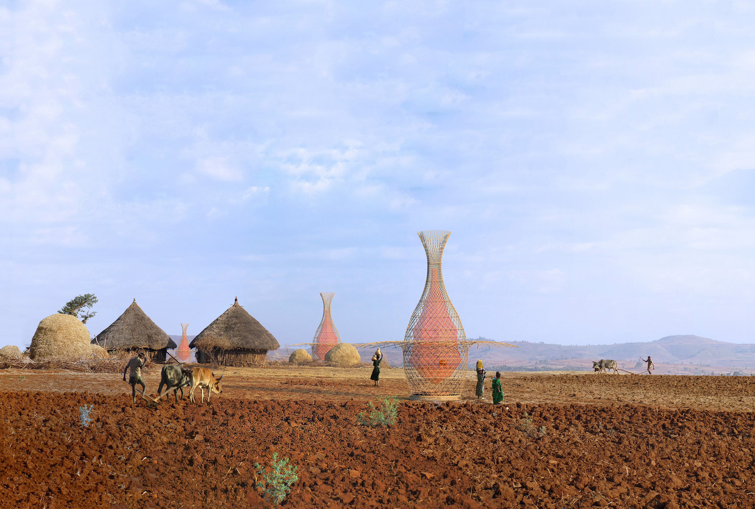
Ideas and innovations that solve a particular human hardship are worthy of reward and recognition. When the idea is also ingenious and simple it should be celebrated. Take the invention of industrial designers Arturo Vittori and Andreas Vogler. Fashioned from plant stalks and nylon mess their 30 foot tall WarkaWater Towers soak up moisture from the air for later collection — often up to 25 gallons of drinking water today. When almost a quarter of the world’s population has poor access to daily potable water this remarkable invention serves a genuine need.

From Smithsonian:

In some parts of Ethiopia, finding potable water is a six-hour journey.

People in the region spend 40 billion hours a year trying to find and collect water, says a group called the Water Project. And even when they find it, the water is often not safe, collected from ponds or lakes teeming with infectious bacteria, contaminated with animal waste or other harmful substances.

The water scarcity issue—which affects nearly 1 billion people in Africa alone—has drawn the attention of big-name philanthropists like actor and Water.org co-founder Matt Damon and Microsoft co-founder Bill Gates, who, through their respective nonprofits, have poured millions of dollars into research and solutions, coming up with things like a system that converts toilet water to drinking water and a “Re-invent the Toilet Challenge,” among others.

Critics, however, have their doubts about integrating such complex technologies in remote villages that don’t even have access to a local repairman. Costs and maintenance could render many of these ideas impractical.

“If the many failed development projects of the past 60 years have taught us anything,” wrote one critic, Toilets for People founder Jason Kasshe, in a New York Times editorial, “it’s that complicated, imported solutions do not work.”

Other low-tech inventions, like this life straw, aren’t as complicated, but still rely on users to find a water source.

It was this dilemma—supplying drinking water in a way that’s both practical and convenient—that served as the impetus for a new product called Warka Water, an inexpensive, easily-assembled structure that extracts gallons of fresh water from the air.

The invention from Arturo Vittori, an industrial designer, and his colleague Andreas Vogler doesn’t involve complicated gadgetry or feats of engineering, but instead relies on basic elements like shape and material and the ways in which they work together.

At first glance, the 30-foot-tall, vase-shaped towers, named after a fig tree native to Ethiopia, have the look and feel of a showy art installation. But every detail, from carefully-placed curves to unique materials, has a functional purpose.

The rigid outer housing of each tower is comprised of lightweight and elastic juncus stalks, woven in a pattern that offers stability in the face of strong wind gusts while still allowing air to flow through. A mesh net made of nylon or  polypropylene, which calls to mind a large Chinese lantern, hangs inside, collecting droplets of dew that form along the surface. As cold air condenses, the droplets roll down into a container at the bottom of the tower. The water in the container then passes through a tube that functions as a faucet, carrying the water to those waiting on the ground.

Using mesh to facilitate clean drinking water isn’t an entirely new concept. A few years back, an MIT student designed a fog-harvesting device with the material. But Vittori’s invention yields more water, at a lower cost, than some other concepts that came before it.

“[In Ethiopia], public infrastructures do not exist and building [something like] a well is not easy,” Vittori says of the country. “To find water, you need to drill in the ground very deep, often as much as 1,600 feet.  So it’s technically difficult and expensive. Moreover, pumps need electricity to run as well as access to spare parts in case the pump breaks down.”

So how would Warka Water’s low-tech design hold up in remote sub-Saharan villages? Internal field tests have shown that one Warka Water tower can supply more than 25 gallons of water throughout the course of a day, Vittori claims. He says because the most important factor in collecting condensation is the difference in temperature between nightfall and daybreak, the towers are proving successful even in the desert, where temperatures, in that time, can differ as much as 50 degrees Fahrenheit.

The structures, made from biodegradable materials, are easy to clean and can be erected without mechanical tools in less than a week. Plus, he says, “once locals have the necessary know-how, they will be able to teach other villages and communities to build the Warka.”

In all, it costs about $500 to set up a tower—less than a quarter of the cost of something like the Gates toilet, which costs about $2,200 to install and more to maintain. If the tower is mass produced, the price would be even lower, Vittori says. His team hopes to install two Warka Towers in Ethiopia by next year and is currently searching for investors who may be interested in scaling the water harvesting technology across the region.

Read the entire article here.

Image: WarkaWater Tower. Courtesy of Andreas vogler and Arturo Vittori, WARKAWATER PROJECT / www.architectureandvision.com.


Beauty Of and In Numbers

golden-ratio

Mathematics seems to explain and underlie much of our modern world: manufacturing, exploration, transportation, logistics, healthcare, technology — all depend on numbers in one form or another. So it should come as no surprise that there are mathematical formulae that describe our notions of beauty. This would seem to be counter-intuitive since beauty is a very subjective experience for all of us — one person’s colorful, blotted mess is another’s Jackson Pollock masterpiece. Yet, mathematicians have known for some time that there is a certain composition of sizes that are more frequently characterized as beautiful than others. Known as the golden ratio, architects, designers and artists have long exploited this mathematical formula to render their works more appealing.

From Wired:

Mathematical concepts can be difficult to grasp, but given the right context they can help explain some of the world’s biggest mysteries. For instance, what is it about a sunflower that makes it so pleasing to look at? Or why do I find the cereal box-shaped United Nations building in New York City to be so captivating?

Beauty may very well be subjective, but there’s thought to be mathematical reasoning behind why we’re attracted to certain shapes and objects. Called the golden ratio, this theory states there’s a recurring proportion of arrangement that lends certain things their beauty. Represented as an equation: a/b = (a+b)/a, the golden ratio is all around us—conical sea shells, human faces, flower petals, buildings—we just don’t always know we’re looking at it. In Golden Meaning, a new book from London publisher GraphicDesign&, 55 designers aim to demystify the golden ratio using clever illustrations and smart graphic design.

GraphicDesign& founders Lucienne Roberts and Rebecca Wright partnered up with math evangelist Alex Bellos to develop the book, with the main goal of making math accessible through design. “We want this to be a useful tool to demonstrate something that often makes people anxious,” explains Roberts. “We hope it’s as interesting to people who are interested in math as it is to the people who are interested in the visual.”

Each designer came at the problem from a different angle, but in order to appreciate the cleverness found in the book, it’s important to have a little background on the golden mean. Bellos uses this line to illustrate the concept at its most basic.

n Golden Meaning he writes: “The line is separated into two sections in such a way that the ratio of the whole line to the larger section is equal to the ratio of the larger section to the smaller section.” This ratio ends up being 1.618.

Salvador Dali and Le Corbusier have used the golden mean as a guiding principle in their work, the Taj Mahal was designed with it in mind, and it’s thought that many of the faces of attractive people follow these proportions. The golden ratio then is essentially a formula for beauty.

With this in mind, Robert and Wright gave designers a simple brief: To explore, explain and communicate the golden ratio however they see fit. There’s a recipe for golden bars that requires bakers to parcel out ingredients based the ratio instead of exact measurements, an illustration that shows a bottle of wine being poured into glasses using the ratio. The book itself is actually a golden rectangle. “You get it much more than looking at an equation,” says Roberts.

A particular favorite shows two side-by-side images of British designer Oli Kellett. On the left is his normal face, on the right is the same face after he rearranged his features in accordance to the golden ratio. So is he really more beautiful after his mathematical surgery? “We liked him as he is,” says Roberts. “In a way it disproves the theory.”

Read the entire article here.

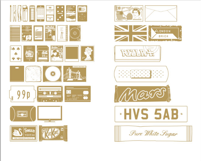
Image: Several examples of the golden ratio at work, from the book Golden Meaning by GraphicDesign&. Courtesy of GraphicDesign&.

Mining Minecraft

minecraft-example

If you have a child under the age of 13 it’s likely that you’ve heard of, seen or even used Minecraft. More than just a typical online game, Minecraft is a playground for aspiring architects — despite the Creepers. Minecraft began in 2011 with a simple premise — place and remove blocks to fend of unwanted marauders. Now it has become a blank canvas for young minds to design and collaborate on building fantastical structures. My own twin 11 year-olds have designed their dream homes complete with basement stables, glass stairways roof-top pool.

From the Guardian:

I couldn’t pinpoint exactly when I became aware of my eight-year-old son’s fixation with Minecraft. I only know that the odd reference to zombies and pickaxes burgeoned until it was an omnipresent force in our household, the dominant topic of conversation and, most bafflingly, a game he found so gripping that he didn’t just want to play it, he wanted to watch YouTube videos of others playing it too.

This was clearly more than any old computer game – for Otis and, judging by discussion at the school gates, his friends too. I felt as if he’d joined a cult, albeit a reasonably benign one, though as someone who last played a computer game when Jet Set Willy was the height of technological wizardry, I hardly felt in a position to judge.

Minecraft, I realised, was something I knew nothing about. It was time to become acquainted. I announced my intention to give myself a crash course in the game to Otis one evening, interrupting his search for Obsidian to build a portal to the Nether dimension. As you do. “Why would you want to play Minecraft?” he asked, as if I’d confided that I was taking up a career in trapeze-artistry.

For anyone as mystified about it as I was, Minecraft is now one of the world’s biggest computer games, a global phenomenon that’s totted up 14,403,011 purchases as I write; 19,270 in the past 24 hours – live statistics they update on their website, as if it were Children in Need night.

Trying to define the objective of the game isn’t easy. When I ask Otis, he shrugs. “I’m not sure there is one. But that’s what’s brilliant. You can do anything you like.”

This doesn’t seem like much of an insight, though to be fair, the developers themselves, Mojang, define it succinctly as, “a game about breaking and placing blocks”. This sounds delightfully simple, an impression echoed by its graphics. In sharp contrast to the rich, more cinematic style of other games, this is unapologetically old school, the sort of computer game of the future that Marty McFly would have played.

In this case, looks are deceptive. “The pixelated style might appear simple but it masks a huge amount of depth and complexity,” explains Alex Wiltshire, former editor of Edge magazine and author of forthcoming Minecraft guide, Block-o-pedia. “Its complex nature doesn’t lie in detailed art assets, but in how each element of the game interrelates.”

It’s this that gives players the potential to produce elaborate constructions on a lavish scale; fans have made everything from 1:1 scale re-creations of the Lord of the Rings’ Mines of Moria, to models of entire cities.

I’m a long way from that. “Don’t worry, Mum – when I first went on it when I was six, I had no idea what I was doing,” Otis reassures, shaking his head at the thought of those naive days, way back when.

Otis’s device of choice is his iPod, ideal for on-the-move sessions, though this once caused him serious grief after being caught on it under his duvet after lights out. I take one look at the lightning speed with which his fingers move and decide to download it on to my MacBook instead. The introduction of an additional version of the game into our household is greeted very much like Walter Raleigh’s return from the New World.

We open up the game and he tells me that I am “Steve”, the default player, and that we get a choice of modes in which to play: creative or survival. He suggests I start with the former on the basis that this is the best place for those who aren’t very good at it.

In creative mode, you are dropped into a newly generated world (an island in our case) and gifted a raft of resources – everything from coal and lapis lazuli to cake and beds.

At the risk of sounding like a dunce, it isn’t at all obvious what I’m supposed to do. So instead of springing into action, I’m left standing, looking around lamely as if I’m on the edge of a dance floor waiting for someone to come and put me out of my misery. Despite knowing that the major skill required in this game is building, before Otis intervenes, the most I can accomplish is to dig a few holes.

“When it first came out everyone was confused as the developer gave little or no guidance,” says Wiltshire. “It didn’t specifically say you had to cut down a tree to get some wood, whereas games that are produced by big companies give instructions – the last thing they want is for people not to understand how to play. With Minecraft, which had an indie developer, the player had to work things out for themselves. It was quite a tonic.”

He believes that this is why a game not specifically designed for children has become so popular with them. “Because you learn so much when you’re young, kids are used to the idea of a world they don’t fully understand, so they’re comfortable with having to find things out for themselves.”

For the moment, I’m happy to take instruction from my son, who begins his demonstration by creating a rollercoaster – an obvious priority when you’ve just landed on a desert island. He quickly installs its tracks, weaving them through trees and into the sea, before sending Steve for a ride. He asks me if I feel ready to have a go. I feel as if I’m on a nursing home word processing course.

Familiarising yourself takes a little time but once you get going – and have worked out the controls – being able to run, fly, swim and build is undeniably absorbing. I also finally manage to construct something, a slightly disappointing shipping container-type affair that explodes Wiltshire’s assertion that it’s “virtually impossible to build something that looks terrible in Minecraft”. Still, I’m enjoying it, I can’t deny it. Aged eight, I’d have loved it every bit as much as my son does.

The more I play it, the more I also start to understand why this game is been championed for its educational possibilities, with some schools in the US using it as a tool to teach maths and science.

Dr Helen O’Connor, who runs UK-based Childchology – which provides children and their families with support for common psychological problems via the internet – said: “Minecraft offers some strong positives for children. It works on a cognitive level in that it involves problem solving, imagination, memory, creativity and logical sequencing. There is a good educational element to the game, and it also requires some number crunching.

“Unlike lots of other games, there is little violence, with the exception of fighting off a few zombies and creepers. This is perhaps one of the reasons why it is fairly gender neutral and girls enjoy playing it as well as boys.”

The next part of Otis’s demonstration involves switching to survival mode. He explains: “You’ve got to find the resources yourself here. You’re not just given them. Oh and there are villains too. Zombie pigmen and that kind of thing.”

It’s clear that life in survival mode is a significantly hairier prospect than in creative, particularly when Otis changes the difficulty setting to its highest notch. He says he doesn’t do this often because, after spending three weeks creating a house from wood and cobblestones, zombies nearly trashed the place. I make a mental note to remind him of this conversation next time he has a sleepover.

One of the things that’s so appealing about Minecraft is that there is no obvious start and end; it’s a game of infinite possibilities, which is presumably why it’s often compared to Lego. Yet, the addictive nature of the game is clearly vexing many parents: internet talkboards are awash with people seeking advice on how to prize their children away from it.

Read the entire story here.

Image courtesy of Minecraft.

A Quest For Skeuomorphic Noise

Toyota_Prius_III

Your Toyota Prius, or other electric vehicle, is a good environmental citizen. It helps reduce pollution and carbon emissions and does so rather efficiently. You and other eco-conscious owners should be proud.

But wait, not so fast. Your electric car may have a low carbon footprint, but it is a silent killer in waiting. It may be efficient, however it is far too quiet, and is thus somewhat of a hazard for pedestrians, cyclists and other motorists — they don’t hear it approaching.

Cars like the Prius are so quiet — in fact too quiet, for our own safety. So, enterprising engineers are working to add artificial noise to the next generations of almost silent cars. The irony is not lost: after years of trying to make cars quieter, engineers are now looking to make them noisier.

Perhaps, the added noise could be configurable as an option for customers — a base option would sound like a Citroen CV, a high-end model could sound like, well, a Ferrari or a classic Bugatti. Much better.

From Technology Review:

It was a pleasant June day in Munich, Germany. I was picked up at my hotel and driven to the country, farmland on either side of the narrow, two-lane road. Occasional walkers strode by, and every so often a bicyclist passed. We parked the car on the shoulder and joined a group of people looking up and down the road. “Okay, get ready,” I was told. “Close your eyes and listen.” I did so and about a minute later I heard a high-pitched whine, accompanied by a low humming sound: an automobile was approaching. As it came closer, I could hear tire noise. After the car had passed, I was asked my judgment of the sound. We repeated the exercise numerous times, and each time the sound was different. What was going on? We were evaluating sound designs for BMW’s new electric vehicles.

Electric cars are extremely quiet. The only sounds they make come from the tires, the air, and occasionally from the high-pitched whine of the electronics. Car lovers really like the silence. Pedestrians have mixed feelings, but blind people are greatly concerned. After all, they cross streets in traffic by relying upon the sounds of vehicles. That’s how they know when it is safe to cross. And what is true for the blind might also be true for anyone stepping onto the street while distracted. If the vehicles don’t make any sounds, they can kill. The United States National Highway Traffic Safety Administration determined that pedestrians are considerably more likely to be hit by hybrid or electric vehicles than by those with an internal-combustion engine. The greatest danger is when the hybrid or electric vehicles are moving slowly: they are almost completely silent.

Adding sound to a vehicle to warn pedestrians is not a new idea. For many years, commercial trucks and construction equipment have had to make beeping sounds when backing up. Horns are required by law, presumably so that drivers can use them to alert pedestrians and other drivers when the need arises, although they are often used as a way of venting anger and rage instead. But adding a continuous sound to a normal vehicle because it would otherwise be too quiet is a challenge.

What sound would you want? One group of blind people suggested putting some rocks into the hubcaps. I thought this was brilliant. The rocks would provide a natural set of cues, rich in meaning and easy to interpret. The car would be quiet until the wheels started to turn. Then the rocks would make natural, continuous scraping sounds at low speeds, change to the pitter-patter of falling stones at higher speeds. The frequency of the drops would increase with the speed of the car until the rocks ended up frozen against the circumference of the rim, silent. Which is fine: the sounds are not needed for fast-moving vehicles, because then the tire noise is audible. The lack of sound when the vehicle is not moving would be a problem, however.

The marketing divisions of automobile manufacturers thought the addition of artificial sounds would be a wonderful branding opportunity, so each car brand or model should have its own unique sound that captured just the car personality the brand wished to convey. Porsche added loudspeakers to its electric car prototype to give it the same throaty growl as its gasoline-powered cars. Nissan wondered whether a hybrid automobile should sound like tweeting birds. Some manufacturers thought all cars should sound the same, with standardized noises and sound levels, making it easier for everyone to learn how to interpret them. Some blind people thought they should sound like cars—you know, gasoline engines.

Skeuomorphic is the technical term for incorporating old, familiar ideas into new technologies, even though they no longer play a functional role. Skeuomorphic designs are often comfortable for traditionalists, and indeed the history of technology shows that new technologies and materials often slavishly imitate the old for no apparent reason except that it’s what people know how to do. Early automobiles looked like horse-driven carriages without the horses (which is also why they were called horseless carriages); early plastics were designed to look like wood; folders in computer file systems often look like paper folders, complete with tabs. One way of overcoming the fear of the new is to make it look like the old. This practice is decried by design purists, but in fact, it has its benefits in easing the transition from the old to the new. It gives comfort and makes learning easier. Existing conceptual models need only be modified rather than replaced. Eventually, new forms emerge that have no relationship to the old, but the skeuomorphic designs probably helped the transition.

When it came to deciding what sounds the new silent automobiles should generate, those who wanted differentiation ruled the day, yet everyone also agreed that there had to be some standards. It should be possible to determine that the sound is coming from an automobile, to identify its location, direction, and speed. No sound would be necessary once the car was going fast enough, in part because tire noise would be sufficient. Some standardization would be required, although with a lot of leeway. International standards committees started their procedures. Various countries, unhappy with the normally glacial speed of standards agreements and under pressure from their communities, started drafting legislation. Companies scurried to develop appropriate sounds, hiring psychologists, Hollywood sound designers, and experts in psychoacoustics.

The United States National Highway Traffic Safety Administration issued a set of principles along with a detailed list of requirements, including sound levels, spectra, and other criteria. The full document is 248 pages. The document states:

This standard will ensure that blind, visually-impaired, and other pedestrians are able to detect and recognize nearby hybrid and electric vehicles by requiring that hybrid and electric vehicles emit sound that pedestrians will be able to hear in a range of ambient environments and contain acoustic signal content that pedestrians will recognize as being emitted from a vehicle. The proposed standard establishes minimum sound requirements for hybrid and electric vehicles when operating under 30 kilometers per hour (km/h) (18 mph), when the vehicle’s starting system is activated but the vehicle is stationary, and when the vehicle is operating in reverse. The agency chose a crossover speed of 30 km/h because this was the speed at which the sound levels of the hybrid and electric vehicles measured by the agency approximated the sound levels produced by similar internal combustion engine vehicles. (Department of Transportation, 2013.)

As I write this, sound designers are still experimenting. The automobile companies, lawmakers, and standards committees are still at work. Standards are not expected until 2014 or later, and then it will take considerable time for the millions of vehicles across the world to meet them. What principles should be used for the sounds of electric vehicles (including hybrids)? The sounds have to meet several criteria:

Alerting. The sound will indicate the presence of an electric vehicle.

Orientation. The sound will make it possible to determine where the vehicle is located, roughly how fast it is going, and whether it is moving toward or away from the listener.

Lack of annoyance. Because these sounds will be heard frequently even in light traffic and continually in heavy traffic, they must not be annoying. Note the contrast with sirens, horns, and backup signals, all of which are intended to be aggressive warnings. Such sounds are deliberately unpleasant, but because they are infrequent and relatively short in duration, they are acceptable. The challenge for electric vehicles is to make sounds that alert and orient, not annoy.

Standardization versus individualization. Standardization is necessary to ensure that all electric-vehicle sounds can readily be interpreted. If they vary too much, novel sounds might confuse the listener. Individualization has two functions: safety and marketing. From a safety point of view, if there were many vehicles on the street, individualization would allow them to be tracked. This is especially important at crowded intersections. From a marketing point of view, individualization can ensure that each brand of electric vehicle has its own unique characteristic, perhaps matching the quality of the sound to the brand image.

Read the entire article here.

Image: Toyota Prius III. Courtesy of Toyota / Wikipedia.

The AbFab Garden Bridge

London-garden-bridge

Should it come to fruition, London’s answer to Lower Manhattan’s High Line promises to be a delightful walker’s paradise and another visitor magnet. The Garden Bridge is a new pedestrian walkway across the River Thames designed with nature in mind, and planted throughout with trees, shrubs and wildflowers. Interestingly, the idea for the design came from British national treasure, actress Joanna Lumley.

From Slate:

British designer Thomas Heatherwick has a knack for reinventing iconic designs. See, for example, his modern take on a midcentury double-decker bus or his 2012 Olympic cauldron, made of 204 copper petals representing participating nations. Heatherwick is also known for whimsical inventions like his 2004 rolling bridge, which curls up on itself to let boats pass beneath it.

The latest proposal from Heatherwick, the man that mentor Terence Conran branded a modern-day Leonardo da Vinci, is a nature-inspired walkway across the Thames: The Garden Bridge.

Oddly, the idea for the design came from Absolutely Fabulous actress Joanna Lumley, who approached Heatherwick years ago. The bridge would be a new structure across the river intended to help improve pedestrian life by connecting North and South London with a planted garden path landscaped by U.K. designer and horticulturalist Dan Pearson. It would be filled with indigenous river edge trees, shrubs, and wildflowers and include benches and walkways of varying widths to create both intimate and more expansive spaces along the walkway. If built, the bridge would be an obvious crowdpleaser as a public green space, lookout point, and tourist destination. In London it would be a rare new jewel in the crown of a city already famed for its gardens.

Why is the idea of a slow garden path through a bustling urban landscape so appealing? Perhaps it’s because, like a vertical garden, such greenways inject our concrete metropolises with a stylized dose of the natural world we destroyed to build them. (Even if the inevitable crowds might detract from the imagined experience.)

Or perhaps it has something to do with biologist Edward O. Wilson’s biophilia hypothesis, described in Charles Montgomery’s new book Happy City as the notion that “humans are hardwired to find particular scenes of nature calming and restorative.” Montgomery also discusses a theory by biologists Stephen and Rachel Kaplan that explains how negotiating busy city streets demands draining “voluntary attention,” whereas “involuntary attention, the kind we give to nature, is effortless, like a daydream or a song washing through your brain. You might not even realize you are paying attention and yet you may be restored and transformed by the act.”

Is this London’s answer to NYC’s High Line, itself inspired by Paris’ Promenade plantée? (Although those projects were built on the ruins of abandoned railway tracks, the parallels are clear.) Earlier this week, the Financial Times noted that the initiative has been “seen by many as the capital’s answer to New York’s much-praised High Line,” adding that “the project appealed to the rivalry between New York and London.”

While the proposed Garden Bridge has the informal support of Mayor Boris Johnson, it would be built using mostly private funding (and board trustees have rejected the idea of selling naming rights to corporate sponsors). Half of that money has already been raised, through private donations and a recent injection of cash from the government, notes The Independent, which reported on Wednesday that Transport for London, the city’s transit authority, has pledged 30 million pounds in support of the project.

Until Dec. 20, the public can visit the website of the Garden Bridge Trust that has been set up to welcome suggestions and thoughts on the plan, which if built could be open to the public in late 2017. In the meantime, this Garden Bridge video narrated by Lumley offers a sneak peek.

Read the entire article here.

Image: Thomas Heatherwick’s Garden Bridge would provide a leisurely garden path across the Thames River. Courtesy Arup.


Of Monsters And the Man

Neil Gorton must have one of the best jobs in the world. For the last ten years he has brought to life monsters and alien beings for TV series Doctor Who. The iconic British sci-fi show, on air since 1963, is an established part of British popular culture having influenced — and sometimes paired with nightmares — generations of audiences and TV professionals. [Our favorites here at theDiagonal are the perennially clunky but evil Daleks].

From Wired:

The Time Lord, also known as “The Doctor,” has run into a lot of different aliens, monsters and miscellaneous beasties during his five-decade run on the BBC’s Doctor Who. With the show’s 50th anniversary upon us this weekend, WIRED talked to Neill Gorton — director of Millennium FX, which has created prosthetics and makeup for Doctor Who for the last nine years — about what it’s like to make the show’s most memorable monsters (above) appear on-screen.

Although Gorton works with other television series, movies and live events, he said Doctor Who in particular is more than just another job. “There’s no other project we’ve had such a close association with for so long,” he told WIRED. “It can’t help but become part of your life.”

It helps, too, that Gorton was a Who fan long before he started working on the show. “I grew up in Liverpool in the ’70s so I was a long way away from the London-centric film and TV world,” he recalled. “Nearby Blackpool, the Las Vegas of the North, had a permanent Doctor Who exhibition, and on our yearly family day trips to Blackpool I would insist on visiting. I think this was the first time I really started to understand that these things, these creatures and robots and monsters, had to be made by someone. On TV it was magical and far away but here I could see the joins and the seams and paint flaking off. Seeing that they where tangible made them something in my grasp.”

That early love for the show paid off when one of his childhood favorite characters reappeared on the series. “Davros [the cyborg creator of the show’s signature monsters, the Daleks] haunted me as a child,” Gorton said. “I remember seeing him on TV and thinking, ‘Where did they find that creepy old man?’ For years, I thought they found a bald old bloke and painted him brown. I pestered Russell T. [Davies, former Doctor Who showrunner] constantly about when I would get to do Davros.”

When the character did reappear in 2008?s “The Stolen Earth,” Gorton said that his work with actor Julian Bleach was “really personal to me… I sculpted [the prosthetics], molded it, painted and applied the makeup on the shoot every day. It’s the only revival of a classic Doctor Who monster that I’ve not heard a single fan moan about. Everyone just loved it.”

After nine years of working on the show, Gorton said that his team and the show’s producers have “a pretty good understanding” of how to deal with the prosthetic effect demands for the show. “It’s like that scene in Apollo 13 when they dump a box of bits on the table and the Nasa guys have to figure out how to make a CO2 scrubber out of odd objects and trash that happens to be aboard,” he joked. “The team is so clever at at getting the maximum effect out of the minimum resources, we’d be able to rustle up an engine modification that’d get us a round trip to Mars on top of fixing up that life support… The reality is the scripted vision always outstrips the budget by a huge margin.”

Although the showrunner usually plots out the season’s stories before Gorton’s team becomes involved — meaning there’s little chance to impact storyline decisions — that’s not always the case. “Last [season], I mentioned to producer Marcus Wilson that I had a couple of cool nine-foot robot suits that could add value to an episode. And several months later Chris Chibnall delivers ‘Dinosaurs on a Spaceship’ with two nine-foot robots taking featured roles!” he said. “Since then I’ve been turfing all kinds of oddities out of my store rooms and excitedly saying ‘How about this?’”

Read the entire article and see more doctor Who monsters here.

Image: Daleks. Courtesy of Wired / BBC.

Hotels of the Future

Fantastic — in the original sense of the word — designs for some futuristic hotels, some of which have arrived in the present.

See more designs here.

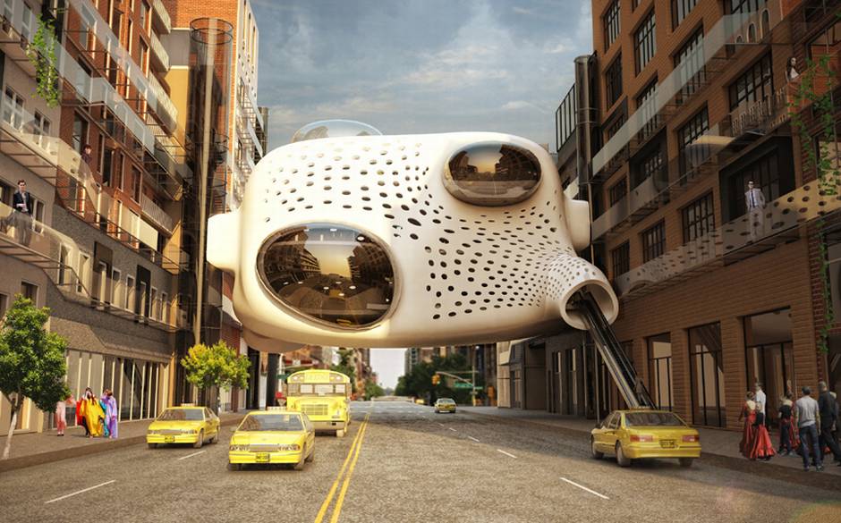
Image: The Heart hotel, designed by Arina Agieieva and Dmitry Zhuikov, is a proposed design for a New York hotel. The project aims to draw local residents and hotel visitors closer together by embedding the hotel into city life; bedrooms are found in the converted offices that flank the core of the structure – its heart – and leisure facilities are available for the use of everyone. Courtesy of Telegraph.

The Golden Age of Travel

Travel to far flung destinations was once a luxurious — some would say elitist — affair. Now that much of the process, and to some extent the end result, has been commoditized, we are left to dream of an age that once seemed glamorous and out of reach for most. And, what better way to market these dreams than through colorful, engaging travel posters. A collection of wonderful marketing posters from that “golden age” is up for auction.

Many of these beautiful works of art were published as commercial pieces so the artists often worked under the covers of their advertising or design agencies. While a few, such as Willy Burger, Maurice Logan, went on to be recognized by the art establishment, most worked in anonymity. However, the travel poster art they produced beginning at the turn of the previous century formed at key part of the Art Nouveau and later the Art Deco movements. Luckily this continues to influence art and design and still makes us dream of the romance of travel and exotic destinations to this day.

See a sample of the collection here.

Image: Roger Broders, Sports D’Hiver, c 1929. Courtesy: Swann Auction Galleries

100-Year Starship Project

As Voyager 1 embarks on its interstellar voyage, having recently left the confines of our solar system, NASA and the Pentagon are collaborating with the 100-Year Starship Project. This effort aims to make human interstellar travel a reality within the next 100 years. While this is an admirable goal, let’s not forget that the current record holder for fastest man made object — Voyager 1 — would still take around 50,000 years to reach the nearest star to Earth. So NASA had better get its creative juices flowing.
From the Guardian:

It would be hard enough these days to find a human capable of playing a 12-inch LP, let alone an alien. So perhaps it is time for Nasa to update its welcome pack for extraterrestrials.

The agency announced earlier this month that its Voyager 1 probe has left the solar system, becoming the first object to enter interstellar space. On board is a gold-plated record from 1977.

It contains greetings in dozens of languages, sounds such as morse code, a tractor, a kiss, music – from Bach to Chuck Berry – and pictures of life on Earth, including a sperm fertilising an egg, athletes, and the Sydney Opera House.

Now, Jon Lomberg, the original Golden Record design director, has launched a project aiming to persuade Nasa to upload a current snapshot of Earth to one of its future interstellar craft as a sort of space-age message in a bottle.

The New Horizons spacecraft will reach Pluto in 2015, then is expected to leave the solar system in about three decades. The New Horizons Message Initiative wants to create a crowd-sourced “human fingerprint” for extra-terrestrial consumption that can be digitally uploaded to the probe as its journey continues. The message could be modified to reflect changes on Earth as years go by.

With the backing of numerous space experts, Lomberg is orchestrating a petition and fundraising campaign. The first stage will firm up what can be sent in a format that would be easy for aliens to decode; the second will be the online crowd-sourcing of material.

Especially given the remote possibility that the message will ever be read, Lomberg emphasises the benefits to earthlings of starting a debate about how we should introduce ourselves to interplanetary strangers.

“The Voyager record was our best foot forward. We just talked about what we were like on a good day … no wars or famine. It was a sanitised portrait. Should we go warts and all? That is a legitimate discussion that needs to be had,” he said.

“The previous messages were decided by elite groups … Everybody is equally entitled and qualified to do it. If you’re a human on Earth you have a right to decide how you’re presented.”

“Astronauts have said that you step off the Earth and look back and you see things differently. Looking at yourself with a different perspective is always useful. The Golden Record has had a tremendous effect in terms of making people think about the culture in ways they wouldn’t normally do.”

Buoyed by the Voyager news, scientists gathered in Houston last weekend for the annual symposium of the Nasa- and Pentagon-backed 100-Year Starship project, which aims to make human interstellar travel a reality within a century.

“I think it’s an incredible boost. I think it makes it much more plausible,” said Dr Mae Jemison, the group’s principal and the first African-American woman in space. “What it says is that we know we can get to interstellar space. We got to interstellar space with technologies that were developed 40 years ago. There is every reason to suspect that we can create and build vehicles that can go that far, faster.”

Jeff Nosanov, of Nasa’s Jet Propulsion Laboratory, near Los Angeles, hopes to persuade the agency to launch about ten interstellar probes to gather data from a variety of directions. They would be powered by giant sails that harness the sun’s energy, much like a boat on the ocean is propelled by wind. Solar sails are gaining credibility as a realistic way of producing faster spacecraft, given the limitations of existing rocket technology. Nasa is planning to launch a spacecraft with a 13,000 square-foot sail in November next year.

“We have a starship and it’s 36 years old, so that’s really good. This is not as impossible as it sounds. Where the challenge becomes ludicrous and really astounding is the distances from one star to another,” Nosanov said.

Read the entire article here.

Image: USS Enterprise (NCC-1701). Courtesy of Star Trek franchise.

En Vie: Bio-Fabrication Expo

En Vie, french for “alive” is an exposition like no other. It’s a fantastical place defined through a rich collaboration of material scientists, biologists, architects, designers and engineers. The premise of En Vie is quite elegant — put these disparate minds together and ask them to imagine what the future will look like. And, it’s a quite magical world; a world where biological fabrication replaces traditional mechanical and chemical fabrication. Here shoes grow from plants, furniture from fungi and bees construct vases. The En Vie exhibit is open at the Space Foundation EDF in Paris, France until September 1.

From ars technica:

The natural world has, over millions of years, evolved countless ways to ensure its survival. The industrial revolution, in contrast, has given us just a couple hundred years to play catch-up using technology. And while we’ve been busily degrading the Earth since that revolution, nature continues to outdo us in the engineering of materials that are stronger, tougher, and multipurpose.

Take steel for example. According to the World Steel Association, for every ton produced, 1.8 tons of carbon dioxide is emitted into the atmosphere. In total in 2010, the iron and steel industries, combined, were responsible for 6.7 percent of total global CO2 emissions. Then there’s the humble spider, which produces silk that is—weight for weight—stronger than steel. Webs spun by Darwin’s bark spider in Madagascar, meanwhile, are 10 times tougher than steel and more durable than Kevlar, the synthetic fiber used in bulletproof vests. Material scientists savvy to this have ensured biomimicry is now high on the agenda at research institutions, and an exhibit currently on at the Space Foundation EDF in Paris is doing its best to popularize the notion that we should not just be salvaging the natural world but also learning from it.

En Vie (Alive), curated by Reader and Deputy Director of the Textile Futures Research Center at Central Saint Martins College Carole Collet, is an exposition for what happens when material scientists, architects, biologists, and engineers come together with designers to ask what the future will look like. According to them, it will be a world where plants grow our products, biological fabrication replaces traditional manufacturing, and genetically reprogrammed bacteria build new materials, energy, or even medicine.

It’s a fantastical place where plants are magnetic, a vase is built by 60,000 bees, furniture is made from funghi, and shoes from cellulose. You can print algae onto rice paper, then eat it or encourage gourds to grow in the shape of plastic components found in things like torches or radios (you’ll have to wait a few months for the finished product, though). These are not fanciful designs but real products, grown or fashioned with nature’s direct help.

In other parts of the exhibit, biology is the inspiration and shows what might be. Eskin, for instance, provides visitors with a simulation of how a building’s exterior could mimic and learn from the human body in keeping it warm and cool.

Alive shows that, speculative or otherwise, design has a real role to play in bringing different research fields together, which will be essential if there’s any hope of propelling the field into mass commercialization.

“More than any other point in history, advances in science and engineering are making it feasible to mimic natural processes in the laboratory, which makes it a very exciting time,” Craig Vierra, Professor and Assistant Chair, Biological Sciences at University of the Pacific, tells Wired.co.uk. In his California lab, Vierra has for the past few years been growing spider silk proteins from bacteria in order to engineer fibers that are close, if not quite ready, to give steel a run for its money. The technique involves purifying the spider silk proteins away from the bacteria proteins before concentrating these using a freeze-dryer in order to render them into powder form. A solvent is then added, and the material is spun into fiber using wet spinning techniques and stretched to three times its original length.

“Although the mechanical properties of the synthetic spider fibers haven’t quite reached those of natural fibers, research scientists are rapidly approaching this level of performance. Our laboratory has been working on improving the composition of the spinning dope and spinning parameters of the fibers to enhance their performance.”

Vierra is a firm believer that nature will save us.

“Mother Nature has provided us with some of the most outstanding biomaterials that can be used for a plethora of applications in the textile industry. In addition to these, modern technological advances will also allow us to create new biocomposite materials that rely on the fundamentals of natural processes, elevating the numbers and types of materials that are available. But, more importantly, we can generate eco-friendly materials.

“As the population size increases, the availability of natural resources will become more scarce and limiting for humans. It will force society to develop new methods and strategies to produce larger quantities of materials at a faster pace to meet the demands of the world. We simply must find more cost-efficient methods to manufacture materials that are non-toxic for the environment. Many of the materials being synthesized today are very dangerous after they degrade and enter the environment, which is severely impacting the wildlife and disrupting the ecology of the animals on the planet.”

According to Vierra, the fact that funding in the field has become extremely competitive over the past ten years is proof of the quality of research today. “The majority of scientists are expected to justify how their research has a direct, immediate tie to applications in society in order to receive funding.”

We really have no alternative but to continue down this route, he argues. Without advances in material science, we will continue to produce “inferior materials” and damage the environment. “Ultimately, this will affect the way humans live and operate in society.”

We’re agreed that the field is a vital and rapidly growing one. But what value, if any, can a design-led project bring to the table, aside from highlighting the related issues. Vierra has assessed a handful of the incredible designs on display at Alive for us to see which he thinks could become a future biomanufacturing reality.

Read the entire article here.

Image: Radiant Soil, En Vie Exposition. Courtesy of Philip Beesley, En Vie / Wired.

Menu Engineering

We live in a world of brands, pitches, advertising, promotions, PR, consumer research, product placement, focus groups, and 24/7 spin. So, it should come as no surprise that even that ubiquitous and utilitarian listing of food and drink items from your local restaurant — the menu — would come in for some 21st century marketing treatment.

Fast food chains have been optimizing the look and feel of their menus for years, often right down to the font, color (artificial) and placement of menu items. Now, many upscale restaurants are following suit. Some call it menu engineering.

From the Guardian:

It’s not always easy trying to read a menu while hungry like the wolf, woozy from aperitif and exchanging pleasantries with a dining partner. The eyes flit about like a pinball, pinging between set meal options, side dishes and today’s specials. Do I want comforting treats or something healthy? What’s cheap? Will I end up bitterly coveting my companion’s dinner? Is it immoral to fuss over such petty, first-world dilemmas? Oh God, the waiter’s coming over.

Why is it so hard to decide what to have? New research from Bournemouth University shows that most menus crowbar in far more dishes than people want to choose from. And when it comes to choosing food and drink, as an influential psychophysicist by the name of Howard Moskowitz once said: “The mind knows not what the tongue wants.”

Malcolm Gladwell cites an interesting nugget from his work for Nescafé. When asked what kind of coffee they like, most Americans will say: “a dark, rich, hearty roast”. But actually, only 25-27% want that. Most prefer weak, milky coffee. Judgement is clouded by aspiration, peer pressure and marketing messages.

The burden of choice

Perhaps this is part of the joy of a tasting or set menu – the removal of responsibility. And maybe the recent trend for tapas-style sharing plates has been so popular because it relieves the decision-making pressure if all your eggs are not in one basket. Is there a perfect amount of choice?

Bournemouth University’s new study has sought to answer this very question. “We were trying to establish the ideal number of starters, mains and puddings on a menu,” says Professor John Edwards. The study’s findings show that restaurant customers, across all ages and genders, do have an optimum number of menu items, below which they feel there’s too little choice and above which it all becomes disconcerting. In fast-food joints, people wanted six items per category (starters, chicken dishes, fish, vegetarian and pasta dishes, grills and classic meat dishes, steaks and burgers, desserts), while in fine dining establishments, they preferred seven starters and desserts, and 10 main courses, thank you very much.

Nightmare menu layouts

Befuddling menu design doesn’t help. A few years back, the author William Poundstone rather brilliantly annotated the menu from Balthazar in New York to reveal the marketing bells and whistles it uses to herd customers into parting with the maximum amount of cash. Professor Brian Wansink, author of Slim by Design, Mindless Eating Solutions to Every Day Life, has extensively researched menu psychology, or as he puts it, menu engineering. “What ends up initially catching the eye,” he says, “has an unfair advantage over anything a person sees later on.” There’s some debate about how people’s eyes naturally travel around menus, but Wansink reckons “we generally scan the menu in a z-shaped fashion starting at the top-left hand corner.” Whatever the pattern, though, we’re easily interrupted by items being placed in boxes, next to pictures or icons, bolded or in a different colour.

The language of food

The Oxford experimental psychologist Charles Spence has an upcoming review paper on the effect the name of a dish has on diners. “Give it an ethnic label,” he says, “such as an Italian name, and people will rate the food as more authentic.” Add an evocative description, and people will make far more positive comments about a dish’s appeal and taste. “A label directs a person’s attention towards a feature in a dish, and hence helps bring out certain flavours and textures,” he says.

But we are seeing a backlash against the menu cliches (drizzled, homemade, infused) that have arisen from this thinking. For some time now, at Fergus Henderson’s acclaimed restaurant, St John, they have let the ingredients speak for themselves, in simple lists. And if you eat at one of Russell Norman’s Polpo group of restaurants in London, you will see almost no adjectives (or boxes and other “flim-flam”, as he calls it), and he’s doing a roaring trade. “I’m particularly unsympathetic to florid descriptions,” he says.

However, Norman’s menus employ their own, subtle techniques to reel diners in. Take his flagship restaurant Polpo’s menu. Venetian dishes are printed on Italian butchers’ paper, which goes with the distressed, rough-hewn feel of the place. I don’t use a huge amount of Italian,” he says, “but I occasionally use it so that customers say ‘what is that?'” He picks an easy-to-pronounce word like suppli (rice balls), to start a conversation between diner and waiter.

Read the entire article here.

Image courtesy of Multyshades.

Lillian Moller Gilbreth: Inventor of the Modern Kitchen

Lillian Moller Gilbreth, industrial engineer and psychologist, mother of 12 children, but non-cook, invented the modern kitchen design. Unveiled in 1929 at a Women’s Exposition, her design ideas were codified into what became known as the Kitchen Practical.

[div class=attrib]From Slate:[end-div]

The idea that housework is work now seems like a commonplace. We contract it out to housekeepers, laundromats, cleaning services, takeout places. We divvy it up: You cooked dinner, I’ll do the dishes. We count it as a second shift, as well as primary employment. But it wasn’t until the early part of the 20th century that first a literature, and then a science, developed about the best way to cook and clean. The results of this research shape the way we treat housework today, and created a template for the kitchen that remains conceptually unchanged from the 1920s. And the woman who made the kitchen better? She couldn’t cook.

If that sounds like the set-up for a comedy, that’s because it was. Lillian Moller Gilbreth, industrial psychologist and engineer, was the mother of 12 children. She and husband and partner Frank B. Gilbreth, inventors of what is known as motion study, pioneered the use of short films to watch how industrial processes and office tasks were done, breaking them down into component parts (which they called “therbligs,” Gilbreth backward) to determine how to make a job faster and less taxing. They tested many of their ideas on their children, establishing “the one best way” to take a bath, training preteens to touch type, and charting age-appropriate chores for each child. The ensuing hijinks provided enough material for memoirs written by two Gilbreth children, Cheaper by the Dozen and Belles on Their Toes.

While Frank Gilbreth was alive, he and Lillian worked for industry. She wrote or co-wrote many of his books, but often took no credit, as it was Frank with whom the male executives wanted to deal. After his sudden death in 1924, she had to re-establish herself as a solo female practitioner. According to biographer Jane Lancaster, in Making Time, Gilbreth soon saw that combining her professional expertise on motion study with her assumed expertise on women’s work gave her a marketable niche.

Frank B. Gilbreth Jr. and Ernestine Gilbreth Carey write, in Belles on Their Toes:
If the only way to enter a man’s field was through the kitchen door, that’s the way she’d enter… Mother planned, on paper, an efficiency-type kitchenette of the kind used today in a good many apartments. Under her arrangement, a person could mix a cake, put it in the oven, and do the dishes, without taking more than a couple of dozen steps.

It had to be cake, because that was one of few dishes Gilbreth made well. Gilbreth had grown up in an upper class household in California with a Chinese chef. She had worked side-by-side with Frank Gilbreth from the day they married. As she told a group of businesswomen in 1930, “We considered our time too valuable to be devoted to actual labor in the home. We were executives.”And family councils, at the Gilbreth home in Montclair, were run like board meetings.

Even though she did not do it herself, Gilbreth still considered housework unpaid labor, and as such, capable of efficiencies. The worker in the kitchen in the 1920s was often not a servant but the lady of the house, who spent an estimated 50 percent of her day there. The refrigerator had begun to arrive in middle-class homes, but was the subject of a pitched battle between gas and electric companies as to who made the superior chiller. Smaller electric appliances were also in development. “Home economists” raised the bar for domestic health and hygiene. Women became the targets of intense marketing campaigns for products large and small. Gilbreth worked for these manufacturers, and thus is complicit in the rise of consumerism for the home, but she never made explicit endorsements.

She did, however, partner with the Brooklyn Borough Gas Company to develop Gilbreth’s Kitchen Practical, unveiled in 1929 at a Women’s Exposition. The kitchen was intended to showcase the new gas-fueled appliances as well as Gilbreth’s research on motion savings. It was to replace the loose-fit kitchen of many traditional homes (including the Gilbreths’): a large room with discrete pieces of furniture around the edges. These might include a table, a freestanding cupboard or Hoosier cabinet, an icebox, a sink with a drying board and a stove. Ingredients, utensils and cookware might be across the room, or even in a separate pantry.

[div class=attrib]Read the entire article after the jump.[end-div]

[div class=attrib]Image: Kitchen Practical 1929. Courtesy of Gilbreth Network.[end-div]

La Macchina: The Machine as Art, for Caffeine Addicts

You may not know their names, but Desiderio Pavoni and Luigi Bezzerra are to coffee as are Steve Jobs and Steve Wozniak to computers. Modern day espresso machines owe all to the innovative design and business savvy of this early 20th century Italian duo.

[div class=attrib]From Smithsonian:[end-div]

For many coffee drinkers, espresso is coffee. It is the purest distillation of the coffee bean, the literal essence of a bean. In another sense, it is also the first instant coffee. Before espresso, it could take up to five minutes –five minutes!– for a cup of coffee to brew. But what exactly is espresso and how did it come to dominate our morning routines? Although many people are familiar with espresso these days thanks to the Starbucksification of the world, there is often still some confusion over what it actually is – largely due to “espresso roasts” available on supermarket shelves everywhere. First, and most importantly, espresso is not a roasting method. It is neither a bean nor a blend. It is a method of preparation. More specifically, it is a preparation method in which highly-pressurized hot water is forced over coffee grounds to produce a very concentrated coffee drink with a deep, robust flavor. While there is no standardized process for pulling a shot of espresso, Italian coffeemaker Illy’s definition of the authentic espresso seems as good a measure as any:

A jet of hot water at 88°-93°C (190°-200°F) passes under a pressure of nine or more atmospheres through a seven-gram (.25 oz) cake-like layer of ground and tamped coffee. Done right, the result is a concentrate of not more than 30 ml (one oz) of pure sensorial pleasure.

For those of you who, like me, are more than a few years out of science class, nine atmospheres of pressure is the equivalent to nine times the amount of pressure normally exerted by the earth’s atmosphere. As you might be able to tell from the precision of Illy’s description, good espresso is good chemistry. It’s all about precision and consistency and finding the perfect balance between grind, temperature, and pressure. Espresso happens at the molecular level. This is why technology has been such an important part of the historical development of espresso and a key to the ongoing search for the perfect shot. While espresso was never designed per se, the machines –or Macchina– that make our cappuccinos and lattes have a history that stretches back more than a century.

In the 19th century, coffee was a huge business in Europe with cafes flourishing across the continent. But coffee brewing was a slow process and, as is still the case today, customers often had to wait for their brew. Seeing an opportunity, inventors across Europe began to explore ways of using steam machines to reduce brewing time – this was, after all, the age of steam. Though there were surely innumerable patents and prototypes, the invention of the machine and the method that would lead to espresso is usually attributed to Angelo Moriondo of Turin, Italy, who was granted a patent in 1884 for “new steam machinery for the economic and instantaneous confection of coffee beverage.” The machine consisted of a large boiler, heated to 1.5 bars of pressure, that pushed water through a large bed of coffee grounds on demand, with a second boiler producing steam that would flash the bed of coffee and complete the brew. Though Moriondo’s invention was the first coffee machine to use both water and steam, it was purely a bulk brewer created for the Turin General Exposition. Not much more is known about Moriondo, due in large part to what we might think of today as a branding failure. There were never any “Moriondo” machines, there are no verifiable machines still in existence, and there aren’t even photographs of his work. With the exception of his patent, Moriondo has been largely lost to history. The two men who would improve on Morinodo’s design to produce a single serving espresso would not make that same mistake.

Luigi Bezzerra and Desiderio Pavoni were the Steve Wozniak and Steve Jobs of espresso. Milanese manufacturer and “maker of liquors” Luigi Bezzera had the know-how. He invented single-shot espresso in the early years of the 20th century while looking for a method of quickly brewing coffee directly into the cup. He made several improvements to Moriondo’s machine, introduced the portafilter, multiple brewheads, and many other innovations still associated with espresso machines today. In Bezzera’s original patent, a large boiler with built-in burner chambers filled with water was heated until it pushed water and steam through a tamped puck of ground coffee. The mechanism through which the heated water passed also functioned as heat radiators, lowering the temperature of the water from 250°F in the boiler to the ideal brewing temperature of approximately 195°F (90°C). Et voila, espresso. For the first time, a cup of coffee was brewed to order in a matter of seconds. But Bezzera’s machine was heated over an open flame, which made it difficult to control pressure and temperature, and nearly impossible to to produce a consistent shot. And consistency is key in the world of espresso. Bezzera designed and built a few prototypes of his machine but his beverage remained largely unappreciated because he didn’t have any money to expand his business or any idea how to market the machine. But he knew someone who did. Enter Desiderio Pavoni.

[div class=attrib]Read the entire article after the jump.[end-div]

[div class=attrib]Image: A 1910 Ideale espresso machine. Courtesy of Smithsonian.[end-div]

Killer Ideas

It’s possible that most households on the planet have one. It’s equally possible that most humans have used one — excepting members of PETA (People for the Ethical Treatment of Animals) and other tolerant souls.

United States Patent 640,790 covers a simple and effective technology, invented by Robert Montgomery. The patent for a “Fly Killer”, or fly swatter as it is now more commonly known, was issued in 1900.

Sometimes the simplest design is the most pervasive and effective.

[div class=attrib]From the New York Times:[end-div]

The first modern fly-destruction device was invented in 1900 by Robert R. Montgomery, an entrepreneur based in Decatur, Ill. Montgomery was issued Patent No. 640,790 for the Fly-Killer, a “cheap device of unusual elasticity and durability” made of wire netting, “preferably oblong,” attached to a handle. The material of the handle remained unspecified, but the netting was crucial: it reduced wind drag, giving the swatter a “whiplike swing.” By 1901, Montgomery’s invention was advertised in Ladies’ Home Journal as a tool that “kills without crushing” and “soils nothing,” unlike, say, a rolled-up newspaper might.

Montgomery sold the patent rights in 1903 to an industrialist named John L. Bennett, who later invented the beer can. Bennett improved the design — stitching around the edge of the netting to keep it from fraying — but left the name.

The various fly-killing implements on the market at the time got the name “swatter” from Samuel Crumbine, secretary of the Kansas Board of Health. In 1905, he titled one of his fly bulletins, which warned of flyborne diseases, “Swat the Fly,” after a chant he heard at a ballgame. Crumbine took an invention known as the Fly Bat — a screen attached to a yardstick — and renamed it the Fly Swatter, which became the generic term we use today.

Fly-killing technology has advanced to include fly zappers (electrified tennis rackets that roast flies on contact) and fly guns (spinning discs that mulch insects). But there will always be less techy solutions: flypaper (sticky tape that traps the bugs), Fly Bottles (glass containers lined with an attractive liquid substance) and the Venus’ flytrap (a plant that eats insects).

During a 2009 CNBC interview, President Obama killed a fly with his bare hands, triumphantly exclaiming, “I got the sucker!” PETA was less gleeful, calling it a public “execution” and sending the White House a device that traps flies so that they may be set free.

But for the rest of us, as the product blogger Sean Byrne notes, “it’s hard to beat the good old-fashioned fly swatter.”

[div class=attrib]Read the entire article after the jump.[end-div]

[div class=attrib]Image courtesy of Goodgrips.[end-div]

Arial or Calibri?

Nowadays the choice of a particular font for the written word seems just as important as the word itself. Most organizations, from small businesses to major advertisers, from individual authors to global publishers, debate and analyze the typefaces for their communications to ensure brand integrity and optimum readability. Some even select a particular font to save on printing costs.

The infographic below, courtesy of Mashable, shows some of the key milestones in the development of some of our favorite fonts.

[div class=attrib]See the original, super-sized infographic after the jump.[end-div]

Undesign

Jonathan Ive, the design brains behind such iconic contraptions as the iMac, iPod and the iPhone discusses his notion of “undesign”. Ive has over 300 patents and is often cited as one of the most influential industrial designers of the last 20 years. Perhaps it’s purely coincidental that’s Ive’s understated “undesign” comes from his unassuming Britishness.

[div class=attrib]From Slate:[end-div]

Macworld, 1999. That was the year Apple introduced the iMac in five candy colors. The iMac was already a translucent computer that tried its best not to make you nervous. Now it strove to be even more welcoming, almost silly. And here was Apple’s newish head of design, Jonathan Ive, talking about the product in a video—back when he let his hair grow and before he had permanently donned his dark T-shirt uniform. Even then, Ive had the confessional intimacy that makes him the star of Apple promotional videos today. His statement is so ridiculous that he laughs at it himself: “A computer absolutely can be sexy, it’s um … yeah, it can.”

A decade later, no one would laugh (too loudly) if you said that an Apple product was sexy. Look at how we all caress our iPhones. This is not an accident. In interviews, Ive talks intensely about the tactile quality of industrial design. The team he runs at Apple is obsessed with mocking up prototypes. There is a now-legendary story from Ive’s student days of an apartment filled with foam models of his projects. Watch this scene in the documentary Objectified where Ive explains the various processes used to machine a MacBook Air keyboard. He gazes almost longingly upon a titanium blank. This is a man who loves his materials.

Ive’s fixation on how a product feels in your hand, and his micro-focus on aspects like the shininess of the stainless steel, or the exact amount of reflectivity in the screen, were first fully realized with the iPod. From that success, you can see how Ive and Steve Jobs led Apple to glory in the past decade. The iPod begat the iPhone, which in turned inspired the iPad. A new kind of tactile computing was born. Ive’s primary concern for physicality, and his perfectionist desire to think through every aspect of the manufacturing process (even the boring parts), were the exact gifts needed to make a singular product like the iPhone a reality and to guide Apple products through a new era of human-computer interaction. Putting design first has reaped huge financial rewards: Apple is now vying with Exxon to be the world’s most valuable company.

[div class=attrib]More from theSource here.[end-div]

[div class=attrib]Image courtesy of CNNMoney.[end-div]

World’s Narrowest House – 4 Feet Wide

[div class=attrib]From TreeHugger:[end-div]

Aristotle said “No great genius was without a mixture of insanity.” Marcel Proust wrote “Everything great in the world is created by neurotics. They have composed our masterpieces, but we don’t consider what they have cost their creators in sleepless nights, and worst of all, fear of death.”

Perhaps that’s why Jakub Szcz?sny designed this hermitage, this “studio for invited guests – young creators and intellectualists from all over the world.”- it will drive them completely crazy.

Don’t get me wrong, I love the idea of living in small spaces. I write about them all the time. But the Keret House is 122 cm (48.031″) at its widest, 72 (28.34″) at its narrowest. I know people wider than that.

[div class=attrib]More from theSource here.[end-div]