Tag Archives: life expectancy

MondayMap: Mississippi is Syria; Colorado is Slovenia

US-life-expectancy

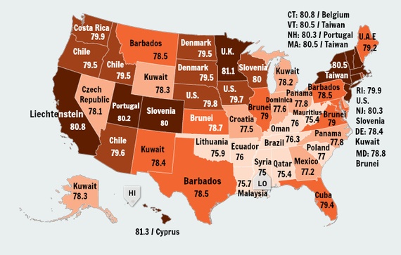
A fascinating map re-imagines life expectancy in the United States, courtesy of Olga Khazan over at measureofamerica.org. The premise of this map is a simple one: match the average life expectancy for each state of the union with that of a country having a similar rate. Voila. The lowest life expectancy rate belongs to Mississippi at 75 years, which equates with that of Syria. The highest, at 81.3 years, is found in Hawaii and Cyprus.

From the Atlantic:

American life expectancy has leapt up some 30 years in the past century, and we now live roughly 79.8 years on average. That’s not terrible, but it’s not fantastic either: We rank 35th in the world as far as lifespan, nestled right between Costa Rica and Chile. But looking at life expectancy by state, it becomes clear that where you live in America, at least to some extent, determines when you’ll die.

Here, I’ve found the life expectancy for every state to the tenth of a year using the data and maps from the Measure of America, a nonprofit group that tracks human development. Then, I paired it up with the nearest country by life expectancy from the World Health Organization’s 2013 data. When there was no country with that state’s exact life expectancy, I paired it with the nearest matching country, which was always within two-tenths of a year.

There’s profound variation by state, from a low of 75 years in Mississippi to a high of 81.3 in Hawaii. Mostly, we resemble tiny, equatorial hamlets like Kuwait and Barbados. At our worst, we look more like Malaysia or Oman, and at our best, like the United Kingdom. No state approaches the life expectancies of most European countries or some Asian ones. Icelandic people can expect to live a long 83.3 years, and that’s nothing compared to the Japanese, who live well beyond 84.

Life expectancy can be causal, a factor of diet, environment, medical care, and education. But it can also be recursive: People who are chronically sick are less likely to become wealthy, and thus less likely to live in affluent areas and have access to the great doctors and Whole-Foods kale that would have helped them live longer.

It’s worth noting that the life expectancy for certain groups within the U.S. can be much higher—or lower—than the norm. The life expectancy for African Americans is, on average, 3.8 years shorter than that of whites. Detroit has a life expectancy of just 77.6 years, but that city’s Asian Americans can expect to live 89.3 years.

Read the entire article here.

Declining and Disparate Life Expectancy in the U.S

Social scientists are not certain of the causes but the sobering numbers speak for themselves: life expectancy for white women without a high school diploma is 74 years, while that for women with at least a college degree is 84 years; for white men the comparable life expectancies are 66 years versus 80 years.

[div class=attrib]From the New York Times:[end-div]

For generations of Americans, it was a given that children would live longer than their parents. But there is now mounting evidence that this enduring trend has reversed itself for the country’s least-educated whites, an increasingly troubled group whose life expectancy has fallen by four years since 1990.

Researchers have long documented that the most educated Americans were making the biggest gains in life expectancy, but now they say mortality data show that life spans for some of the least educated Americans are actually contracting. Four studies in recent years identified modest declines, but a new one that looks separately at Americans lacking a high school diploma found disturbingly sharp drops in life expectancy for whites in this group. Experts not involved in the new research said its findings were persuasive.

The reasons for the decline remain unclear, but researchers offered possible explanations, including a spike in prescription drug overdoses among young whites, higher rates of smoking among less educated white women, rising obesity, and a steady increase in the number of the least educated Americans who lack health insurance.

The steepest declines were for white women without a high school diploma, who lost five years of life between 1990 and 2008, said S. Jay Olshansky, a public health professor at the University of Illinois at Chicago and the lead investigator on the study, published last month in Health Affairs. By 2008, life expectancy for black women without a high school diploma had surpassed that of white women of the same education level, the study found.

White men lacking a high school diploma lost three years of life. Life expectancy for both blacks and Hispanics of the same education level rose, the data showed. But blacks over all do not live as long as whites, while Hispanics live longer than both whites and blacks.

“We’re used to looking at groups and complaining that their mortality rates haven’t improved fast enough, but to actually go backward is deeply troubling,” said John G. Haaga, head of the Population and Social Processes Branch of the National Institute on Aging, who was not involved in the new study.

The five-year decline for white women rivals the catastrophic seven-year drop for Russian men in the years after the collapse of the Soviet Union, said Michael Marmot, director of the Institute of Health Equity in London.

[div class=attrib]Read the entire article after the jump.[end-div]

Best Countries for Women

If you’re female and value lengthy life expectancy, comprehensive reproductive health services, sound education and equality with males, where should you live? In short, Scandinavia, Australia and New Zealand, and Northern Europe. In a list of the 44 most well-developed nations, the United States ranks towards the middle, just below Canada and Estonia, but above Greece, Italy, Russia and most of Central and Eastern Europe.

The fascinating infographic from the National Post does a great job of summarizing the current state of womens’ affairs from data gathered from 165 countries.

[div class=attrib]Read the entire article and find a higher quality infographic after the jump.[end-div]

Your Life Expectancy Mapped

Your life expectancy mapped, that is, if you live in London, U.K. So, take the iconic London tube (subway) map, then overlay it with figures for average life expectancy. Voila, you get to see how your neighbors on the Piccadilly Line fair in their longevity compared with say, you, who happen to live near a Central Line station. It turns out that in some cases adjacent areas — as depicted by nearby but different subway stations — show an astounding gap of more than 20 years in projected life span.

So, what is at work? And, more importantly, should you move to Bond Street where the average life expectancy is 96 years, versus only 79 in Kennington, South London?

[div class=attrib]From the Atlantic:[end-div]

Last year’s dystopian action flick In Time has Justin Timberlake playing a street rat who suddenly comes into a great deal of money — only the currency isn’t cash, it’s time. Hours and minutes of Timberlake’s life that can be traded just like dollars and cents in our world. Moving from poor districts to rich ones, and vice versa, requires Timberlake to pay a toll, each time shaving off a portion of his life savings.

Literally paying with your life just to get around town seems like — you guessed it — pure science fiction. It’s absolute baloney to think that driving or taking a crosstown bus could result in a shorter life (unless you count this). But a project by University College London researchers called Lives on the Line echoes something similar with a map that plots local differences in life expectancy based on the nearest Tube stop.

The trends are largely unsurprising, and correlate mostly with wealth. Britons living in the ritzier West London tend to have longer expected lifespans compared to those who live in the east or the south. Those residing near the Oxford Circus Tube stop have it the easiest, with an average life expectancy of 96 years. Going into less wealthy neighborhoods in south and east London, life expectancy begins to drop — though it still hovers in the respectable range of 78-79.

Meanwhile, differences in life expectancy between even adjacent stations can be stark. Britons living near Pimlico are predicted to live six years longer than those just across the Thames near Vauxhall. There’s about a two-decade difference between those living in central London compared to those near some stations on the Docklands Light Railway, according to the BBC. Similarly, moving from Tottenham Court Road to Holborn will also shave six years off the Londoner’s average life expectancy.

Michael Marmot, a UCL professor who wasn’t involved in the project, put the numbers in international perspective.

“The difference between Hackney and the West End,” Marmot told the BBC, “is the same as the difference between England and Guatemala in terms of life expectancy.”

[div class=atrib]Read the entire article after the jump.[end-div]

[div class=attrib]Image courtesy of Atlantic / MappingLondon.co.uk.[end-div]