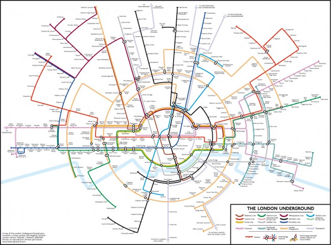
Your life expectancy mapped, that is, if you live in London, U.K. So, take the iconic London tube (subway) map, then overlay it with figures for average life expectancy. Voila, you get to see how your neighbors on the Piccadilly Line fair in their longevity compared with say, you, who happen to live near a Central Line station. It turns out that in some cases adjacent areas — as depicted by nearby but different subway stations — show an astounding gap of more than 20 years in projected life span.
So, what is at work? And, more importantly, should you move to Bond Street where the average life expectancy is 96 years, versus only 79 in Kennington, South London?
[div class=attrib]From the Atlantic:[end-div]
Last year’s dystopian action flick In Time has Justin Timberlake playing a street rat who suddenly comes into a great deal of money — only the currency isn’t cash, it’s time. Hours and minutes of Timberlake’s life that can be traded just like dollars and cents in our world. Moving from poor districts to rich ones, and vice versa, requires Timberlake to pay a toll, each time shaving off a portion of his life savings.
Literally paying with your life just to get around town seems like — you guessed it — pure science fiction. It’s absolute baloney to think that driving or taking a crosstown bus could result in a shorter life (unless you count this). But a project by University College London researchers called Lives on the Line echoes something similar with a map that plots local differences in life expectancy based on the nearest Tube stop.
The trends are largely unsurprising, and correlate mostly with wealth. Britons living in the ritzier West London tend to have longer expected lifespans compared to those who live in the east or the south. Those residing near the Oxford Circus Tube stop have it the easiest, with an average life expectancy of 96 years. Going into less wealthy neighborhoods in south and east London, life expectancy begins to drop — though it still hovers in the respectable range of 78-79.
Meanwhile, differences in life expectancy between even adjacent stations can be stark. Britons living near Pimlico are predicted to live six years longer than those just across the Thames near Vauxhall. There’s about a two-decade difference between those living in central London compared to those near some stations on the Docklands Light Railway, according to the BBC. Similarly, moving from Tottenham Court Road to Holborn will also shave six years off the Londoner’s average life expectancy.
Michael Marmot, a UCL professor who wasn’t involved in the project, put the numbers in international perspective.
“The difference between Hackney and the West End,” Marmot told the BBC, “is the same as the difference between England and Guatemala in terms of life expectancy.”
[div class=atrib]Read the entire article after the jump.[end-div]
[div class=attrib]Image courtesy of Atlantic / MappingLondon.co.uk.[end-div]


