Tag Archives: photography

Soviet Optics

Krakow-poland-1988

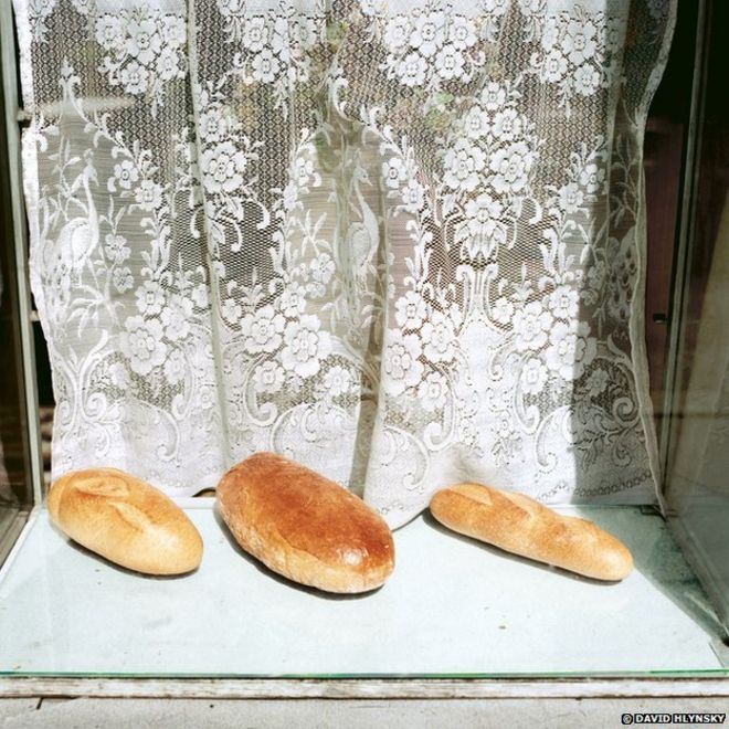
The heavy hand of the Soviet Union left untold scars on the populations of many Eastern European nations. Millions of citizens were repressed, harmed, spied-upon and countless disappeared. The Soviets and their socialist puppet governments also fostered many decades of centrally-planed austerity that created generations of impoverished — though not the ruling elites, of course. Nonetheless independent shopkeepers would try to put a brave face on their lack of a market for most goods and services — little supply and limited demand.

Photographer David Hlynsky spend several years in Eastern Europe, following the fall of the Berlin Wall, documenting the waning of the Soviet era. His book, Window-Shopping Through the Iron Curtainfeaturing many absurdly bleak views of consumer-minimalism [not necessarily a bad thing], was published in February 2015.

Read more from The Guardian’s article here.

Image: Three Loaves of Bread, Krakow, Poland, 1988. Courtesy of David Hlynsky.

The Me-Useum

art-in-island-museum

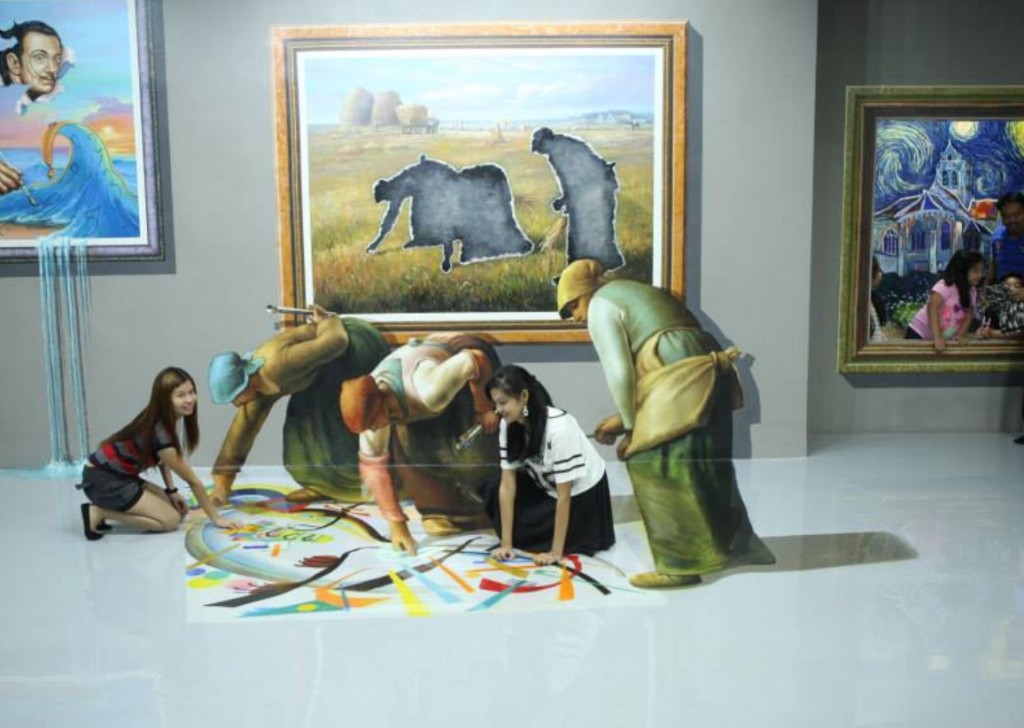
The smartphone and its partner in crime, the online social network, begat the ubiquitous selfie. The selfie begat the self-stick. And, now we have the selfie museum. This is not an April Fool’s prank. Quite the contrary.

The Art in Island museum in Manila is making the selfie part of the visitor experience. Despite the obvious crassness, it may usher in a way for this and other museums to engage with their visitors more personally, and for visitors to connect with art more intimately. Let’s face it, if you ever try to pull a selfie-like stunt, or even take a photo, in the Louvre or the Prado galleries you would be escorted rather promptly to the nearest padded cell.

From the Guardian:

Selfiemania in art galleries has reached new heights of surreal comedy at a museum in Manila. Art in Island is a museum specifically designed for taking selfies, with “paintings” you can touch, or even step inside, and unlimited, unhindered photo opportunities. It is full of 3D reproductions of famous paintings that are designed to offer the wackiest possible selfie poses.

Meanwhile, traditional museums are adopting diverse approaches to the mania for narcissistic photography. I have recently visited museums with wildly contrasting policies on picture taking. At the Prado in Madrid, all photography is banned. Anything goes? No, nothing goes. Guards leap on anyone wielding a camera.

At the Musée d’Orsay in Paris photography is a free-for-all. Even selfie sticks are allowed. I watched a woman elaborately pose in front of Manet’s Le Déjeuner sur l’herbe so she could photograph herself with her daft selfie stick. This ostentatious technology turns holiday snaps into a kind of performance art. That is what the Manila museum indulges.

My instincts are to ban selfie sticks, selfies, cameras and phones from museums. But my instincts are almost certanly wrong.

Surely the bizarre selfie museum in Manila is a warning to museums, such as New York’s MoMA, that seek to ban, at the very least, selfie sticks – let alone photography itself. If you frustrate selfie enthusiasts, they may just create their own simulated galleries with phoney art that’s “fun” – or stop going to art galleries entirely.

It is better for photo fans to be inside real art museums, looking – however briefly – at actual art than to create elitist barriers between museums and the children of the digital age.

The lure of the selfie stick, which has caused such a flurry of anxiety at museums, is exaggerated. It really is a specialist device for the hardcore selfie lover. At the Musée d’Orsay there are no prohibitions, but only that one visitor, in front of the Manet, out of all the thousands was actually using a selfie stick.

And there’s another reason to go easy on selfies in museums, however irritating such low-attention-span, superficial behaviour in front of masterpieces may be.

Read the entire story here.

Image: Jean-François Millet’s gleaners break out of his canvas. The original, The Gleaners (Des glaneuses) was completed in 1857. Courtesy of Art in Island Museum. Manila, Philippines.

Kissing for the Sake of Art

The Makeout ProjectThe process for many artists in often long and arduous. Despite the creative and, usually, fulfilling end result the path is frequently punctuated with disrespect, self-deprivation, suffering and pain. Indeed, many artists have paid a heavier price for their expression: censorship, imprisonment, torture, death.

So, it’s refreshing to see an artist taking a more pleasure-filled route. Kissing. Someone has to do it!

From the Guardian:

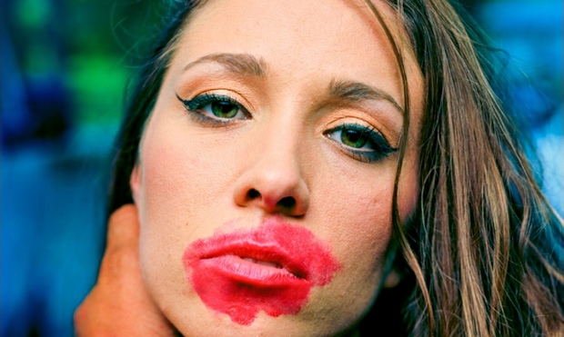
From the naked women that Yves Klein covered in blue paint to Terry Richardson’s bevy of porny subjects, the art world is full of work that for one person seems liberated and for another exploitative. Continuing to skirt that line is Jedediah Johnson, an American photographer whose ongoing series the Makeout Project involves him putting on lipstick then kissing people, before documenting the resulting smears in portraits.

Johnson’s shots are really striking, with his LaChapellian palette of bright colours making the lipstick jump out from its surprisingly circuitous path across each person’s face. The subjects look variously flirtatious, amused and ashamed; some have strange narratives, like the woman who is holding a baby just out of shot, her partner hovering off to one side.

It’s sensational enough to have been covered in the Daily Mail with their characteristically BIZARRE use of capitalisation, perhaps chiefly because it seems cheeky – or indeed sleazy. “People say ‘oh, it’s disgusting and he’s just doing it to get cheap thrills’, and I guess that is kind of not totally untrue,” Johnson tells me, explaining the germ of his project. “I just got this thought of this lipstick mark on your face when someone kisses you as being a powerful, loaded gesture that could communicate a lot. And also, y’know, there were a lot of people I knew who I wanted to kiss.” It was a way of addressing his “romantic anxiety”, which was holding him back from kissing those he desired.

So he started asking to kiss people at parties, generally picking someone he knew first of all, so the other partygoers could see it was an art project rather than a novel way of getting his end away. After a while, he graduated to studio portraits, and not just of attractive young women. He says he didn’t want to be “the guy using art as an excuse to kiss people he wants to – and I don’t think there’s necessarily anything wrong with that, but that’s just not who I wanted to be. So I’m going to have to kiss some people I don’t want to.” This includes a series of (still pretty attractive) men, who ended up teaching Jedediah a lot. “I didn’t realise people lead a kiss – I would always just kiss people, and I was leading, and I had no idea. There have been a couple of times when I kissed guys and they led; I tried to move into different real estate on their face, and they wouldn’t let me.”

His work is understandably misinterpreted though, with some people seeing the hand that cradles the face in each shot as a controlling, violent image. “I understand that when you are just pointing the viewer in a direction, they come up with stuff you’re not into.” But the only thing that really grates him is when people accuse him of not making art. “I have two degrees in art, and I don’t feel I have the ability to declare whether something is art or not. It’s an awful thing to say.”

The intrigue of his images comes from trying to assess the dynamic between the pair, from the woman biting her lip faux-seductively to those trying to hide their feelings about what’s just happened. Is there ever an erotic charge? “A few times it’s got really real for me; there’s some where I was probably like oh that was nice, and they’re thinking oh that was incredible, I don’t know what to do now. The different levels are very interesting.” He has had one unfortunate bad breath incident, though: “I was like hey, let’s make out, and she was like, great, just let me finish my garlic string beans. She still had garlic in her mouth.”

Read the entire story and see more images here.

Visit Jedediah Johnson’s website to see the entire Makeout Project here.

Image: The Makeout Project by Jedediah Johnson. Courtesy of Jedediah Johnson / Guardian.

Frozen Moving Pictures

green-salt-flotowarner

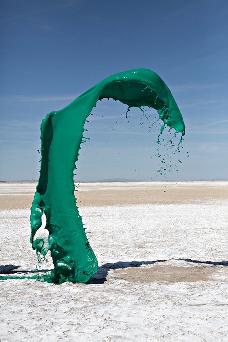
Recent works by artist duo Floto+Warner could be mistaken for a family of bizarrely fluid, alien life-forms, not 3D sculptures of colorful chemicals. While these still images of fluorescent airborne liquids certainly pay homage to Jackson Pollock, they have a unique and playful character all of their own. And, in this case the creative process is just as fascinating as the end result.

From Jonathan Jones over at the Guardian:

Luridly chemical colours hang in the air in the vast wastelands of Nevada in an eye-catching set of pictures by the New York art duo Floto+Warner. To make these images of bright liquids arrested in space, Cassandra and Jeremy Floto threw up cocktails of colour until their camera caught just the splashy, fluid, stilled moments they wanted to record. Apparently, Photoshop is not involved.

These images echo the great modern tradition that pictures motion, energy and flux. “Energy and motion made visible – memories arrested in space,” as Jackson Pollock said of his paintings that he made by dripping, flicking and throwing paint on to canvases laid on the floor. Pollock’s “action paintings” are the obvious source of Floto and Warner’s hurled colours: their photographs are playful riffs on Pollock. And they bring out one of the most startling things about his art: the sense it is still in motion even when it has stopped; the feel of paint being liquid long after it has dried.

Floto and Warner prove that Pollock is still the Great American Artist, 58 years after his death. American art still can’t help echoing him. Works from Robert Smithson’s Spiral Jetty to Andy Warhol’s piss paintings echo his free-ranging exploration of space and his dynamic expansion of the act of drawing.

Yet these images of arrested veils and clouds of colour also echo other attempts to capture living motion. In 1830 to 1831 Hokusai depicted The Great Wave off Kanagawa as a tower of blueness cresting into white foam and about to fall onto the boats helplessly caught in its path. Hokusai’s woodblock print is a decisive moment in the story of art. It takes motion as a topic, and distills its essence in an image at once dynamic and suspended.

Photographers would soon take up Hokusai’s challenge to understand the nature of motion. Famously, Eadweard Muybridge in the late 19th century took strange serial studies of human and animal bodies in motion. Yet the photographer whom Floto+Warner echo most vividly is Harold E Edgerton, who brought the scientific photography of movement into modern times in striking pictures of a foot kicking a ball or a bullet piercing an apple.

Read the entire story and see more of Floto+Warner’s images here.

Image: Green Salt, Floto+Warner. Courtesy of the Guardian.

Images: Go Directly To Jail or…

open-door

If you live online and write or share images it’s likely that you’ve been, or will soon be, sued by the predatory Getty Images. Your kindly editor at theDiagonal uses images found to be in the public domain or references them as fair use in this blog, and yet has fallen prey to this extortionate nuisance of a company.

Getty with its army of fee extortion collectors — many are not even legally trained or accredited — will find reason to send you numerous legalistic and threatening letters demanding hundreds of dollars in compensation and damages. It will do this without sound proof, relying on the threats to cajole unwary citizens to part with significant sums. This is such a big market for Getty that numerous services, such as this one, have sprung up over the years to help writers and bloggers combat the Getty extortion.

With that in mind, it’s refreshing to see the Metropolitan Museum of Art in New York taking a rather different stance: the venerable institution is doing us all a wonderful service by making many hundreds of thousands of classic images available online for free. Getty take that!

From WSJ:

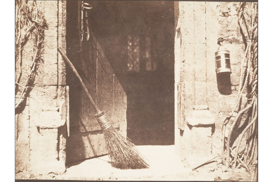
This month, the Metropolitan Museum of Art released for download about 400,000 digital images of works that are in the public domain. The images, which are free to use for non-commercial use without permission or fees, may now be downloaded from the museum’s website. The museum will continue to add images to the collection as they digitize files as part of the initiative Open Access for Scholarly Content (OASC). 

When asked about the impact of the initiative, Sree Sreenivasan, Chief Digital Officer, said the new program would provide increased access and streamline the process of obtaining these images. “In keeping with the Museum’s mission, we hope the new image policy will stimulate new scholarship in a variety of media, provide greater access to our vast collection, and broaden the reach of the Museum to researchers world-wide. By providing open access, museums and scholars will no longer have to request permission to use our public domain images, they can download the images directly from our website.”

Thomas P. Campbell, director and chief executive of the Metropolitan Museum of Art, said the Met joins a growing number of museums using an open-access policy to make available digital images of public domain works. “I am delighted that digital technology can open the doors to this trove of images from our encyclopedic collection,” Mr. Campbell said in his May 16 announcement. Other New York institutions that have initiated similar programs include the New York Public Library (map collection),  the Brooklyn Academy of Music and the New York Philharmonic. 

See more images here.

Image: “The Open Door,” earlier than May 1844. Courtesy of William Henry Fox Talbot/The Metropolitan Museum of Art, New York.

Kids With Guns

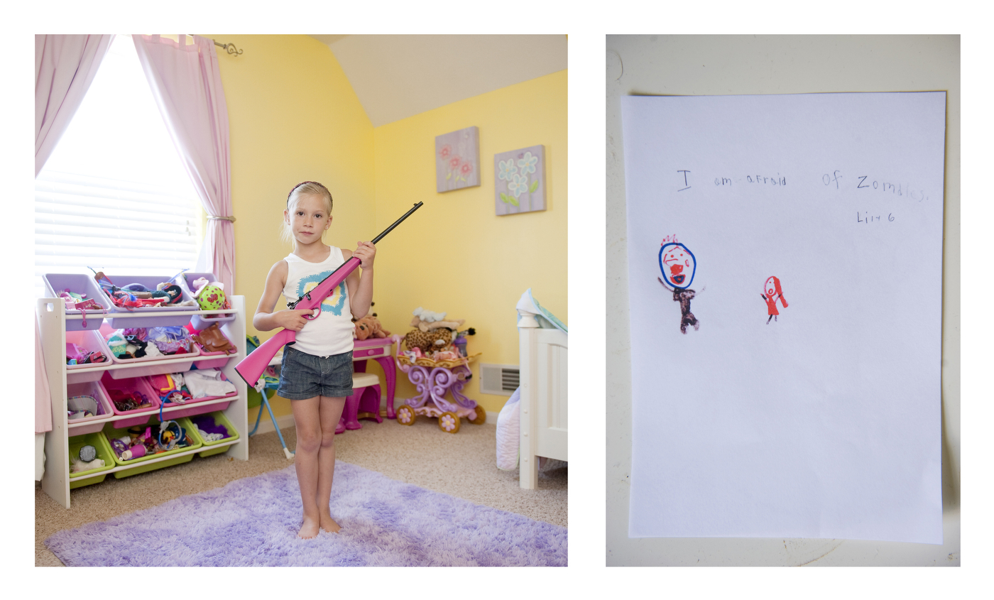
lily-with-her-gunIf you were asked to picture a contemporary scene populated with gun-toting children it’s possible your first thoughts might lean toward child soldiers in Chad, Burma, Central African Republic, Afghanistan or South Sudan. You’d be partially correct — that this abhorrent violation of children goes on in this world today, is incomprehensible and morally repugnant. Yet, you’d also be partially wrong.

So, think closer to home, think Louisiana, Texas, Alabama and Kentucky in the United States. A recent series of portraits titled “My First Rifle” by photographer An-Sofie Kesteleyn showcases children posing with their guns. See more of her fascinating and award-winning images here.

From  Wired:

Approaching strangers at gun ranges across America and asking to photograph their children holding guns isn’t likely to get you the warmest reception. But that’s exactly what photographer An-Sofie Kesteleyn did last June for her series My First Rifle. “One of the only things I had going for me was that I’m not some weird-looking guy,” she says.

Kesteleyn lives in Amsterdam but visited the United States to meet gun owners about a month after reading a news story about a 5-year-old boy in Kentucky who killed his 2-year-old sister with his practice rifle. She was taken aback by the death, which was deemed an accident. Not only because it was a tragic story, but also because in the Netherlands, few people if any own guns and it was unheard of to give a 5-year-old his own firearm.

“I really wanted to know what parents and kids thought about having the guns,” she says. “For me it was hard to understand because we don’t have a gun culture at all. The only people with guns [in the Netherlands] are the police.”

Thinking Texas would be cliché, Kesteleyn started her project in Ohio and worked her way though Tennessee, Alabama, Mississippi, and Louisiana before ending in the Lone Star State. Most of the time, it was rough going. Many people didn’t want to talk about their gun ownership. More often than not, she ended up talking to gun shop or shooting range owners, the most outspoken proponents.

During the three weeks she was on the ground, about 15 people were willing to let her photograph their children with Crickett rifles, which come in variety of colors, including hot pink. She always asked to visit people at home, because photos at the gun range were too expected and Kesteleyn wanted to reveal more details about the child and the parents.

“At home it was a lot more personal,” she says.

She spent time following one young girl who owned a Crickett and tried to develop a traditional documentary story, but that didn’t pan out so she switched, mid-project, to portraits. If the parents were OK with the idea, she’s ask children to pose in their rooms, in whatever way they felt comfortable.

“By photographing them in their bedroom I thought it helped remind us that they’re kids,” she says.

Kesteleyn also had the children write down what they were most scared of and what they might use the gun to defend themselves against (zombies, dinosaurs, bears). She then photographed those letters and turned the portrait and letter into a diptych.

So far the project has been well received in Europe. But Kesteleyn has yet to show it many places in the United States worries about how people might react. Though she tried coming to the story with an open mind and didn’t develop a strong opinion one way or another, she knows some viewers might assume she has an agenda.

Kesteleyn says that the majority of parents give their kids guns to educate them and ensure they know how to properly use a firearm when they get older. At the same time, she never could shake how odd she felt standing next to a child with a gun.

“I don’t want to be like I’m against guns or pro guns, but I do think giving a child a gun is sort of like giving your kids car keys,” she says.

Read the entire article here.

Image: Lily, 6. Courtesy of An-Sofie Kesteleyn / Wired.

Selfies That Celebrate the Environment

northern lights at Lake Minnewanka

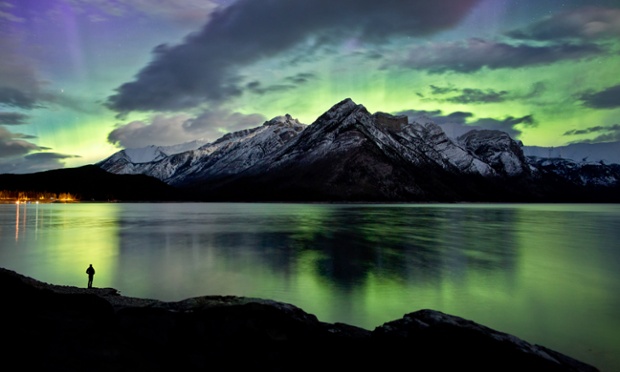
Not every selfie has to be about me or you, the smartphone-carrier. Sometimes a selfie can focus on something else, something bigger than ourselves. Sometimes the self in the selfie becomes just a meaningless dot on a broader, deeper, richer landscape. We need to see more selfies like those of Canadian photographer Paul Zizka — his are indeed selfies worth sharing and celebrating.

See more of Paul Zizka’s stunning images here.

Image: The northern lights at Lake Minnewanka, Banff National Park Photograph: Paul Zizka Photography/Caters News Agency.

It’s a Stage of Mind

Panic room, 2010Panic room, 2010

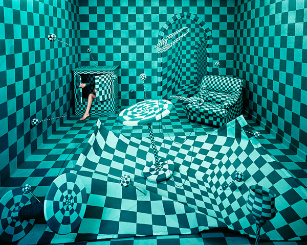
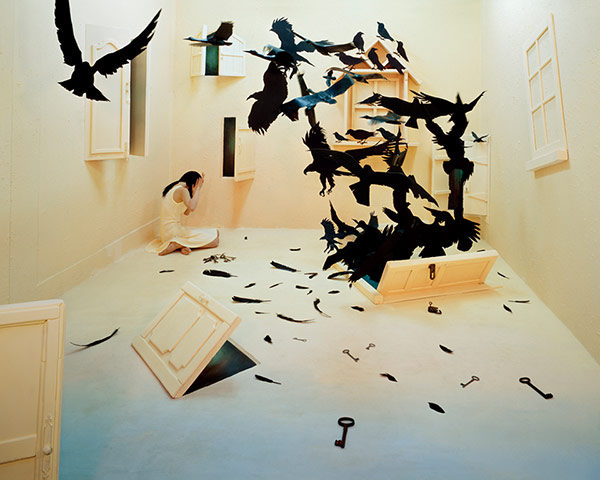
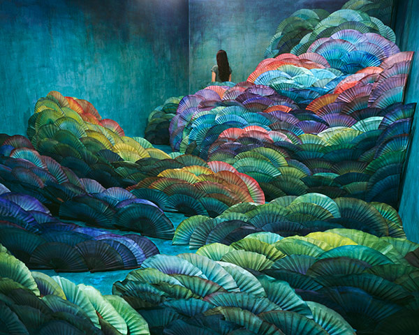
The art world continues to surprise. Just as creativity fades into a morass of commercial, “artotainment” drivel, along comes an artist with a thoroughly refreshing perspective. JeeYoung Lee creates breathtaking human-scale dioramas completely filling her 10 x 20 square foot studio with a parallel universe.

While it would be a delight to inhabit these spaces in Lee’s studio, it is unfortunately and understandably off-limits. However, the photographs are on display at the Opiom Gallery in Opio, France from 7 February to 7 March 2014.

Black birds, 2009Black birds, 2009

Nightscape, 2012Nightscape, 2012

From the Guardian:

From a giant honeycomb to a land of Lego and the last supper with mice, Korean artist JeeYoung Lee creates mystical universes in the confines of her 3×6 metre studio – then captures them on camera. Her first European exhibition, Stage of Mind, is at Opiom Gallery in Opio, France from 7 February to 7 March 2014.

See more images here.

Images courtesy of JeeYoung Lee/OPIOM Gallery.

Through the Eyes of Children

Sderot_Home

The very human invention that is war has taken an incalculable cost since it was first conceived, presumably when the first hunter-gatherers picked up the first rock or fashioned the first club. The cost on the innocent — especially the children — is brutal: death, pain, broken bodies, maimed limbs, fractured minds, shredded families.

Photographer Brian McCarty has chronicled the stories of some victims from the war and violence in the Middle East. In his visits to a therapeutic center in Jerusalem in 2011 he would watch the children work with therapists as they voice their painful memories and fear through art and play. Later, we would re-create their “war art” in photographs, often with the help of the children.

From Wired:

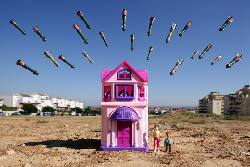
At the Spafford Children’s Center for in East Jerusalem, L.A.–based photographer Brian McCarty watched as a little girl made a crayon drawing of a dead boy. She carefully colors in a red pool of blood around his body. It was a drawing that McCarty would later use to stage one of his photographs for WAR-TOYS, a series that recreates children’s memories and fears of conflict in the Middle East with toys.

“Play can become a mechanism for healing,” says McCarty. Drawing on the tenets of art and play therapy, which help children express emotions in non-verbal ways, he sees WAR-TOYS as providing witness to the often unseen impact of armed conflict on children, while serving as part of these children’s therapeutic process.

McCarty first visited this therapeutic center in 2011 where he would observe as children worked with art and play therapists to tell and draw their stories. The drawings then served as a storyboard of sorts for McCarty, who re-created the scenes using locally purchased toys as characters and props. When possible, he brought the child along to help art direct the shoot.

McCarty worked with children in Jerusalem, the West Bank and Gaza, which produced a variety of drawings. Some children drew the keys their families kept as symbols of the homes they had to flee. A few boys portrayed heroic militants with homemade bombs. Young girls in Gaza City often drew mothers and babies near scenes of carnage.

Yet most of the drawings depicted the children’s fears. One boy’s drawing expressed how unattainable safety felt even with defense systems ready. It shows the sky full of incoming rockets and defensive interceptor missiles, while on the ground a bus explodes.

The use of toys as surrogates gives McCarty’s reenactments a playful, fictional distance while shifting the perspective to that of a child’s: closer to the ground, helplessly witnessing the shocking blur of play and violence.

The local toys also reveal the socio-economic layers of the region. While most of the toys in the region were made in China; in Gaza they were often botched discount versions.

And despite some previous efforts to rid the region of war toys, plastic soldiers, guns and bombs are ubiquitous. Notably, Israeli and Palestinian flags figures largely in the children’s drawings, and thus McCarty’s photographs, revealing the intensely divisive tribalism recognized, and sometimes identified with, from an early age.

“I’ve chosen to be as neutral as possible for the project. Much like the kids, I only know that the person shooting at me is a bad guy. They are ‘them,’ no matter which side of the border I’m on,” McCarty says.

McCarty, who has used toys in his photographs for 17 years, views this series as the first phase of a larger project — though gaining access is a challenge. “It took two years and a number of face-to-face meetings for an Israeli NGO to grant me access,” he says.

And that’s only the first difficulty. There’s also an element of danger. He recalled one particularly harrowing photo shoot: “Throughout, the sounds of outbound rockets and concussions from incoming airstrikes grew in intensity. I managed to complete my work, while experiencing first-hand the fear and anxiety the children face throughout their lives.”

See more images and read the full story here.

Image:  Photograph from WAR-TOYS by Brian McCarty. Courtesy of Brian McCarty / Wired.

Colorizing History

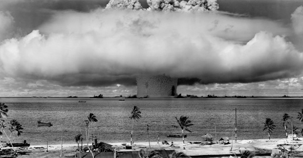
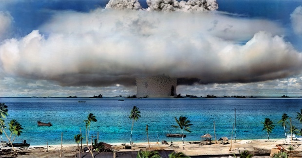
Historical events happened in full color. Yet, many of the photographs that captured most of our important collective, cultural moments were, and still are, in black and white. So, is right to have them colorized? An iconic image of a mushroom cloud over Bikini Atoll from 1946 shows the effect of colorization.

We would argue that while the process of colorization adds a degree of realism and fidelity to an image that would otherwise not exist as black and white in nature. However, it is no more true than the original photograph itself. A color version is merely another rendition of a scene through the subjective eyes of a colorist, however skilled. In the case of a black and white image it is perhaps truer to a historical period in the sense that it is captured and rendered by the medium of expression at the time. The act of recording an event, including how it is done, cannot be divorced from the event itself.

Original: A nuclear weapon test by the United States military at Bikini Atoll, Marshall Islands, on 25 July 1946. Photograph: Library Of Congress.

Colorized: Colorization of the Bikini Atoll nuclear explosion by Sanna Dullaway.

From the Guardian:

Do historic photographs look better in colour? The colorizers think so. Skilled digital artists such as Sanna Dullaway and Jordan J Lloyd are keen to remind us that the past was as colourful as the present – and their message is spreading though Reddit and Facebook.

See more images and read the entire article here.

Images courtesy of the Library of Congress and respective copyright holders.

Painting the Night

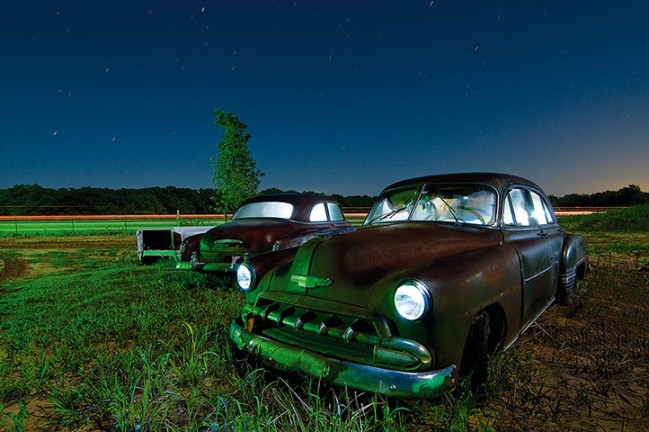
Photographer Noel Kerns turns abandoned roadside attractions into luminous nightscapes using a combination of moonlight and artificial lighting. His book of stunning and eerie images of quintessential, nocturnal Americana — motels, truck stops, classic cars and drive-ins — is titled Nightwatch.

See more of Kerns images here.

Image: Chevys in Bowie, Texas. April 2009. Courtesy of Noel Kerns.

Ode to Gasoline (Petrol)

Photography writer David Campany has collected some extraordinary photographs of American gas stations in a new book, Gasoline, which tells the story of our foremost liquid addiction — alcoholism pales in comparison.

From the Guardian:

“Running out of gas, Rabbit Angstrom thinks as he stands behind the summer-dusty windows of the Springer Motors display room watching the traffic go by on Route 111, traffic somehow thin and scared compared to what it used to be. The fucking world is running out of gas.” So begins John Updike’s novel Rabbit Is Rich, which is set in the 1970s, when it seemed like the world was indeed running out of gasoline.

Set against a backdrop of American unease heightened by petrol rationing and long fractious queues at gas pumps, Updike’s story illustrates how important oil is to the smooth running of things, both automotive and sociopolitical. America runs on gasoline. So does the American dream, as shown in so many stories, songs and films that hymn the open road and the fast car as the ultimate symbol of freedom.

This is one of the subtexts of Gasoline, a book of photographs of American gas stations rescued from various newspaper archives and edited into a visual meta-narrrative by the British photography writer David Campany. It’s an intriguing book, not least because its publication chimes with the 50th anniversary of one of the most iconic photobooks of all time: Ed Ruscha’s Twentysix Gasoline Stations. Ruscha commercially printed his book of wilfully anonymous photographs as an antidote to the overly precious, limited-edition, collectable artist’s book, producing a first print run of 400 and selling it for $3 a copy. As Campany notes in an interview included in Gasoline, the very “stylelessness” of Ruscha’s images has become their defining aspect. “The problem is that photographs don’t remain unspecial and styleless for long. In unforeseen ways, the passing of time renders them significant.”

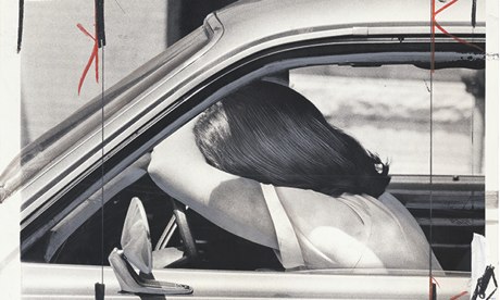
So it is with these found images of gasoline stations. They are, Campany notes, “a good measure of what is going on in society”, whether that is austerity or growth, changes in car manufacture or the decline of industrial cities and the freeways that link them. The cover image is one of the most striking: a young woman slumped on the steering wheel of her car, her head resting on her forearm as if exhausted or exasperated. This is the image from which the entire project sprang. Her name is Pat Sullivan and she was photographed while waiting in line at a gasoline station in Baltimore in 1979. A press cutting on the back of the original image, also included in the book, reads: “Pat Sullivan lowers her head in despair while waiting for gas in a long line yesterday at Lafayette and Charles. The lines were long again this morning …”

Campany was struck by the beauty of the image, which like most of these photographs has been marked by the grease pen of a newspaper’s art director. “The hair and the car have been retouched almost as if the newspaper wanted her to look her best even at this low point … But that image was so evocative that I felt I wanted to place it in a story of the second half of the 20th century.” Which is just what Gasoline does. There are images of gas station attendants and customers, iconic signage from a time before global corporations became tarnished – Gulf, Shell, Esso, BP – as well as local roadside stations in all their vernacular splendour, and sites where gasoline stations are about to be built or have just been demolished. There is black humour – a neon sign that reads We Wash Foreign Cars With Imported Water – and characteristic American stoicism – another reads No Gas Happy Holidays. There are images of gas stations that have just been robbed, destroyed by hurricanes, flooded and hit by cars.

Gasoline is an observational history of post-war America that is as richly suggestive as Twentysix Gasoline Stations is blank and detached. It shows how central gasoline is to the American way of life but, as Campany notes, it could also be read as “an allegory about news photography. Or a minor history of car design, or vernacular architecture, or street graphics, or outfits worn by pump attendants. All of the above.”

Read the entire article here.

Image: Gasoline Shortage Baltimore & Maryland. 15 June 1979. Pat Sullivan, Frustrated. Photograph: Richard Childress. David Campany / Guardian.

When the Gold Rush is Over

Bryan Schutmaat chronicles the slow death of communities in decline.

His images are stark and eerily beautiful.

From the Guardian:

Weatherbeaten male faces stare out from the land they struggle to make a living from. The landscapes seem both elemental and despoiled; the men at once stoic and sad. Around them, the houses are rundown, while abandoned cars and trucks rust in wintry sunlight.

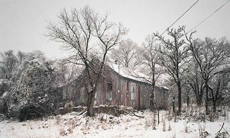
Photographer Bryan Schutmaat’s series Grays the Mountain Sends shows rural working-class mining communities in decline across the Amerian midwest. Inspired by the fiction of Raymond Carver and Richard Ford as well as the poetry of Richard Hugo, from whom he borrowed the title, Schutmaat’s images are tough yet lyrical. “The stories of some of these men run parallel to those of the towns they live in, or even of the nation at large,” Schutmaat told the critic Aaron Schuman. “Once young and full of promise, now their great expectations have been shed somewhere during the course of history.”

Here and there, photographs of fresh-faced young men interrupt the narrative of fading hope, but the inference is that their destiny is linked to their land and to a mining industry now struggling to survive. Schutmaat’s interior landscapes are more poignant: a battered armchair sits on a messy carpet beneath a fading print of an idealised rural landscape. Beside it, a hunting trophy stands under a cluttered tabletop. There is a sense throughout of things fading into history.

See more images and read the entire article here.

Image: Pinos Altos, New Mexico, 2012. Courtesy of Bryan Schutmaat / Guardian.

Creative Apocalypse

Following our story last week about artist Thomas Doyle’s miniature dystopian diaramas, we take a step further into nightmarish artistic visions, and of course, still small ones.

From Wired:

How will the world end? Will it be an asteroid, extreme climate conditions, a viral pandemic? No one really knows, which is why apocalypse scenarios are such rich territory for imaginative artists like Lori  Nix. The Brooklyn-based photographer creates and then documents detailed miniature dioramas of the end times — visions of what might be left behind once humans are gone.

Constructing the dioramas is a painstaking process, and Nix completes only three in a given year. As such, she makes very conscious decisions about what scenes she conjures. Crumbling institutions of science and learning turn up often in the work and are depicted with a gratifying realism.

“I think these are incredibly important places to learn about ourselves, learn what it means to be human,” says Nix. “These institutions are telling us about our pasts so that we may avoid the same mistakes in the future. Unfortunately, we’re not listening very well.”

The Kansas-born artist gravitates to destruction in part because she is no stranger to natural disasters.

“I have been in floods, tornadoes, blizzards; and when you are a kid, your parents are there to deal with the stress, but for me it was such an adventure. My boring life became suddenly exciting,” Nix says.

One time a tornado came through her neighborhood in Topeka and destroyed the houses right next door.

“A couple of days later, I was playing in the woods, seeing all of the scattered debris. And I came upon a stove, and when I opened the oven door, there was a perfect golden ham. The tornado hit right at dinner time,” she says.

Nix started working in photography at a newspaper, but soon realized the world of breaking news was not for her. She found herself moving towards darkroom work and constructed images.

She begins her sets by first drawing the floor plan of the building, creating the color scheme, and considering mood and lighting. Then Nix and her assistant build the entire set, including trees, books, and furniture using hot glue, foam, wood, and cardboard. Finishing each tiny piece means sanding, painting, and detailing.

Finally, it’s time to light and then shoot the scene with her 8×10 camera — Nix makes the sets to be seen by the camera from one viewpoint. When Nix showed the actual dioramas to the curator at the Museum of Art and Design in New York, she had to explain that she never intends to make models viewable from any angle. The edges remain unfinished.

“You could see the pink foam and the hot glue, but that is how we work,” she says.

Nix does not use Photoshop, and instead proofs her images as contacts and then as mural prints to look for any flaws. Once she is satisfied, she shoots an extra sheet of film and then takes apart the diorama and throws it away.

See more of Lori Nix’s apocalyptic constructions here.

Image: Circulation Desk, Lori Nix. Courtesy of Lori Nix / Wired.

Growing Pains

The majority of us can identify with the awkward and self-conscious years of adolescence. And, interestingly enough many of us emerge to the other side.

From Telegraph:

Photographer Merilee Allred tries to show us that teenage insecurities don’t have to hold us back as an adult in her project ‘Awkward Years’. Bullied as a child, the 35-year-old embarked on the project after a friend didn’t believe Merilee was a self-described ‘queen of the nerds’ as a child. She asked people to pose with unflattering pictures of themselves when they were young to highlight how things can turn out alright.

Check out more pictures from the awkward years here.

Image: Project photographer Merilee Allred. Then: 11 years old, 5th grade, in Billings, Montana. Now: 35 years old, UX Designer residing in Salt Lake City, Utah. Courtesy of Merilee Allred / Telegraph.

Our Beautiful Galaxy

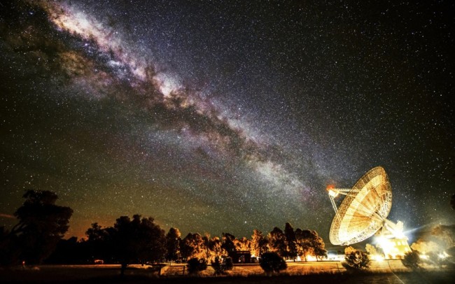
We should post stunning images of the night sky like these more often. For most of us, unfortunately, light pollution from our surroundings hides beautiful vistas like these from the naked eye.

Image: Receiving the Galatic Beam. The Milky Way appears to line up with the giant 64-m dish of the radio telescope at Parkes Observatory in Australia. As can be seen from the artificial lights around the telescope, light pollution is not a problem for radio astronomers. Radio and microwave interference is a big issue however, as it masks the faint natural emissions from distant objects in space. For this reason many radio observatories ban mobile phone use on their premises. Courtesy: Wayne England / The Royal Observatory Greenwich / Telegraph.

Fifty Years After Gettysburg

In 1913 some 50,000 veterans from both sides of the U.S. Civil War gathered at Gettysburg in Pennsylvania to commemorate. Photographers of the time were on hand to capture some fascinating and moving images, which are now preserved in the U.S. Library of Congress.

See more images here.

Image: The Blue and the Gray at Gettysburg: a Union veteran and a Confederate veteran shake hands at the Assembly Tent. Courtesy of U.S. Library of Congress.

Kolmanskop, Namibian Ghost Town

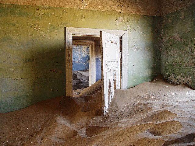
Ghost towns have a peculiar fascination. They hold the story of a once glorious past and show us how the future took a very different and unexpected turn. Many ghost towns were abandoned by their residents as the economic fortunes of the local area took a turn for the worst — some from exhausted natural resources such as over-exploited mines, others from re-routed transportation, natural disaster or changes in demographics. One such town to have suffered from the inevitable boom and bust cycle of mining — in this case diamonds — is Kolmanskop in Namibia. The town is now being swallowed whole by the ever-shifting sands of the nearby Namib desert, which makes the eerie landscape a photographer’s paradise.

From Atlas Obscura:

People flocked to what became known as Kolmanskop, Namibia, after the discovery of diamonds in the area in 1908. As people arrived with high hopes, houses and other key buildings were built. The new town, which was German-influenced, saw the construction of ballrooms, casinos, theaters, ice factories, and hospitals, as well as the first X-ray station in the southern hemisphere.

Prior to World War I, over 2000 pounds of diamonds were sifted from the sands of the Namib desert. During the war, however, the price of diamonds dropped considerably. On top of this, larger diamonds were later found south of Kolmanskop, in Oranjemund. People picked up and chased after the precious stones. By 1956, the town was completely abandoned.

Today, the eerie ghost town is a popular tourist destination. Guided tours take visitors around the town and through the houses which, today, are filled only with sand.

Read the entire article here.

Image: Kolmanskop. Courtesy of Damien du Toit (coda). See more images from the flickr-stream here.

The Death of Photojournalism

Really, it was only a matter of time. First, digital cameras killed off their film-dependent predecessors and then dealt a death knell for Kodak. Now social media and the #hashtag is doing the same to the professional photographer.

Camera-enabled smartphones are ubiquitous, making everyone a photographer. And, with almost everyone jacked into at least one social network or photo-sharing site it takes only one point and a couple of clicks to get a fresh image posted to the internet. Ironically, the newsprint media, despite being in the business of news, have failed to recognize this news until recently.

So, now with an eye to cutting costs, and making images more immediate and compelling — via citizens — news organizations are re-tooling their staffs in four ways: first, fire the photographers; second, re-train reporters to take photographs with their smartphones; third, video, video, video; fourth, rely on the ever willing public to snap images, post, tweet, #hashtag and like — for free of course.

From Cult of Mac:

The Chicago Sun-Times, one of the remnants of traditional paper journalism, has let go its entire photography staff of 28 people. Now its reporters will start receiving “iPhone photography basics” training to start producing their own photos and videos.

The move is part of a growing trend towards publications using the iPhone as a replacement for fancy, expensive DSLRs. It’s a also a sign of how traditional journalism is being changed by technology like the iPhone and the advent of digital publishing.

Screen Shot 2013-05-31 at 1.58.39 PM

When Hurricane Sandy hit New York City, reporters for Time used the iPhone to take photos on the field and upload to the publication’s Instagram account. Even the cover photo used on the corresponding issue of Time was taken on an iPhone.

Sun-Times photographer Alex Garcia argues that the “idea that freelancers and reporters could replace a photo staff with iPhones is idiotic at worst, and hopelessly uninformed at best.” Garcia believes that reporters are incapable of writing articles and also producing quality media, but she’s fighting an uphill battle.

Big newspaper companies aren’t making anywhere near the amount of money they used to due to the popularity of online publications and blogs. Free news is a click away nowadays. Getting rid of professional photographers and equipping reporters with iPhones is another way to cut costs.

The iPhone has a better camera than most digital point-and-shoots, and more importantly, it is in everyone’s pocket. It’s a great camera that’s always with you, and that makes it an invaluable tool for any journalist. There will always be a need for videographers and pro photographers that can make studio-level work, but the iPhone is proving to be an invaluable tool for reporters in the modern world.

Read the entire article here.

Image: Kodak 1949-56 Retina IIa 35mm Camera. Courtesy of Wikipedia / Kodak.

National Geographic Hits 125

Chances are that if you don’t have some ancient National Geographic magazines hidden in a box in your attic, then you know someone who does. If not, it’s time to see what you have been missing all these years. National Geographic celebrates 125 years in 2013, and what better way to do this than to look back through some of its glorious photographic archives.

[div class=attrib]See more classic images after the jump.[end-div]

[div class=attrib]Image: 1964, Tanzania: a touching moment between the primatologist and National Geographic grantee Jane Goodall and a young chimpanzee called Flint at Tanzania’s Gombe Stream reserve. Courtesy of Guardian / National Geographic.[end-div]

Photography is Now Our Art

Over at the Guardian’s art and culture blog Jonathan Jones argues that photography has now become our de facto medium for contemporary artistic expression. Some may argue that the creative process underlying photography comes up short when compared with the skills and techniques required to produce some art in more traditional media. However, Jones seems right in one respect: today’s photography captures the drama of the human condition in a way that no other medium can today, it’s not even close. We are in awe of the skills demonstrated by the Old Masters. However, that it took months for Rembrandt to paint a single canvas misses the point. It still takes an eye and empathy and a desire to tell a unique story as the photographer clicks the digital shutter in a five-hundredth of a second.

[div class=attrib]From the Guardian:[end-div]

It has taken me a long time to see this, and you can laugh at me if you like. But here goes.

Photography is the serious art of our time. It also happens to be the most accessible and democratic way of making art that has ever been invented. But first, let’s define photography.

A photograph is an image captured on film, paper or – most commonly now – in digital memory. Photography also includes moving images captured on film or video. Moving or still, we all know a photograph is not a pure record of the visual world: it can be edited and transformed in infinite ways.

Moving or still, and however it is taken, whether by pinhole camera or phone, the photographic image is the successor to the great art of the past. It is in pictures by Don McCullin or films by Martin Scorsese that we see the real old master art of our time. Why? Because photography relishes human life. The greatness of art lies in human insight. What matters most is not the oil paints Rembrandt used, but his compassion. Photography is the quickest, most exact tool ever invented to record our lives and deaths – 17th-century painters would have loved it.

Or if David Hockney is right, they did love it. Vermeer almost certainly used a camera obscura to compose his scenes. Hockney believes that Caravaggio and many more artists used a “secret knowledge” of early cameras to perfect their almost hallucinatory understanding of the visual world.

However they did it, they painted the flux and drama of real life. From birth to death, great art is a sequence of moving pictures of the human condition.

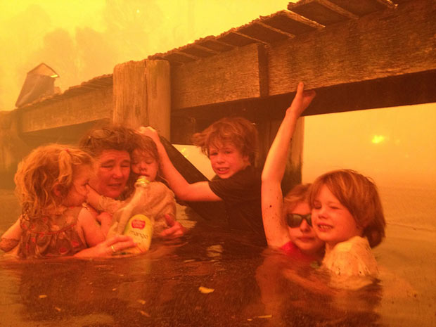
Today, photography is the only art that seriously maintains this attention to the stuff that matters. Just look (as the world is looking) at this week’s incredible photographs of a family surviving a wild fire in Tasmania. Here is the human creature, vulnerable and heroic.

[div class=attrib]Read the entire article after the jump.[end-div]

[div class=attrib]Image: Tim Holmes (not pictured) and his wife Tammy (second from left) huddled under a jetty for three hours with their grandchildren while their hometown in Tasmania was destroyed by wildfires. Courtesy of Tim Holmes/AP.[end-div]

Black and White or Color

Please forget Instagram, Photoshop filters, redeye elimination, automatic camera shake reduction systems and high dynamic range apps. If you’re a true photographer or simply a lover of great photography the choice is much simpler: black and white or color.

A new photography exhibit in London pits these contrasting media alongside each other for you to decide. The great Henri Cartier-Bresson would have you believe that black and white images live in a class of their own, far and above the lowly form of color snaps. He was vociferous in his opinion — that for technical and aeasthetic reasons only black and white photography could be considered art.

So, curators of the exhibition — Cartier-Bresson: A Question of Colour, have juxtaposed 10 of Cartier-Bressons prints alongside the colorful works of 15 international contemporary photographers. The results show that “the decisive moment”, so integral to Cartier-Bresson’s memorable black and white images, can be adapted to great, if not equal effect, in color.

The exhibit can be seen at Somerset House, London and runs from 8 November 2012 to 27 January 2013.

[div class=attrib]From Somerset House:[end-div]

Positive View Foundation announces its inaugural exhibition Cartier-Bresson: A Question of Colour, to be held at Somerset House, 8 November 2012 – 27 January 2013. Curated by William A. Ewing, the exhibition will feature 10 Henri Cartier-Bresson photographs never before exhibited in the UK alongside over 75 works by 15 international contemporary photographers, including: Karl Baden (US), Carolyn Drake (US), Melanie Einzig (US), Andy Freeberg (US), Harry Gruyaert (Belgium), Ernst Haas (Austrian), Fred Herzog (Canadian), Saul Leiter (US), Helen Levitt (US), Jeff Mermelstein (US), Joel Meyerowitz (US), Trent Parke (Australian), Boris Savelev (Ukranian), Robert Walker (Canadian), and Alex Webb (US).

The extensive showcase will illustrate how photographers working in Europe and North America adopted and adapted the master’s ethos famously known as  ‘the decisive moment’ to their work in colour. Though they often departed from the concept in significant ways, something of that challenge remained: how to seize something that happens and capture it in the very moment that it takes place.

It is well-known that Cartier-Bresson was disparaging towards colour photography, which in the 1950s was in its early years of development, and his reasoning was based both on the technical and aesthetic limitations of the medium at the time.

Curator William E. Ewing has conceived the exhibition in terms of, as he puts it, ‘challenge and response’. “This exhibition will show how Henri Cartier-Bresson, in spite of his skeptical attitude regarding the artistic value of colour photography, nevertheless exerted a powerful influence over photographers who took up the new medium and who were determined to put a personal stamp on it. In effect, his criticisms of colour spurred on a new generation, determined to overcome the obstacles and prove him wrong. A Question of Colour simultaneously pays homage to a master who felt that black and white photography was the ideal medium, and could not be bettered, and to a group of photographers of the 20th and 21st centuries who chose the path of colour and made, and continue to make, great strides.”

Cartier-Bresson: A Question of Colour will feature a selection of photographers whose commitment to expression in colour was – or is – wholehearted and highly sophisticated, and which measured up to Cartier-Bresson’s essential requirement that content and form were in perfect balance. Some of these artists were Cartier-Bresson’s contemporaries, like Helen Levitt, or even, as with Ernst Haas, his friends; others, such as Fred Herzog in Vancouver, knew the artist’s seminal work across vast distances; others were junior colleagues, such as Harry Gruyaert, who found himself debating colour ferociously with the master; and others still, like Andy Freeberg or Carolyn Drake, never knew the man first-hand, but were deeply influenced by his example.

[div class=attrib]Find out more about the exhibit here.[end-div]

[div class=attrib]Image Henri Cartier-Bresson. Courtesy of Wikipedia.[end-div]

What is the True Power of Photography?

Hint. The answer is not shameless self-promotion or exploitative voyeurism; images used in this way may scratch a personal itch, but rarely influence fundamental societal or political behavior. Importantly, photography has given us a rich, nuanced and lasting medium for artistic expression since cameras and film were first invented. However, the principal answer is lies in photography’s ability to tell truth about and to power.

Michael Glover reminds us of this critical role through the works of a dozen of the most influential photographers from the 1960s and 1970s. Their collective works are on display at a new exhibit at the Barbican Art Gallery, London, which runs until mid-January 2013.

[div class=attrib]From the Independent:[end-div]

Photography has become so thoroughly prostituted as a means of visual exchange, available to all or none for every purpose under the sun (or none worthy of the name), that it is easy to forget that until relatively recently one of the most important consequences of fearless photographic practice was to tell the truth about power.

This group show at the Barbican focuses on the work of 12 photographers from around the world, including Vietnam, India, the US, Mexico, Japan, China, Ukraine, Germany, Mali, Japan and South Africa, examining their photographic practice in relation to the particular historical moments through which they lived. The covert eye of the camera often shows us what the authorities do not want us to see: the bleak injustice of life lived under apartheid; the scarring aftermath of the allied bombing and occupation of Japan; the brutish day-to-day realities of the Vietnam war.

Photography, it has often been said, documents the world. This suggests that the photographer might be a dispassionate observer of neutral spaces, more machine than emotive being. Nonsense. Using a camera is the photographer’s own way of discovering his or her own particular angle of view. It is a point of intersection between self and world. There is no such thing as a neutral landscape; there is only ever a personal landscape, cropped by the ever quizzical human eye. The good photographer, in the words of Bruce Davidson, the man (well represented in this show) who tirelessly and fearlessly chronicled the fight for civil rights in America in the early 1960s, seeks out the “emotional truth” of a situation.

For more than half a century, David Goldblatt, born in the mining town of Randfontein of Lithuanian Jewish parentage, has been chronicling the social divisions of South Africa. Goldblatt’s images are stark, forensic and pitiless, from the matchbox houses in the dusty, treeless streets of 1970s Soweto, to the lean man in the hat who is caught wearily and systematically butchering the coal-merchant’s dead horse for food in a bleak scrubland of wrecked cars. Goldblatt captures the day-to-day life of the Afrikaners: their narrowness of view; that tenacious conviction of rightness; the visceral bond with the soil. There is nothing demonstrative or rhetorical about his work. It is utterly, monochromatically sober, and quite subtly focused on the job in hand, as if he wishes to say to the onlooker that reality is quite stark enough.

Boris Mikhailov, wild, impish and contrarian in spirit, turns photography into a self-consciously subversive art form. Born in Kharkov in Ukraine under communism, his photographic montages represent a ferociously energetic fight-back against the grinding dullness, drabness and tedium of accepted notions of conformity. He frames a sugary image of a Kremlin tower in a circlet of slabs of raw meat. He reduces accepted ideas of beauty to kitsch. Underwear swings gaily in the air beside a receding railway track. He mercilessly lampoons the fact that the authorities forbade the photographing of nudity. This is the not-so-gentle art of blowing red raspberries.

Shomei Tomatsu has been preoccupied all his life by a single theme that he circles around obsessively: the American occupation of Japan in the aftermath of its humiliating military capitulation. Born in 1930, he still lives in Okinawa, the island from which the Americans launched their B52s during the Vietnam war. His angle of view suggests a mixture of abhorrence with the invasion of an utterly alien culture and a fascination with its practical consequences: a Japanese child blows a huge chewing gum bubble beside a street sign that reads “Bar Oasis”. The image of the child is distorted in the bubble.

But this show is not all about cocking a snook at authority. It is also about aesthetic issues: the use of colour as a way of shaping a different kind of reality, for example. William Eggleston made his series of photographic portraits of ordinary people from Memphis, Tennessee, often at night, in the 1970s. These are seemingly casual and immediate moments of intimate engagement between photographer and subject. Until this moment, colour had often been used by the camera (and especially the movie camera), not to particularise but to glamorise. Not so here. Eggleston is especially good at registering the lonely decrepitude of objects – a jukebox on a Memphis wall; the reptilian patina of a rusting street light; the resonance of an empty room in Las Vegas.

[div class=attrib]Read the entire article following the jump.[end-div]

[div class=attrib]Image courtesy of “Everything Was Moving: Photography from the 60s and 70s”, Barbican Art Gallery. Copyright Bruce Davidson / Magnum Photos.[end-div]

Instagram: Confusing Mediocrity with Artistry

Professional photographers take note: there will always be room for high-quality images that tell a story or capture a timeless event or exude artistic elegance. But, your domain is under attack, again — and the results are not particularly pretty. This time courtesy of Instagram.

Just over a hundred years ago, to be a good photographer one required the skills of an alchemist; the chemical processing of plates and prints was more complex, much more time-consuming than capturing the shot itself, and sometimes dangerous. A good print required constant attention, lengthy cajoling and considerable patience, and of course a darkroom and some interesting chemicals.

Then Kodak came along; it commoditized film and processing, expanding photography to the masses. More recently as technology has improved and hardware prices have continued to drop, more cameras have found their ways into the hands of more people. However, until recently access to good quality (yet still expensive) photographic equipment has played an important role in allowing photographers to maintain superiority of their means and ends over everyday amateurs.

Even as photography has become a primarily digital process, with camera prices  continuing to plummet, many photographers have continued to distinguish their finished images from the burgeoning mainstream. After all, it still takes considerable skill and time to post-process an image in Photoshop or other imaging software.

Nowadays, anyone armed with a $99 smartphone is a photographer with a high-resolution camera. And, through the power of blogs and social networks every photographer is also a publisher. Technology has considerably democratized and shortened the process. So, now an image can find its way from the hands of the photographer to the eyes of a vast audience almost instantaneously. The numbers speak for themselves — by most estimates, around 4.2 million images are uploaded daily to Flickr and 4.5 million to Instagram.

And, as the smartphone is to a high-end medium or large format camera, so is Instagram to Photoshop. Now, armed with both smartphone and Instagram a photographer — applying the term loosely — can touch-up an image of their last meal with digital sepia or apply a duo-tone filter to a landscape of their bedroom, or, most importantly, snap a soft-focus, angled self-portrait. All this, and the photographer can still deliver the finished work to a horde of followers for instant, gratuitous “likes”.

But, here’s why Instagram may not be such a threat to photography after all, despite the vast ocean of images washing across the internet.

[div class=attrib]From the Atlantic Wire:[end-div]

While the Internet has had a good time making fun of these rich kid Instagram photos, haters should be careful. These postings are emblematic of the entire medium we all use. To be certain, these wealthy kid pix are particularly funny (and also sad) because they showcase a gross variant of entitlement. Preteens posing with helicopters they did nothing to earn and posting the pictures online for others to ogle provides an easy in for commentary on the state of the American dream. (Dead.) While we don’t disagree with that reading, it’s par for the course on Instagram, a shallow medium all about promoting superficiality that photo takers did little to nothing to earn.

The very basis of Instagram is not just to show off, but to feign talent we don’t have, starting with the filters themselves. The reason we associate the look with “cool” in the first place is that many of these pretty hazes originated from processes coveted either for their artistic or unique merits, as photographer and blogger Ming Thein explains: “Originally, these styles were either conscious artistic decisions, or the consequences of not enough money and using expired film. They were chosen precisely because they looked unique—either because it was a difficult thing to execute well (using tilt-shift lenses, for instance) or because nobody else did it (cross-processing),” he writes. Instagram, however, has made such techniques easy and available, taking away that original value. “It takes the skill out of actually having to do any of these things (learn to process B&W properly, either chemically or in Photoshop, for instance),” he continues.

Yet we apply them to make ourselves look like we’ve got something special. Everything becomes “amaaazzing,” to put it in the words of graphic design blogger Jack Mancer, who has his own screed about the site. But actually, nothing about it is truly amazing. Some might call the process democratizing—everyone is a professional!—but really, it’s a big hoax. Everyone is just pressing buttons to add computer-generated veneers to our mostly mundane lives. There is nothing artsy about that. But we still do it. Is that really better than the rich kids? Sure, we’re not embarrassing ourselves by posting extreme wealth we happened into. But what are we posting? And why? At the very least, we’re doing it to look artsy; if not that, there is some other, deeper, more sinister thing we’re trying to prove, which means we’re right up there with the rich kids.

Here are some examples of how we see this playing out on the network:

The Food Pic

Why you post this: This says my food looks cool, therefore it is yummy. Look how well I eat, or how well I cook, or what a foodie I am.

Why this is just like the rich kids: Putting an artsy filter on a pretty photo can make the grossest slosh look like gourmet eats. It does not prove culinary or photographic skill, it proves that you can press a button.

The Look How much Fun I’m Having Pic

Why you post this: To prove you have the best, most social, coolest life, and friends. To prove you are happy and fun.

Why this is just like the rich kids: This also has an underlying tone of flaunting wealth. Fun usually costs money, and it’s something not everybody else has.

The Picture of Thing Pic

Why you post this: This proves your fantastic, enviable artistic eye: “I turned a mundane object into art!”

What that is just like the rich kids: See above. Essentially, you’re bragging, but without the skills to support it.

Instagram and photo apps like it are shallow mediums that will generate shallow results. They are there for people to showcase something that doesn’t deserve a platform. The rich kids are a particularly salient example of how the entire network operates, but those who live in glass houses shot by Instagram shouldn’t throw beautifully if artfully filtered stones.

[div class=attrib]Read the entire article after the jump.[end-div]

[div class=attrib]Image courtesy of Tumblr: Rich Kids of Instgram.[end-div]

Tilt: The World in Miniature

Tilt-shift photography has been around for quite a while, primarily as a tool in high-end architectural photography. More recently with the advent of more affordable lens attachments for consumer cameras and through software post-processing, including Photoshop and Instagram, tilt-shift is becoming more mainstream.

Tilt-shift is a combination of two movements. Photographers tilt, or rotate, the lens plane relative to the image to control which part of an image retains focus. Then, they shift the perspective to re-position the subject in the image (this usually has the effect of reducing the convergence of parallel lines). When used appropriately, tilt-shift delivers a highly selective focus, and the resulting images give the illusion of a miniaturized landscape.

[div class=attrib]More tilt-shift photographs from the Telegraph after the jump.[end-div]

[div class=attrib]Image: Brighton beach, on the south coast of Sussex, England. Courtesy of the Telegraph.[end-div]

Wedding Photography

If you’ve been through a marriage or other formal ceremony you probably have an album of images that beautifully captured the day. You, significant other, family and select friends will browse through the visual memories every so often. Doubtless you will have hired, for a quite handsome sum, a professional photographer and/or videographer to record all the important instants. However, somewhere you, or your photographer, will have a selection of “outtakes” that should never see the light of day, such as those described below.

[div class=attrib]From the Daily Telegraph:[end-div]

Thomas and Anneka Geary commissioned professional photographers Ian McCloskey and Nikki Carter £750 to cover what should have been the best day of their lives.

But they were stunned when the pictures arrived and included out of focus shots of the couple, the back of guests’ heads and a snap of the bride’s mother whose face was completely obscured by her hat.

Astonishingly, the photographers even failed to take a single frame of the groom’s parents.

One snap of the couple signing the marriage register also appears to feature a ghostly hand clutching a toy motorbike where the snappers tried to edit out Anneka’s three-year-old nephew Harry who was standing in the background.

The pictures of the evening do, which hosted 120 guests, were also taken without flash because one of the photographers complained about being epileptic.

[div class=attrib]Read the entire article and browse through more images after the jump.[end-div]

[div class=attrib]Image: Tom, 32, a firefighter for Warwickshire Fire Service, said: “We received a CD from the wedding photographers but at first we thought it was a joke. Just about all of the pictures were out of focus or badly lit or just plain weird.” Courtesy of Daily Telegraph, Westgate Photography / SWNS.[end-div]