Tag Archives: infographic

Java by the Numbers

If you think the United States is a nation of coffee drinkers, thing again. The U.S., only ranks eighth in terms of annual java consumption per person. Way out in front is Finland. Makes one wonder if there is a correlation of coffee drinking and heavy metal music.

[div class=attrib]Infographic courtesy of Hamilton Beach.[end-div]

Coke or Pepsi?

Most people come down on one side or the other; there’s really no middle ground when it comes to the soda (or pop) wars. But, while the choice of drink itself may seem trivial the combined annual revenues of these food and beverage behemoths is far from it — close to $100 billion. The infographic below dissects this seriously big business.

Are you a Spammer?

Infographic week continues here at theDiagonal with a visual guide to amateur email spammers. You know you may one if you’ve ever sent an email titled “Read now: this will make your Friday!”, to friends, family and office colleagues. You may be a serial offender if you use the “forward this email” button more than a couple of times as day.

[div class=attrib]Infographic courtesy of OnlineITDegree.[end-div]

Google’s GDP

According to the infographic below Google had revenues of $29.3 billion in 2010. Not bad! Interestingly, that’s more than the combined Gross Domestic Product (GDP) of the world’s 28 poorest nations.

[div class=attrib]Infographic courtesy of MBA.org / dailyinfographic.[end-div]


How Many People Have Died?

Ever wonder how many people have gone before? The succinct infographic courtesy of Jon Gosier takes a good stab at answering the question. First, a few assumptions and explanations:

The numbers in this piece are speculative but are as accurate as modern research allows. It’s widely accepted that prior to 2002 there had been somewhere between 106 and 140 billion homo sapiens born to the world. The graphic below uses the conservative number (106 bn) as the basis for a circle graph. The center dot represents how many people are currently living (red) versus the dead (white). The dashed vertical line shows how much time passed between milestones. The spectral graph immediately below this text illustrates the population ‘benchmarks’ that were used to estimate the population over time. Adding the population numbers gets you to 106 billion. The red sphere is then used to compare against other data.

[div class=attrib]Checkout the original here.[end-div]

The Climate Spin Cycle

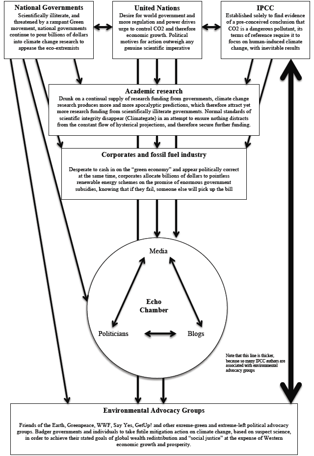
There’s something to be said for a visual aide that puts a complex conversation about simple ideas into perspective. So, here we have a high-level flow chart that characterizes one on the most important debates of our time — climate change. Whether you are for or against the notion or the science, or merely perplexed by the hyperbole inside the “echo chamber” there is no denying that this debate will remain with us for quite sometime.

[div class=attrib]Chart courtesy of Riley E. Dunlap and Aaron M. McCright, “Organized Climate-Change Denial,” In J. S. Dryzek, R. B. Norgaard and D. Schlosberg, (eds.), Oxford
Handbook of Climate Change and Society. New York: Oxford University Press, 2011.[end-div]

Mapping the Murder Rate

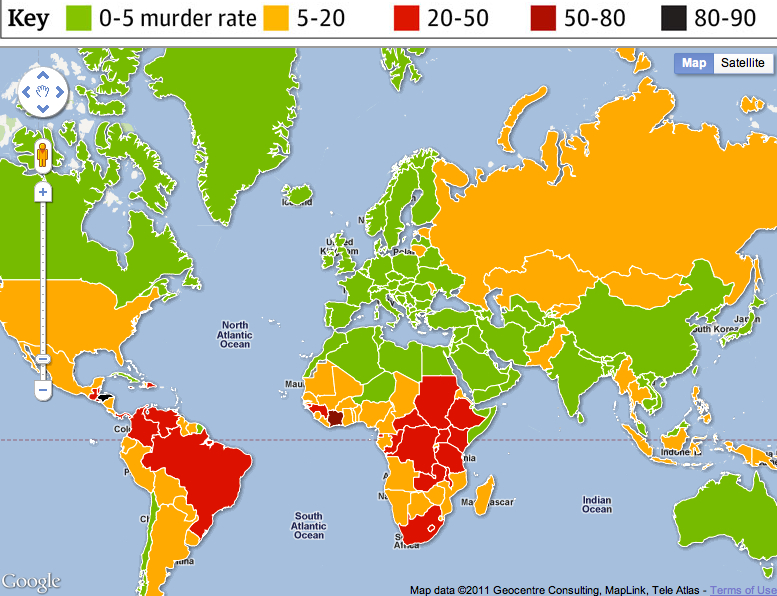
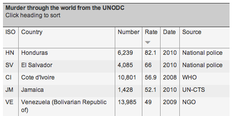
A sad but nonetheless interesting infographic of murder rates throughout the world. The rates are per 100,000 of the population. The United States with a rate of 5 per 100,000 ranks close to Belarus, Peru and Thailand. Interestingly, it has a higher murder rate than Turkmenistan (4.4), Uzbekistan (3.1), Afghanistan (2.4) , Syria (3) and Iran (3).

The top 5 countries with the highest murder rates are:

How Will You Die?

Bad news and good news. First, the bad news. If you’re between 45-54 years of age your cause of death will most likely be heart disease, that is, if you’re a male. If you are a female on the other hand, you’re more likely to fall prey to cancer. And, interestingly you are about 5 times more likely to die falling down stairs than from (accidental) electrocution. Now the good news. While the data may give us a probabilistic notion of how we may perish, no one (yet) knows when.

More vital statistics courtesy of this macabre infographic derived from data of National Center for Health Statistics and the National Safety Council.

Shnakule, Ishabor and Cinbric: The Biggest Networks You’ve Never Heard

Shnakule, Ishabor, Cinbric, Naargo and Vidzeban are not five fictional colleagues of Lord Voldemort from the mind of JK Rowling. They are indeed bad guys, but they live in our real world, online. Shnakule and its peers are the top 5 malware delivery networks. That is, they host a range of diverse and sophisticated malicious software, or malware, on ever-changing computer networks that seek to avoid detection. Malware on these networks includes: fake anti-virus software, fake software updates, drive-by downloads, suspicious link farming, ransomware, pharmacy spam, malvertising, work-at-home scams and unsolicited pornography. Other malware includes: computer viruses, worms, trojan horses, spyware, dishonest adware, and other unwanted software.

Malware researcher Chris Larsen, with Blue Coat, derived this malware infographic from the company’s Mid-Year Security Report. Interestingly, search engine poisoning is the most prevalent point of entry for the delivery of malware to a user’s computer. As the New York Times reports:

Search engine poisoning (SEP) makes up 40% of malware delivery vectors on the Web. It is easy to see why. People want to be able to trust that what they search for in Google, Bing or Yahoo is safe to click on. Users are not conditioned to think that search results could be harmful to the health of their computers. The other leading attack vectors on the Web all pale in comparison to SEP, with malvertising, email, porn and social networking all 10% of malware delivery.

[div class=attrib]Infographic courtesy of Blue Coat:[end-div]

Graduate Job Picture

Encouraging news for the class 0f 2011. The National Association of Colleges and Employers (NACE) released results from a recent survey showing a slightly improved job picture for 2011 college graduates.

[div class=attrib]From Course Hero:[end-div]

[div class=attrib]More from theSource here.[end-div]

Answers to Life’s Big Questions

Do you gulp Pepsi or Coke? Are you a Mac or a PC? Do you side with MSNBC or Fox News? Do you sip tea or coffee? Do you prefer thin crust or deep pan pizza.

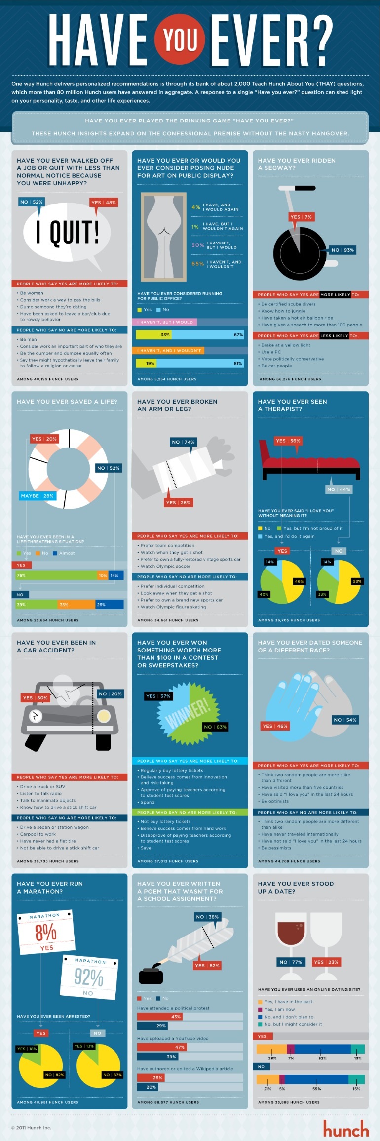
Hunch has compiled a telling infographic compiled from millions of answers gathered via its online Teach Hunch About You (THAY) questions. Interestingly, it looks like 61 percent of respondents are “dog people” and 31 percent “cat people” (with 8 percent neither).

[div class=attrib]From Hunch:[end-div]

[div class=attrib]More from theSource here.[end-div]