
En Vie, french for “alive” is an exposition like no other. It’s a fantastical place defined through a rich collaboration of material scientists, biologists, architects, designers and engineers. The premise of En Vie is quite elegant — put these disparate minds together and ask them to imagine what the future will look like. And, it’s a quite magical world; a world where biological fabrication replaces traditional mechanical and chemical fabrication. Here shoes grow from plants, furniture from fungi and bees construct vases. The En Vie exhibit is open at the Space Foundation EDF in Paris, France until September 1.
From ars technica:
The natural world has, over millions of years, evolved countless ways to ensure its survival. The industrial revolution, in contrast, has given us just a couple hundred years to play catch-up using technology. And while we’ve been busily degrading the Earth since that revolution, nature continues to outdo us in the engineering of materials that are stronger, tougher, and multipurpose.
Take steel for example. According to the World Steel Association, for every ton produced, 1.8 tons of carbon dioxide is emitted into the atmosphere. In total in 2010, the iron and steel industries, combined, were responsible for 6.7 percent of total global CO2 emissions. Then there’s the humble spider, which produces silk that is—weight for weight—stronger than steel. Webs spun by Darwin’s bark spider in Madagascar, meanwhile, are 10 times tougher than steel and more durable than Kevlar, the synthetic fiber used in bulletproof vests. Material scientists savvy to this have ensured biomimicry is now high on the agenda at research institutions, and an exhibit currently on at the Space Foundation EDF in Paris is doing its best to popularize the notion that we should not just be salvaging the natural world but also learning from it.
En Vie (Alive), curated by Reader and Deputy Director of the Textile Futures Research Center at Central Saint Martins College Carole Collet, is an exposition for what happens when material scientists, architects, biologists, and engineers come together with designers to ask what the future will look like. According to them, it will be a world where plants grow our products, biological fabrication replaces traditional manufacturing, and genetically reprogrammed bacteria build new materials, energy, or even medicine.
It’s a fantastical place where plants are magnetic, a vase is built by 60,000 bees, furniture is made from funghi, and shoes from cellulose. You can print algae onto rice paper, then eat it or encourage gourds to grow in the shape of plastic components found in things like torches or radios (you’ll have to wait a few months for the finished product, though). These are not fanciful designs but real products, grown or fashioned with nature’s direct help.
In other parts of the exhibit, biology is the inspiration and shows what might be. Eskin, for instance, provides visitors with a simulation of how a building’s exterior could mimic and learn from the human body in keeping it warm and cool.
Alive shows that, speculative or otherwise, design has a real role to play in bringing different research fields together, which will be essential if there’s any hope of propelling the field into mass commercialization.
“More than any other point in history, advances in science and engineering are making it feasible to mimic natural processes in the laboratory, which makes it a very exciting time,” Craig Vierra, Professor and Assistant Chair, Biological Sciences at University of the Pacific, tells Wired.co.uk. In his California lab, Vierra has for the past few years been growing spider silk proteins from bacteria in order to engineer fibers that are close, if not quite ready, to give steel a run for its money. The technique involves purifying the spider silk proteins away from the bacteria proteins before concentrating these using a freeze-dryer in order to render them into powder form. A solvent is then added, and the material is spun into fiber using wet spinning techniques and stretched to three times its original length.
“Although the mechanical properties of the synthetic spider fibers haven’t quite reached those of natural fibers, research scientists are rapidly approaching this level of performance. Our laboratory has been working on improving the composition of the spinning dope and spinning parameters of the fibers to enhance their performance.”
Vierra is a firm believer that nature will save us.
“Mother Nature has provided us with some of the most outstanding biomaterials that can be used for a plethora of applications in the textile industry. In addition to these, modern technological advances will also allow us to create new biocomposite materials that rely on the fundamentals of natural processes, elevating the numbers and types of materials that are available. But, more importantly, we can generate eco-friendly materials.
“As the population size increases, the availability of natural resources will become more scarce and limiting for humans. It will force society to develop new methods and strategies to produce larger quantities of materials at a faster pace to meet the demands of the world. We simply must find more cost-efficient methods to manufacture materials that are non-toxic for the environment. Many of the materials being synthesized today are very dangerous after they degrade and enter the environment, which is severely impacting the wildlife and disrupting the ecology of the animals on the planet.”
According to Vierra, the fact that funding in the field has become extremely competitive over the past ten years is proof of the quality of research today. “The majority of scientists are expected to justify how their research has a direct, immediate tie to applications in society in order to receive funding.”
We really have no alternative but to continue down this route, he argues. Without advances in material science, we will continue to produce “inferior materials” and damage the environment. “Ultimately, this will affect the way humans live and operate in society.”
We’re agreed that the field is a vital and rapidly growing one. But what value, if any, can a design-led project bring to the table, aside from highlighting the related issues. Vierra has assessed a handful of the incredible designs on display at Alive for us to see which he thinks could become a future biomanufacturing reality.
Read the entire article here.
Image: Radiant Soil, En Vie Exposition. Courtesy of Philip Beesley, En Vie / Wired.

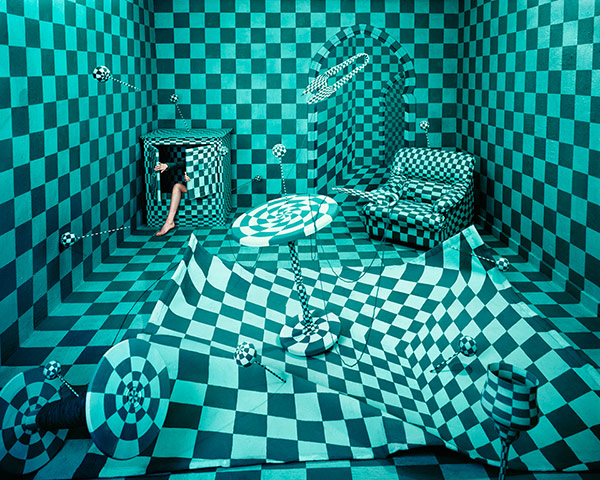 Panic room, 2010
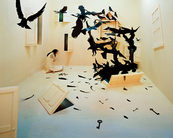 Black birds, 2009
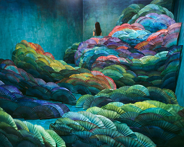 Nightscape, 2012


 The majority of us can identify with the awkward and self-conscious years of adolescence. And, interestingly enough many of us emerge to the other side.


 Description detail of the face of Wolfgang Amadeus Mozart. Cropped version of the painting where Mozart is seen with Anna Maria (Mozart's sister) and father, Leopold, on the wall a portrait of his deceased mother, Anna Maria.") Do you prefer the Beatles to Beethoven? Do you prefer Rembrandt over the Sunday comics or the latest Marvel? Do you read Patterson or Proust? Gary Gutting professor of philosophy argues that the distinguishing value of aesthetics must drive us to appreciate fine art over popular work. So, you had better dust off those volumes of Shakespeare.
Do you prefer the Beatles to Beethoven? Do you prefer Rembrandt over the Sunday comics or the latest Marvel? Do you read Patterson or Proust? Gary Gutting professor of philosophy argues that the distinguishing value of aesthetics must drive us to appreciate fine art over popular work. So, you had better dust off those volumes of Shakespeare.

, from SACRED (2013). Photograph: David Levene") Artist Ai Weiwei has suffered at the hands of the Chinese authorities much more so than Andy Warhol’s brushes with surveillance from the FBI. Yet the two are remarkably similar: brash and polarizing views, distinctive art and creative processes, masterful self-promotion, savvy media manipulation and global ubiquity. This is all the more astounding given Ai Weiwei’s arrest, detentions and prohibition on travel outside of Beijing. He’s even made it to the Venice Biennale this year — only his art of course.
Artist Ai Weiwei has suffered at the hands of the Chinese authorities much more so than Andy Warhol’s brushes with surveillance from the FBI. Yet the two are remarkably similar: brash and polarizing views, distinctive art and creative processes, masterful self-promotion, savvy media manipulation and global ubiquity. This is all the more astounding given Ai Weiwei’s arrest, detentions and prohibition on travel outside of Beijing. He’s even made it to the Venice Biennale this year — only his art of course. That a small group of Young British Artists (YBA) made an impact on the art scene in the UK and across the globe over the last 25 years is without question. Though, whether the public at large will, 10, 25 or 50 years from now (and beyond), recognize a Damien Hirst spin painting or Tracy Emin’s “My Bed” or a Sarah Lucas self-portrait — “The Artist Eating a Banana” springs to mind — remains an open question.

 Only yesterday we